By Jason Nale
Posted on Monday, February 17th, 2025

The photos of outstanding signs on SignCraft.com are loaded with ideas and information, for sure. But what about the back story: How did the layout come together? The finished product can’t tell the story behind the design—the decisions about letter styles, colors, illustrations and the like. What about the materials used and, if it’s a 3D sign, how it was fabricated?
There’s a lot to learn from a behind-the-scenes look at those questions for a specific sign project. Let’s let Jason Nale, Nazareth Sign Co., Nazareth, Pennsylvania, tell you how the design for this window sign for Vintage Hair Design came to be. It gives insight into his design approach as well as how the sign was produced. Going forward, we’ll do this with more signs by other top sign makers, too:

I pass by this little hair salon almost every day. I’ve long wanted to do something really effective for them. I wanted it to fit their image better, to be more interesting and more readable. Recently they said they were ready to upgrade their image and that’s how this project came to be.
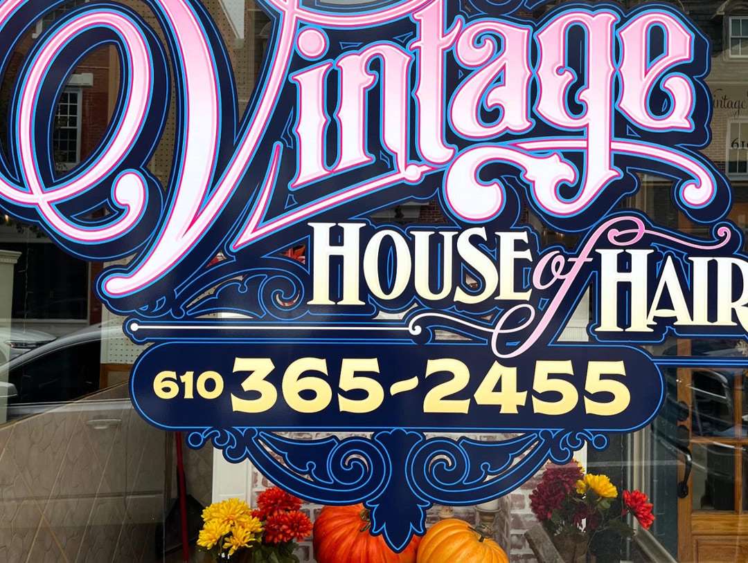
This pair of storefront window signs are the primary sign for Vintage House of Hair. The people who see it are either walking or they are driving by at 15 or 20 miles per hour. There’s a lot of walking traffic in a small town.

Before
Depending on the design, I begin either with a pencil sketch or I go right to the computer. I used to start with a sketch most of the time, but after all these years I’m usually comfortable starting on the computer. That’s what I did here.
I work in Illustrator CS3 on a Mac. I know that’s quite an old version of the software, but it does what I need it to do, and I’m really comfortable with it. I still use a mouse too.
Choosing the fonts: I started off by choosing the fonts. I was, of course, looking for letter styles with a vintage look. I love vintage fonts anyway, so it was easy. The customer wanted a vintage look, too.
I began by entering Vintage House of Hair and copying it several times. Then I changed the font for each of them as I looked through my font options. I really like great-looking fonts, and I have collected a lot of them. And I mean a lot.
I looked at the business name in about 20 different fonts. Several of them just didn’t work for the combinations of letters in the business name, and others had a character that I just didn’t like. I moved those off to the side just in case I needed any part of them as the design came together.
I narrowed my choices down to three options, then I chose the version done in Old Alfie Regular from Heritage Type Co. Then I started playing around with it, arranging the words in a few different layouts to find one that worked best.
I often combine different fonts in the same word. I really liked the V in one of my other versions, which was done in NS Lasttown Script by Ephemera Fonts Co. So I switched that out. I liked how well it fit with the rest of the word.
I never use the default spacing of the type. Type is often designed to be used at much smaller sizes than on signs, such as on a printed page or a computer display, so the spacing is typically too open at large sizes. I usually tighten the spacing overall then adjust individual letter pairs to get the spacing that I think works best for the word. I don’t use any system for this—I just space it by the eye.
Another thing that I always do is tighten the space between the words. Too much space between words is a common problem on sign layouts. I always reduce that space and think that this is just as important as good letter spacing.
I used the same process to choose the typeface for House of Hair. I looked at it in several different fonts and narrowed it down to LHF Palmer by Letterhead Fonts. It was very legible and also worked well with Vintage. I use this font often in other designs. It’s one of my favorites.
The “of” is the same font as the V in Vintage, but I added some additional scrolls from the NS Lasttown font I used for the V. I’m not sure which letter it came from but that’s where I got it. I do that often. If the letter Z in one font has a neat swash or scroll in one font, I may add it to another letter in a different font. I do some mix-and-match stuff.
I added that swash on the bottom of the G the same way. I wanted something to fit in there above House and I wanted it to sort of underline the Vintage. So I found that swash on the capital Z in the same font and grafted it on to the G with some slight modification.
One thing I never do is distort a typeface by compressing or extending it. I use it as it was designed. I may change the length of a stroke like a descender, but I don’t squeeze or stretch the letters. And I almost always do some modification of the letters to make them more custom. It really helps to use a good base font that is well designed from the start. I can also make my own letters as well if I can’t find what I’m looking for in a font.
Adding the scrolls: I like to use scrolls in my layouts when they’re appropriate, and that was the case here. Vintage graphics and advertising were often full of scrolls. I usually keep them in the background, though, or I sometimes use them to create a background like I did here. I want them muted so the business name stays out front. I don’t want anything else in the layout to get in front of the main message.
Color choices: Then I was ready for colors. I knew she wanted pinks and purples, so that was my starting point. I don’t get to use pink much in my work so that was fun.
I did some experimenting with a pink gradient on the Vintage. I liked a light pink to a very light beige but decided on pink to a very light pink. You have to be careful with gradients because they can overpower your lettering and make it hard to read. I keep them subtle.
Wrapping it up: They wanted their phone number on one of the windows, so I added that in a panel that the rest of the design could sit on. I finished that off by adding some scroll work below it. I fine-tuned it all by moving the elements around until it felt right to me. I like to fit the elements together, often letting them bump into each other or overlap. It makes for a more cohesive look.
I did some final tweaking, got the approval, then sent the file off to Signs365.com to be printed. Installation was just a matter of giving the glass a good cleaning and applying the graphics.
The results were good. It was quite a transformation—more interesting and easier to read. I was really glad she went for the design and was so happy with the final outcome.
You can see more of Jason’s work in his profile in the May/June 2020 issue of SignCraft.