By signcraft
Posted on Monday, April 14th, 2025

There are loads of great ideas in the photos of outstanding signs on SignCraft.com. But what about the back story: How did the layout come together? The finished product can’t tell the story behind the design—the decisions about letter styles, colors, illustrations and the like. What materials were used? If it’s a 3D sign, how it was fabricated?
There’s a lot to learn from a behind-the-scenes look for a specific sign project. This week, Travis Toews, RT Signs, RT Signs, Steinbach, Manitoba, Canada, tells how this 3D monument came together:
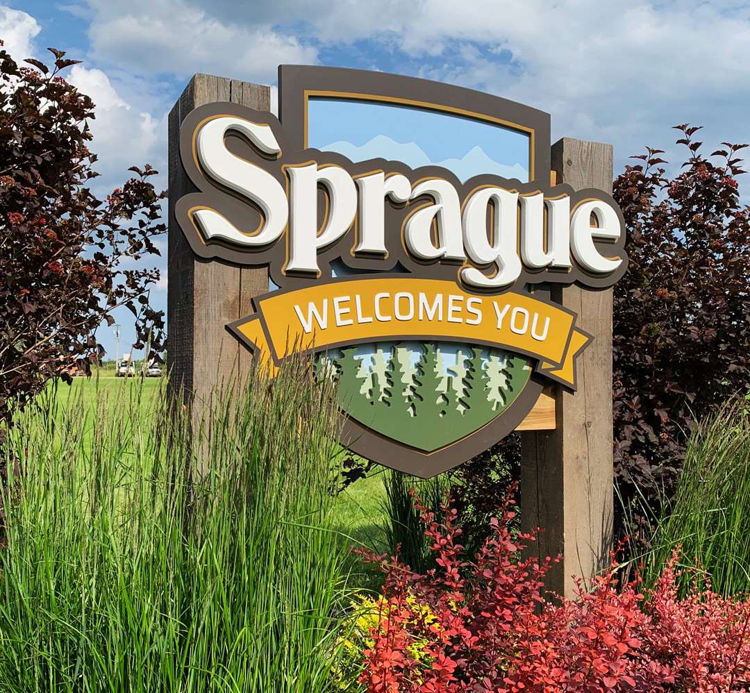
 Sprague is a very small town not far from the US border. It’s a rural/agricultural town with a post office, a few businesses and a community center along a highway. We had done a sign for the community center about ten years ago and they wanted to replace their existing “Welcome” sign with something more professional. Their previous sign was wood with more of a do-it-yourself design.
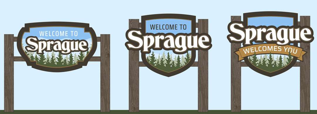
The font I ended up using wasn’t my first choice, but the request was for something “similar to what they had.” Fortunately they were open-minded and willing to hear a few ideas.
The sign we did for them so many years ago was a digital print. When I gave them the price on this 3D sign, their question was “Why is this so much more expensive?” I had to explain the differences—flat vs. dimensional, printed vs. painted, shape vs. a 4×8. All these give the sign a lot more value but also take more time to produce.
On signs like this, it’s not uncommon to give a few options at different price levels, from somewhat basic to more complex. I don’t think they chose the top version, but very close to it. We probably pushed the budget a bit beyond what they were originally thinking, but they were very satisfied with the results.
A sign like this should last for years, which really adds to its value. The base layer is aluminum composite material [ACM]. The layers are all 1/2-in. PVC board. There’s a layer that is the border, then another that makes up the background for the main copy and the Welcomes You banner. The tree graphics below the banner are two more layers. Everything was finished with exterior acrylic paint.
Sprague was cut from 1-in. PVC board painted with an automotive paint, and the Welcomes You letters are 3/8-in. cut-out acrylic letters from Gemini Inc. The sign face was attached to stringers that were let into the 8-by-8-in. tamarack timbers then secured with lag screws from the end.
Once the face was installed, we bonded the letters to the PVC panels with 3M VHB double-sided tape and silicone adhesive. The letters hid a few screws that were used to mount the face to the structure.
We feel this design has a lot of warmth and character. The sign is also very durable and should do its job for many years without much maintenance.