By signcraft
Posted on Monday, June 9th, 2025

If you’re like most creative sign people, you’re always on the lookout for layout ideas, cool letter styles and interesting color combinations. Web pages, restaurant menus, detergent bottles on the grocery store shelves—just about anything visual may spark the idea for your next sign design.
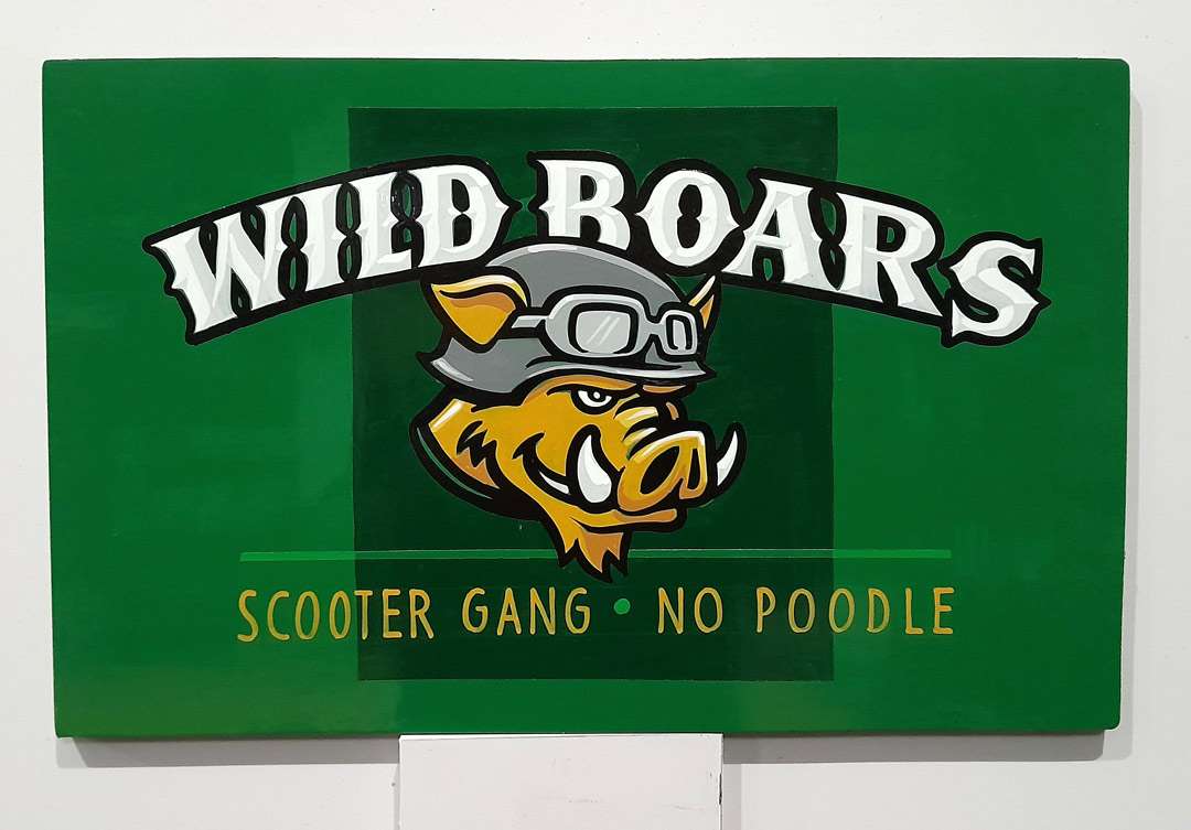
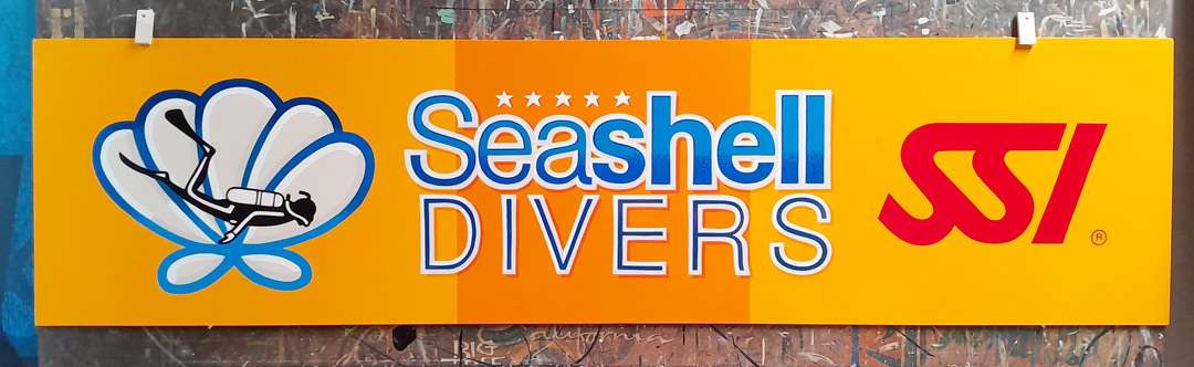
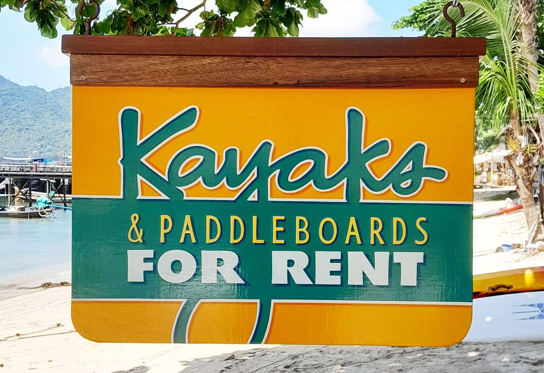
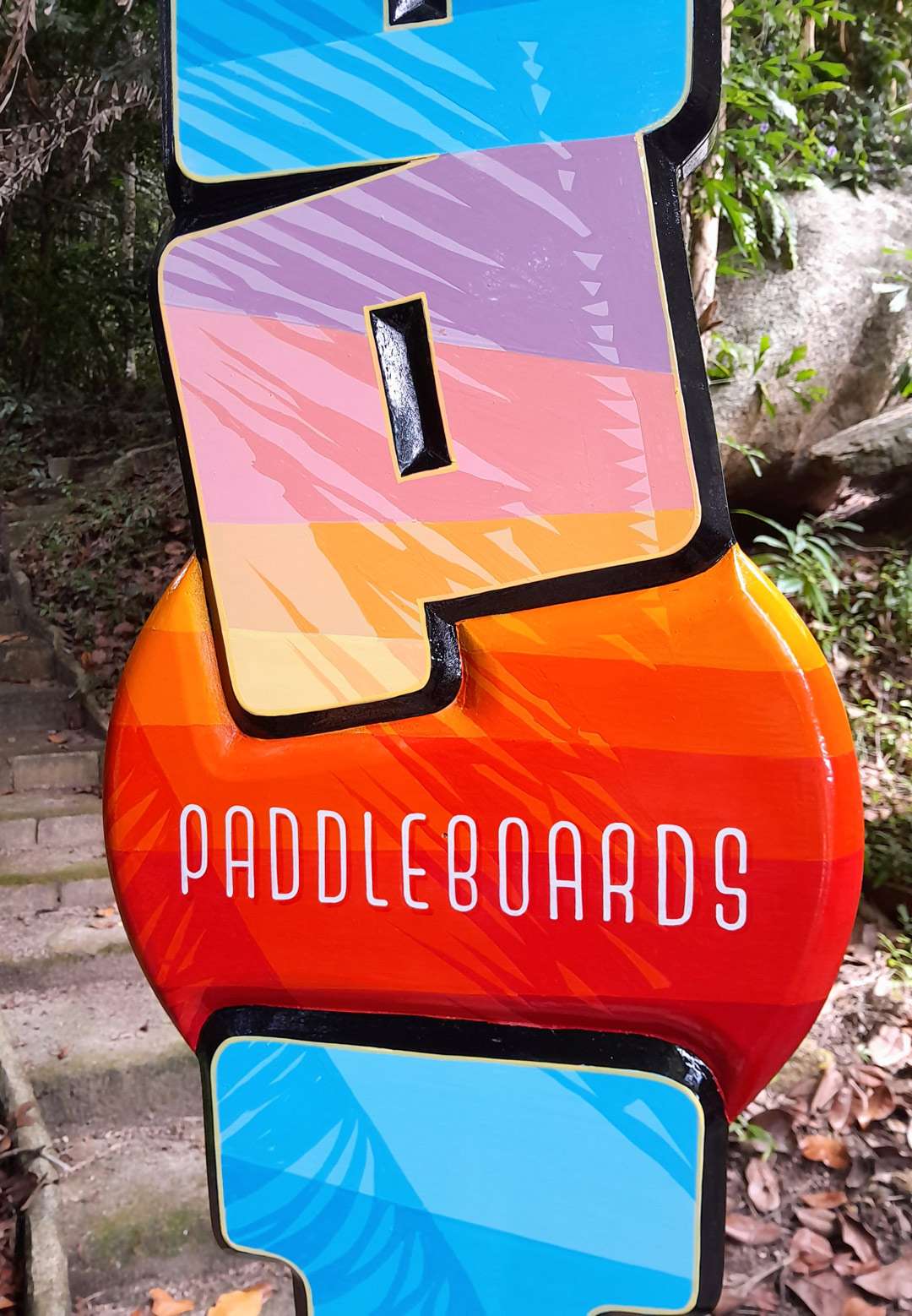
At SignCraft, we like to make it easier on you, so here are a few photos of recent projects that Rob Cooper, Koh Tao, Thailand, shared with us recently. We counted seven great ideas to help fuel the designs you’ll be doing during the busy summer ahead.
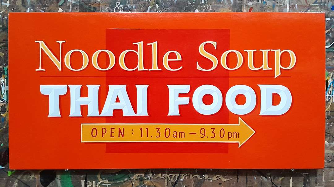
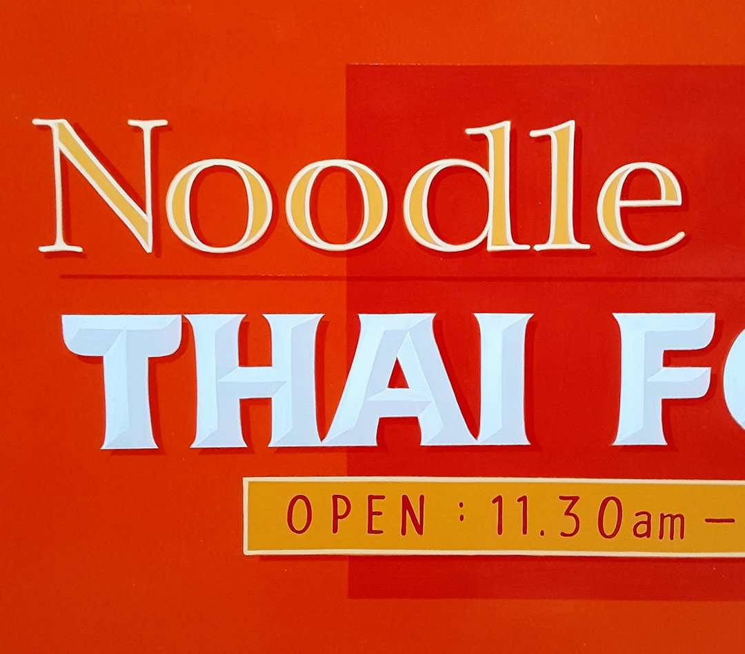
Add a subtle panel shape in the background like Rob did on these signs. The layout and lettering alone would have looked great, but the square spices up the sign just right. It’s easy to do, too.
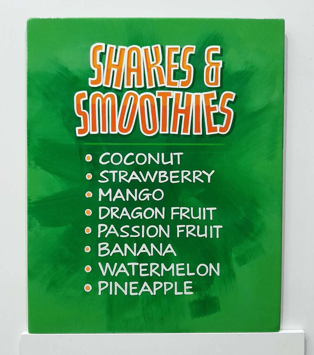
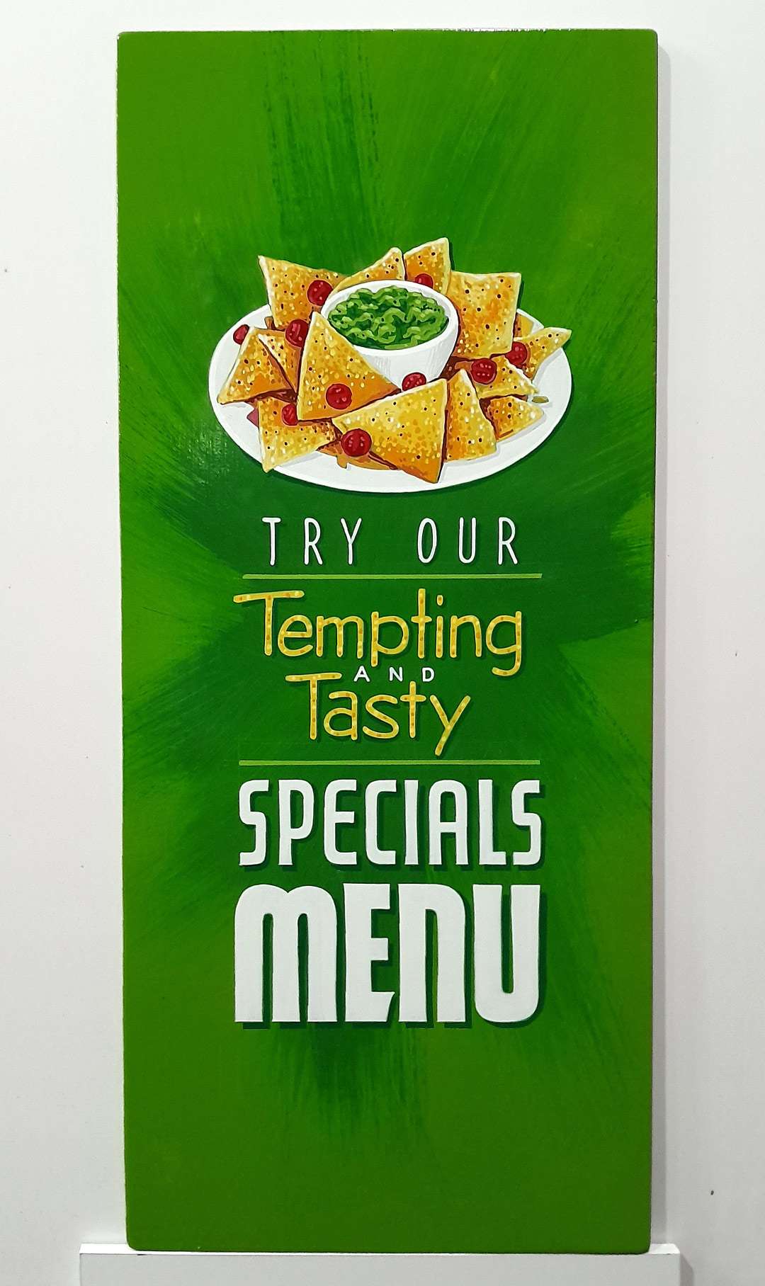
Toss a dry-brush panel in there. Mix a slightly darker shade of green, grab a brush and dry-brush a panel behind the lettering.
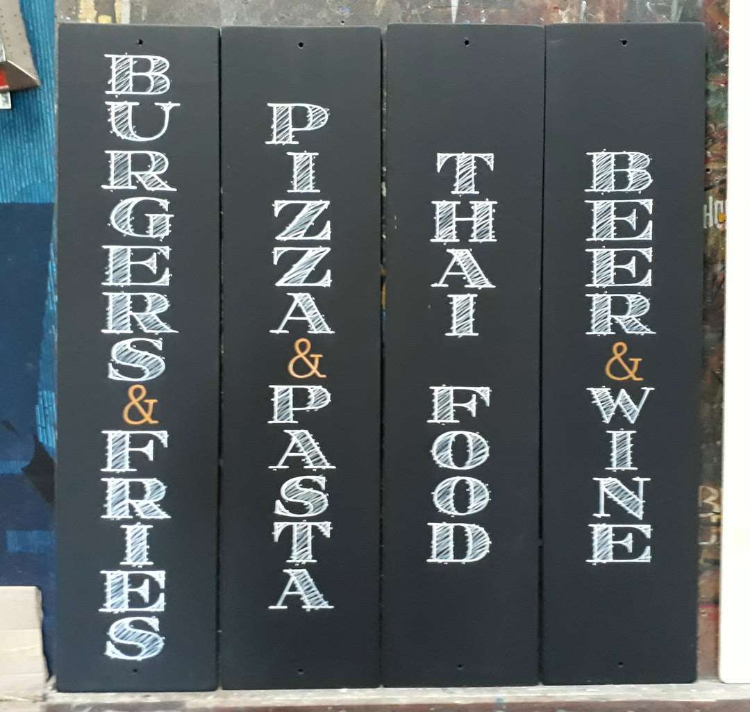
Write it on the blackboard! Use a flat charcoal gray background and blackboard-y letter styles to get the look of a chalkboard.
Try some fresh new colors. It’s pretty easy to get into a rut when it comes to color choices, but as seen with the muted orange and green Rob used here, switching gears makes a big difference.
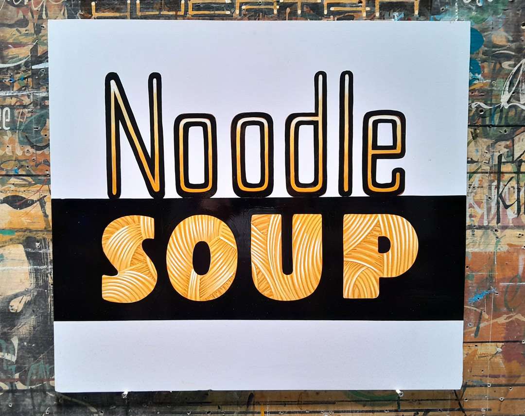
Get something going inside the letters. If the lettering is big enough and bold enough, and will be seen fairly closely, try a pattern or some cool detailing inside the lettering (like noodles!). It gives them something to hold their interest for a few more seconds.
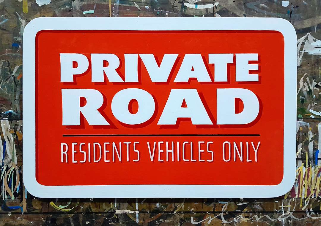
Fake the viewer out with a phony raised border. Just add a simple line at the top and one side. It would work great on a panel, too.
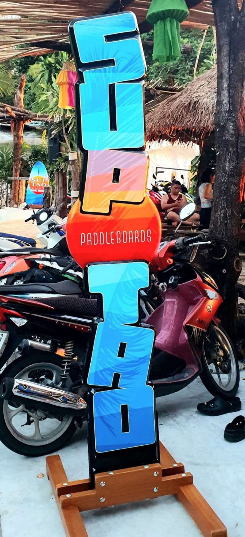
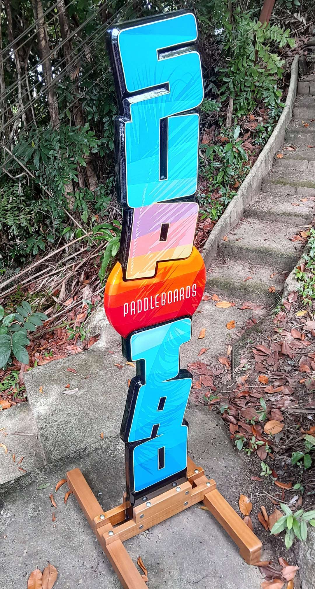
And if you’re really feeling adventurous, stack the letters up in 3D and bounce them around—then add transparent graphics on the letter faces!
