By signcraft
Posted on Sunday, September 28th, 2025

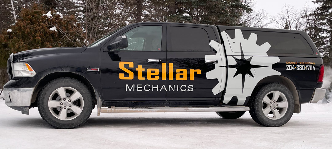
When you flip through the online portfolio of the work of RT Signs [Steinbach, Manitoba, Canada], you can’t help but be struck by the clean, legible layouts that use strong contrasts. Each design delivers the intended message—with little extra baggage for the viewer to deal with. Even though there is a lot of variety in the designs, the common thread they all share is simplicity.
“It’s hard to keep a design simple,” says Travis Toews, “but it pays off with a more effective design. I think that doing more dimensional work the past few years has impressed on me that much of the effects and the bling are superficial. They don’t really add to the appeal and effectiveness. Unless you are very careful, they distract from the message.”
See the power of a clean, simple approach to layout in “Making simplicity work” in the examples of the work of RT Signs!