By signcraft
Posted on Monday, October 6th, 2025

What makes one sign more visually appealing than another? It’s contrast. Take a close look at sign layouts that really appeal to you. Nine times out of ten, you’ll find strong contrasts in the size and weight of the letters, in the letter styles chosen and in the colors that were used.
If there is a secret tool of highly effective sign designers, it’s probably the use of contrast. Effective sign designers use contrast to invigorate their layouts, and they aren’t timid about it. Strong contrasts prevent monotony and make a layout interesting.
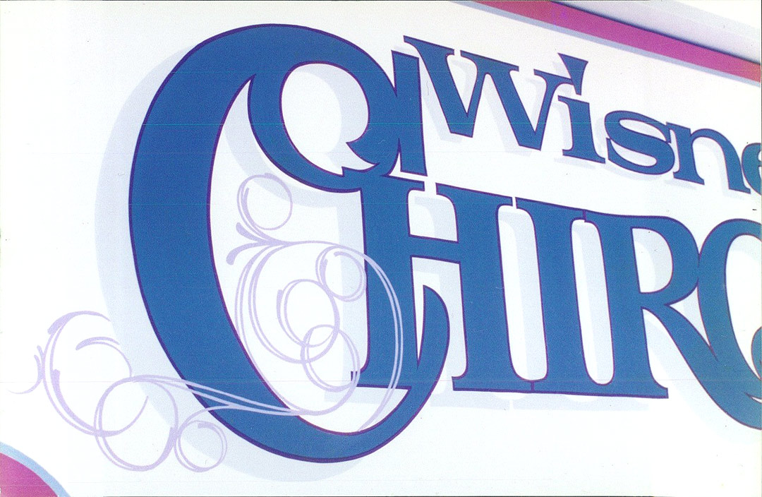
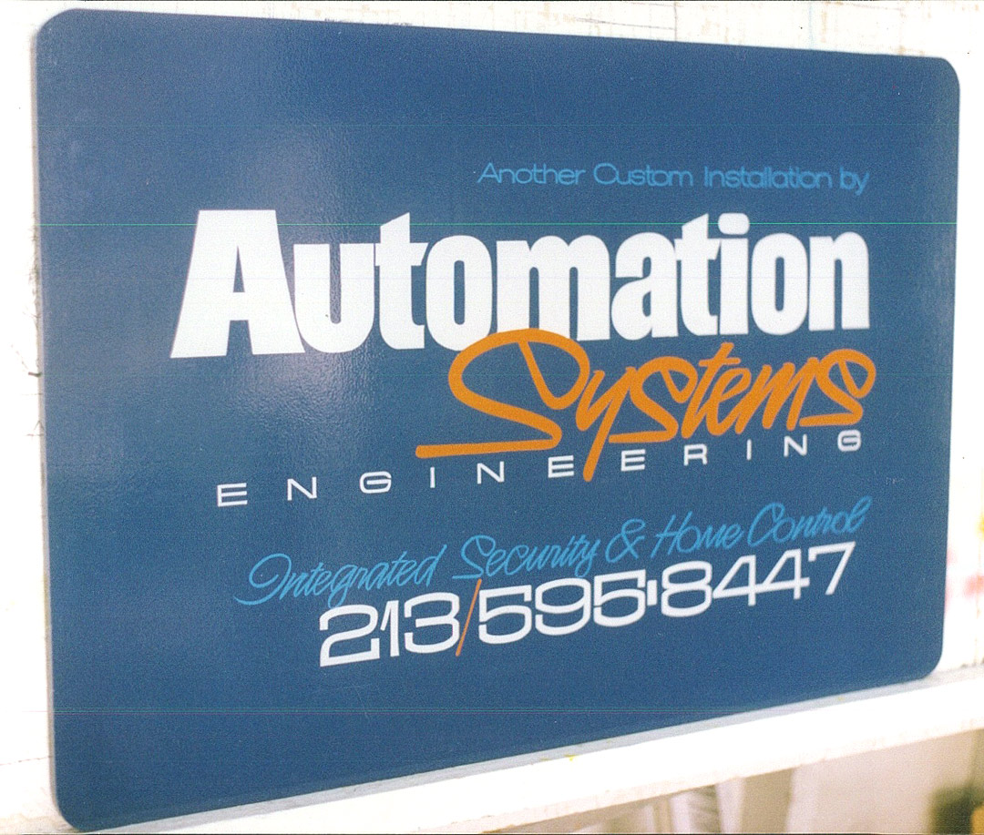
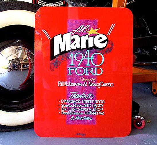
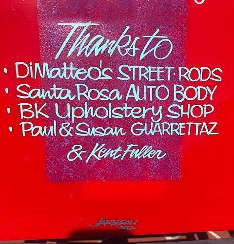
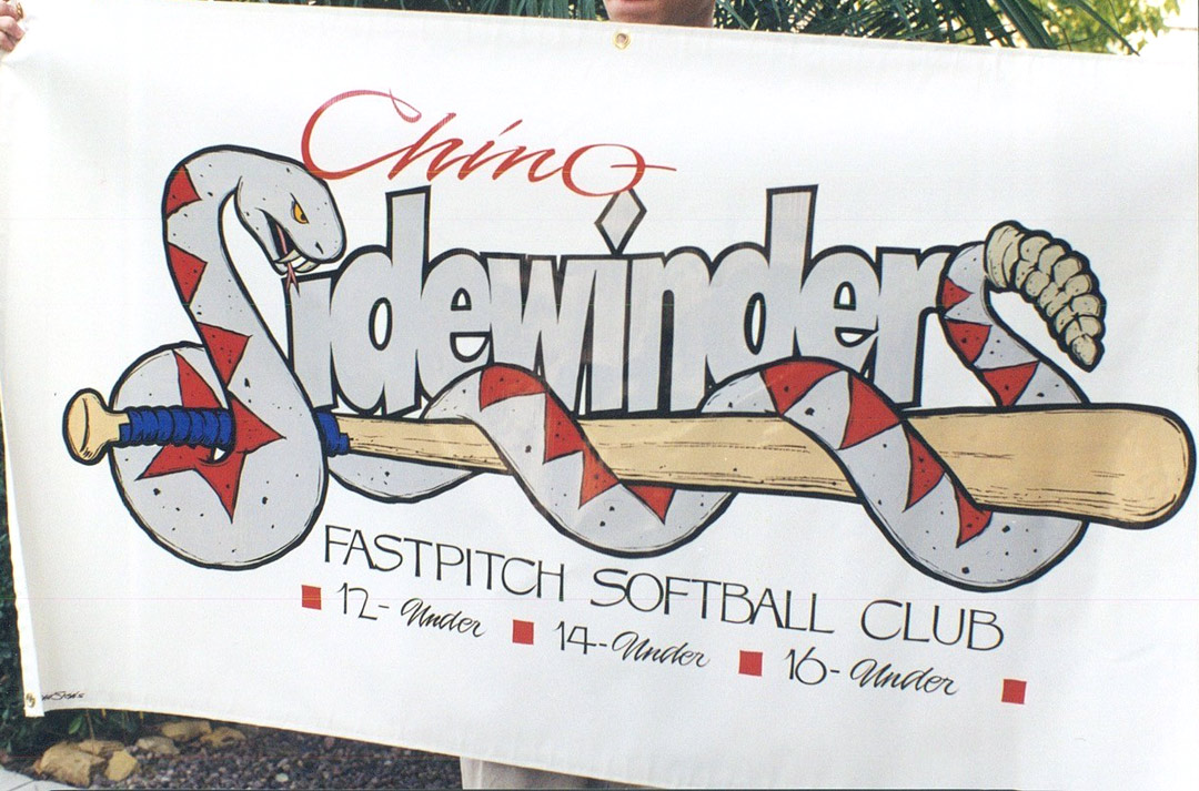
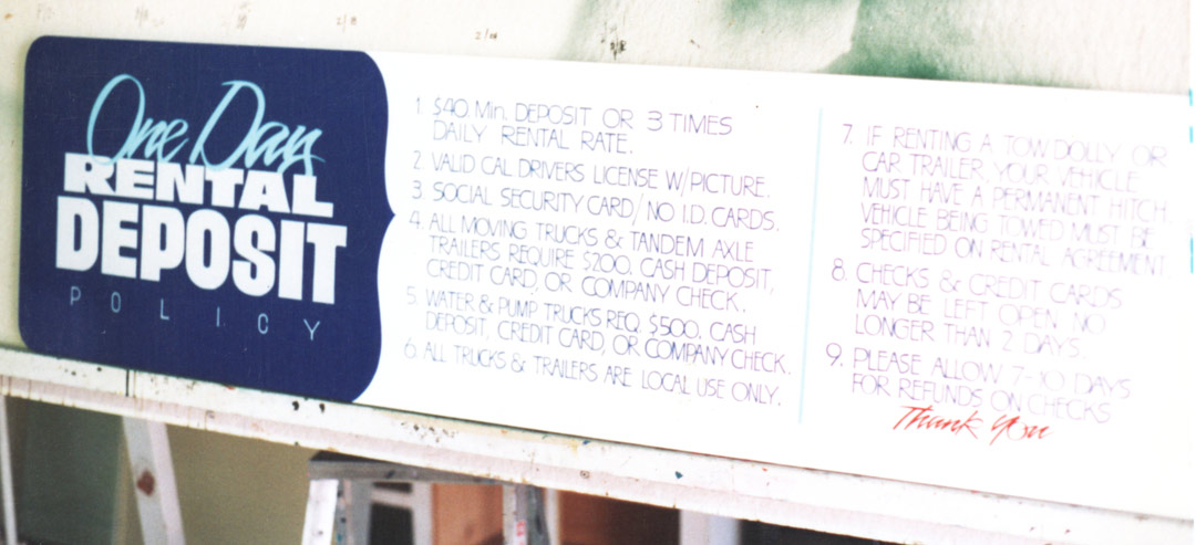
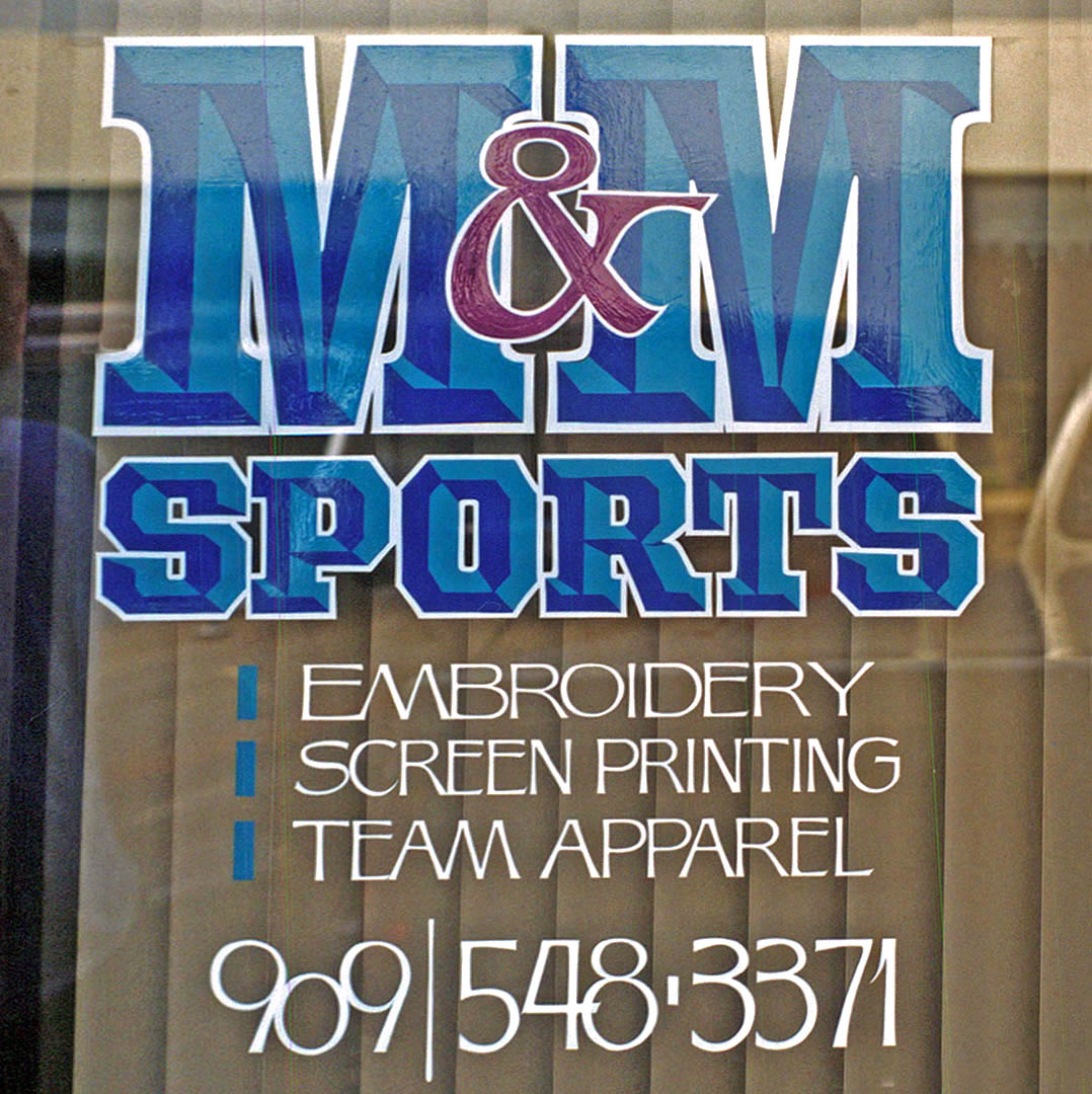
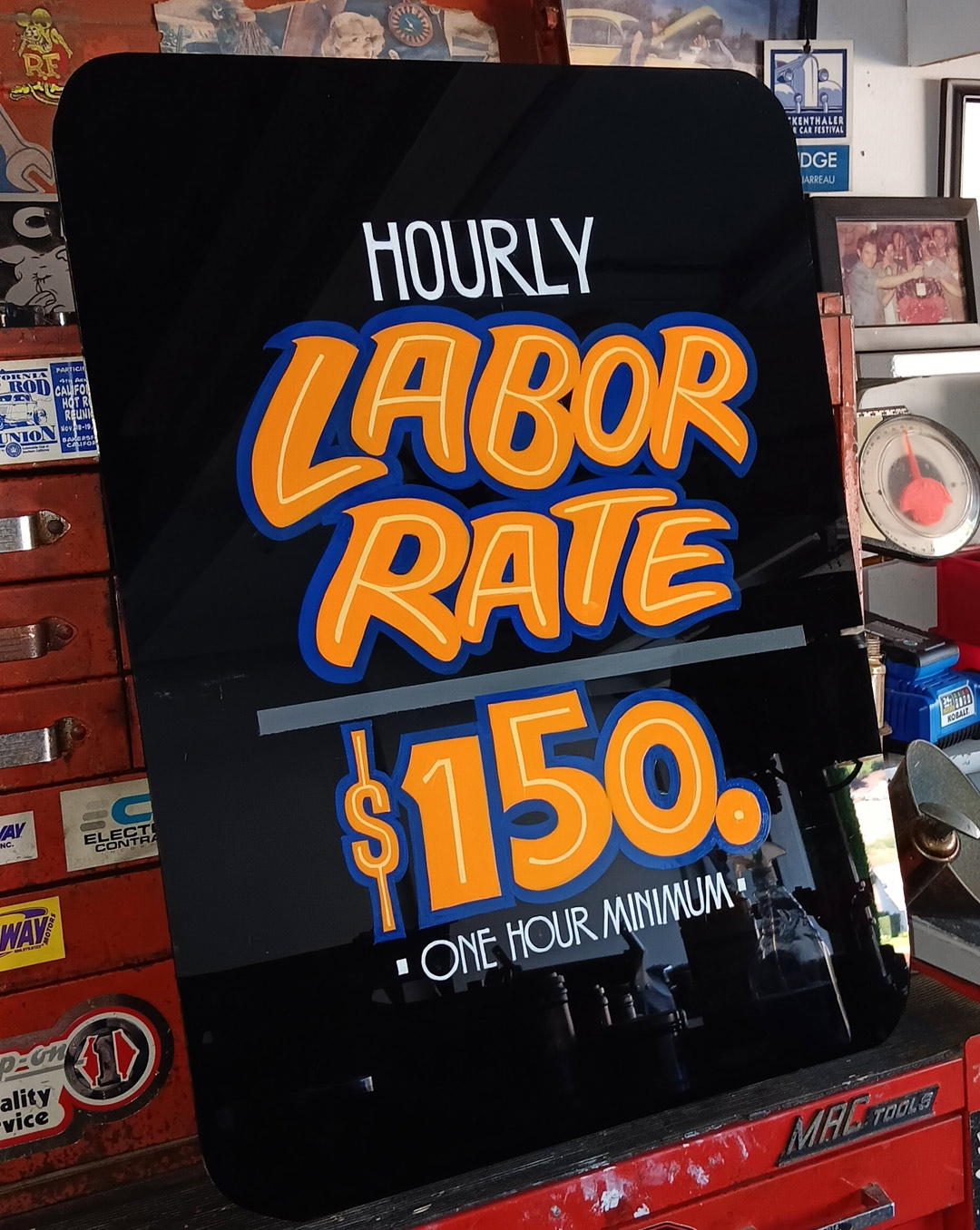
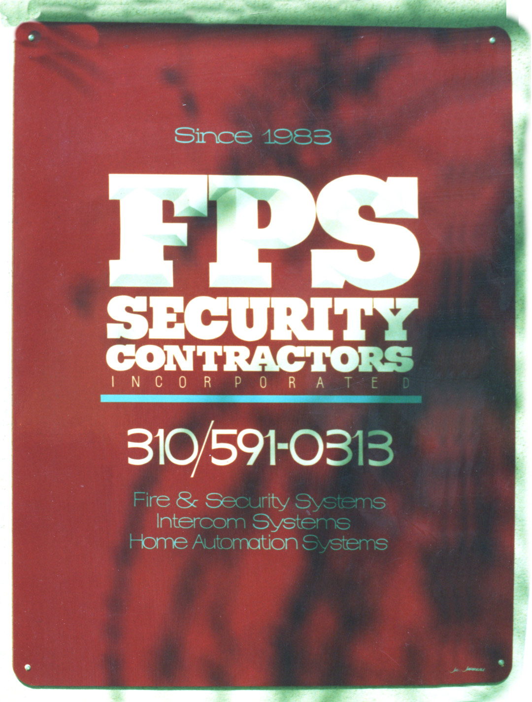
As we put the recent feature on Joe Jarreau [Jarreau Signs, Chino Hills, California] together, it was obvious that his work showed how he used contrast to create powerful, appealing layouts. It was true across the board—from a routine sign for the labor rates in a body shop to gold leaf window lettering.
“For me,” Joe says, “it comes from years of studying the work of other sign painters. I realized how much better contrasts in size and weight and color made a sign look.”
In his early days as a sign painter, there was a lot of work in his area that was just knocked out—done fast in one or two colors, with lots of casual lettering and little thought about layout. Joe soon decided that he wanted to do signs that were more striking and had more impact so he could set his business apart.
“If you want to improve your layouts, you have to look at a lot of signs and see what makes them effective or not. I went looking for whatever was out there that looked better than my stuff. I tried to take it apart and learn from it.”
Joe says it starts with prioritizing the copy—deciding the order of importance of the copy and messages on the sign. People can only read one message at a time, and you want them to get the most important message first.
“Prioritization is something that [the late] Jon Harl and I used to talk about a lot. Your job is to decide what needs to be the main focus of the layout—then what comes after that and then after that. Once you know that, you can use contrast in size, weight, letter style and color to make it happen.
“Many times the customer want copy on a sign that you know few people who see the sign will read—like a phone number on some signs. You can use contrast to subordinate that part of the message so that it’s there, but it doesn’t take away from the main message.
“Once I have the copy prioritized, I do a pencil layout. Old school people like me aren’t going to just sit down at the computer and start typing in the copy. We’re going to do a quick scale sketch in pencil so we can work out that prioritization first. We’re composing a layout rather than just entering text. After that, we go to the computer and choose fonts and create the layout. I know there are some who can do that without a sketch, but starting with pencil and paper still works best for me.”
The sketch is a great place to work out the contrasts before color gets involved. He and Jon did a lot of routine commercial signs for contractors and small businesses where the budget was tight. When you’re hand lettering, adding more colors adds more time and can squeeze the budget. Many of these signs were done in one color—sometimes with one additional color for an accent here or there.
“The layout has to be strong in just black and white. If a layout doesn’t look good in just one color, no amount of color or outlines or shadows or other effects are going to save it.
“Using negative space is a very important part of this, too. That’s something that Mike Stevens [author of Mastering Layout] really emphasized in his workshops—negative space can have just as much impact as positive space, which is the lettering and any other graphics.”
As you scroll through these photos of Joe’s work, notice how he used contrast to add appeal to the layout. It was always done with intention.
“In the beginning, if a customer wanted a sign and gave me a lot of copy, I was lost. I didn’t know how to arrange all of this text. As I learned about prioritizing copy, I could decide what was most important, what was least important and what was in between. I kept learning as I went along.
“And I’m still that way today. Even as I look back at these signs from years ago, I can see things in every one that I would do differently today. It’s just natural to want to keep improving.”
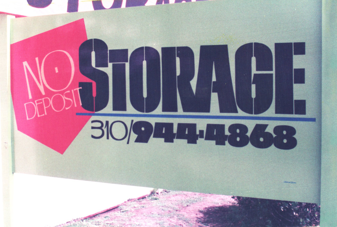
“This sign had a lime green background,” says Joe, “even though it doesn’t look like that in the photo. That was another thing that Jon and I talked about—getting away from the plain white background. Even if you just use one color for the lettering, if you use a dark or interesting color on the background, the sign is automatically more interesting.”
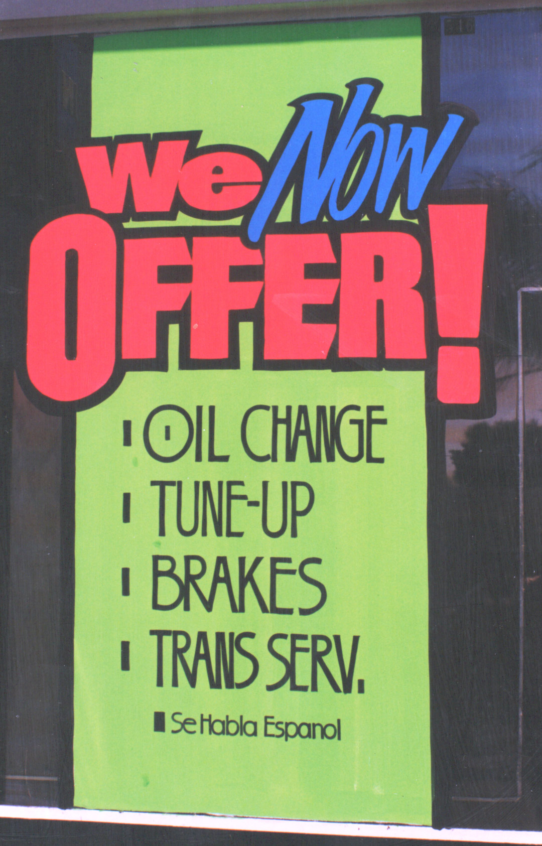
“I really worked at my window splash layouts. I may not have made much money on them but I learned a lot. I knew several splash painters, and they were really fast. Amazingly fast. I had a few good accounts that I did them for but I was never a specialist. I always felt that when you’re a journeyman, you have to do everything.”
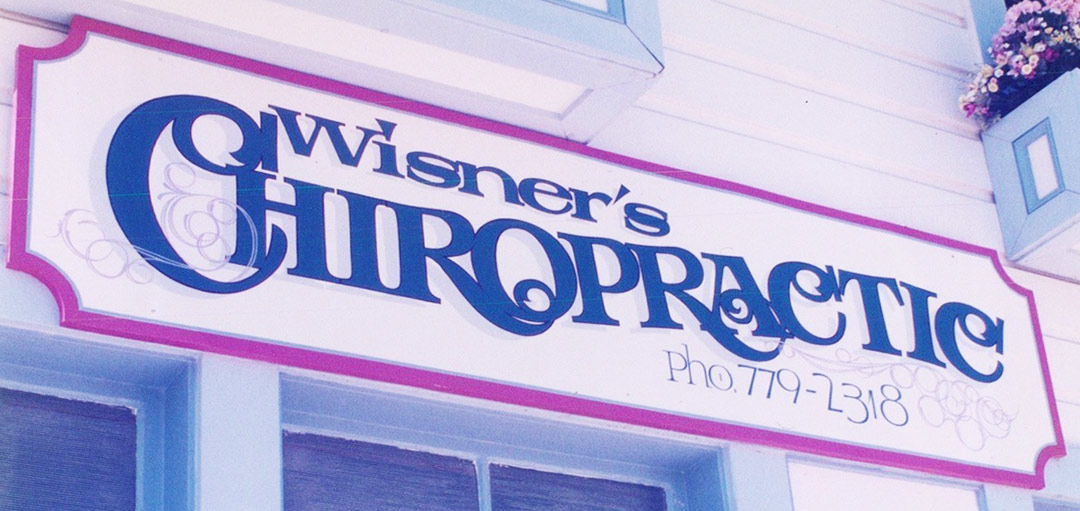
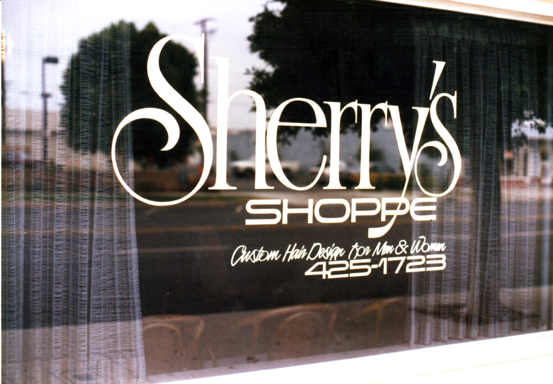
“Sherri’s was on a little storefront on a little side street and had a little budget. I kept it in one color and tried to keep it interesting.”
8×12 sign on ¾ overlaid plywood panels
