By signcraft
Posted on Monday, November 10th, 2025

Whomever said “a picture is worth a thousand words” may well have been talking about the concept of negative space. The concept of negative space can sound a little strange at first, but it’s simply the space on a sign that isn’t occupied by letters and/or graphics. It’s the margin around the layout, the space around the words and message blocks, and even the space in and around each letter. An example shows it best.
In “Pssst…Here’s the secret: Contrast”, Joe Jarreau mentioned the importance of negative space. The late Mike Stevens, author of Mastering Layout, stressed the importance of understanding the power of negative space and often illustrated it with examples. How one uses negative space is critical to a successful sign layout.
“You start by noticing it as the margins, the negative space around the whole layout,” Joe says. “That’s where it’s most obvious. Then you learn how to see the space around the copy blocks. You go on to see the negative space in and around the letters themselves can be effective—or not.”
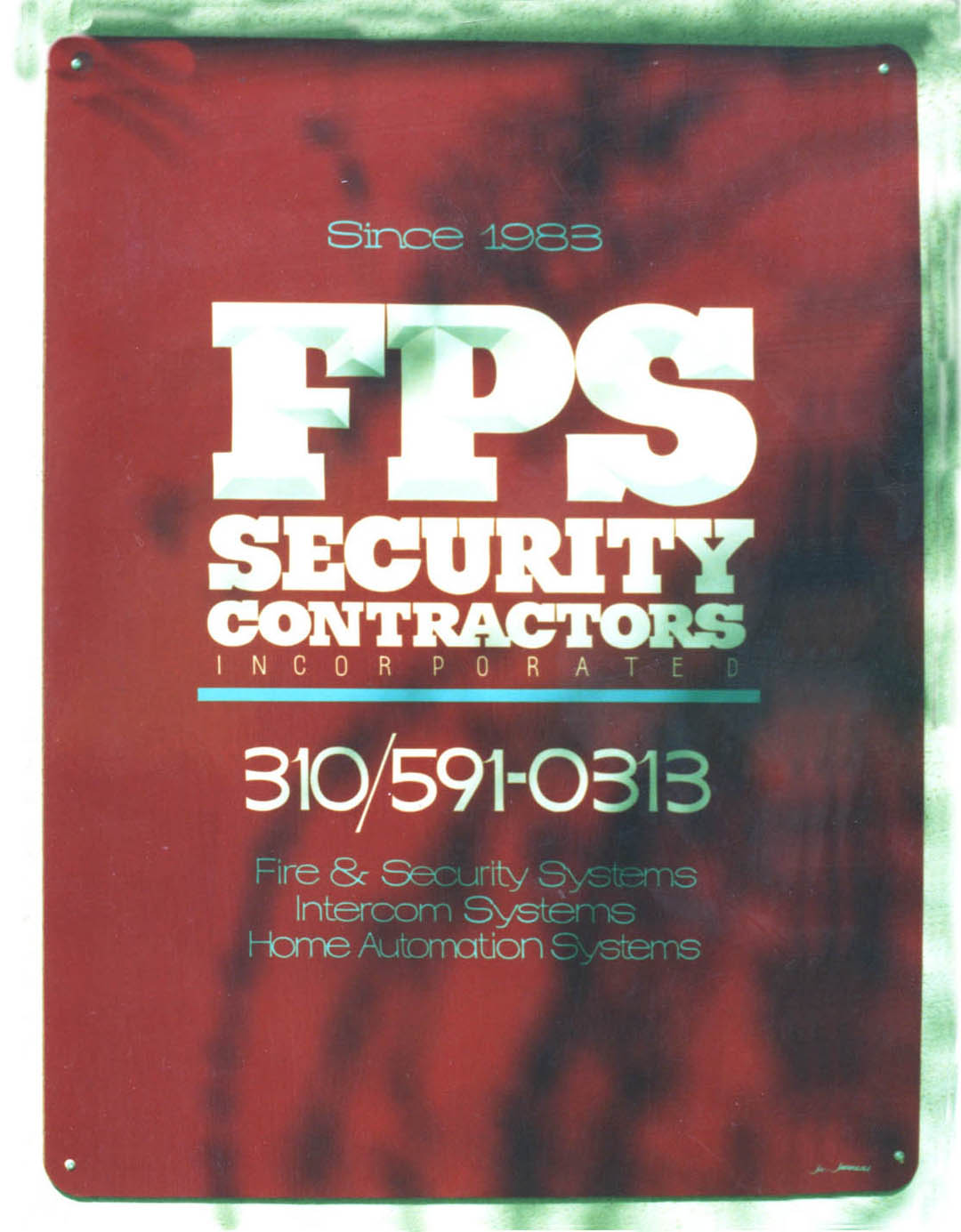 This layout of Joe’s is a good example of negative space in action. First, there’s a large margin that frames the composition of the lettering. Then Joe used negative space to separate the three copy blocks—name, phone number and description of services. Finally, he tightened the spacing of all the lettering to create powerful copy blocks that can be read quickly. “FPS” has a convex effect, but the bright sun in this photo hides most of that.
When you reduce the space between the letters in a word, the word becomes easier to read. That’s because we do a lot of reading by recognizing the silhouette of the word, rather than identifying each letter and sounding the word out. Of course, if you tighten that spacing to the point where letters overlap severely, too much negative space is lost and the word becomes harder to read.
The most common place where sign layouts are deprived of negative space is the margins. With a little help from Photoshop, we removed much of the margin on this sign to show the effect.
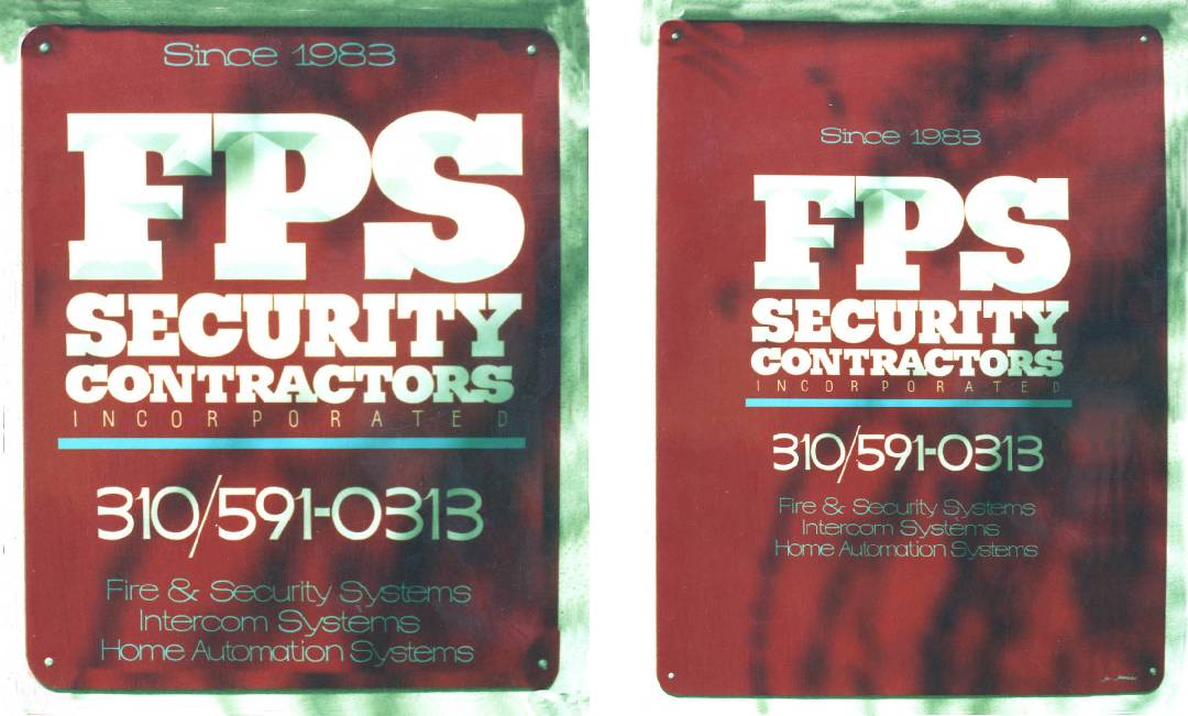
Without the hefty margin, the message on the sign at left becomes much more “in your face.” It’s far less inviting to read. The copy on the sign occupies more space—but it sure takes more effort to read.
