By signcraft
Posted on Monday, December 15th, 2025
Stepping outside the commonplace is a sure way to catch the sign viewer’s eye. Peter Poanessa, Keene Signworx, Swanzey, New Hampshire, does this often, sometimes by simply making the sign face curved instead of the usual flat surface.
In this case, the client had seen one of Peter’s signs with a curved face and wanted that same look because he realized the power of its unique look. He also wanted a granite mounting, something Peter often uses for freestanding signs.
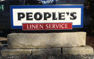
This time, rather than mounting a curved face on a granite pylon or posts, Peter decided to marry the two requests and make a curved sign atop a curved granite slab. We asked Peter for the details on the project:
 The granite base: “A local demolition companyhas a yard full of recovered granite slabs—old building components and pieces of curbing,” Peter says, “I went there to look around and found this really interesting 8-ft. slab with a 4-in. arc to it to use as the monument. That rests on three large granite blocks that sit on a gravel bed. Granite weighs 200 pounds per cubic foot so at over 1500 pounds, you can imagine the weight here. It doesn’t require a poured concrete foundation. It isn’t going anywhere.”
The sign face: “I made the sign from HDU and curved it to match that arc. I made a frame that matches the curve of the granite using the Keene System—a thin wall tubular aluminum frame with aluminum composite material bonded to it. The SignFoam HDU is flexible enough that it bends over the ACM skin of the frame.
“For me, it’s really important to have a practical, easy way to build a durable sign cabinet like this in-house. It keeps the sign’s cost within reach of buyers and moves through the shop quickly. All that means profits for the sign shop and value for the customer.
“The sign panel is 87-by-30-in. and about 5 inches thick. ‘People’s’ is done in prismatic HDU letters on the chip-carved HDU background. ‘Linen Service’ is a raised ACM panel with ¼-in. white PVC letters, and the cove border is finished with 23K gold. The black base that you see below the sign face is actually the aluminum composite material that wraps the structure that holds the face.”
The background texture: “The background texture was done with Vectric VCarve software using a feature called Rapid Texture. It was done with a ball-nosed bit. It’s not a 3D tool path, so it runs much faster. It’s a vector path. You can choose how deep and how wide the cuts go, and how tightly spaced they are.
“It’s meant to look like a chip-carved background. In the past, I have tried to lay this out but it never quite got the random look of chip carving done by hand. This feature does a great job of it. I like to put a piece of scrap in the router and play around with the width, depth, spacing and overlap of the cuts to get the look I want. When I get one that I like, I name and save it so that I can use it in the future on another job.
“Once the background was textured, I routed a pocket to accept each of the letters. The letters were cut to shape and prismatically carved from SignFoam HDU on the router.”
Finishes: “It’s finished with Sherwin-Williams Emerald acrylic urethane paint. It’s their top of the line water-based finish. They call it a urethane but it is completely water-based. We’ve used it for several years and I really like it. It comes in a nice satin finish, dries fast and it’s super durable. You can put a couple of coats on a panel during the day, and by the end of the day you can put tape on it and it won’t leave a mark. That really helps you move things through the shop.
“The sign has more mass and more appeal without being too costly to build. There’s no welding, no special equipment and nothing to outsource. This was a fun sign both to design and install. The customer liked this one so well that he had us make another one for his second location.”