By signcraft
Posted on Saturday, May 30th, 2026

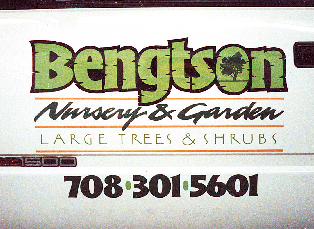
Tucking a simple silhouette of a graphic into one of the letters in the name is a creative effect that is both easy and cool. It can also create a very unique logo.
Generally, the graphic goes in the largest open area of a letter—it more or less replaces the open space (called the “counter” in typography) that would ordinarily be there in an O, P, A, etc. In other cases, the graphic replaces the letter completely. You’ll find plenty of examples of this in “Tuck the graphic in a letter.”