By Dan Antonelli
Posted on Friday, November 4th, 2022

The “rules” of fleet lettering are pretty consistent for most business: You have a fleet of vehicles; they should all look identical. Generally, that’s a smart idea, especially for large corporate enterprises (think UPS and FedEx). And even for mid-sized businesses with a fleet of 20 or 30 service vehicles—creating a consistent design reinforces their brand and helps them look bigger.
But rules are meant to broken. The key is in knowing when to break the rules and having a client who trusts you enough to move outside the norm.
Enter one of my long-term clients, Jerry Smith from Dial Pest Control. Jerry had purchased four Chevy HHRs to replace some smaller pickup trucks. He wanted to take advantage of the large canvas the truck affords but gave me the freedom to think outside the box a bit, and to “work your magic” (as he put it).
When you’re given that kind of creative license it’s a big responsibility. We handle the company’s advertising and marketing, and we certainly realize the importance of vehicle advertising. We let Jerry know that this was a unique opportunity to create a campaign around the vehicles that would attract a lot of attention.
Complementing the existing marketing approach
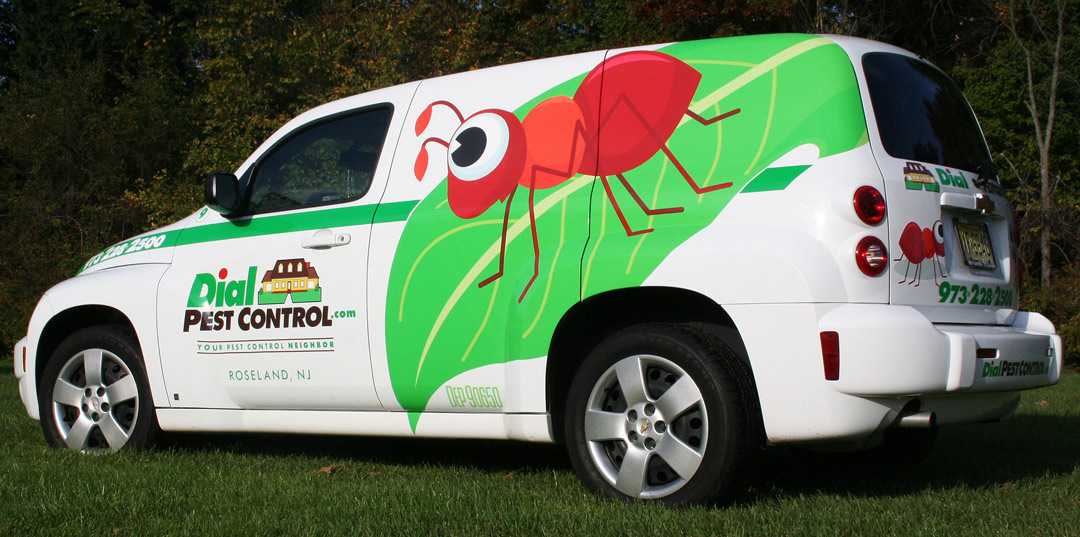
Our marketing for this pest control company has always run contrary to what most other pest control companies do. While many businesses in this sector use scare tactics in their marketing efforts (like ads with photos of scary bugs) we’ve always tried to focus on the positive (like photos of happy homeowners). To date, none of our marketing has employed photos of bugs, or anything that could be remotely perceived as being scary or threatening. So, I wasn’t about to start heading down that path now.
While some might say a large photograph of a roach on the side of vehicle would surely attract a lot of attention, for us, it’s the wrong kind of attention. Besides, as a homeowner, would you want such a vehicle parked in your driveway while your home was treated? Probably not.
The Idea
I began to think about a way that the truck could attract a lot of positive attention. One idea we kicked around was to use cartoons or illustrations of “happy” bugs. At first, I was going to have the truck covered with a lot of these happy bugs. Then I decided that such an approach would suffer from a distance legibility standpoint, and that it would lack the impact of a single large supergraphic.
So, we zeroed in on the approach of a large illustration of a single bug. Initially, it was to be a ladybug. It was also important to tie in an aspect that looked more fleet-like. The previous design employed a 4-in. green stripe from front to rear of the pickup. Could we find a way to keep that aspect and introduce this new supergraphic? After playing with several concepts, we found a design that had the striping as well as the logo design and phone number integrated in such a manner that conveyed that fleet look.
We could have stopped here, and simply replicated this exact design on the remaining vehicles. But that wouldn’t have had as much impact as a campaign based on this first design. So, we brainstormed about what other friendly bugs we could implement on the design of the other vehicles.
We settled on a bee, a spider and an ant. While not inherently as “friendly” as a ladybug, with the right illustration we could certainly make them look playful and less scary. We researched some artwork options and found a series on istockphoto.com that had just what we needed. We kept the leaf design consistent and used the different bugs on the remaining three vehicles.
The Install
Granted, I’m a little removed nowadays from how difficult my designs can be to actually install. Thankfully I have some of the area’s best installers nearby who can handle just about anything I can dream up. In this instance, we recommended the client use Rich Dombey [Rich Designs, Inc., www.richdesignsinc.com] to handle the install.
Rich had done a few HHRs already, so we knew the job would get executed properly. If you are not handling the installs, it’s important to partner with companies you can trust to handle complex installations. Rich printed the graphics for the leaf on a Roland VersaCamm, then laminated them.
The Results
The vehicles have been on the road for about two months and the results have been impressive.
“I never could have imagined the response we would get from the design on the trucks,” says Jerry. “People are commenting all the time about seeing our trucks everywhere. We took the vehicles to a street fair, and people were having their kids pose with the trucks for pictures. The only problem it’s created is that my drivers are arguing over driving their favorite bug!
“This has been by far my most effective advertising expenditure. On the surface, the $10,000 we spent seems like a lot of money, but when you consider these trucks should be on the road for at least five years, you can’t really get this level of exposure at this price anywhere else.”
So next time you’re given the task of designing the graphics for a fleet of vans or truck, think outside the box a bit. Who says each truck needs to be identical?
This article appeared in the January/February 2009 issue of SignCraft.


Dan Antonelli owns KickCharge Creative (formerly Graphic D-Signs, Inc.) in Washington, New Jersey. His latest book, Building a Big Small Business Brand, joins his Logo Design for Small Business I and II. He can be reached at dan@kickcharge. com. Dan also offers consulting and business coaching services to sign companies. For more information, visit danantonelli.com. On Instagram: @danantonelli_kickcharge.
