By signcraft
Posted on Sunday, January 12th, 2025


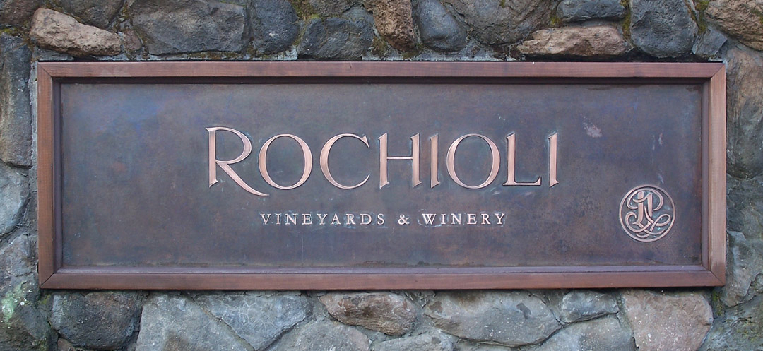
Odds are most of your sign designs are for commercial businesses that need plenty of impact. But not every sign needs to shout—sometimes a very subtle, understated look is more appropriate. Jim Lago often uses faux finishes, copper and steel to create high style, tasteful graphics for the wineries and related businesses in his area. He shares how he does that in “Signs that don’t shout.” See how this low-key look works great for prestige businesses and subdivisions that want to state their name in an artful, dignified way.