By signcraft
Posted on Monday, March 17th, 2025

SignCraft first featured Jason Nale and his work in the May/June 2020 issue. Since then he’s moved to a slightly larger shop, just around the corner from his old shop—though not for the purpose of expansion. At 600sq. ft., it’s still relatively small. But since he works alone, the space works fine. He hasn’t had an employee since 2011 and prefers working alone.
He still works on a Mac and uses Illustrator CS3 for his designs, and still uses Instagram [@jason.nale] to help market his work, which often brings him design projects outside his local market. His shop equipment includes a Jaguar III cutter, but no digital printer.
“I’ve outsourced my printing ever since my digital printer got hit by lightning in 2011,” he says. “I don’t have to worry about vinyl/laminate inventory, maintenance, inks or color profiles. I’ve got plenty to do without managing the printing.”
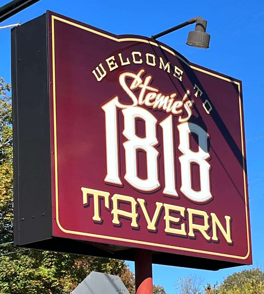
Jason describes his preferred design style as “a little more complex than most.” He does clean-and-simple” layouts when needed—like the Vista Grill below—but he leans towards more complex but readable designs.
“I’ve tried to simplify my designs over the past few years,” says Jason, “but my work is still more complex than most. It’s a fight for me, between the ability to read it and the appeal—what makes people want to read it rather than pass it by.
“Many designers would disagree with me on this, and I know readability is very important. But there has to be something going on in a layout to make people ‘want’ to look at and read the sign—something that catches them and draws them in. Sometimes that can be simplicity, maybe even extreme simplicity. Other times it might be an illustration, maybe something fun. Or it may be complexity, and that’s what I like to do.
“I would rather have a design that is really interesting and appealing to look at even if you can’t read it from a block away. It’s a balancing act. Too far towards simplicity and things get boring. Too far towards complexity and it gets to be too much work to read.
“There are a lot of designers, who do a great job at balancing those two things. Braun Bleamer [Jet Signs, Palmerton, Pennsylvania] is not far from me, and I think he’s one of the best at this. You can see and read his work from quite a distance and it always has appeal. I have a lot of respect for his work. He always seems to manage to deliver both interest and readability.
“The problem, though, happens when a sign layout fails on both counts—it’s not interesting and it’s not readable. It’s money thrown away. And that happens a lot.”
Jason’s local market is the small town of Nazareth and the many small towns that surround it. He also does a lot of work outside that area, thanks to social media.
“Around town,” he says, “a lot of my work is storefront signs and windows that are seen from relatively close distances and at relatively slow speeds. Most of my work is not along busy four-lane highways, so more complex designs work well. It’s good to see a sign out there and know that it’s appealing and legible.
“Thanks to Instagram, I do a lot of designs for other people in other states and even other countries. That’s cool, but unfortunately I seldom get to see how they worked as a sign. That’s the downside of long distance design.”


“This window is a good example of a complex design,” says Jason. “We’ve got all this scroll work in the background, then we have an airplane and a mushroom bomb and some rocket ship tattoo ink bottles. Then out front we have the business name. There’s a lot going on there.”

“I would consider this window to be a simpler design for me.”

“This is one that I really like and what I consider pretty simple.”

“I started this one with a sketch. If it’s a complex design, I can plan it better on paper and get an idea of where I’m going. I still make changes on the screen, though.”