By Randy Howe
Posted on Monday, May 5th, 2025

One of the greatest country music artists of all time, and one of my favorites, is Alan Jackson. He says of himself, “I’m just a singer of simple songs….” As true as that may be, those simple songs have had quite an impact on his millions of fans around the world.
Wait a minute, there’s that word: “Impact.”
SignCraft once asked how I create impact in my sign layouts. I thought for a second and answered, “It depends on how you define impact.”
 Naturally, when I was first asked the question, the first things that came to my mind were bright colors, fancy letter styles and cool special effects—and oftentimes that’s the case. But I also know that simple layouts can pack a lot of impact.
I’m a big country music fan, and I’ve been to Nashville a couple of times. The light show of signs on Broadway Street is spectacular, and the huge brilliant colorful impact of these signs is truly amazing. With budgets in the thousands, tens of thousands, maybe even hundreds of thousands, combined with designers and fabricators who are amongst the best in the world, I would expect no less.
But back “Here in the Real World” (a favorite Alan Jackson song!), the budgets ain’t so big—most of the time in the hundreds of dollars and occasionally in the thousands. Creating impact must be done in a simpler and more cost-effective way.
I’m a big fan of simple, clean layouts. Some customers like that and others like more complex designs. You just have to do what you do best. Most of the time I find a simple, to-the-point layout gives my customers real value.
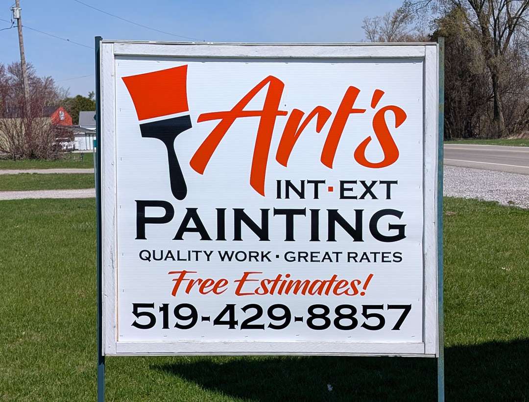
A sign for Art’s Painting
So that brings me to Art’s Painting. I’ve known Art and his wife Betty Anne for years—a hard-working couple around my age. During COVID, they both unfortunately found themselves out of work. So they created work by starting a painting business.
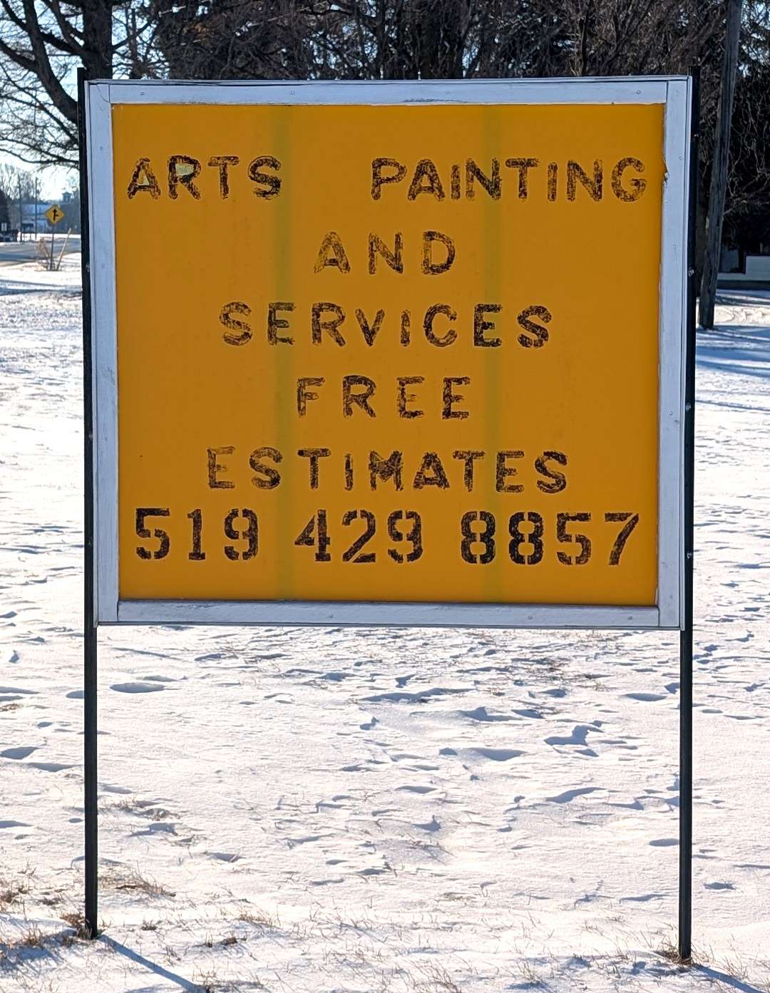
Before long they came to me for lettering on the windows of their vehicle since it was parked at the sites where they worked. They wanted something professional—something with some impact, but their budget was very limited.
So that’s where our skill as designers comes into play—creating simple signs with impact that get the job done for our small business customers.
I did some basic lettering for the windows. It was a knockout job—a very quick but interesting layout with Art’s in a script called Hughs and the rest in Copperplate Bold. It got them more calls and more work, so they wanted me to do something for a makeshift sign they had put on a friend’s property along a busy road when they first got started.
A step up from basic lettering
At 3-by-3-ft., it was a relatively small double-faced sign. Art had built the sign from material he had on hand, plywood on a metal frame. It sits along the road that goes from Port Dover, population about 10,000, and Simcoe, which has about 20,000 people. Like I said, I’m in a market of small towns.
I started with what I had done on the car but wanted to add some interest. A simple clipart paintbrush did the trick. It was a simple icon that immediately gets the point across about what Art does. It doesn’t even need read in the conventional sense because it registers with you instantly.
 I subscribe to a couple of inexpensive clipart services—Shutterstock.com and Vecteezy.com. Vecteezy is very good. They have a lot of good stuff and it’s all vector art that’s ready to cut. I went there and took a quick look at the paintbrush graphics for one that would work. I used the same fonts that I used on their car, Hughs and Copperplate Bold.
Like most customers, they wanted a lot of copy on the sign. But we have to get the viewer’s attention first, then deliver the main message. The paintbrush and Art’s will take care of that. The rest of the copy is there for anyone who is really interested. Most of the people who see the sign won’t be interested of course, but we want them to get the main message. Maybe they will need a painter sometime in the future. So the secondary messages needed toned down.
Once the design was worked out, we cut the graphics in vinyl. I had used orange on the lettering on their car windows because the car was a dark orange along with black secondary copy, so I stayed with that. The graphics went on two corrugated plastic faces that Art then installed himself.
A “knockout job”
I remember seeing the “Knocking It Out” issue of SignCraft when I first got in the sign business. It talked about “knockout jobs” that you had to do quickly and efficiently. That’s what this job is. It’s a sign with a low budget but done with an interesting layout. The only difference is doing the production with a computer instead of paint and brushes.
In a small town like ours there aren’t big budgets for signs. These are mom-and-pop businesses that provide a living for the owners and not much for advertising and marketing. But inexpensive doesn’t have to mean cheap or boring. You can do signs that are effective even on a tight budget.
This sign is anything but fancy, but it has impact. It gets the main message across in an interesting, easy to read way. People drive by it, see it and they get the message—unless their head is in their phone, as many are these days.
Impact is king
As sign people, we talk about impact all the time. Even after all these years in the business, I still think about it. What is it that creates the impact in a certain design? It’s not what we tend to think it is—the fireworks, dramatic images or wild colors. It may be that sometimes, but most of the time impact is the result of the basic layout principles.
Often we think, “What can I do to give this more impact?” But often it’s a matter of “What can I take away to give this more impact?” It may just be a matter of reducing the size of the secondary copy to get more space for that all-important main message.
Someone who isn’t in the sign business won’t be able to explain that because it’s mostly subliminal. To the viewer, it’s not a conscious thing. They glanced at the sign and got the message without ever thinking about why or how they did.
I believe Art’s is a great example of this. Sure, it’s a small sign on the side of the road, but it’s pleasing to the eye, and you know what it’s about with just a glance—it’s actually hard to miss.
Now don’t get me wrong; I love my good ol’ rock ‘n’ roll, too. If the situation and budget call for a bit more noise, I’m always ready to crank up the volume!
Randy Howe’s shop, GetZumExposure.com, is in Port Dover, Ontario, Canada.