By signcraft
Posted on Monday, June 16th, 2025

There are plenty of great ideas in the photos of outstanding signs on SignCraft.com. But what about the back story: How did the layout come together? The finished product can’t tell the story behind the design—the decisions about letter styles, colors, illustrations and the like. What materials were used? If it’s a 3D sign, how it was fabricated?
You can learn a lot from a behind-the-scenes look at a specific sign project. This week, Travis Toews, RT Signs, RT Signs, Steinbach, Manitoba, Canada, tells how this 3D monument came together:
Customers often come to a sign company in need of a sign, but also with a design that they have come up with. It may have been done with an app like Canva or from a logo design website or even AI.
In this case, the customer brought this layout idea from his employee. It had the business name in small type around a large illustration of a bee. I saw weaknesses in the concept and explained what I thought would work better for his farm/business. I also recommended keeping it somewhat simple.
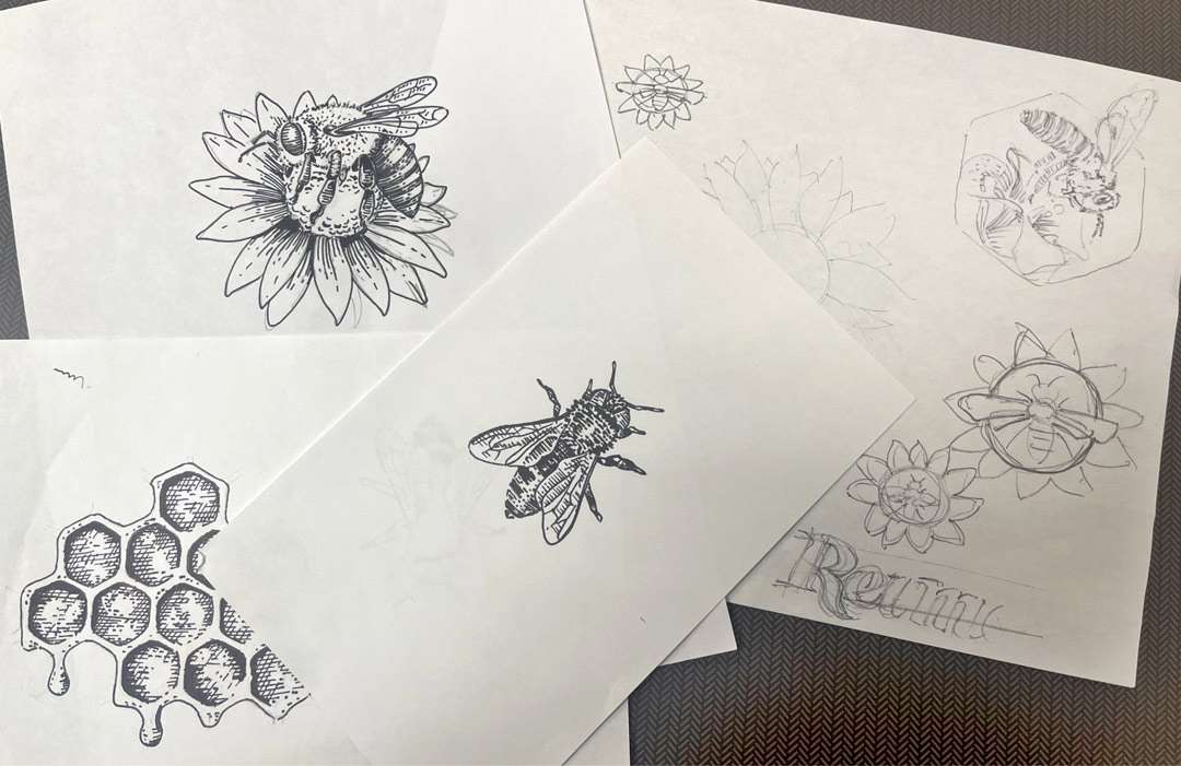
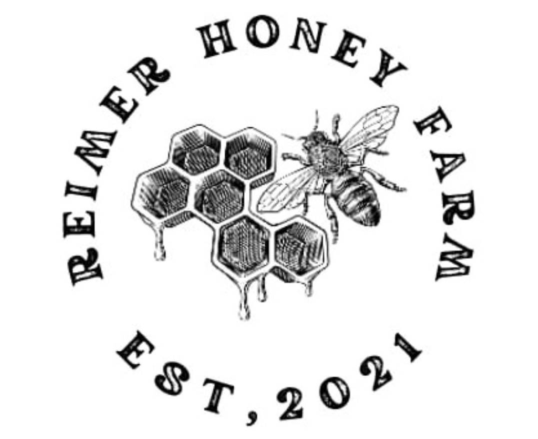
This design would also likely be used for more than just the sign—vehicle graphics, labels, business cards—so I designed with that in mind. I did some sketches, playing around with the graphic of the bee on a sunflower. I worked a bit to get the bee’s wings to line up well with the sunflower’s petals. I sent an initial concept, and it was different than he was expecting. That is not unusual.
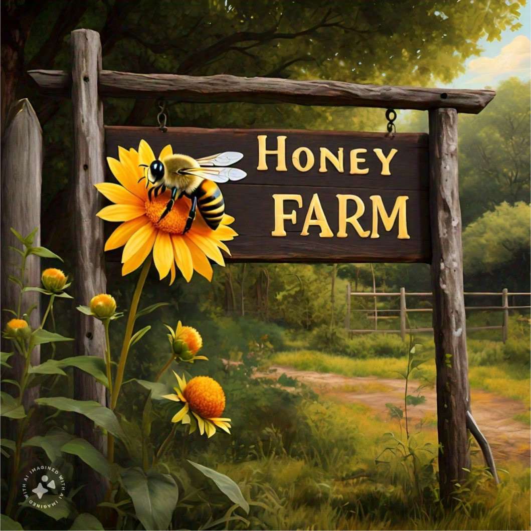
At that point, he shared some other ideas that he was considering. They had used AI to generate a concept that included a bee on a sunflower, but it was not as graphic as the one I had proposed. They added that portion of the AI-generated design to the original design as the graphic and asked us about that.
We worked with those ideas but ultimately came back to something very similar to the initial concept. This also is not unusual. In the final layout, I had added the other canola yellow flowers almost as scrollwork on the background panel.
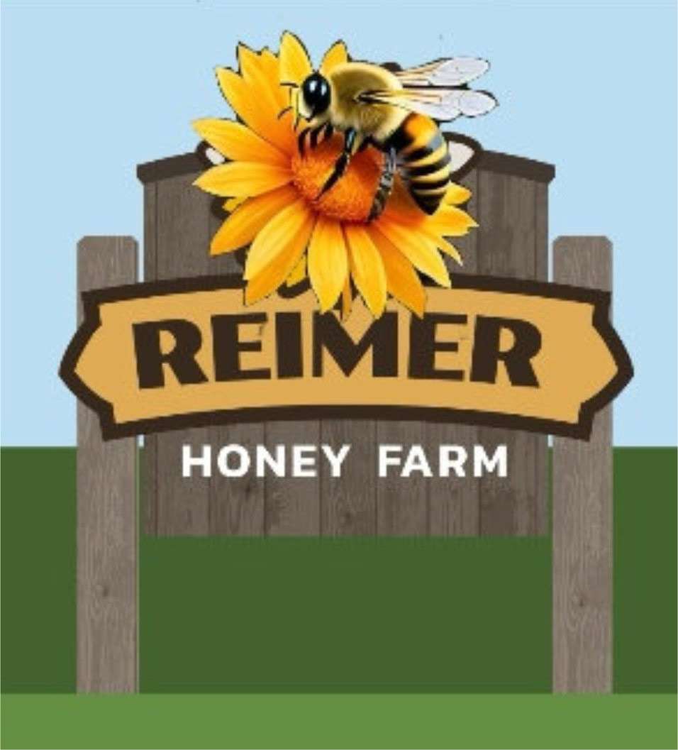
The design was a bit more detailed than my original one, but it should still work well on all sorts of applications. They deal directly with consumers, so more detail and warmth in the logo is appropriate.
I’ve found that this is how the cycle often works. The customer often doesn’t quite know what they want until you put a design together and show it to them. Suddenly they have ideas and preferences and other input. Maybe seeing the design gets them enthused about the sign or perhaps it gets them thinking about what they do or don’t want.
Either way, when they start showing you their ideas, it can be a challenge. Often what they want is not possible or it’s going to totally miss the point. But you work with them to come up with a version that you know will work, even though it may not be as strong as your original concept. Fortunately this one came around and it all worked out.
Working around the customer’s ideas can be a good exercise sometimes, though. It gets you thinking about other approaches to the design and can lead to a new layout that is just as effective as your first concept.
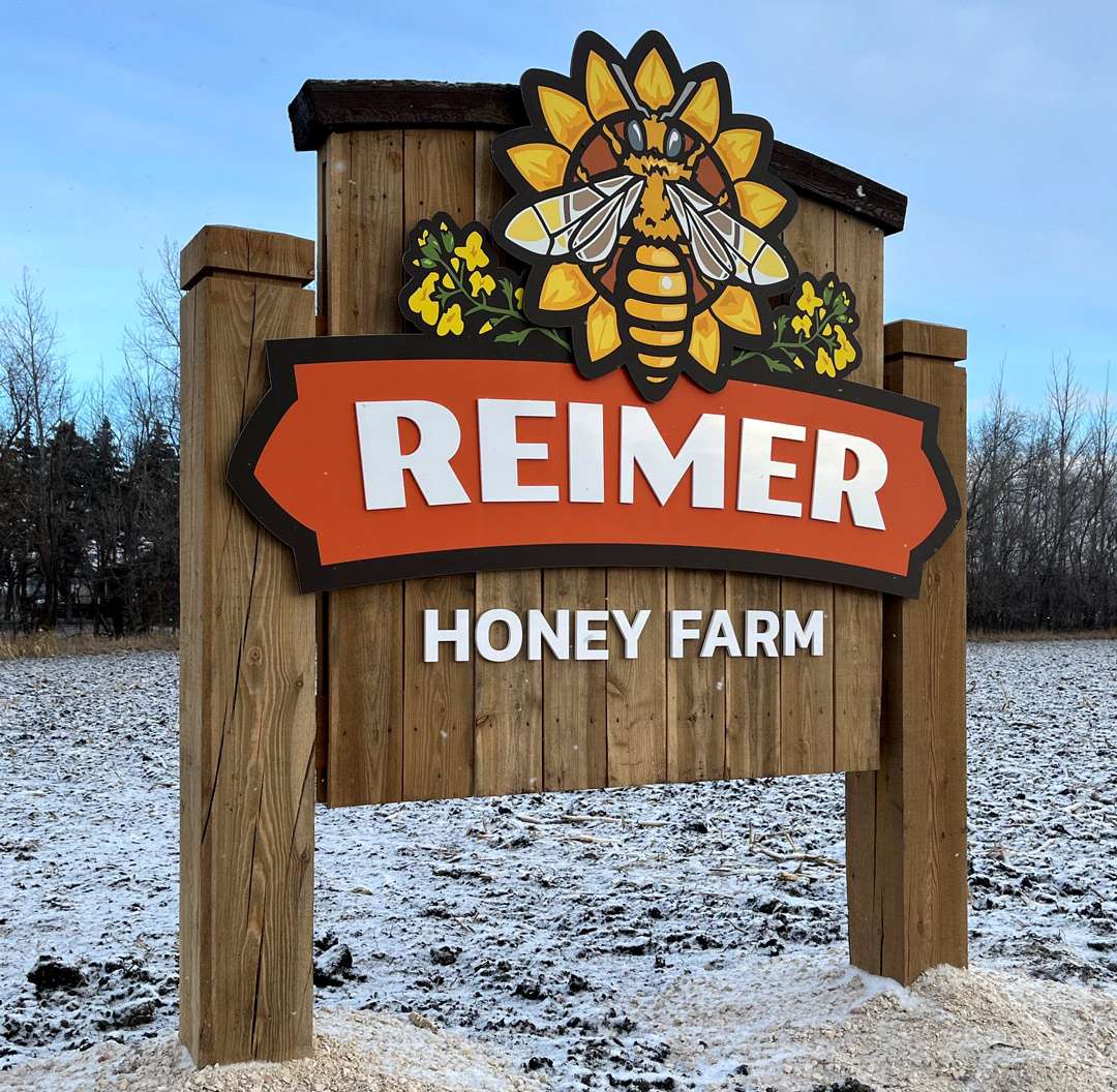
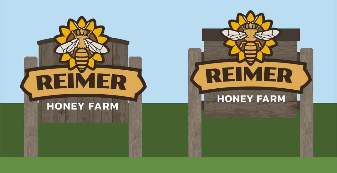
Three options to choose from
Once the design was resolved, we gave him final pricing for the logo design and three options for the sign. The overall width of the main panel on the sign is about 70 inches.
Option 1 was for a flat cut-out 6mm aluminum composite material [ACM] panel with a digital print applied. Honey Farm would be cut-out acrylic letters.
Option 2 was for a flat cut-out 6mm ACM panel with a digital print applied. Reimer and Honey Farm would be cut-out acrylic letters, and the sunflower graphic would be another layer of ACM mounted on standoffs.
Option 3 would be the same as Option 2 but the graphic would be done in paint instead of a digital print.
In our opinion, ideally a high-end sign should be painted. It’s more durable and we like the look. But in this situation a print was more practical. I don’t like to undersell but I don’t like to oversell either. Given that, when he asked what I would recommend, I said a digital print.
They chose Option 2, which I felt was a good fit for their situation. I find that the tiered pricing approach works very well. It gives the customer an option, so they don’t feel trapped.
We find that most people go up from the lower-priced basic option. Most opt for the middle option, but it is not uncommon for someone to go for the top option.
Production and installation
The letters are all cut-out acrylic from Gemini. The name letters are ¼-in. thick and are mounted to the ACM with double-sided tape and a few dabs of silicone adhesive. Honey Farm is 3/8-in. thick and was stud mounted.
The customer handled the construction of the mounting from my design. The sign structure is all tamarack, which is sometimes called larch. It’s a local softwood that holds up well outdoors. It weathers to a silvery gray like almost any wood does. It looks very nice at any stage of the weathering process.
The posts are 8-by-8-in. timbers. They are connected by stringers, which were covered with 2×6 vertical planks. It’s a very heavy sign.
We like to hide the fasteners when we can, so in this case we could place almost all of the screws behind the letters then install the letters over them. The bee and sunflower overlay is a separate ACM panel, so there are a few screws through that face. We’ve found that if mechanical fasteners are placed well and painted to match, they don’t distract from the sign.
We were happy with the final outcome, as was the customer. The design works well on this monument sign and will translate well to their vehicles and stationery, too.