By signcraft
Posted on Monday, July 28th, 2025

When Lane Walker [Solo Signs, Reno, Nevada] wants to add a little extra sizzle to a sign layout, he sometimes adds very fine lines to define the break between or around the letter and the outline, usually on the primary copy. But it’s not just a color in the same family as the letter or the letter’s outline.
What defines this technique is that the line’s color contrasts powerfully with the colors of the letter and outline, and even the background. And it’s very fine—often just 1/16 to 1/8 of an inch wide. It is, as Rob Cooper has said, “like the hot sauce on your taco.” It’s just enough to spice things up.
Lane finds himself using this effect in three loosely-defined ways: Inlines, glowlines and Martinlines.
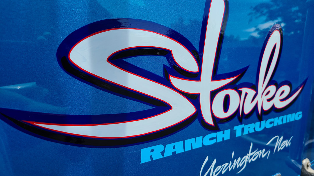
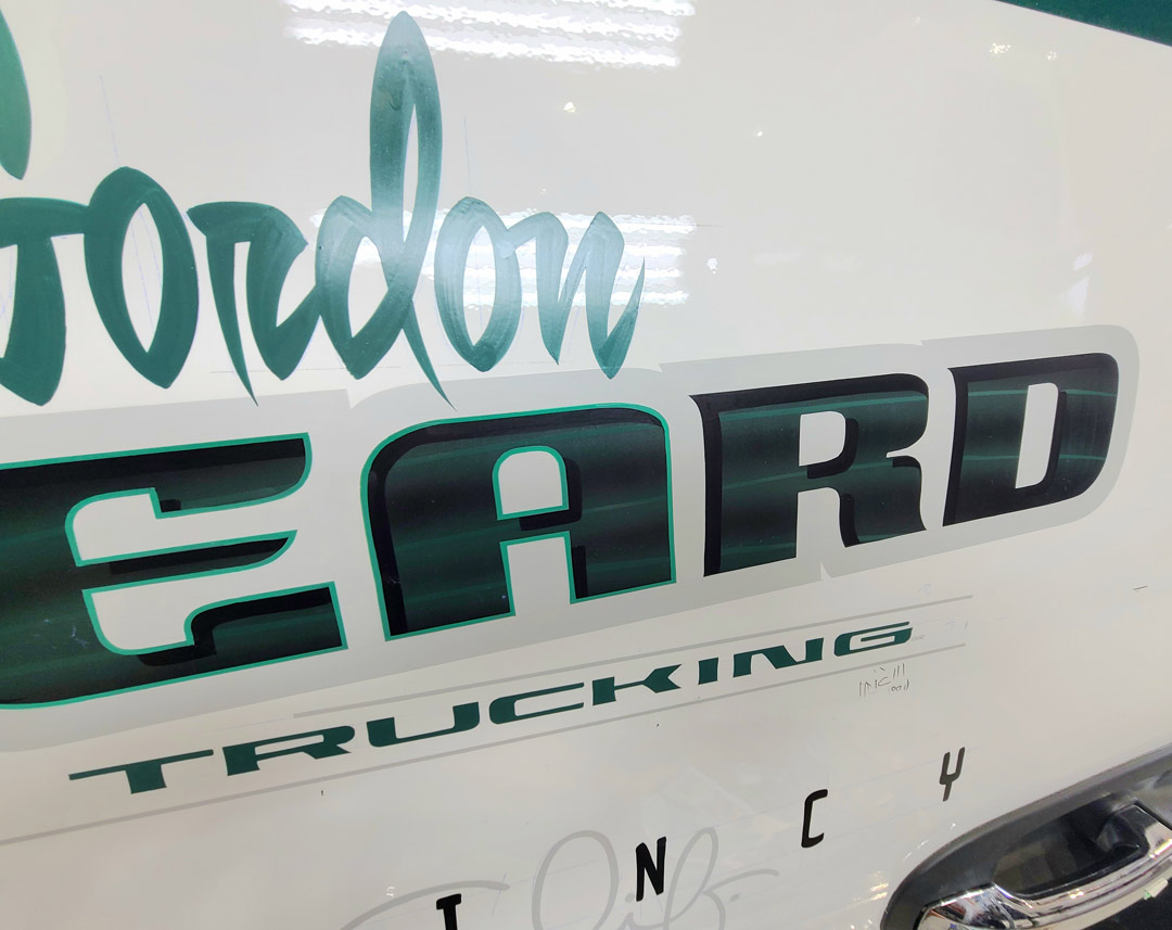
“If it’s inside the main outline, which might be black or some other dark color, I call them inlines. The cool thing about these lines is that they are very fine, very narrow. You feel them before you see them in the finished layout. You notice them only after you see and read the lettering. That little 1/16-in. inline can be pretty transformative. The Storke truck shows one of these inlines at work.
“When choosing the color for an inline, you’re sort of playing with fire. If you use too much contrast on the inline, it can affect legibility. And if you don’t use enough contrast in the color of the inline, you’ve just wasted your time. It blends in and doesn’t add much. No pun intended, but with inlines there’s a fine line between getting the color contrast right and missing the mark.”
Lane calls the fine lines that he sometimes uses around the outside of a heavy outline and shadow, glowlines. Glowlines can have more contrast to the background than an inline. On a dark truck, the glowline can also make the lettering appear to have a wide dark outline—even if it doesn’t have one. The black Rosasco truck is a good example.
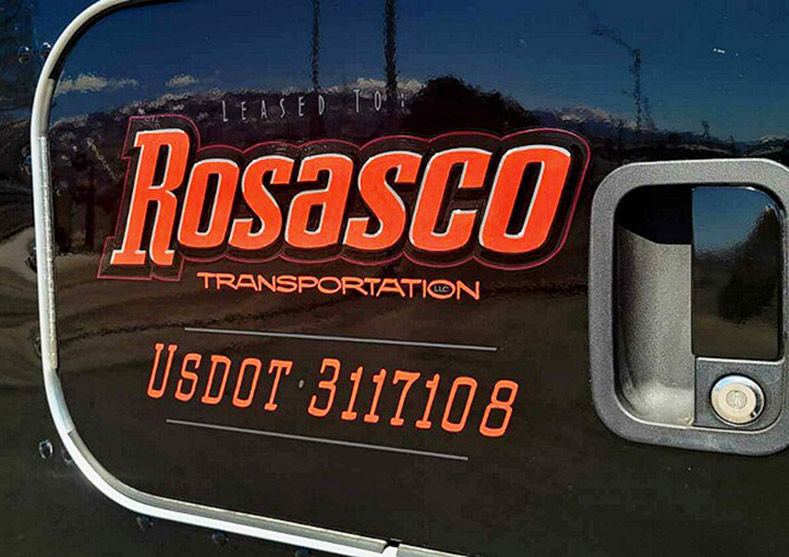
“When I started using glowlines, I would use a very bright color line on a dark truck. On a maroon truck, I would use bright red for the glowline. It would make that copy block look almost like it was backlit with red light. It made that edge of that imaginary outline glow, and that’s how it got its name. But it’s morphed over the years, so today it’s not always in the same color family as the background.”
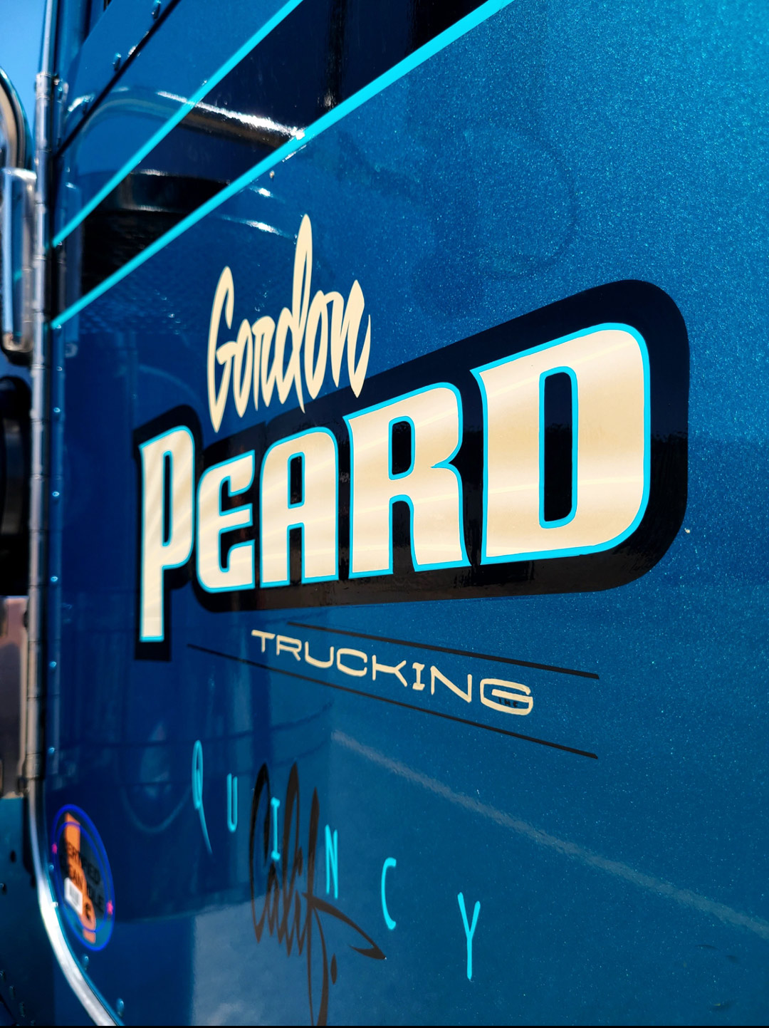
Lane’s third type of inline is one that he has named a “Martinline” because he got it from the work of Paul Martin [Martin Signs & Lines, West Allis, Wisconsin]. It’s an inline that is only apparent on part of the letter, usually the bottom two-thirds.
“Let’s say you’re doing a typical tequila sunrise blended letter—chrome yellow at the top to orange at the bottom. Paul would take the lightest color of the blend, which is chrome or lemon yellow in this case, and do an inline on the letter with that. The inline disappears at the top of the letter because it is the same color as the very top of the letter. Then it gradually appears as it gets toward the orange at the bottom of the fade. I used that on the Conspec truck.”

On the Desert State truck, Lane used orange and vermillion on the letters, with a heavy black outline. Then he came in with that dirty teal that he used for the Nevada state graphic for the inline—switching to a cool color for the inline against the warm color of the letters.
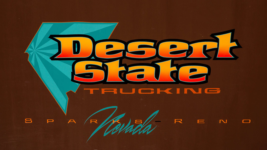
“I learned that from Eric Tapley [Harry’s Custom Paint, Hollister, California],” Lane says. “He often uses a cool inline on a warm letter or vice versa. That is magic for the layout.
“Besides that cool inline making that warm orange letter sing, it also helps unify the layout. It was a good way to work the teal of that colorway [the combination of colors used in a design] out of the state of Nevada and into the Desert State words, then repeat it down in the word Nevada. An inline is a good way to move a color through other components of the layout. It helps unify the design.”
Lane points out that these effects aren’t something that he developed but rather tools that he uses. He mentions several other sign painters who make good use of these fine lines—Paul Martin, Jeff Devey, Eric Tapley, Bert Quimby, Brian Schofield and Rich Dombey, to name just a few.
“Although these techniques are a sign painter’s thing,” he says, “I’m sure it could also be done on a computer screen for something that would be digitally printed. Even though the method is different, it has the same effect.
“Either way, it’s important to note that this technique is only used to enhance a solid layout, not to try to save a poor one. The fundamentals of good layout have to be there to start with.”
Lane says this approach to inlines is similar to the world of race boat and low-rider pinstriping. Those vehicles often have candy-color panels over the background color to accent the body shapes. There may be all sorts of fades, blends and other effects going on in the panels. At the edge of the panel, the pinstriper lays a fine line to separate the color break.
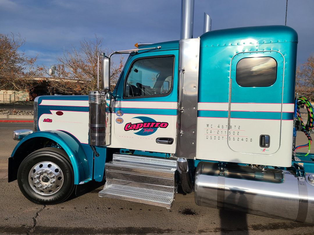
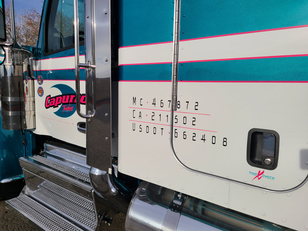
“I do this on the Capurro trucks,” Lane says. “They come in with white and teal two-tone paint. I add a super bright magenta stripe along those color breaks where the dark teal meets the refrigerator white background.
“The magenta stripe is darker that the white but brighter than the teal. It’s meant to work when viewed from about 20 feet away. At that distance you really feel the magenta stripes more than have your eye drawn to them. Up close, it can seem a little garish, but at the viewing distance, it works. You can feel that stripe.”
If you imagine these jobs without the inlines or glowlines, you can see that you would really miss them if they weren’t there. It’s a subtle effect but adds a lot.