By Chris Lovelady
Posted on Monday, November 24th, 2025

There’s often a lot more to a sign project than the photo of the finished product can tell you. The materials that were used, how the sign was built and finished, and how it was installed are all valuable information for creative sign makers. That’s why we asked Chris Lovelady, Vital Signs LLC, Thomasville, Georgia, to share how this sign for a local clothing store came together.
The inspiration for this mounting came from the work of Peter Poanessa, Keene Signworx, Swanzey, New Hampshire. Peter has done plenty of curved signs, often using individual letters mounted to a framework that almost disappears. Here’s what Chris said about the project:
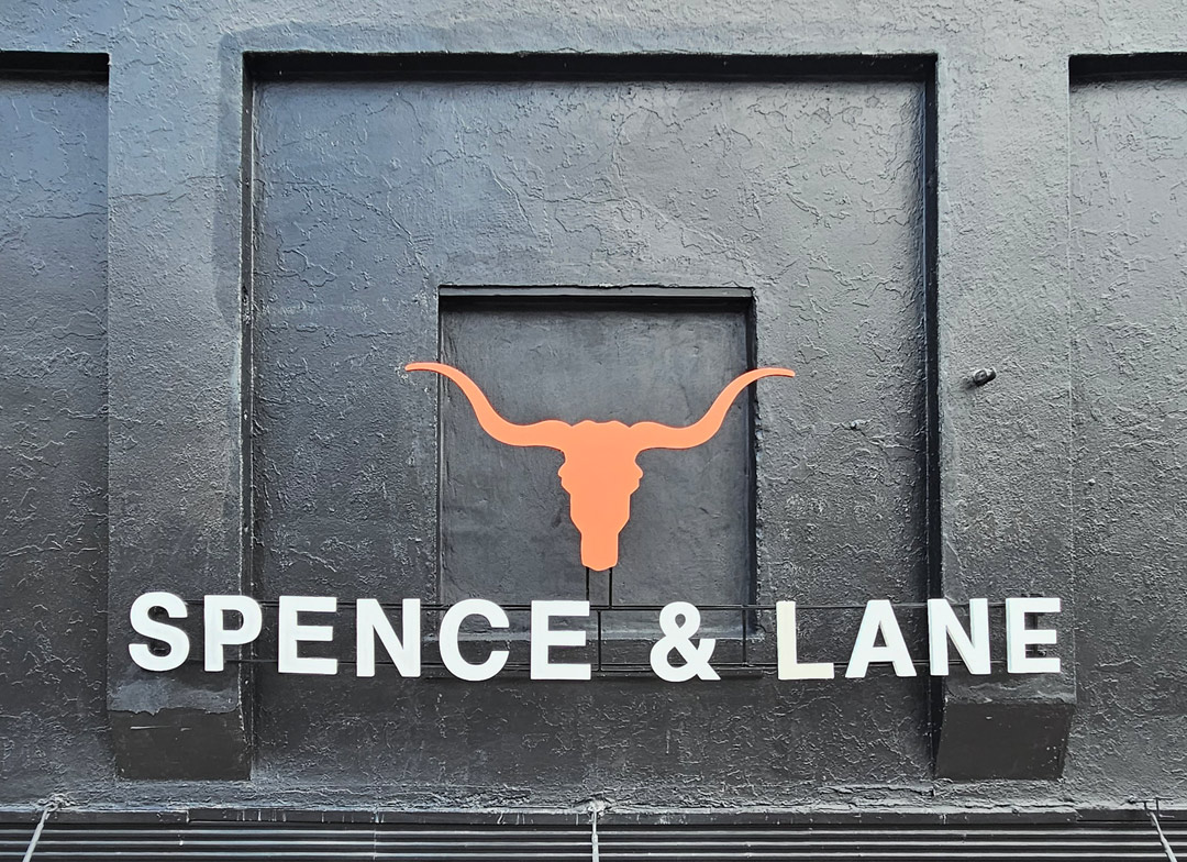
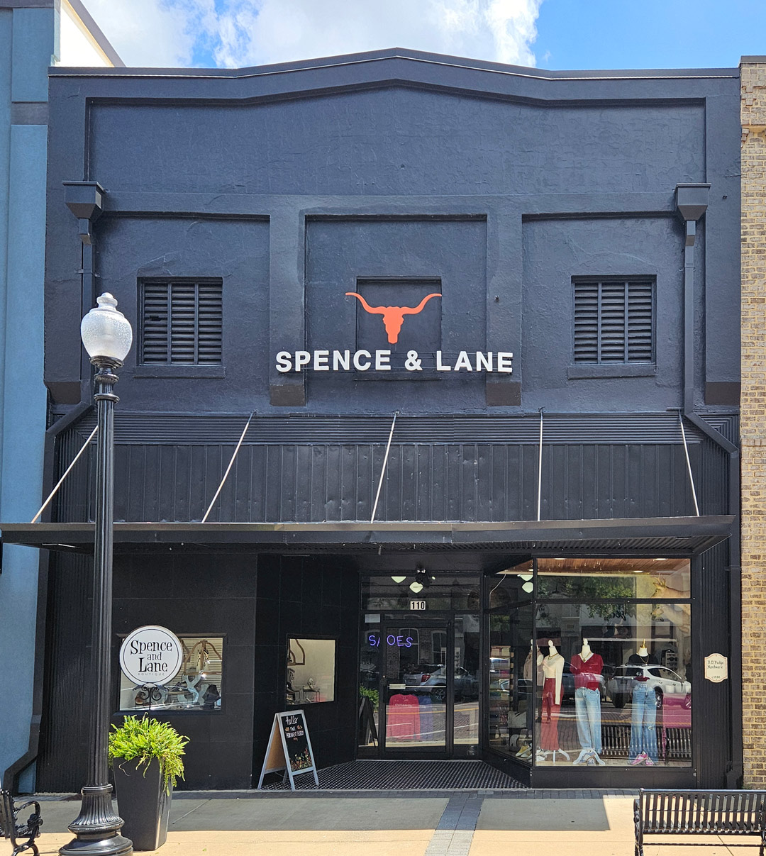
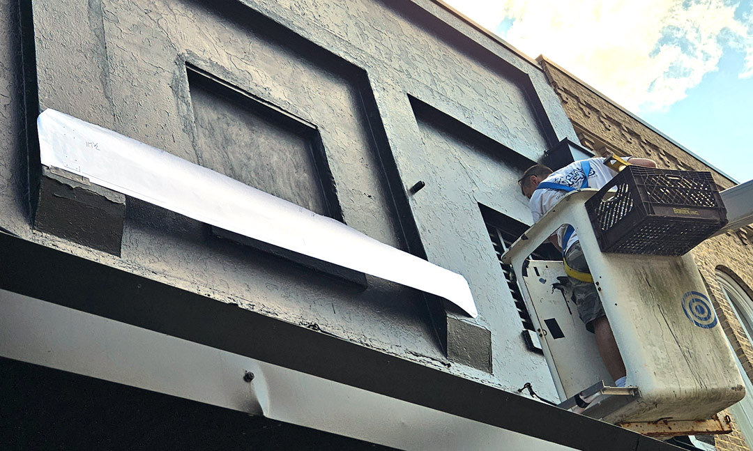
The owners of the clothing store wanted a simple set of dimensional letters for their storefront, using their logo. In this case, though, it wasn’t your typical smooth storefront that was designed to accommodate a set of CN router cut letters. Instead, the supports for the awning and the open space for the louvers obstructed the original possible sign location.
In 2019, I had worked with Peter Poanessa on the Walldog project that he co-hosted in Keene, New Hampshire, painting 16 murals throughout the town. I had seen some of the signs he had made using letters mounted to a thin steel framework that was sometimes curved. I thought this might be the ideal solution for Spence & Lane. I talked with Peter about his construction technique and decided to use it on this project.
I always wanted to learn to weld, so a couple of years ago, I took an evening welding class at the local vo-tech. It was a great experience and the instructor and I became friends in the process. Welding comes in handy when you make custom signs, brackets and frames. In the past, I struggled finding a local welder that would work with me on my small frames and rarely would they meet my deadline. Having the skill of welding, and being able to fabricate frames and brackets, has helped expedite the production and left me with more creative leeway.
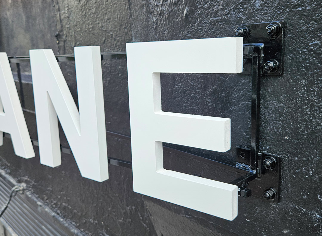
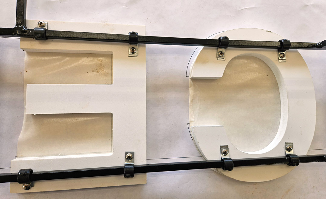
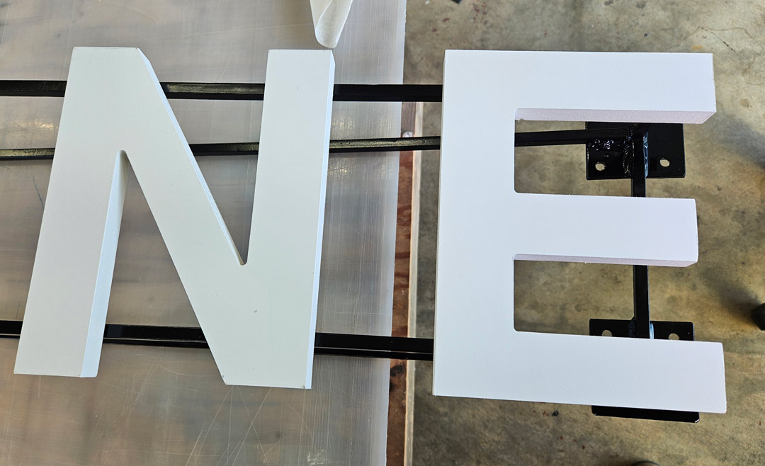
The letters: The letters were CNC cut from ¾-in. PVC board and are 13-in. tall. They were finished with Sherwin-Williams All Surface Enamel, which is an acrylic latex paint that bonds very well to PVC board. We use PVC board often in our work, and this paint works very well on it.
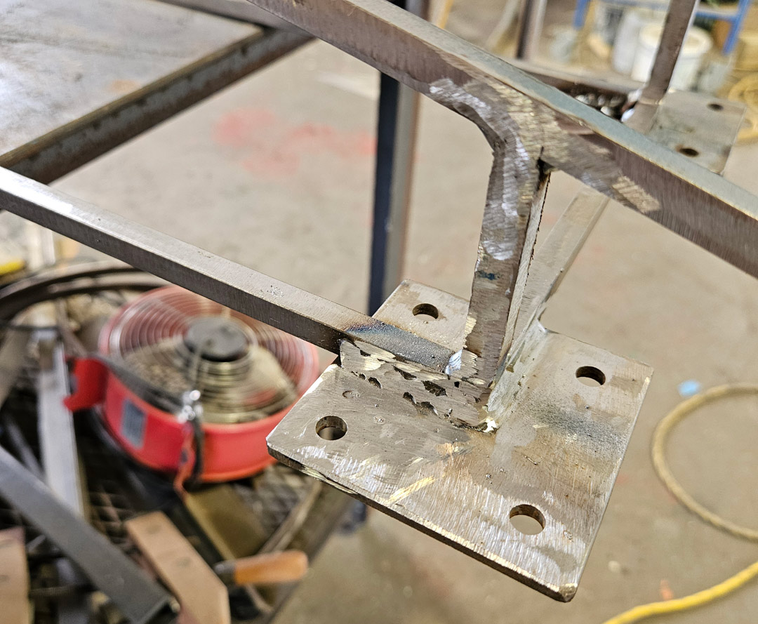
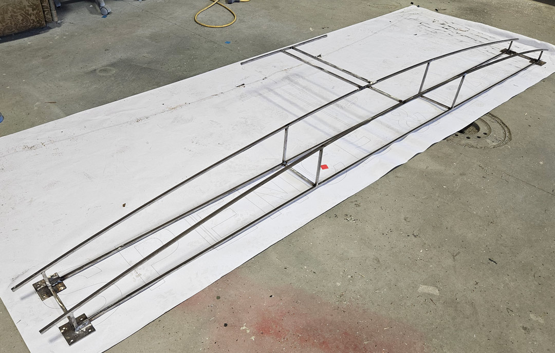
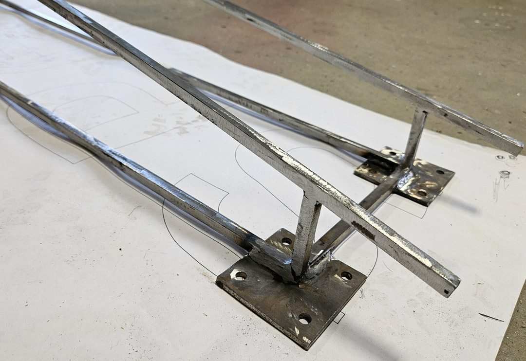
The structure: The letters are mounted on a 10-ft.-wide curved frame that I welded up from 3/8-in. key stock from the local steel supplier. I didn’t have a set of rollers, so I took the steel to the vo-tech metal shop, and the students ran it through a set of rollers to get it to the curve I needed. After it was welded, I painted the framework with DTM [Direct To Metal] paint meant for raw metal.
Assembly and installation: I attached the letters to the framework with a pipe clamp that wraps around the steel and has a single screw into the back of the letter. Peter recommended them to me and it works great. I got them from ElecDirect.com. I put the framework on top of a length of pattern paper on the shop floor and made a pattern that we could use for drilling the holes in the wall.
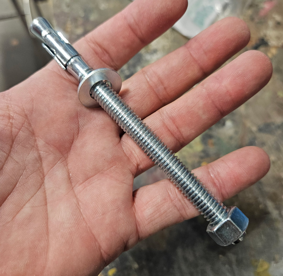
Once on site, we put the pattern on the wall, marked the holes and drilled 3/8-in. holes in the brick wall. The framework was attached to the wall with expansion bolts. If you’re not familiar with them, these bolts are inside a sleeve. When tapped into the hole in the wall, it has a threaded stud that sticks out from the wall. You put a washer and nut on the stud and tighten it. As the nut threads down the stud, it expands the sleeve, securing the stud to the wall.
Once the twelve expansion bolts were installed in the wall, we removed the nuts and washers, then we lifted the framework into position. We slid the holes in the framework over the bolts and returned the nuts and washers to the studs to secure the frame to the wall.
I used my bucket truck to lift the sign. Ordinarily, I would have needed a second lift to hold the other end of the framework, but fortunately there was an old wire insulator installed on the wall just above the far-right end of the sign. We slipped a rope through the insulator and used that to hold that end of the framework. The installation went faster than I anticipated.
The thing that I like best about the sign is that, as you drive down the street, the letters look as if they are floating in the air. The building is black and the frame is black so it just about disappears. Your eye goes to the letters and the steer head.
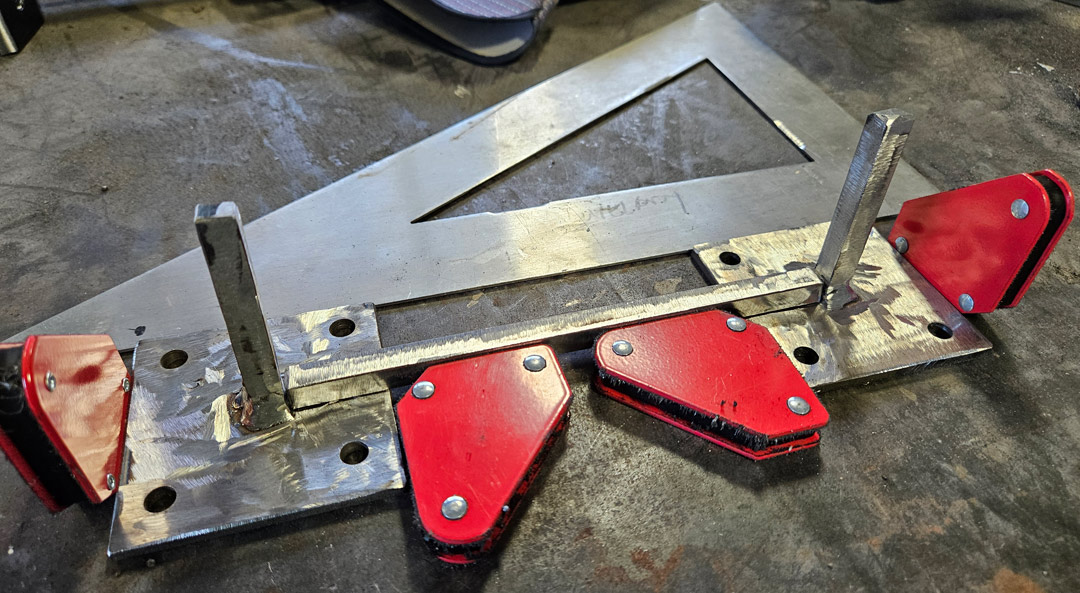
Here’s one end of the bracket welded up.
Expansion bolts were used to mount the bracket to the concrete wall.
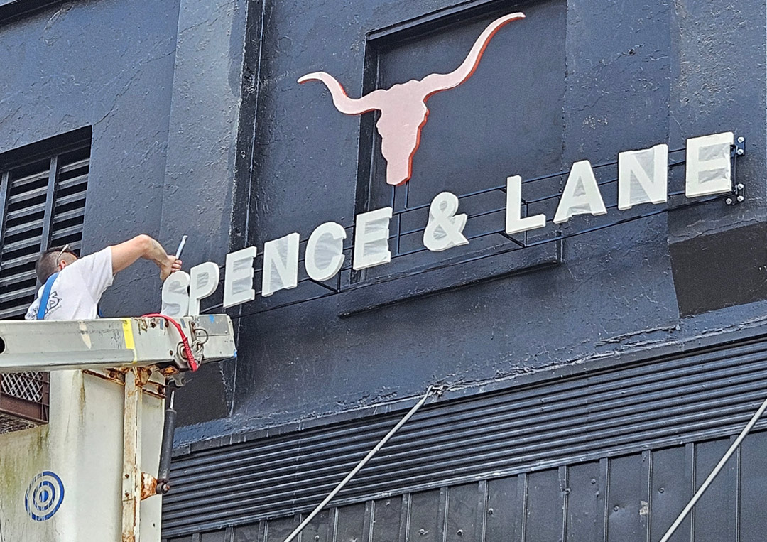
As you see, the faces of the letters were protected with a sheet of transfer tape during installation. I do that on almost every sign that leaves the shop—even a flat sign. It’s good protection while it’s being transported. We do a lot of stud-mounted PVC letters, and apply transfer tape to their faces once they are painted. It keeps them from getting marked while they are being moved around and handled. Once everything is installed, we pull the transfer tape off and it’s all clean and neat.