By signcraft
Posted on Monday, December 8th, 2025

James Dobson has always worn a lot of hats—sign maker, innovator, inventor, all-around graphics person and more. He and his sign work were first featured in SignCraft’s July/August 1998 issue and many times since. In between cool projects of all types, James is still making signs in Albury, New South Wales. Recently he shared some of his recent sign and graphic projects along with comments on each—including some helpful tips:
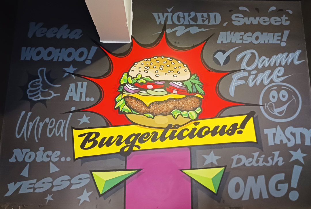
This next internal wall project was done in a Queensland pub and they requested it “loud and colorful.” Who ya gonna call? It was hand-painted in low-sheen acrylics. The hamburger outline and “Burgerlicious” were projected. I wanted to use Jeff Marshall’s beautiful script but was unsure of a faithful reproduction if done entirely freehand.
Once the central part of the design was finished, I freehanded all the surrounding text using whatever words and letters styles came to mind. I wanted the background text to still be readable, but not “come forward” too much and compete with the main central element. I think I was right on the edge of making the sign too busy, which could have easily happened had the background text been any lighter in tone.
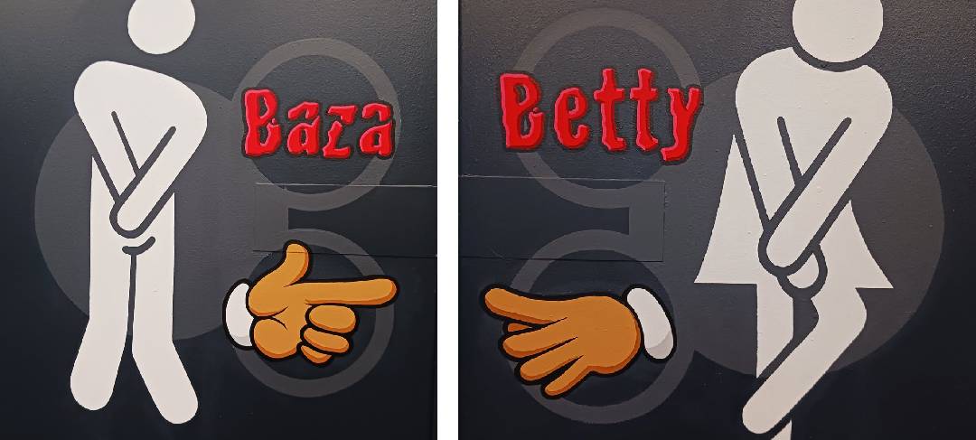
After “Burgerlicious” they then asked me to do Male and Female restrooms murals in the party area behind the pub. This was the local backpacker hangout with a huge stage and dance area where very inebriated Irish, English and German tourists partied hard. I felt this was no place for your standard “Gentlemen” and “Ladies” as in truth, neither was to be found there—LOL! A quick Google search produced the two hilarious white “anxious icons” which I projected up onto the single wall (about 1500mm [or 5 ft.] tall) that divided the two rooms.
I freehanded the cartoon hands and the two Aussie versions of gender using one of my favorite fonts, Crackhouse from House Industries. This project went over extremely well and selfies are continually taken in front of them.

Here’s another example of Crackhouse at work on “Sign Writer,” which was hand painted in flats and fluorescents.

While I’m at it, this was hand painted many years ago and is another example of Crackhouse and Label used for the main copy. It’s all 1Shot enamel except the casual secondary which was computer cut vinyl. It was a Mike Stevens casual font from Sign DNA [available from SignCraft].
Here’s another interior wall mural which was painted in low-sheen water-based acrylic.
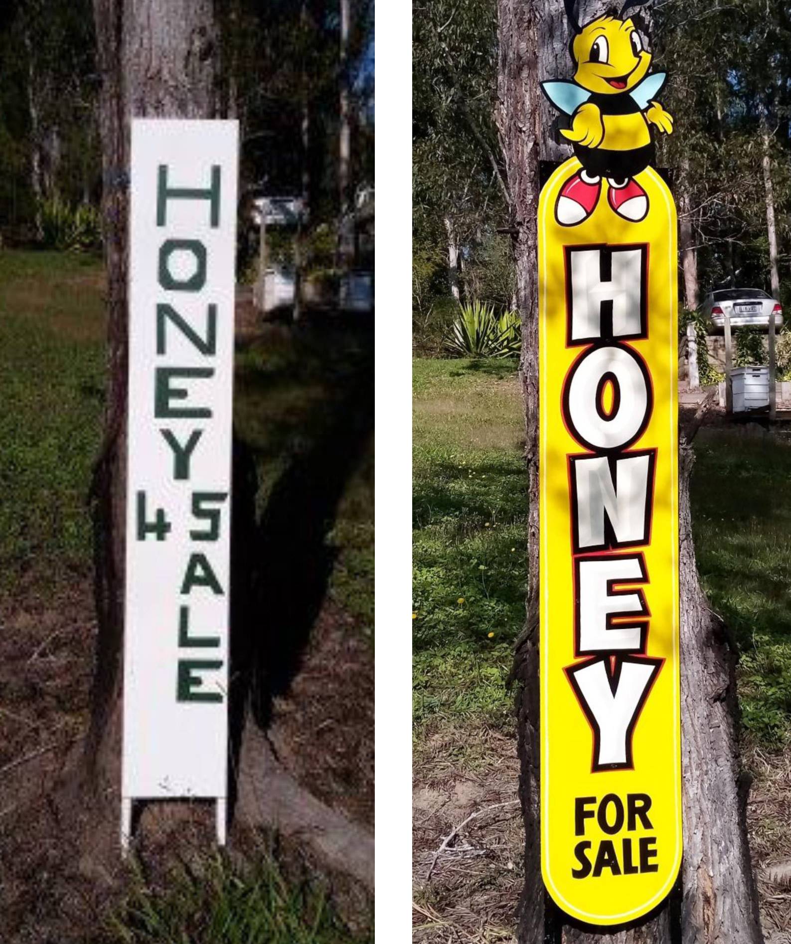
This next job was for a lovely old couple who I used to buy honey from. The man of the house had proudly done the black-and-white version of their sign but they continually mentioned that sales were less than what they wanted. I had some scrap ACM so I suggested I could “add a bit of color” to their sign to help increase business. I didn’t charge them anything and simply screwed the new sign over the old one on my next visit, saying that I “added a bit of color” to their sign.
I freehanded the design out of ACM, cutting around the bee graphic with a jigsaw using a metal cutting blade. This material is very suited to this kind of shaping and only needs minimal edge sanding with a small cordless orbital sander. It was all hand painted in low-sheen water-based acrylics then clear-coated in water-based anti-graffiti clear. The loose sans-serif block of the main copy was prismatized in light grey with a red pinstripe around the black.
The next time I went to get honey, there were a half dozen one-liter tubs of honey waiting for me, and they invited me for dinner. They told me later that within a month of getting the new sign, their honey sales had doubled. He had to buy four more hives!
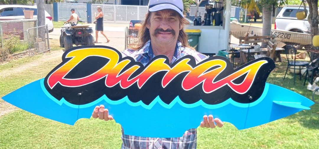
This sign was for a surfer dude in Queensland called “The Wizard”, shown here holding the sign. It was hand painted with low-sheen acrylics on 3mm aluminum composite material [ACM]. It is covered with a thin plastic protective masking that I often take advantage of for blends or splatter.
I first drew a rough thumbnail on A4 paper, as I do for mostly everything. I transferred that to the panel then cut out the shape with a jigsaw using a blade designed for fine metal. I do this with the protective masking still on, as the jigsaw could mark the paint. I added the shark bites not only because they looked cool, but The Wizard had shared stories of a few close shark encounters.
I knife cut the word “Durras” using a font called Fast Eddie from LetterheadFonts.com, creating a mask from the protective plastic film that I could use to wet-blend the red and yellow. I sanded the panel with 600-grit no-fill sandpaper to help provide a mechanical bond.
I cut out a fin shape then attached it to the panel by inserting it into a slot I made in the main board with a hand-held grinder, using a metal cutting blade. I bonded the fin to the board using 5-minute epoxy.
I applied two coats of the sky blue followed by the black outline, then the lighter blue highlight and white outline to really pop “Durras.” Next, I drilled and screwed in the two large-head self-tapping screws half way. I always try to add the fasteners at this stage. I place these screws into the black painted areas if possible because touch-up of the heads is easier to do with black than a custom color. Nothing annoys me more than seeing my sign put up with ugly bolts or screws with no thought as to the overall optics.

This is a hand-painted wall mural done with low-sheen acrylics then clear-coated using a water-based anti-graffiti clear. This quick final step assists not only longevity but also “clean-ability.” I knew the design I wanted, so I drew it on A4 paper using a fish that I found on Pinterest. I wanted both fish to be identical, so I drew the left one first then simply folded the paper over using the front window as a light box to trace the second fish.
I found a cool crab to place in the center then added the large H-type Pisces symbol. I then took a photo of the drawing with my smartphone then projected it with a micro projector to enlarge the design onto the wall. My micro projector connects to my laptop, but now you can get them that connect to your smartphone. For all you closet hippies out there, this mural joined the two astrological symbols of Pisces and Cancer. My comfort in the afterlife is now guaranteed!
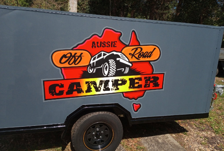

This was for a home-built camper trailer that needed an eye-catching logo design on either side. I drew the design by hand first on A4 paper, photographed it with my phone then projected it onto both sides of the trailer, which had a flat epoxy finish. After projecting the layout, I lightly scuffed the areas to be lettered with fine sandpaper. I hand painted it, first with water-based undercoat/primer then with low-sheen acrylics. It was clear-coated with two-pack automotive paint, which is paint and an activator.
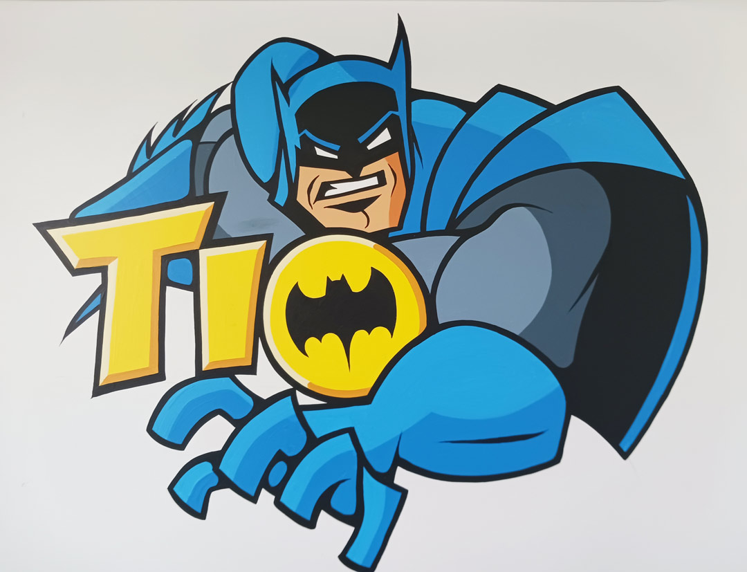
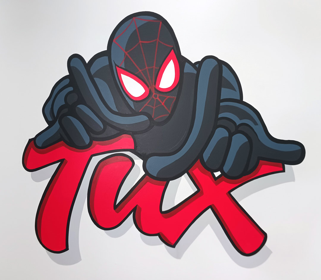
The Tux and Tio interior wall murals were done for the sons of a friend. Each told me their favorite super heroes, so I Googled examples and selected the ones that allowed me to slot in their names as well. I screen-shot them, cropped the image then projected it and did a rough pencil outline of the characters. I then freehanded in their names with hand-drawn letter styles that I felt suited the graphic. They were painted in my low-sheen acrylics then clear-coated with a water-based anti-graffiti clear.
I also like to dabble in Graphic Art occasionally so here are a couple of examples of that. The crazy thing is I don’t use any fancy design software, just Microsoft Word. The look on Jeff Marshall’s face when I told him this was priceless!