By signcraft
Posted on Monday, January 19th, 2026

Big, bold, beefy letter styles really come in handy on signs. They are usually extra-legible. They deliver plenty of contrast to medium, light or extra light letter styles used for secondary copy. They get the main message across loud and clear.
Ironically, you don’t always see ultra bold typefaces used on sign layouts. Medium weight faces seem to dominate the signscape, and they don’t provide much contrast for lighter weight secondary contrast. The good news is that you can take advantage of this by putting beefy typefaces to work for primary copy and set your work apart.
Ken Tamashiro ran Ken’s Custom Signs, Long Beach, California, and is now retired, but he still sends SignCraft links to typefaces that he knows would work well for sign design. This selection of powerful typefaces will give your layouts the extra impact they need in the year ahead—and to shout the important copy over the visual noise that most signs need to overcome.
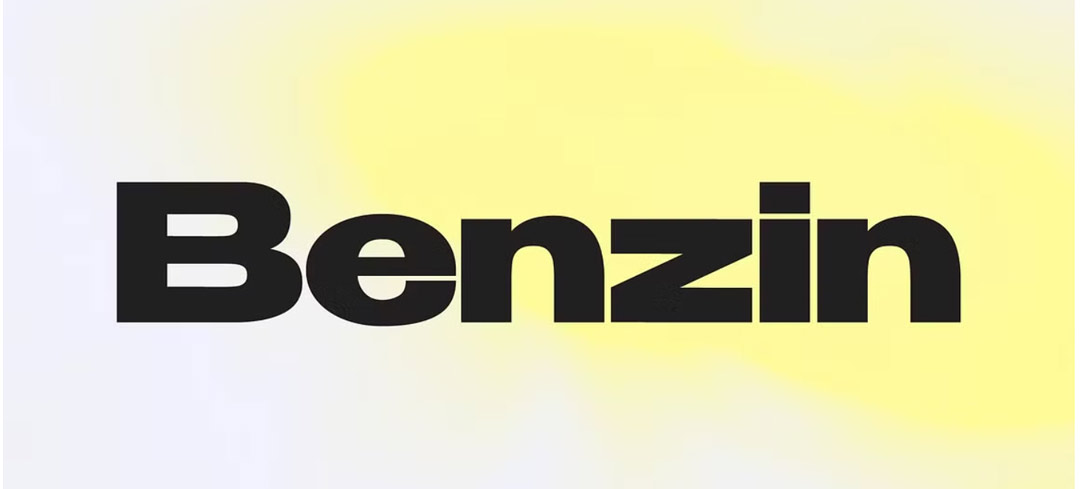
Click here to download the Benzin Font Family
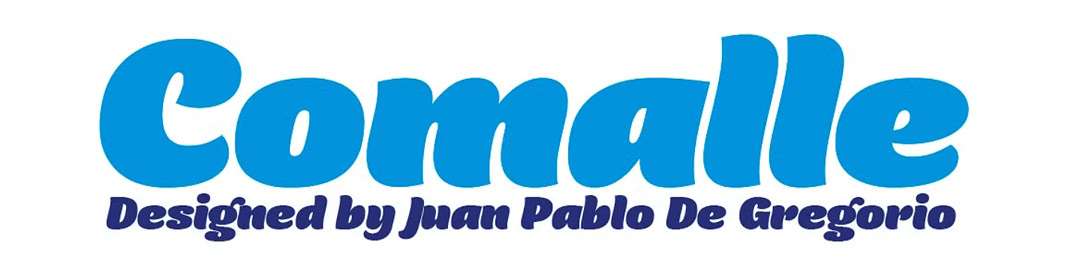
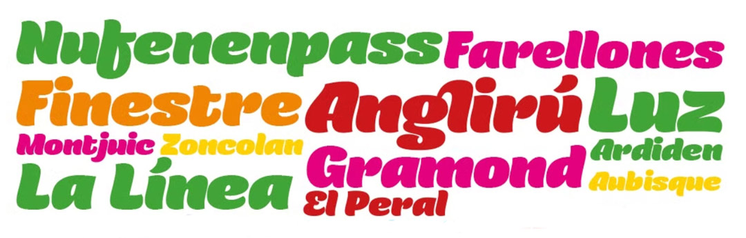
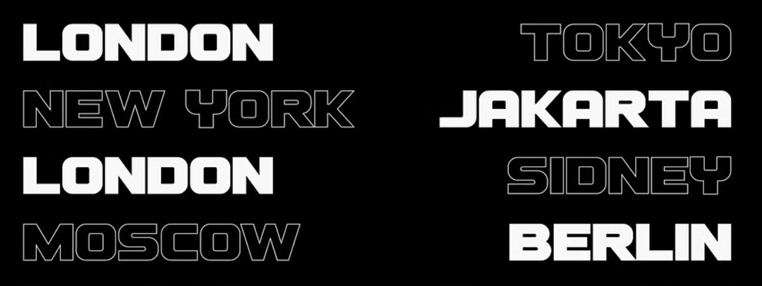
Click here to download the Comalle Font Family
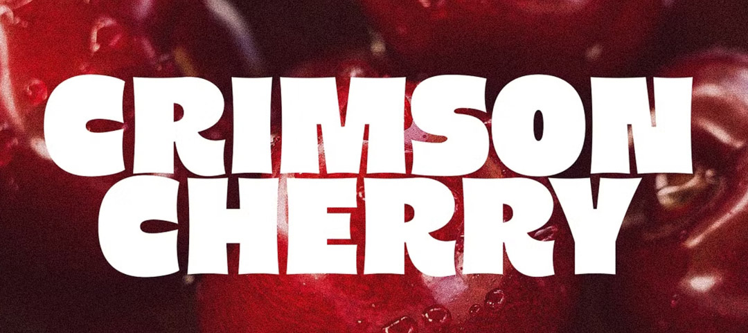
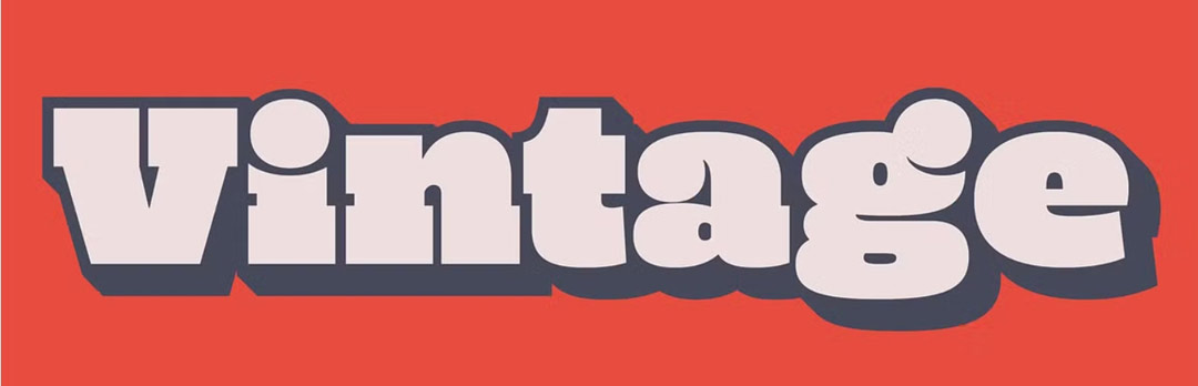
Click here to download Crimson Cherry
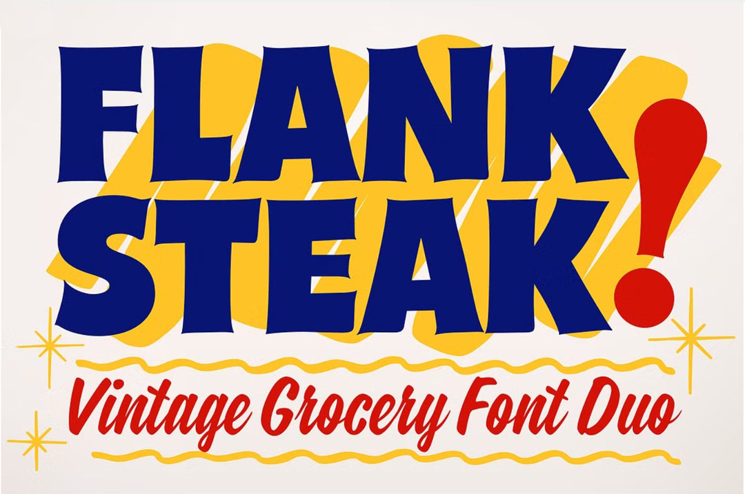

Click here to download the Flank Steak font duo
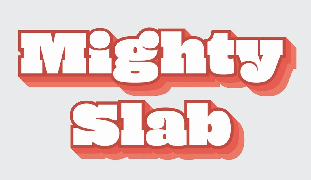
Click here to download Mighty Slab
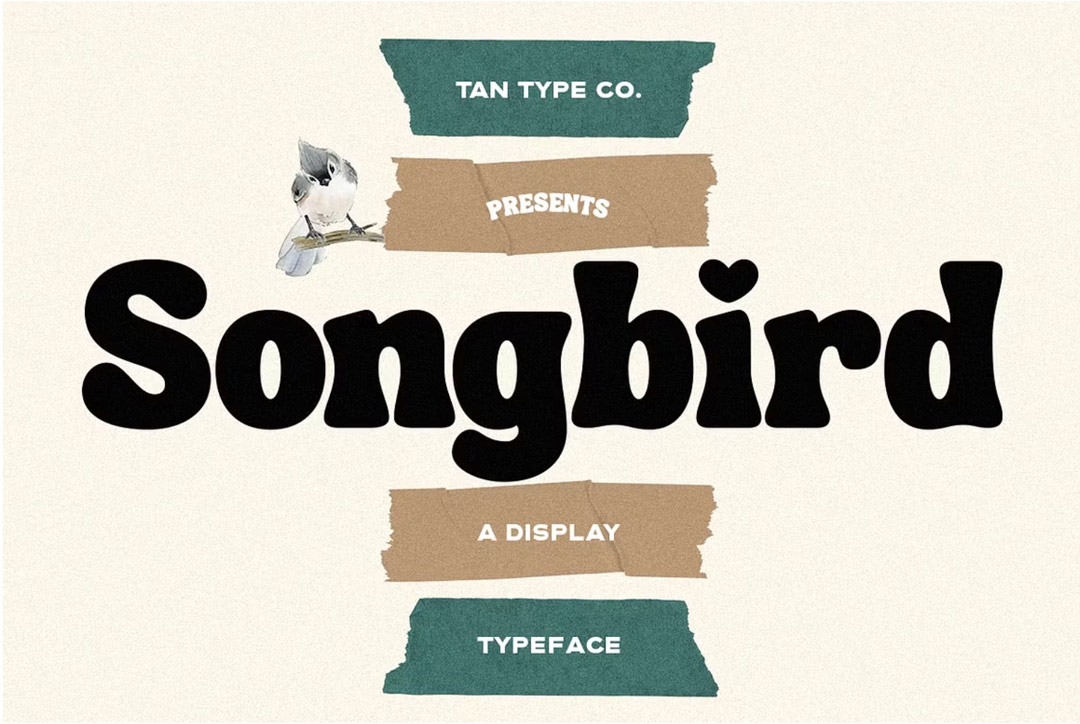
Click here to download Songbird
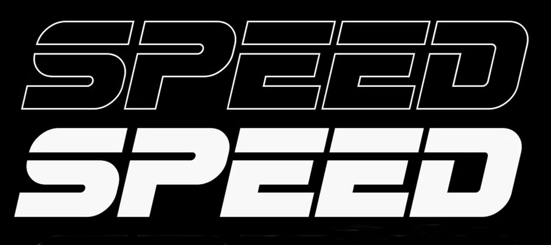
Click here to download Speed Fez
