By signcraft
Posted on Monday, January 26th, 2026

It’s always great to see a beautiful sign, but for creative sign makers it’s even better to learn what went into designing and producing the sign successfully—the typefaces, substrates, finishes and production techniques. Let’s take a closer look at this monument project and how it came together.
Most monument signs are big and built to last, and this sign by RT Signs, Steinbach, Manitoba, Canada, is no exception. It was done for a large family farm in Taché, Manitoba, Canada, and they wanted a sign that reflected their emphasis on quality. Randy Toews of RT Signs shares the backstory on this great-looking monument sign:
For this farm sign, we were shooting for a design that was appropriate and impressive. At 92-by-62-in., the sign is large and colorful, yet tasteful. The oak leaves fit well with the name, and being an egg farm, the chicken was also tucked into the layout.
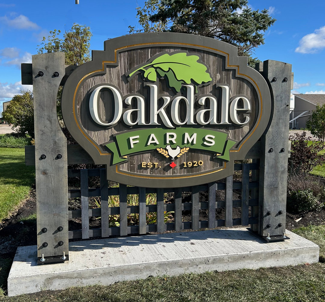 The typefaces: For the main copy, we used Noto Serif Display. The secondary copy is Krona One. Travis rarely uses a font for the main copy without some editing, and here he pushed one leg of the letter K down below the baseline.
The sign face: The sign face is 4-in.-thick Western Red Cedar, and it was laminated by the company we buy our wood from. We then took the panel to a cabinet shop that does CNC work for us. We put a layer of sandblast resist on the panel, then they routed through the resist, leaving the borders and the graphic areas raised. Back in our shop, the background was sandblasted for added texture.
The graphics: The main copy was router-cut from 1-in. SignFoam HDU board then the convex effect was carved by hand. We mounted the letters on ½-in. PVC board to give some additional depth. The rest of the letters, banner and graphics are router-cut PVC board.
The structure: The columns are 4-by-12-in. oak timbers that sandwich the 3-by-8-in. oak stringers that hold the sign face. The oak timbers were router cut to match the shape of the sign. It’s all through-bolted together. The lattice-like trim below the sign panel is 1 ½-by-2-in. oak verticals screwed to the horizontal stringers.
One of the problems with mounting a sign on wood posts in the ground is that sooner or later, the wood rots off at ground level—usually long before the sign has worn out. Bolting to a concrete base prevents this. We pour a substantial concrete base, with studs set in and protruding from it. The sign is bolted to the concrete on custom brackets that fit up into a deep groove that was cut in the bottom of the 4-by-12 timbers. Spacers between the bracket and the concrete allowed for leveling and also keep the timbers up off the concrete.
The finishes: The letters and sign panel were all finished with Benjamin Moore Corotech Command, which is a single-component, waterborne acrylic urethane enamel. We use it on a lot of our signs and it holds up well.
Rather than wait for the natural oak to weather to its natural silver gray, we treated the oak columns with LifeTime Wood Treatment, which speeds oxidation and gives a uniform color to the wood. The bolts were sandblasted and primed with an epoxy primer then finished with matte black Tremclad.
Installation: We assembled the sign in the shop then took it apart to install it on site: the four timbers, the sign face, the stringers and the lattice-like panel. Once the structure was in place on site, the face was screwed in place from behind and the project was complete.

