By signcraft
Posted on Monday, January 12th, 2026

Seeing the finished product can give you an idea for a layout or color combination, but there’s more to the story with most any sign—the choices of typefaces, materials and finishes, the production methods and how it was installed. designed and produced. These three signs were designed, produced and installed by Jason Nale, Nazareth Sign Co., Nazareth, Pennsylvania, and he shared the details with SignCraft. Here’s what he had to say:
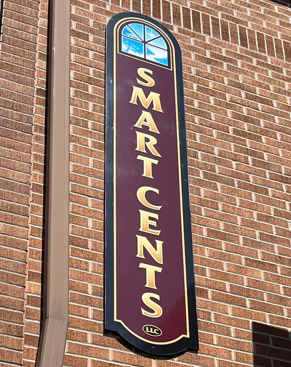
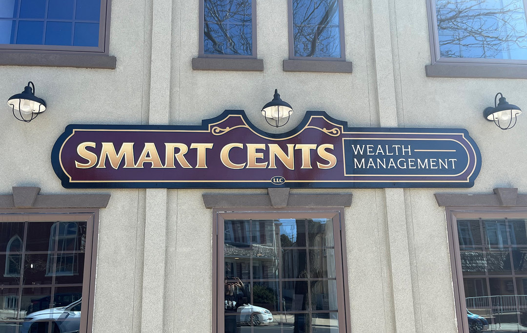
This customer was changing the focus of his business and wanted to market financial adviser services and needed a new sign to show that. They’re in a beautiful building that is right across from my old shop, and I always thought they should have better-looking signs.
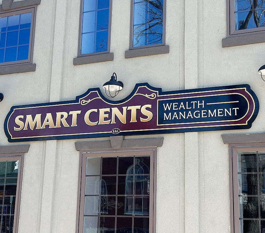
The layout and fonts: They didn’t have any idea what look they wanted, but I knew that they needed something that looked very professional and stable. A carved 3D sign was out of the budget, as it is for many of my customers. But I knew they could still get a nice-looking sign. We did three signs—one for the storefront and one for each side of the building. I designed the storefront sign to work with the three existing light fixtures.
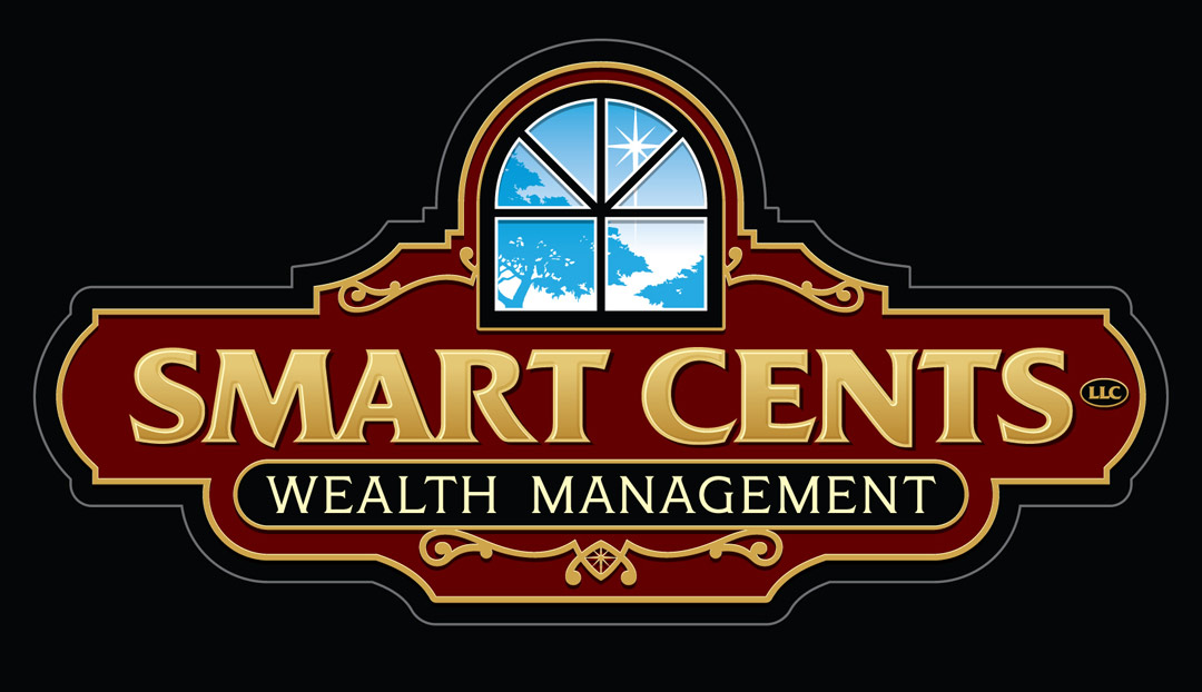
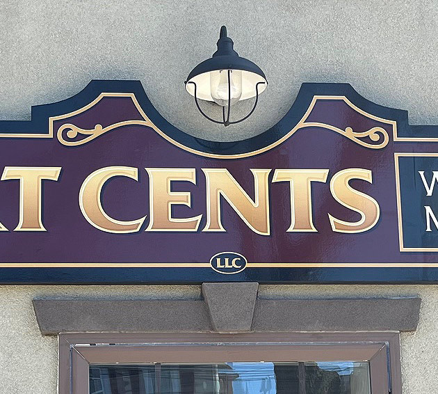
I put together the designs using Quid Bold for the company name and Capstone for “Wealth Management.” I designed a graphic of a window with the Moravian star, which is a big item here since the town is named Nazareth. I also wanted the storefront sign to fit with the three existing light fixtures. Fortunately, it all worked out and they liked my first design.
I really look at the building when I do a design. In this case, one sign would be on the light stone front and the other two would be on the dark red brick on the sides of the building. I wanted the colors to work with the building, and the burgundy background fit with both situations.
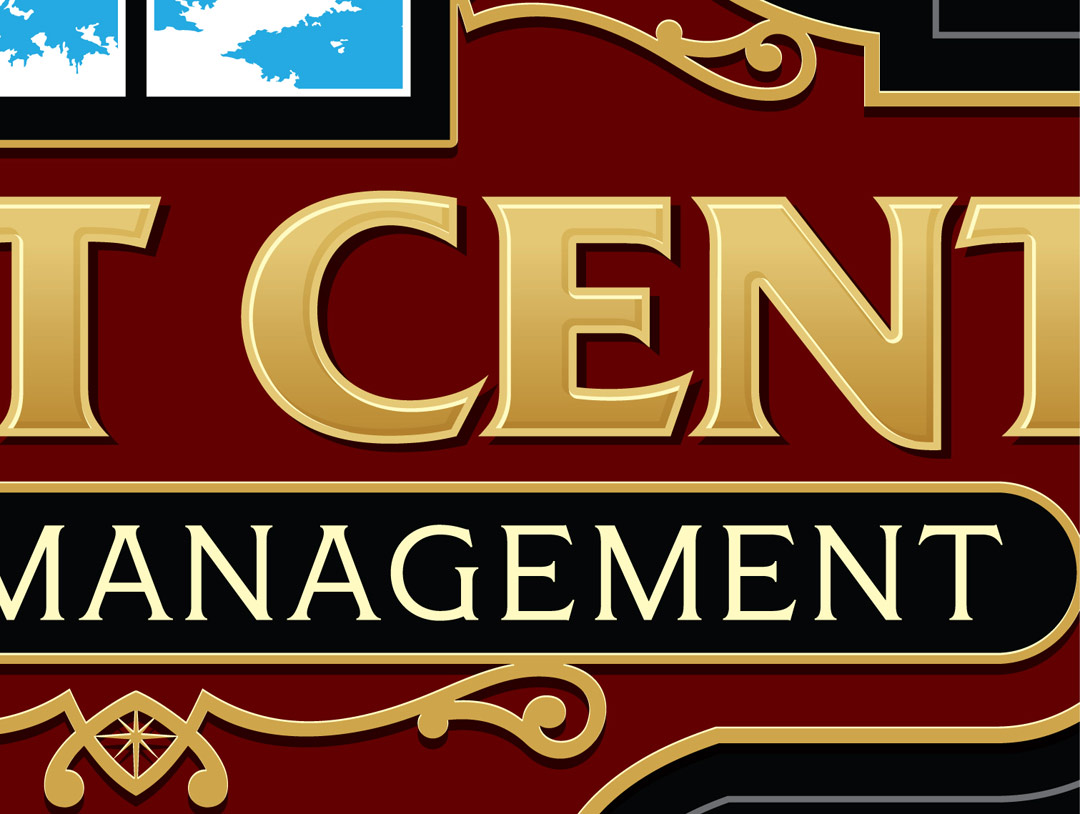
I wanted the sign to have a 3D feel, so I added a subtle shade on the lettering, ornaments and border. I also added a highlight to the ornaments and border. There is also an embossed effect on the letters, done with subtle shadow and highlight. I don’t use Photoshop’s 3D tools—I design everything in vectors.
The substrate: All three signs were done with 3M laminated digital prints mounted on ½-in. double-faced overlaid plywood [MDO]. They were a little heavy but I wanted more thickness than I could get with aluminum composite material [ACM]. I like ACM, but it isn’t always the best choice. It’s not as rigid as MDO, and I like a thicker sign panel, especially for signs like these.
ACM works well on many signs, especially when you can take advantage of its light weight. MDO adds a little more dimension, more presence. When the wall is a little uneven, it bridges all that. It’s sturdy and it holds fasteners well, which is harder with ACM.
My supplier will cut panels to shape and size if you send them a file, so that’s what I did. The router makes a beautiful edge that needs no sanding.
Finishing the edges: I primed the edges of the MDO plywood with Kilz oil-based primer then applied one coat of Behr exterior acrylic latex paint over that. It’s a flexible satin finish that works well on MDO plywood.
Once the paint was dry, I applied the digital prints, which were slightly larger than the panels. I trimmed the prints flush with the edges of the MDO plywood using a flat file by gently filing downward on the print along the edge of the panel. I used to use a knife for this, but the file does a nicer job. Then I applied another coat of the acrylic latex paint, letting the paint flow slightly over the edge to seal the edge of the print.

Installation: I made a French cleat to mount the storefront sign. I ripped strips of ½-in. MDO plywood almost as long as the sign faces. Then I split the MDO strips by making a 45-degree cut lengthwise. One strip was mounted to the MDO with construction adhesive and screws and the other was mounted to the wall with countersunk flathead Tapcon screws. The sign then simply drops down on the material that’s mounted to the wall and hangs on it.
The other two signs were screwed directly to the wall with countersunk flathead Tapcon screws. I put the screws in the border where they would be less conspicuous, touched up the heads with black paint, and the project was finished.