By signcraft
Posted on Monday, June 1st, 2026

There are at least two ways to improve your sign layout skills. One is by instruction, where a skilled designer tells you ways to create effective layout. The second is by observing—seeing how a layout can be improved by looking at examples. This second way of learning works especially well because we have to do some thinking, rather than just listening.
That’s why before-and-after photos can be so helpful.
In before-and-after photos of sign layouts you can see the sign as it was originally designed, then compare it to a new layout that is more appealing and effective. You can study the two signs to see what the designer did in the “after” photo that makes it more legible and more interesting to look at and read.
Usually before-and-after features compare a sign done years ago by some other designer (usually not known) to a new layout done by another sign maker. Here Rob Cooper goes one better—he shows first a sign that he did years ago then a new version of the sign that replaced the original one.
When he replaces one of his own signs, Rob uses it as an opportunity to make improvements in his layout as well as to update the design. Rob talked about this in “More before-and-afters from Rob Cooper” a while back.
Rob has included captions that tell what he changed but what’s most important is taking the time to look closely at the layouts. Though the original sign may look fine, look for what he refined to make it even better. It’s a great way to learn how to make your own work more appealing and more effective.
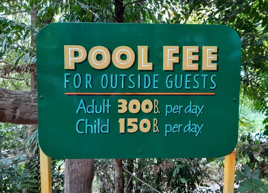
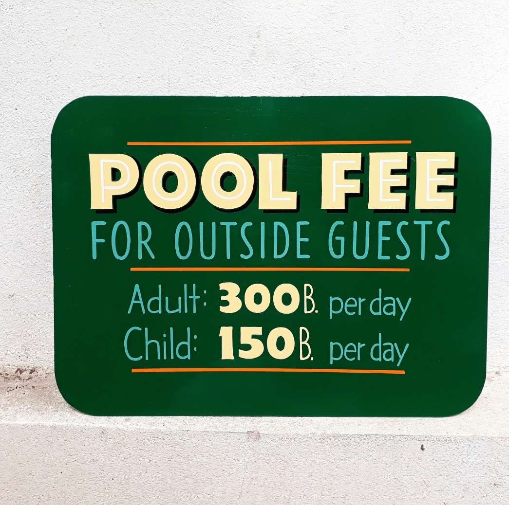
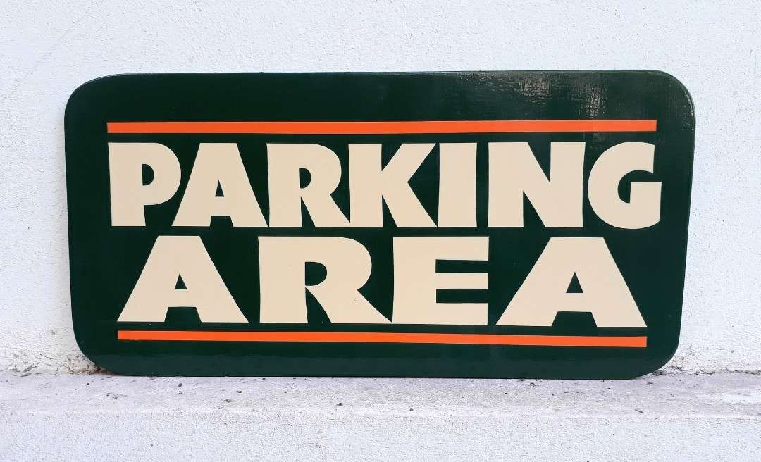
“I added more negative space to this layout,” says Rob, “and I discarded the top and bottom orange rule lines. It was repainted on an aluminum panel.”
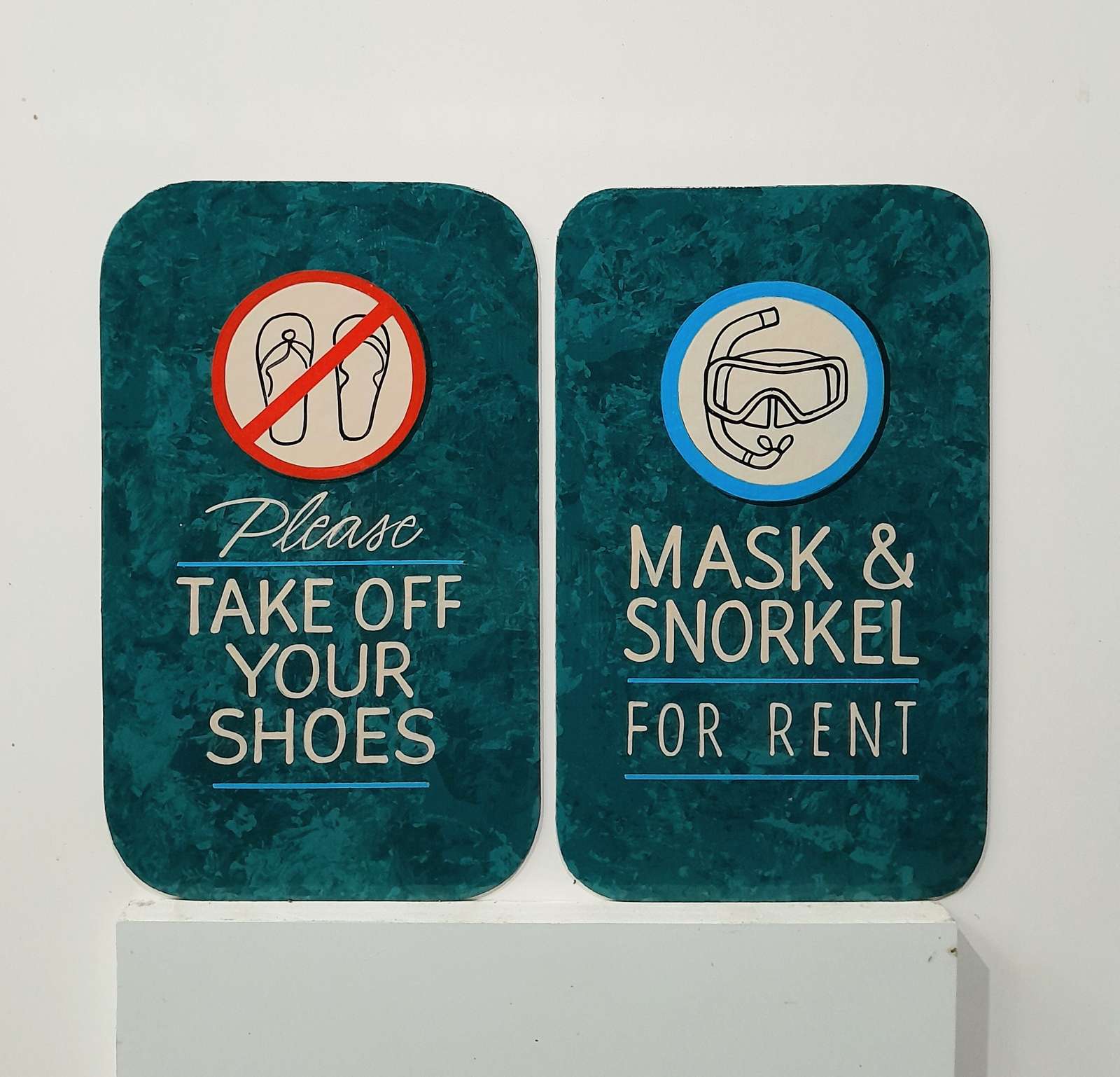
“There was no change on this layout, which was done as part of a new color scheme, changing from gray to teal. It was repainted on an aluminum panel.”
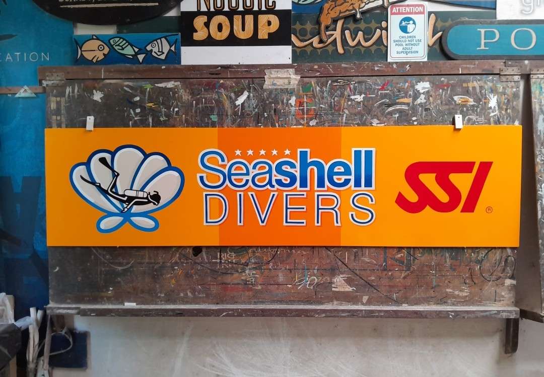
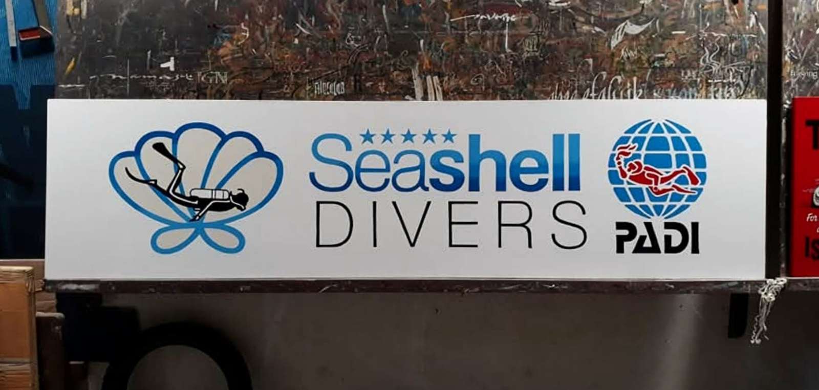
“Originally the Seashell Divers signs were yellow, but somewhere way back it was changed to an off white/beige color. That was okay, but a bit insipid or boring. A new manager recently reverted back to yellow. Interestingly, I think the beige one is more readable, but the yellow one attracts attention.”
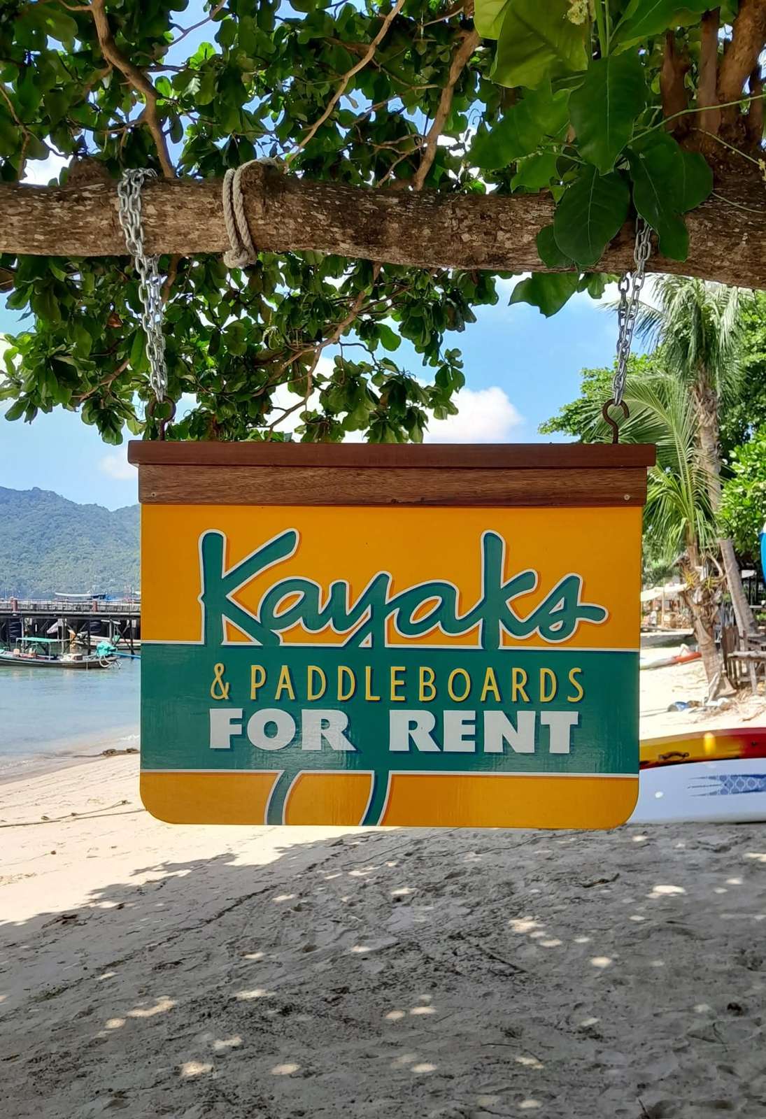
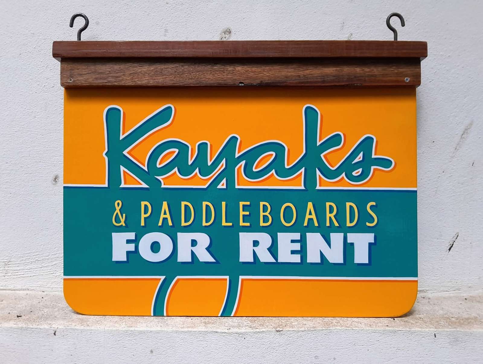
“Here the design and colors are essentially the same, with a bit more negative space added. I also made the panel taller to allow for ‘Paddleboards’ as an extra line of lettering.”
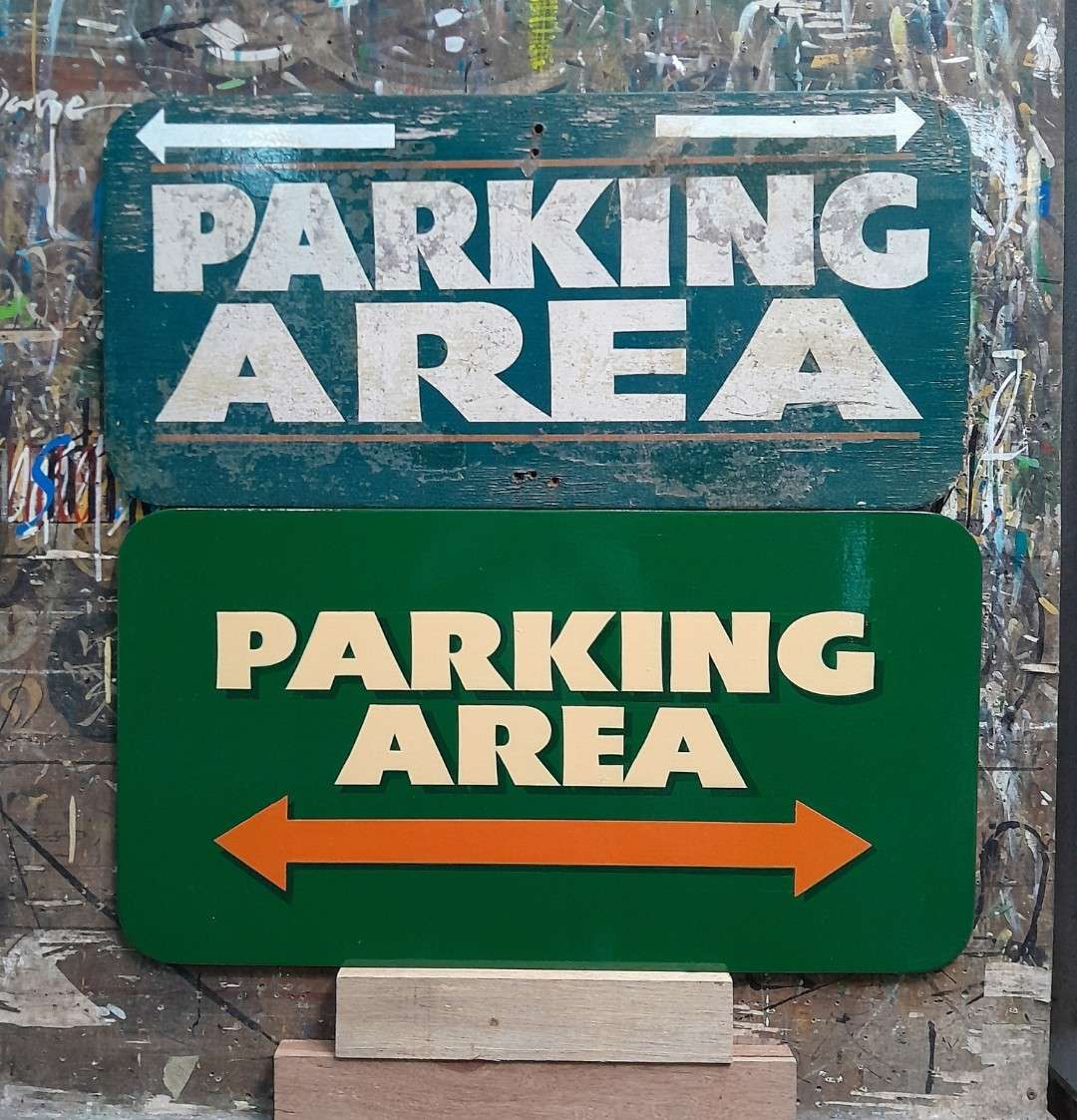
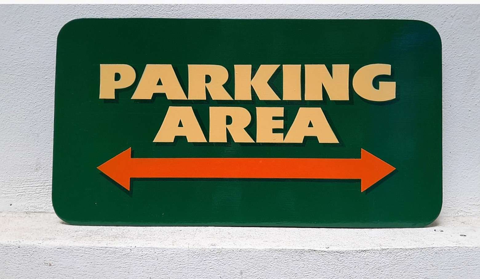
“This lettering was way too close to the edges from day one. Then somewhere along the line an arrow was added on the top in cut vinyl. More negative space and a stronger, repositioned orange arrow fixed this new sign and improved its legibility.”
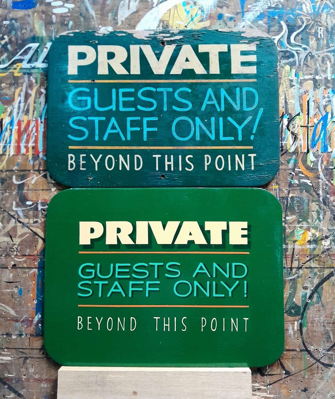
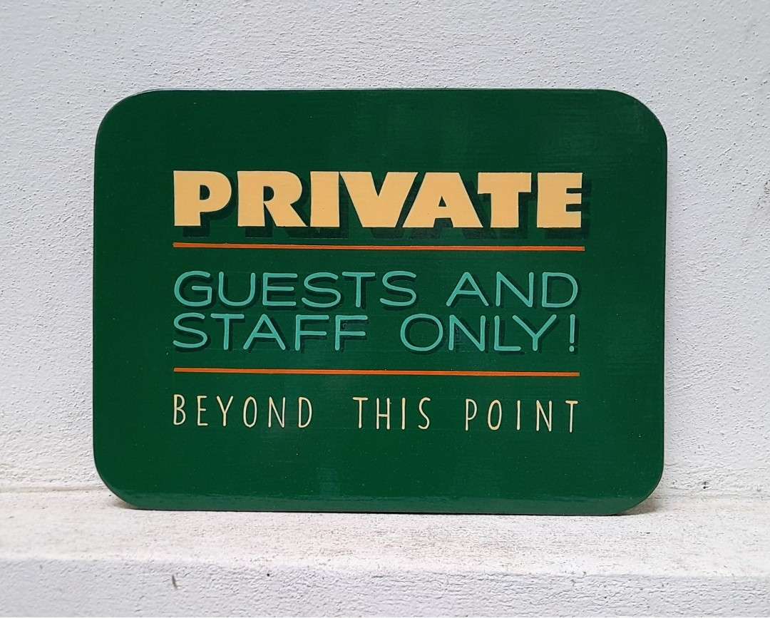
“Here I added more negative space—again. ‘Private’ is now bolder and the letter weight between ‘Guests’ and ‘Beyond’ is more pronounced for contrast. Now ‘Private’ is the first thing you read.”
“The main difference for this repaint on plywood is the shading. It was originally done with dots, but was done wet on wet on the new one. I also added a gloss ‘textured’ panel behind the lettering which was also convexed on the new version.”
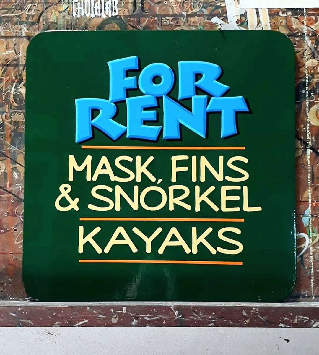
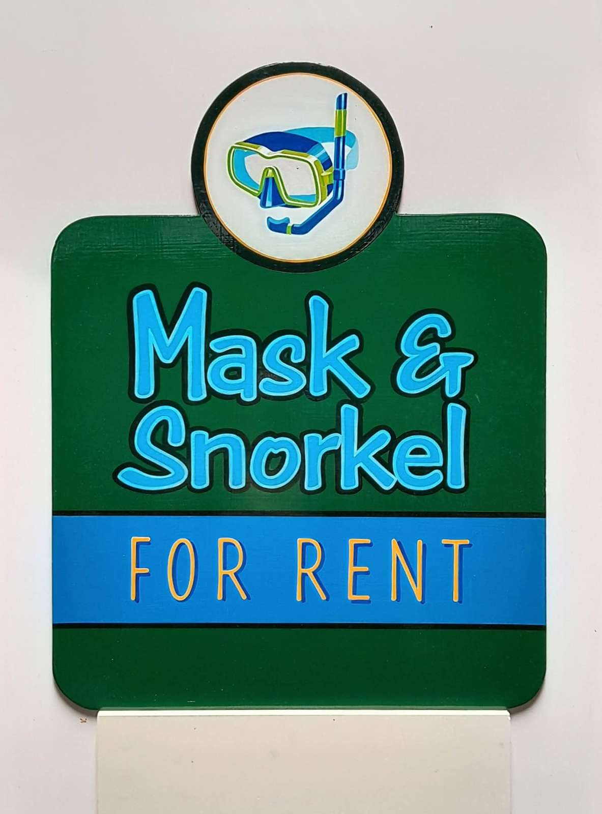
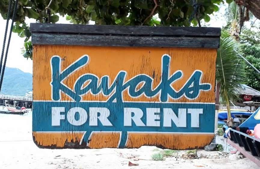
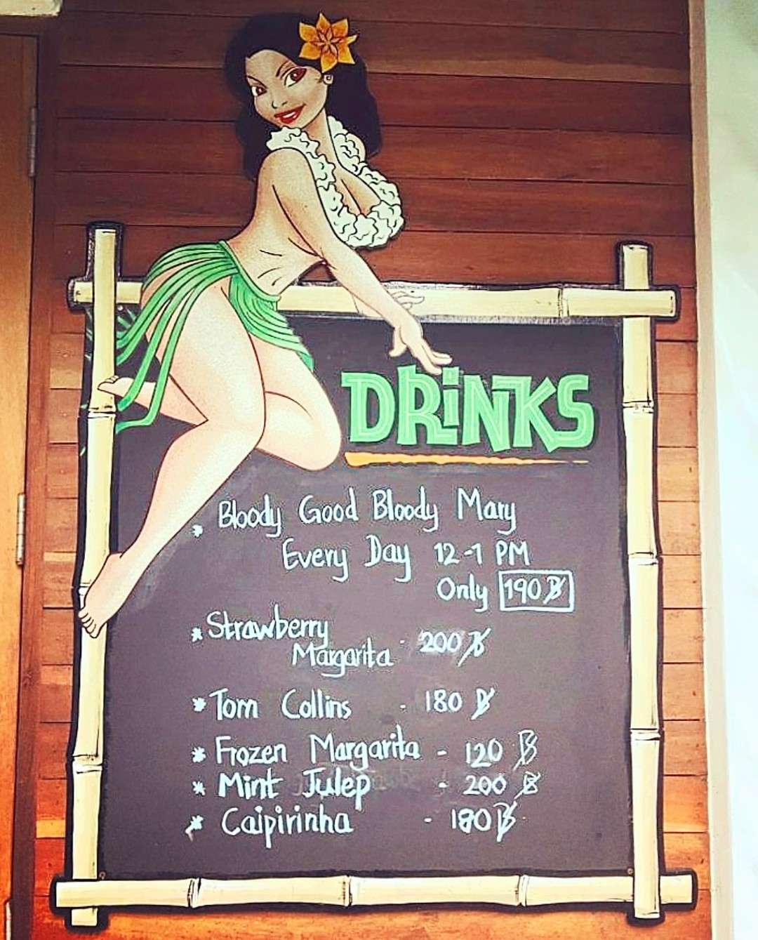
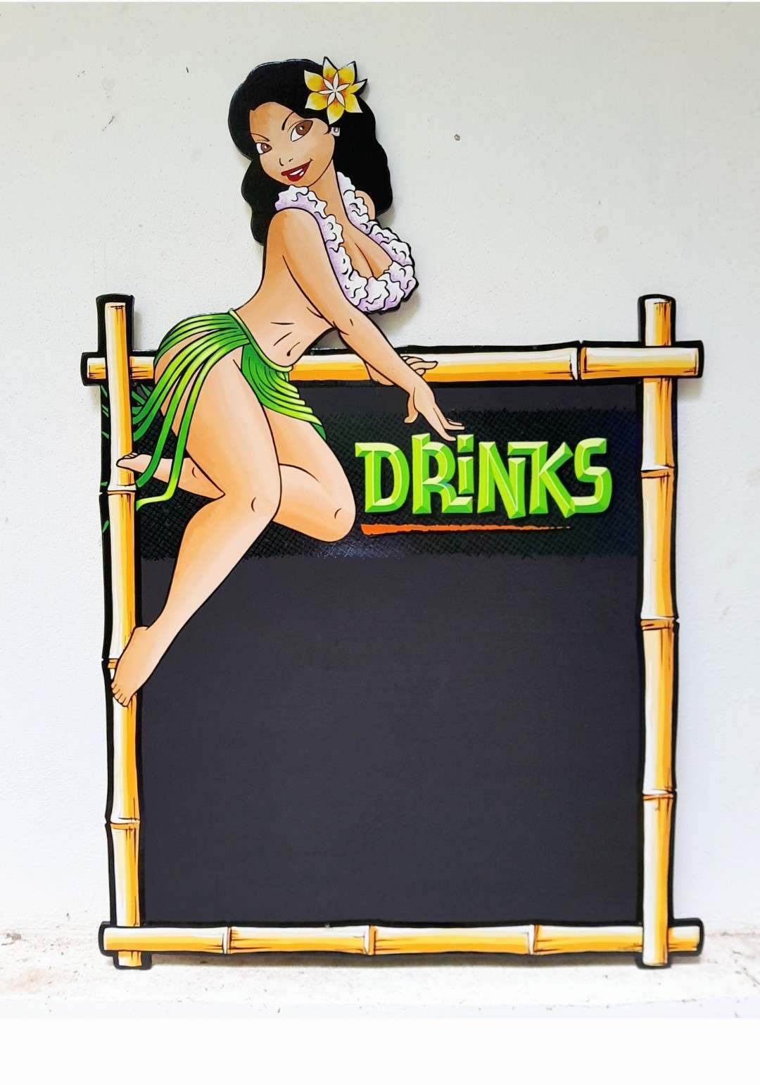
“I was always happy with the original sign, but they stopped renting kayaks and fins, so I added an illustration to simplify the message.”
