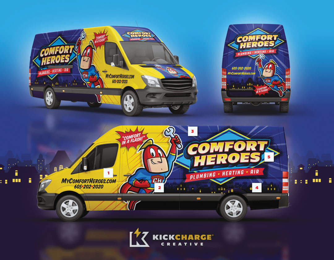

3. Our purple background here is bright, but still living behind the elements that are most important. Even the rays are subtle behind our badge, but leading the viewer to focus on the center of those rays, which is our badge.
4. The cityscape is there, but not so loud that it’s distracting us from what lives above it, which is our brand/badge.
5. Our badge design for the brand is far forward in the foreground where it belongs.
