By signcraft
Posted on Wednesday, January 27th, 2016
Sign makers have long been using special effects to make letters on flat signs more intriguing. Years ago it was common to add a quick shadow with a brush on the main copy, a few shades darker than the background. Gold leaf lettering got an outline and a drop shade. Today, digital printing has made gradient blends easy and other effects not only possible but practical.
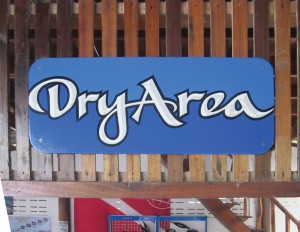
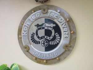
In his studio on the island of Koh Tao, Thailand, Rob Cooper adds all sorts of effects to all sorts of letters—mostly with a brush. On the town’s busy streets, most of the viewers are on foot, which gives a little extra time to lure their eyes to a sign with the look of dimension or texture or depth that really isn’t there on a flat sign.
“You use effects like you’re putting a little hot sauce on a taco,” Rob says. “A little goes a long way. If you overdo it, you can ruin it. You have to be careful with them so that they don’t hurt legibility or take away from the message.”
Take a look at these examples of Rob’s work, and see if they inspire you to find new opportunities to catch the viewer’s eye and draw them in for a closer look.

Good ol’ convex: No budget for carving? A simple two-color convex effect can add a taste of dimension.

Advanced convex: You can wring a little more out of the convex effect by adding a third darker shade on the letter’s facets and maybe a glowline on the “peaks” of the vertical strokes.

Fades: The gradient blend on these beefy Roman letters adds interest, especially with the inline and drop shade. While you’re at it, cutting away the sign’s background and adding a funky pizza graphic helps, too!

Embossed outline: It’s a bit hard to name this effect, which is a combination of an outline and a convex effect, but it sure looks great.

A design inside: A subtle graphic or texture inside a beefy letter makes you want to take a closer look.