By signcraft
Posted on Thursday, October 6th, 2016
It should be easy to make signs that stand out from the crowd, right? Not really. All sorts of things get in the way—the customer’s demands, excessive copy, the viewing distance, lack of understanding of layout principles, you name it. But fortunately there are a few easy ways to improve the odds that your sign design will do its job.
Here are six things you can use to ramp up the visual appeal of your signs and set your work apart. That’s good for your customer’s business because their signs are a better investment, and good for your business because it gives you something unique to sell: You know how to make signs that are more effective. That sure beats selling low prices and fast turnaround.
 Barry Branscum, Master’s Touch Sign Co., Clinton, Arkansas
Give the main message 2/3 of the space on the sign. Veteran sign designer Bob Behounek uses this rule of thumb to make sure the main message gets the push it deserves. It may seem like a lot, but it works. Using color, weight and contrast also helps keep the main message in the forefront.
 Braun Bleamer, Jet Sign Co., Palmerton, Pennsylvania
Stay away from medium weight typefaces. The next time you’re on the road, take a quick look at the signs you see. You’ll see plenty of medium weight typefaces. Most signs use a combination of medium and heavy weight type, or medium and light weight type. Try saving the medium weight for informational signs and use heavy and light weights to create advertising impact.
 Rob Cooper, Koh Tao, Thailand
Use a healthy margin. This can be tough to sell to some customers, but the space around the lettering is critical to the readability of the lettering. It frames the message and tells the reader’s eye, “Hey, look! This is what you want to read. It’s easy. It’s interesting. Nothing’s in your way.”
 David Showalter, David Design, Bryan, Ohio
 Barry Branscum, Master’s Touch Sign Co., Clinton, Arkansas
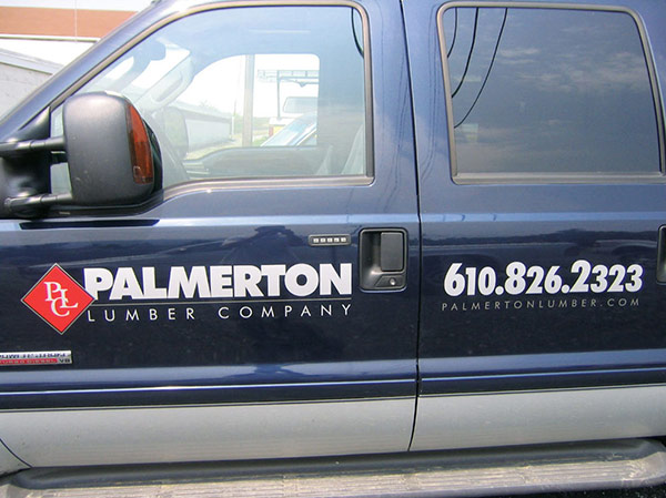
Cut the panel to shape. Who knows what percentage of signs are plain old rectangles? Almost all of them. But a few minutes with a scroll saw (or even less time on a CNC router) can make a sign much more appealing to look at. Appeal is essential if you want to snatch the viewer’s eye from all the things that can distract him from reading the sign. Creating a shape works well on a printed graphic, too, like this truck door.
 Dan Seese, Dan Seese Studios, Inc., Fort Collins, Colorado
Use a dark background—or any color but white. White signs abound—white vans, white banners, white 4-by-8s standing in cornfields. It’s never been easier, though, to use color on a background. You can print a dark blue background or buy a dark green prefinished panel or get a screaming yellow banner blank.

Group copy into related blocks and let them relate to one another. It doesn’t matter if a sign has minimal copy or multiple messages—grouping the copy into message blocks makes it easier for the reader to digest quickly. It organizes the messages for them so that they don’t have to wait for their brain to try to do it before they start reading.
You don’t need to use all of these tools on every sign. Using just one or two can help give your work the edge that customers, and viewers, will notice.
These approaches may seem risky or even scary. That’s great. You’re moving in the right direction—away from the comfort zone of conventional thinking and into the land of visual impact and appeal. It takes courage to get out of a rut.
Medium weight type, white backgrounds, rectangular signs and copy-filled panels bore the viewer. Dare to take advantage of these tips and watch your work get more effective and appealing. And watch sales get easier.
Most of these examples are from the September/October 2016 issue of SignCraft, and you’ll find way over 100 more eye-catching signs in that and every issue of SignCraft. Don’t miss another issue!