By signcraft
Posted on Friday, August 27th, 2021

Back in sign painting days the most common way to add some extra appeal to a letter was to add a shade or shadow. Customers always liked it and when well done, it added a sense of dimension that caught the viewer’s eye, too. Another common effect was to use an outline to increase the readability or power of a line of lettering.
That’s still true today. In the right color and used appropriately, a shade, shadow or outline can add a lot to a sign layout. And just as in sign painting days, these effects are still misused or used in such a way that they decrease the sign’s effectiveness. They’re not a replacement for good layout. They have to be used with care, as part of the layout—not as an afterthought when “something’s missing.”
This collection of 26 photos shows a few of the possibilities for using shades, shadows and outlines. As you look over them, you may want to take note of the size and colors of the shades and outlines—and at how the letters are spaced. All are key factors in using these effects successfully.
SignCraft, July/August 2004

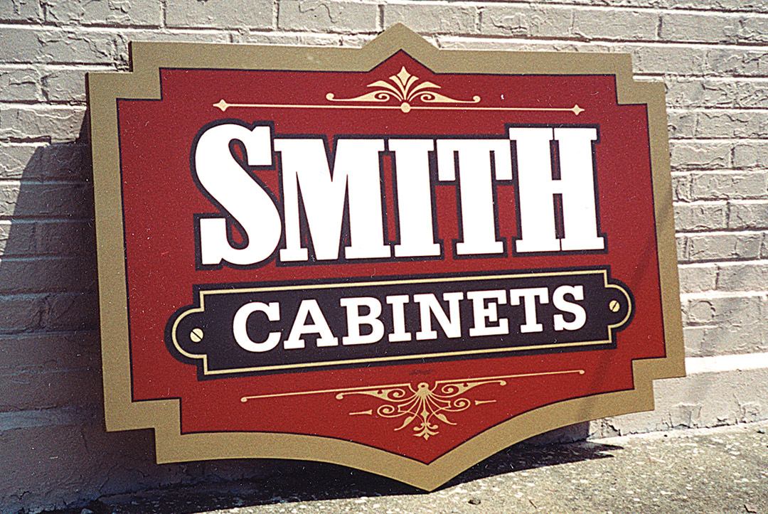
This bold outline makes the company name a unit. Tom Kelly, Lettermen Signage, Inc., Mokena, Illinois

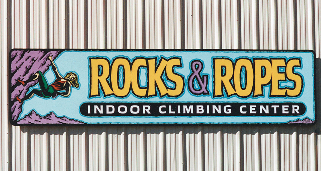
Lane Walker, Solo Signs, Reno, Nevada
![]()
Here, “Transmissions” got a pale purple highlight as well as a shade. Jeff Zeller, Shasta Lake, California

The outline is often a good place to introduce a new color to add interest. The stippled border is done using the process Mike described in “Stipple on an antique background” in the January/February 2004 issue of SignCraft. Mike Meyer, Meyer Signs, Mazeppa, Minnesota

Outline, convex outline, inshade, shadow—this door has them all. Bert Quimby, Bert Graphix, Pompton Lakes, New Jersey

Outlines work on dimensional signs, too. Dave Beatty, Dave Beatty Sign Artist, Sarnia, Ontario, Canada

Spacing an outline away from the letter lets the background color show through as an outline, too. David Showalter, David Design, Bryan, Ohio
Here a simple outline makes the company name more readable. Russ Mills, Artcraft Signs & Designs, Pineville, Kentucky

Convex outline adds dimension. Rob Cooper, Koh Tao, Thailand


A single shadow on the 1.3 Acres panel helps pull it forward. Raymond Chapman, Chapman Sign Studio, Temple, Texas

Rob Cooper, Koh Tao, Thailand
Who says outlines can’t be ragged? Kurt Schlaefer, Signs by Kurt, Tucson, Arizona


Outline with an inshade. Marvin Renter, MR Signs, Inc., Norfolk, Nebraska

Outlines and an inshade make the main copy look 3-D. Brian O’Prey

White outlines make this purple lettering more visible on the black background. Bert Quimby, Bert Graphix, Pompton Lakes, New Jersey

Ragged outlines and a highlight loosen up this lettering. Marvin Renter, MR Signs, Inc., Norfolk, Nebraska

Airbrushing a shadow gives a realistic effect. Bobbo Dunn, Bobbo’s Arts & Letters, Albuquerque, New Mexico

Outline with a drop shade. Todd Hanson, Hanson Graphix, Wauseon, Ohio

Double outlines do the trick here. John Deaton, Deaton Design, Ages-Brookside, Kentucky

Pushing the outline away from the letters can make an interesting effect. Russ Mills, Artcraft Signs & Designs, Pineville, Kentucky

Take a close look at the highlights, outlines and inshade here! Jeff Devey, Jeff’s Graphics, Twin Falls, Idaho

A shade works well on the border, too, sometimes. Bobbo Dunn, Bobbo’s Arts & Letters, Albuquerque, New Mexico

The red and black outlines and shade make the white letters work on yellow. John Deaton, Deaton Design, Ages-Brookside, Kentucky

A bold outline can connect the letters and make the words a unit. Russ Mills, Artcraft Signs & Designs, Pineville, Kentucky
