By David Kynaston
Posted on Thursday, April 14th, 2022

I live in North Wales, not far from a popular tourist attraction, called the Llangollen Canal. Originally used as a means of shipping goods around the country, it was a slow, but very efficient mode of transport. A barge about six feet wide and 55 feet long was pulled through the water by a horse along the towpath at about four miles an hour. The canal averages 25 feet wide, five feet deep and drops one inch per mile.
Two miles from my home stands Pontcysyllte, the largest aqueduct in England and Wales. It carries the canal over a valley, the highest point being 126 feet above the ground. It was built two hundred years ago. Our family’s ancestors owned the nearby Kynaston Foundry, which was used in smelting the iron used in the aqueduct.
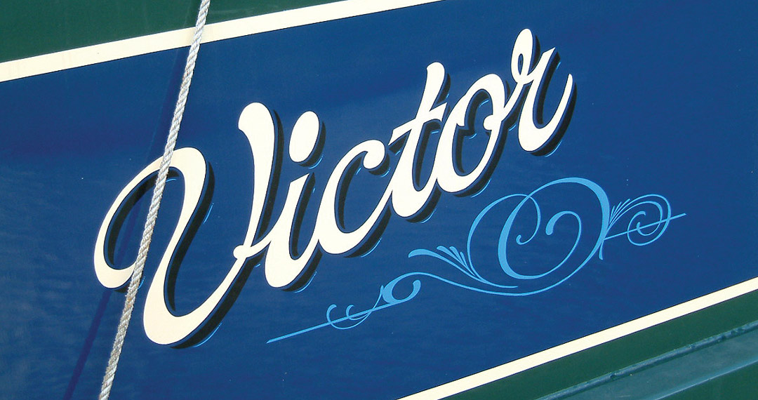
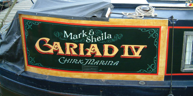
The people who lived on the boats took great pride in them, and this was reflected in the colorful paint schemes. Many are still in use today and they are as popular as ever. Many people live on them; others hire them for holidays. I sign write one or two of these a month for local boat painter Eddie Strong. We keep them as traditional as possible.
David Kynaston’s shop, David Kynaston Signs, is in Llangollen, North Wales, United Kingdom. His web address is www.davidkynaston.co.uk.
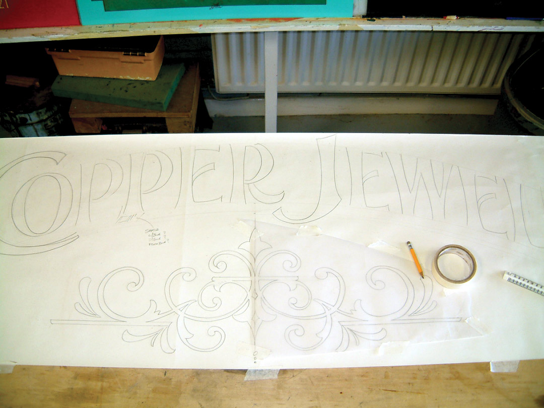
I design and make up a pattern in my workshop. Arched lettering is used frequently on these boats.

I lightly sketch the layout then go over it with a ballpoint pen to clean it up.

I rub the back of the paper with a charcoal stick, then vacuum off the excess dust. Making the pattern takes two hours or less. Once on site, I center the pattern on the panel, apply it with masking tape, then pounce it. On a dark ground I would use chalk on the back or pounce the drawing.

Here’s my on-site workbench.

Using a strong contrasting color, dark brown, I start the sign writing using 1-Shot lettering enamels, and A.S. Handover 2112 brushes (Numbers 5 and 3). The enamel covers in one coat; if two coats are needed, I go over it again as soon as I reach the end.

The other color of the boat is blue, so this is good for the shadow. It’s a different family from the brown and cream so it provides a good contrast. I mix in a bit of light blue and chamois to take it into the background.

I add dark blue to my mix for the under parts.

For the highlights, I added some white to the original mix.

For the cast shadow, a slightly darker version of the background works best. I added a touch of medium brown to chamois. I take great care in placing this, as it is cast off the blue blocking and not the letters.

Here’s the finished job—two sides lettered in one day’s work.