By signcraft
Posted on Friday, August 5th, 2022

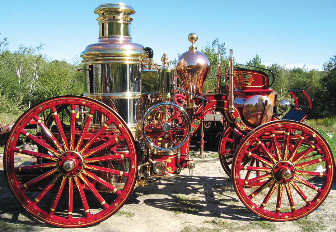
Americans have been decorating fire apparatus for a long time—by most accounts, for over 200 years. The embellishment has always been elaborate, and the styles of decoration have changed over time. Peter Achorn of Tenants Harbor, Maine, is a gilder and striper who has logged countless hours researching—and restoring—these vintage fire trucks. He has this to tell about the evolution of the art form:
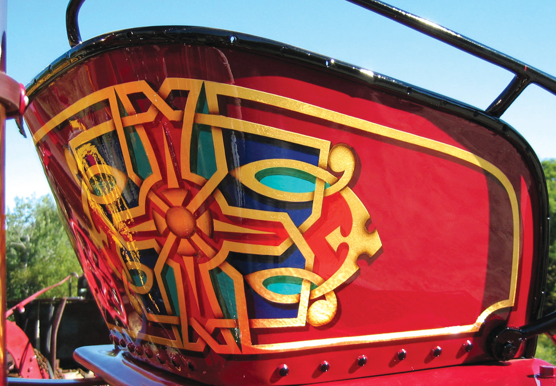
“The older they are, the more decorated they are. In the early 1800s, they hadn’t really figured out what classic fire engine decoration was going to look like. By the middle of the century, there were some wild things out there on fire engines—some with Egyptian people walking down the side of them, others covered with morning glory flowers. Beautiful work, but not what I think of as fire engine decoration.
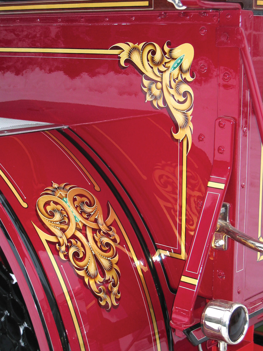
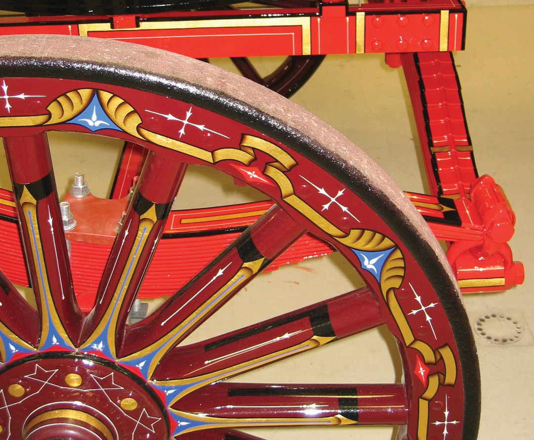
“By the late 1800s there were fewer fire engine companies and the designs kind of stabilized. Decoration had evolved primarily into leaves and scrolls, and companies identified their apparatus partly by coming up with definitive styles of scrollwork. At a fire, you could pick out the different brands of fire equipment just by looking at the fender decorations.
“In the early years, fire engines weren’t always red, either—they were often green or yellow. Different pigments varied in cost, and dark red paint was the costliest. In the later part of the century red started to catch on, and eventually became the tradition.
“People often ask why fire engines have been decorated so much. It’s a good question, since we don’t see that sort of decoration on police cars and ambulances. I think it goes back to colonial times, when the fire engine was the only vehicle owned by the whole town.
“There was a lot of new thinking going on—and Thomas Jefferson did a lot to promote this— such as the notion that ‘In America, every man is king.’ So in some ways, these fire engines are referring to the carriages that European royalty traveled in. There was competition between towns, too, as far as how elaborately decorated their machines were.
“Most of these old machines were decorated at the factory, and the quality of the workmanship is excellent. Every once in a while, a town would have the wagon delivered without stripes and they’d put the stripes on themselves. You can tell—they’re striped like a farm tractor. And yet, there’s history there.
“I remember working on a restored Studebaker wagon which had been built for the U.S. Army long before the Civil War, back when the Army’s colors were yellow and black. The Army requested that the wagons be delivered plain, without stripes—but Studebaker refused. I saw a copy of the letter they sent in reply. Their response was, ‘If you want wagons without stripes, you don’t want a Studebaker.’”
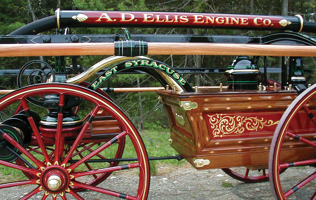
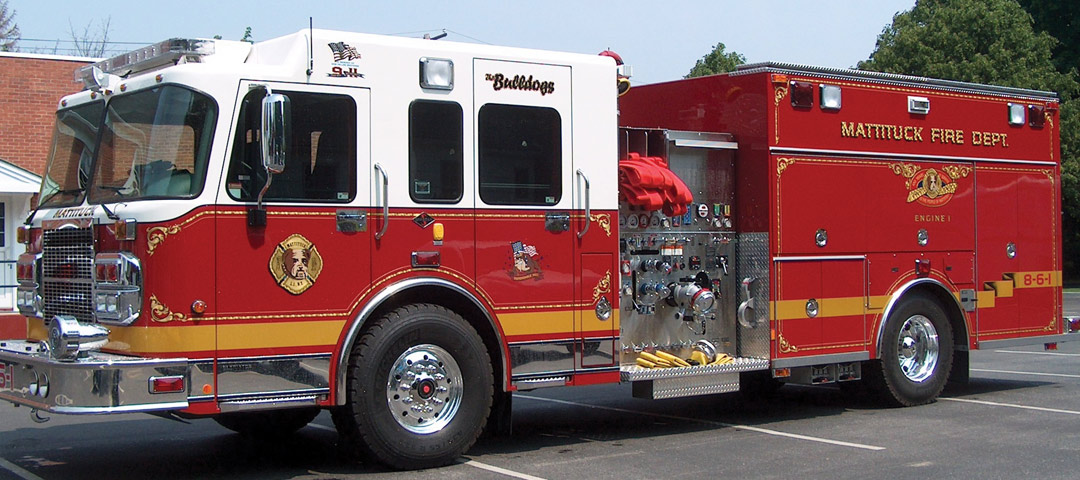
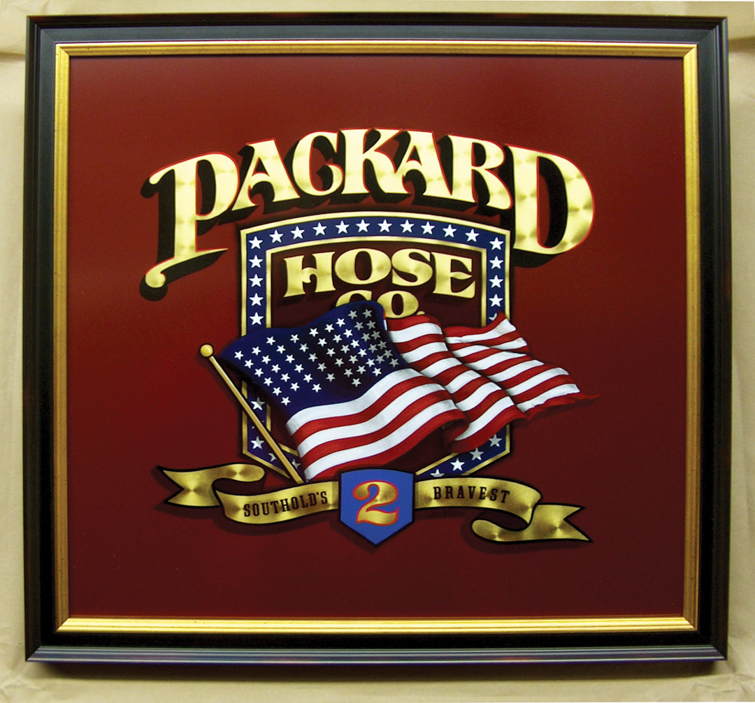
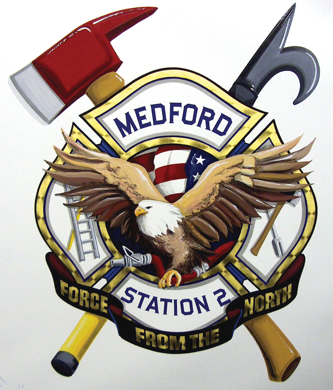
The photos you see here showcase the work of Peter, who specializes in fire engine restoration, and Jim Fetten of Jamesport, New York. Jim also specializes in lettering and decorating fire apparatus, focusing primarily on modern equipment.
Peter Achorn:
“I was a sign painter for years. I guess I still am a sign painter, but I just don’t do very many signs. Now I specialize in putting names on boats and restoring antique fire engines. It breaks down to something like 40% fire engines and 60% boats. I do almost all my restoration work for one particular restoration company.
“I also do pinstriping on antique cars—once you start meeting antique collectors, that’s the way it goes. Most people who own an antique fire engine also own an antique car, so I get to do a lot of work for museums and collectors.
“I really like doing the research on these old vehicles. I want to get each one as accurate as possible—I often take off the layers of paint until I reach the original designs. There’s always something there, graphically, that I would never have thought of. Maybe it doesn’t quite make sense, but by the time I’m done with the restoration, I think, ‘Boy, you know, it all did make sense!’
“By the end of a restoration, I feel like I know the artist who did the work on that machine originally. A lot of those early stripers, geez, they were really good. The thinnest, best stripes I’ve ever seen were on vehicles that are 150 years old.”

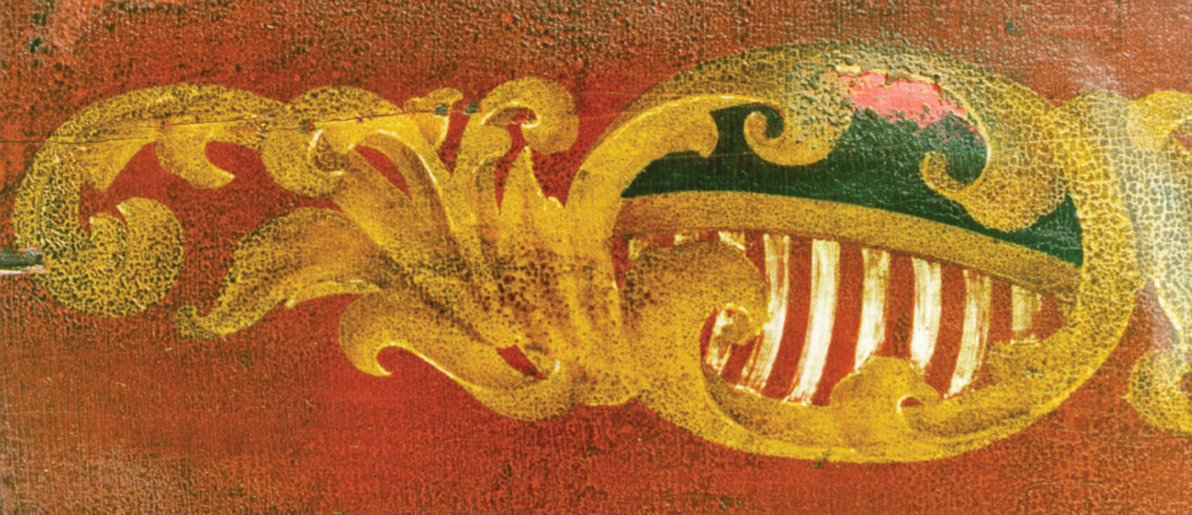
This is an original design from 1850, discovered beneath layers of paint . . .
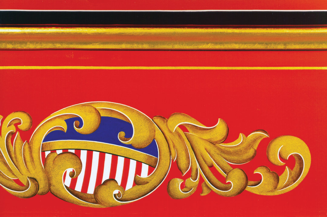
. . . and this is Peter Achorn’s restored version.
Jim Fetten:
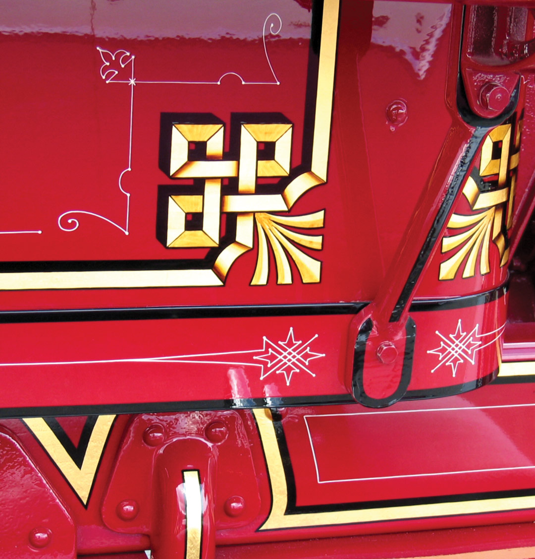
“I’ve been painting signs for 38 years—my first job in a sign shop came when I was 19. For the past fifteen years or so, my focus has mainly been fire trucks, and now they make up about 90% of what I do. I get to do some restorations, but mostly I work on new trucks. So I do mostly gilding, some 22K gold vinyl film, and some reflective film.
“Most of the work is done for fire departments, but occasionally a manufacturer will contact me. I have a one-man shop, and a part-time helper, Carol Callan, who comes in when I need another set of hands to set up vinyl and prepare backgrounds. She helps with gilding as well. We’ve worked together now for nineteen years.
“I employ the old hand-done gold leaf as much as I can, but that’s not always the most practical approach. For chief’s cars, I primarily use 22K gold film. Gold leaf and varnish hold up okay on fire trucks because they’re inside most of the time, but I stopped using traditional gold leaf on chief’s cars years ago because they get more abuse. I’ll often put clear vinyl over gold leaf in order to protect it.
“There a few other hybrid techniques that I occasionally use. Sometimes I’ll cut the emblem from 22K gold film, apply it to the vehicle, then do all my hand painting and shading right over the vinyl film. Then, after it’s done, I’ll put a layer of clear vinyl film over the whole thing.
“Another technique I’ve used is to paint and gild the design on a piece of clear vinyl film, cover it with another layer of clear vinyl film, then apply that ‘decal’ to the vehicle.
“I use asphaltum for shading on scrollwork on all my trucks. For shading on vehicles that are exposed to the elements 24/7, I use 1 Shot Tinting Black. Asphaltum is photosensitive and after a year or so outside it slowly fades away.
“Being a one-man shop enables me to concentrate on my work. There’s more and more work coming in, but I’m not getting backed up—I’m able to stay even with it. I have a comfortable backlog that allows me to focus on taking care of my long-term customers.”
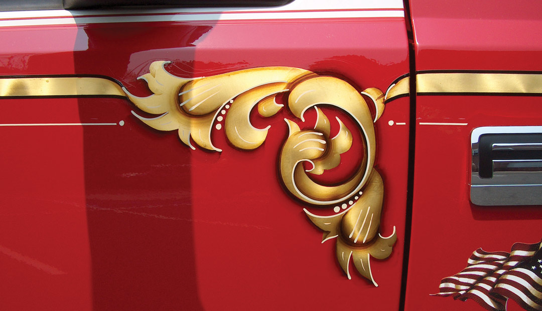

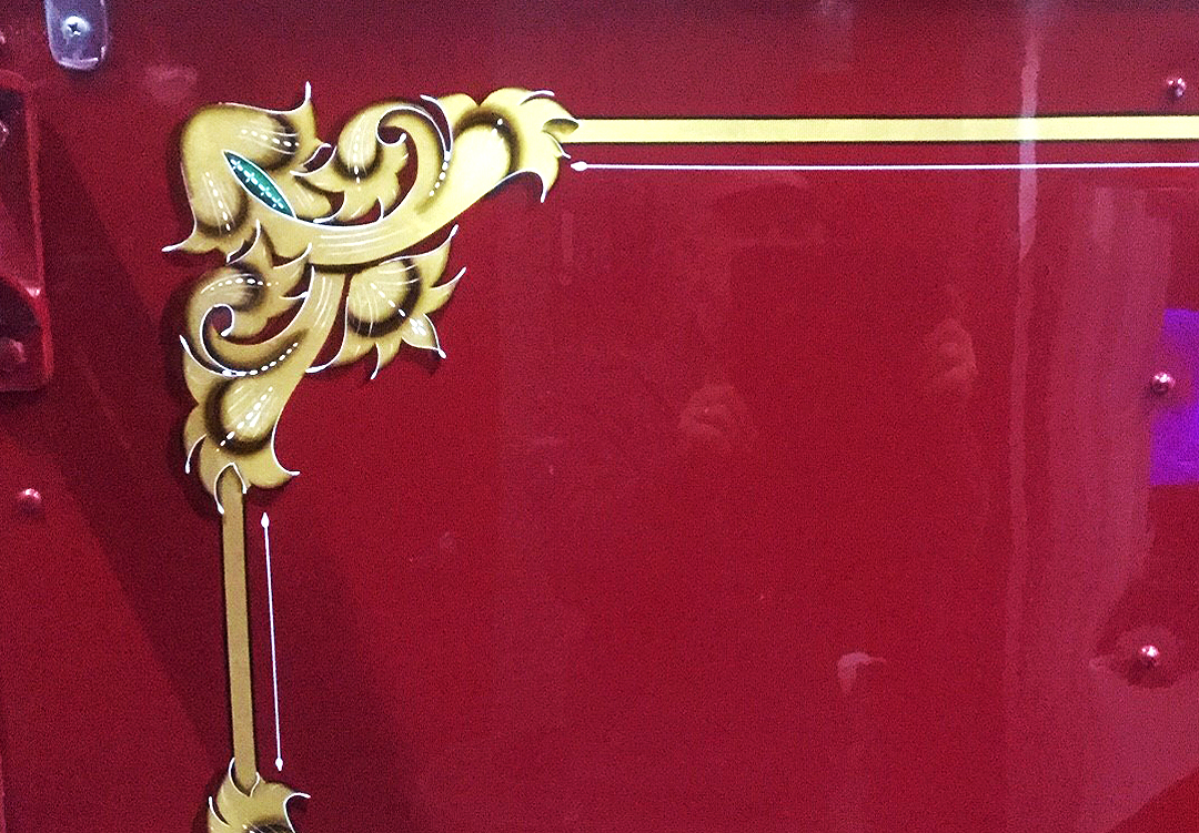
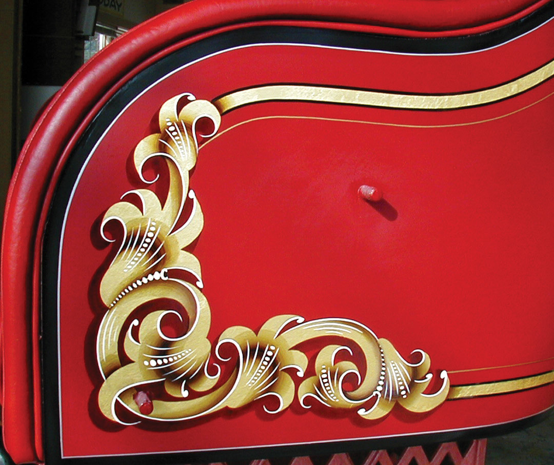
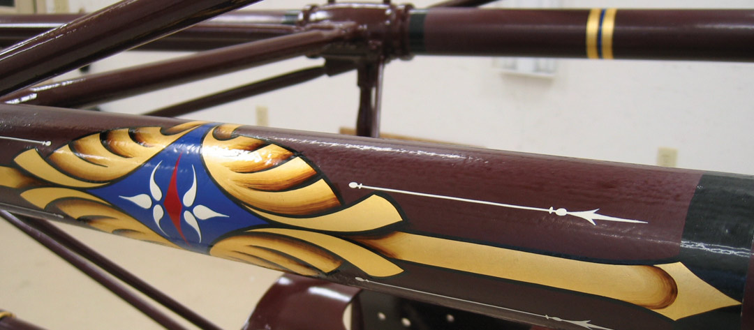
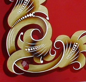
Peter on adding dimension with asphaltum-tinted varnish
Here’s a classic technique that creates the incredible dimension to the traditional scrolls uses on fire apparatus. Peter describes the process start-to-finish:
When these fire engines come to me from the restorer, they’ve been painted with two-part polyurethane automotive paint, and lightly scuffed with very fine sandpaper. It’s a beautiful smooth surface that takes paint really well.
The biggest problem for me is what comes after my work is done, when the restoration company sprays automotive clear over my work. That has led to some bad experiences. My paint has to dry for several weeks in order to avoid problems with the automotive clear.
For most of my work, I use 1 Shot enamel paint with a bit of 1 Shot hardener added to it. That makes it more compatible with the two-part polyurethane used for clear coating.
OLYMPUS DIGITAL CAMERA
I’ve tried other things—oil paints and things like that—for shading, but I just keep coming back to the asphaltum. I like the idea of using the original material. Asphaltum is the perfect color, too. When an asphaltum stroke goes across the red paint, on to the gold, then on to green, it looks like a natural shadow on all three colors. Oil paint, on the other hand, must be mixed to a certain shade for going over each of those colors.
I tried mixing different kinds of clear with the asphaltum, but some dried too glossy, causing the automotive overcoat clear to fisheye. I use the 1 Shot Sign Restoring Clear, and it’s working fine. To do one of those big gold scrolls, I put the gold on first and brush on a single overcoat of clear. That way, if I make a mistake with the shading, I can just wipe it off without affecting the gold.
You start with a palette and a big, thick quill, about a #14 or #16. Mix the asphaltum 50/50 with the clear—the asphaltum by itself isn’t quite paint yet, so it has to be mixed with a binder. Put a little blob of that on a palette, which, by the way, is a piece of brass. I use that because it’s gold-colored, which shows me what the shading will look like on the gold.
Load your brush up with some clean clear, and palette it back and forth right near that blob of asphaltum—back-and-forth, back-and-forth, and work your way up until you’re just touching, with one edge of the brush, that asphaltum blob. Pretty soon the brush will flatten out into a chisel shape, and at one edge it’s dark asphaltum and at the other edge it’s still clear. That gives you a stroke that’s opaque asphaltum fading to clear.
Generally you can do one or two strokes and then you have to palette again. That’s how you work your way through the design—two strokes and palette, two strokes and palette. Eventually the asphaltum in the brush creeps over to the side that’s supposed to be clear, so you have to wash out the brush every six or seven strokes.
For extra dimension, you can make a stroke that goes from light to dark then back to light; you get this effect by flipping the brush over and placing the dark edge of the brush up against the dark edge of the stroke. It takes two strokes, but it’s a neat effect—it really makes those leaves look like they fold over.
After the asphaltum is dry—and that takes a while—go back and add very fine white and black lines for accent. If the gold isn’t reflecting, as on a gray day or under a tree, those white lines enhance the highlights.
You’ll find more of Peter’s work at www.firegold.com, and Jim’s work at www.firetrucklettering.com.
This appeared in the January/February 2008 issue of SignCraft.
