By Dan Antonelli
Posted on Friday, September 2nd, 2022

With so many easy-to-use filters and special effects now available, it’s easy to get carried away with adding all sorts of bells and whistles to your designs—often at the expense of the basics of good logo design. On more than one occasion I’ve surely been guilty of adding a lot of details and effects to a logo. As a former student of the school of Jersey Style Truck Lettering I should get a free pass on some of those design faux pas.
I am still frequently asked to design logos that integrate bevels, prismatic effects and lots of airbrushing. But more and more, we try to push our clients into a more iconic approach to logo design—one that’s easy to read and understand.
Outdoors, the added special effects on logos serve to only hinder legibility in most instances. While the logo may look great from three feet away, how do they look from 10 or 20 feet away? Does it pass the tried-and-true “squint test?” (Step back, squint your eyes and see if it is still legible.)
Before the era of airbrushing and Photoshop filters, sign painters knew the value of good, simple layouts for logos. They didn’t want the viewer to have to work too hard to discern the message. But today, many designers use filters and special effects as crutches to attempt to overcome weak layouts and poor design and typography skills.
This is especially true as it relates to vehicle advertising. I continue to see designers completely miss the advertising opportunity presented to them. They design wraps with a myriad of photos and Photoshop filters—but no clear message or focal point.
So, the next time you’re about to bevel that logo, consider whether or not you’re actually hurting or helping the design. If the design doesn’t work without any bells and whistles, it’s not going to get any better with them.
This appeared in the September/October 2008 issue of SignCraft.
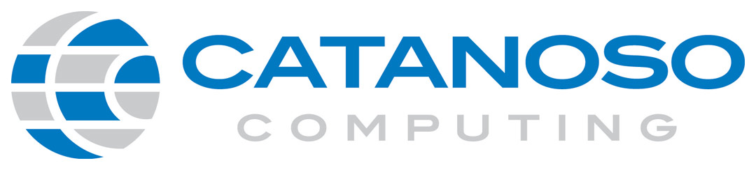
A basic icon and simple typography make this small IT company look a lot larger and more professional. The circle with the two C’s in it creates a unique and identifiable part of the brand, which we integrated on their website and stationery.
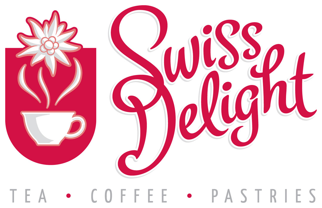
We did this logo for a small café in Switzerland. The client found our work online and called upon us to create a brand for his new café. This was a fun project—he sent pictures of his store, the street and the surrounding stores so we could get a sense of what the area was like. The flower in the logo is the national flower of Switzerland. The typography is hand drawn.
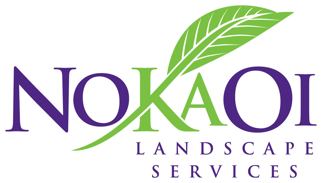
This logo for an Hawaiian landscape firm integrates a leaf element into some clean typography (in this case, Trajan). Note how the A is tucked tighter to the K to make up for the awkward letterspace issue that arose by placing the K and A together. Subtle tweaks like this are often the difference between a good logo and a great one. Had I not altered the letterspace, you would be left with a gaping white space nearly at the design’s optical center.
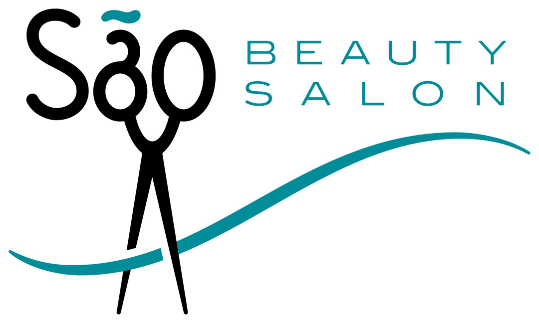
Here’s an interesting approach for this hair salon. The scissors, while certainly an obvious icon and symbol for this particular business, are integrated in a more unique and non-so-obvious manner. The beauty of this logo lies in the fact that the viewer does not have to work too hard to get the message.
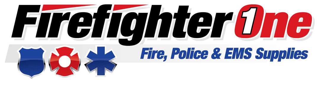
Here’s a simple logo for a company that supplies equipment to police, EMS and firefighters. Easy-to-read typography and the icons communicate the three core lines of business. The subtle grey drop shadow provides a little bit of added depth, but with or without it, the logo would still work fine.
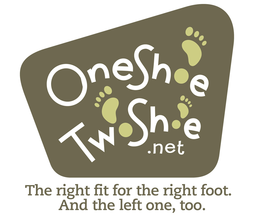
This interesting online store sells left and right shoes of different sizes. We opted for a more playful approach that would work in conjunction with the tagline. The simple, yet unique, panel shape and the customized type for the main copy make this logo more interesting and memorable.
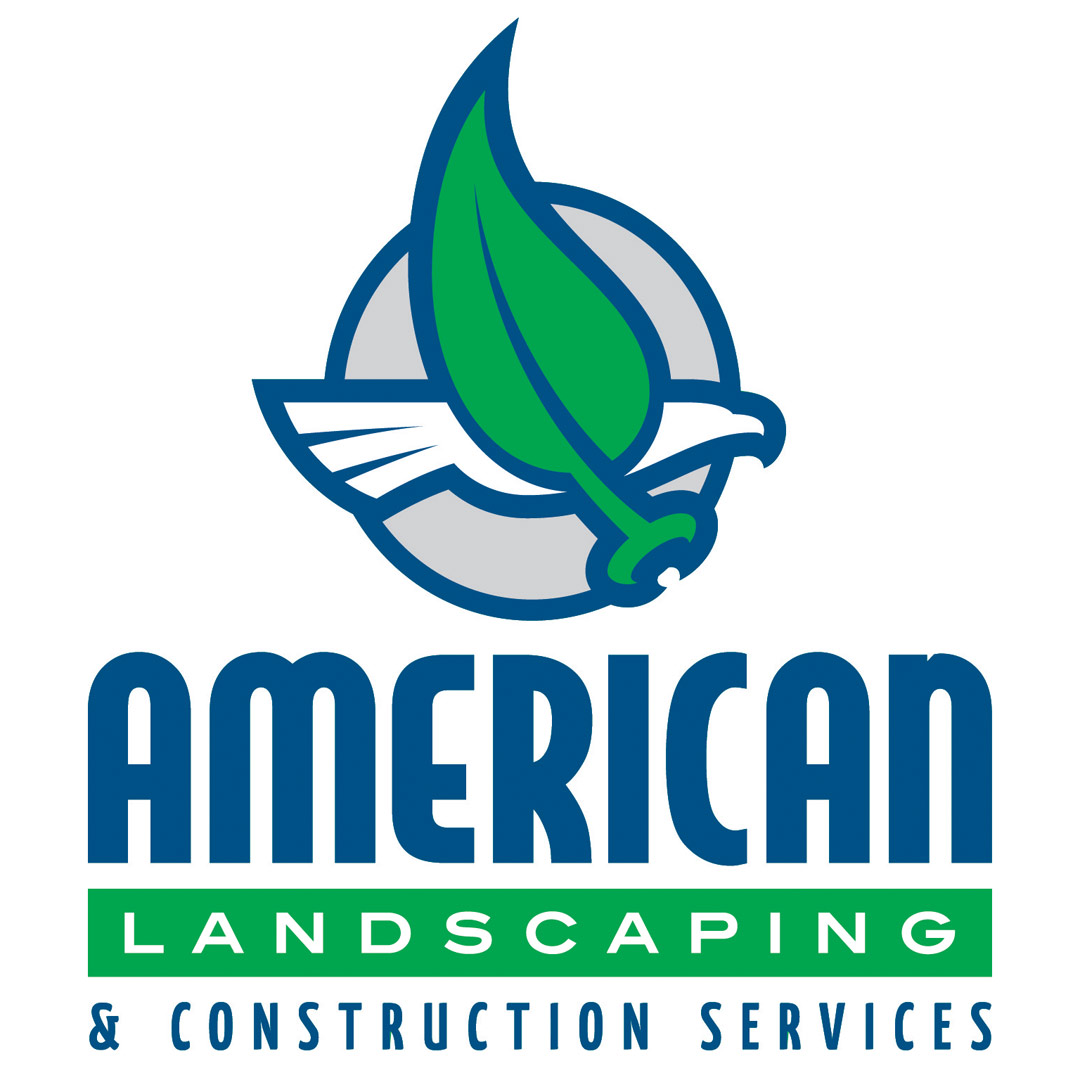
The simple but bold icon brings home the primary words in the logo. With the eagle representing “American” and the leaf representing “Landscaping,” this icon is able to communicate a lot. It’s very difficult to pull off two concepts in one icon, but in this instance I think we nailed it.
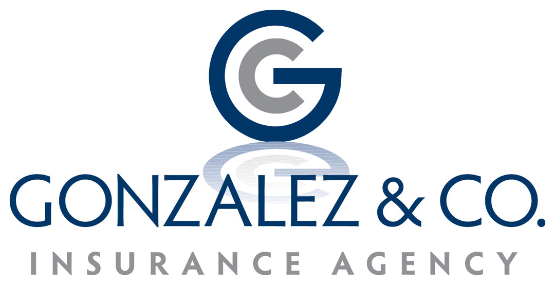
It’s always hard to develop icons that communicate abstract lines of businesses. Here we thought it would be best to develop a logo around their initials. The simple, bolder sans-serif icon coupled with the lighter main copy type play off each other and balance the overall design. The subtle mirror reflection gives it an added impression of depth and makes the logo a little ”fresher.” With or without the reflection, though, the logo would work just fine.
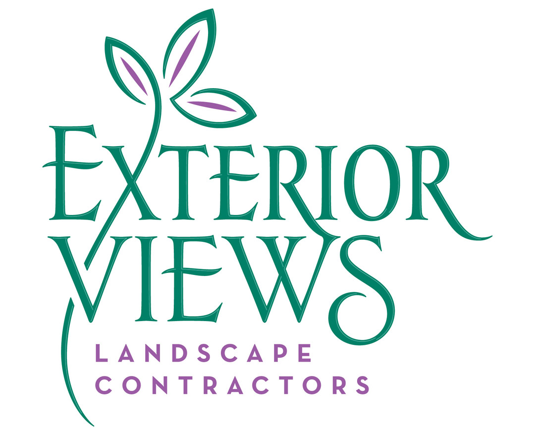
This elegant, hand-drawn typography and simple graphic make for an easy-to-read logo that communicates professionalism and sophistication for this high-end landscape design firm.
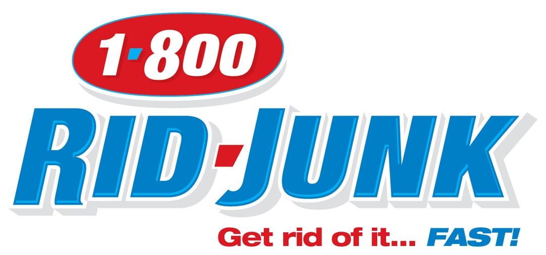
Here’s a very simple, type-based logo for a company that does junk removal for homes and businesses. Sometimes, these simple logos can create the appearance of a larger scale company. The reversed phone number helps create a more memorable icon than if it was just done the same as RID-JUNK.
This appeared in the November/December 2008 issue of SignCraft.
Dan Antonelli owns KickCharge Creative (formerly Graphic D-Signs, Inc.) in Washington, New Jersey. His latest book, Building a Big Small Business Brand, joins his Logo Design for Small Business I and II. He can be reached at dan@kickcharge. com. Dan also offers consulting and business coaching services to sign companies. For more information, visit danantonelli.com. On Instagram: @danantonelli_kickcharge.
