By Mike Jackson
Posted on Friday, September 16th, 2022

Select the Text tool, click somewhere on the page to set to location, then type away. Resize the type to fit the space and you’re ready for production. Right? Maybe that is true sometimes, but in most cases, you need to analyze the line of text and make a few minor adjustments to the oddball spacing that occurs between certain pairs of letter pairs that may be awkward or hamper readability. The process of decreasing the space between any two letters is called kerning.
Ideally, the white space between all letter pairs in a word or line of text should be optically equal. In some extreme cases, failure to properly kern the lettering can make a single word appear to be two words. Better quality fonts will usually contain thousands of kerning pair adjustments built into the font metrics. Hand kerning may be needed on only a few isolated kerning pairs.
Conversely, many fonts offered online as shareware or freeware may have little or no kerning metrics built into the font. While they may be cheap initially, the added time you spend kerning text properly may cost you in the long run. And if you don’t take that time, your end product may be weak or inferior.
The good news: adjusting kerning isn’t hard to do. Even though the process can vary a little from program to program, it’s much the same and generally easy. The examples included here will attempt to show how many of the popular programs handle kerning.
The basics of kerning
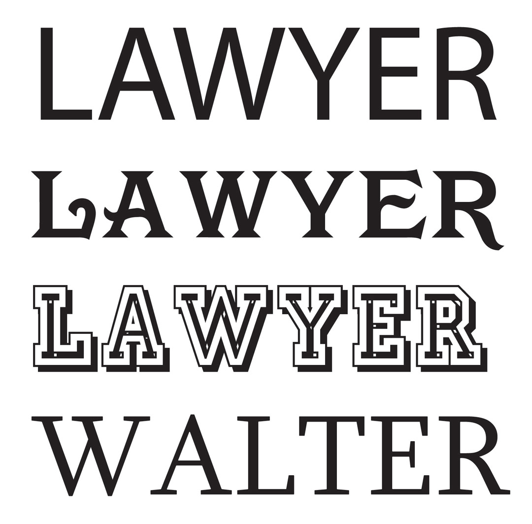
As mentioned earlier, the goal is to make the letter spacing in a word appear optically equal. Round letters like O, G, C and the right side of a D need to be spaced closer than straight sided letters like M, N, I, H and so forth. Some of the extreme problem letter pairs are LT, AT, TA, LY, AY, LW and so forth.
When I was learning to hand letter, I was told to imagine how many BBs or marbles it would take to fill the space between an M and an N. The size of the small element depends on the size of the lettering, of course. On a billboard, the spacing might be better judged by thinking of the number of cantaloupes or tennis balls.
Then I was told to adjust the spacing on the next letter pair based on an equal number of BBs, marbles, cantaloupes or tennis balls. If the next letter was an A, the left corner of the A might be quite close to the straight sided letter such as an M. Combinations like LT will normally overlap in an effort to equalize the space. Lastly, combinations like WY might even be welded together.
In the end, taking the extra few minutes to manually kern your headline text can help your end product tremendously. Failure to pay attention to this small step can put you and your company in the “amateur” league.
Anyone can type in some text. A pro takes the time to get it right. If you need more information on how to manually kern using your software, try the Help button. Type in either kerning or kerning pairs. Lastly, if you are doing pool rules or menus regularly, I’d suggest buying high quality fonts to cut down on the manual kerning.
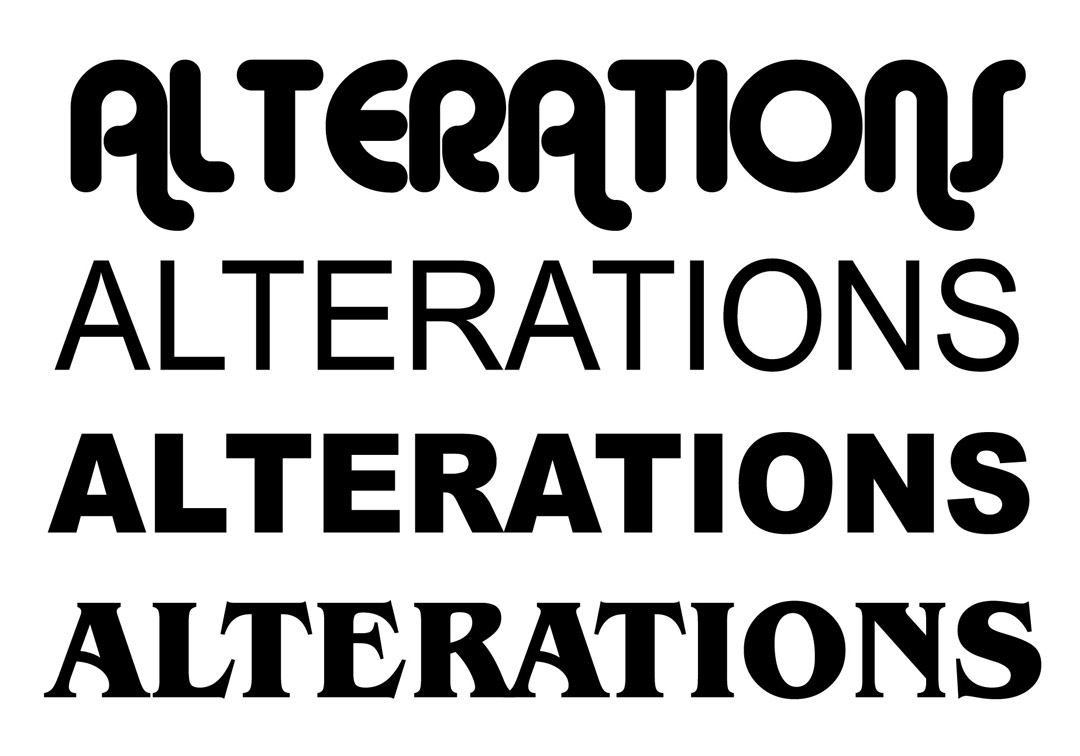
The quality of a typeface’s kerning varies from font to font. Above are a few examples of text entered before kerning. The first one is in Myriad Pro, which does a pretty good job on a tough word. The other three show typical examples of how default kerning can create annoying breaks in a word.
How to kern in Adobe Illustrator or Photoshop:
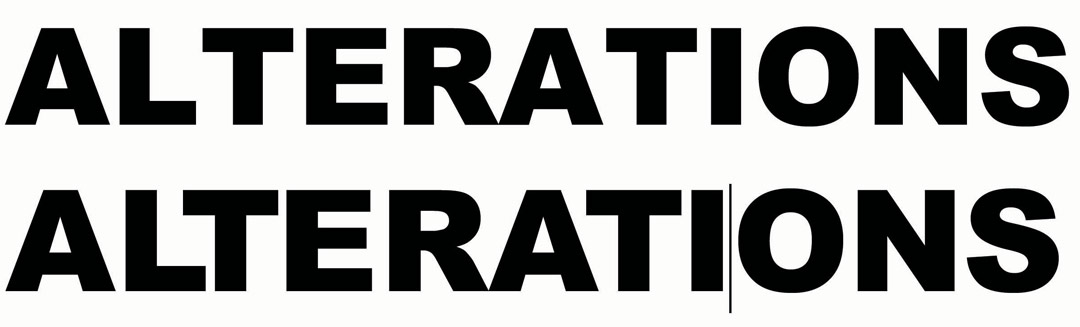
This group of words were entered into Adobe Illustrator with no additional kerning. The top two have kerning problems while the last one was kerned fairly well on the initial text entry.
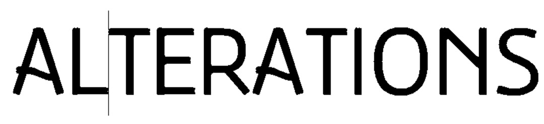
Enter the text and evaluate the kerning. To fix a kerning problem, select the Text tool and click between the problem letters to set the cursor. Simply hold the ALT key down on the keyboard and press the left arrow button to reduce space or the right arrow button to add space. (Note: These are the right/left arrow buttons and not the greater than or less than keys.) To move the cursor to another kerning pair, release the ALT button and toggle to the next pair by pressing the left or right arrow buttons and continue kerning as before. Alternatively, you can move the mouse to the next problem pair and click between them to set the cursor point. This technique works with most Adobe products.
How to kern in Gerber Graphix Advantage and Omega:

When the text is entered onto the work surface, spacing problems may appear.

With the Text tool still selected, click the cursor between any two problem letters to set the cursor. To adjust kerning, hold down the Shift key and press the < (on the keyboard above the comma key) to reduce kerning. To add space between any two characters, hold the Shift key down and press the > key (the character above the period). To move to another set of kerning pairs, either click the mouse in the new location, or use the forward arrow or back arrow. Continue kerning as required.
Here are the results of the kerning tweaks.
How to kern in CorelDRAW:


This shows the original text spaced as entered. It has a few problems that need fixed. When the text is selected, each letter has a small kerning handle on the lower left as seen in the enlarged image.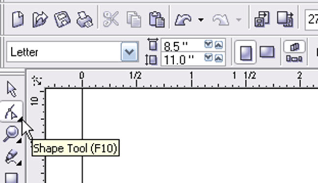
To adjust kerning, select the Shape tool from the toolbar.

Click any of the kerning nodes with the Shape tool, and the white box will turn black. If more than one letter needs to be adjusted, do a “marquee” select (Click-Drag) multiple nodes. With one or more nodes selected, press the left or right arrow on the keyboard (not the > greater than, or < less than keys). Each press on the arrow buttons will adjust the kerning with coarse adjustments. For less aggressive kerning, hold down the Control key as you click the arrow buttons.
Besides using the left and right arrows, you can also simply click on any (or several) of the letter nodes and move it/them anywhere you want by dragging the mouse around the workspace. If you hold the Control key down, you will constrain movement to horizontal directions only. This allows for very controlled adjustments.

Here are the results of manual kerning in CorelDRAW.
This appeared in the November/December 2008 issue of SignCraft.
Mike and Darla Jackson operate Golden Studios in Loveland, Colorado, and do a variety of sign-related projects. Mike’s website is www.goldenstudios.com. His email address is golden@goldenstudios.com. You can see more of Mike’s photos at www.mikejacksonphotography.com and www.goldenstudios.com.
