By George Perkins
Posted on Friday, September 9th, 2022

Early in my career I did a lot of racecar work, mostly dirt track cars. My goal was to have the car show up well out on the racetrack. That experience taught me a lot about contrast and the use of outlines and shadows. I was at the track every weekend and studied what worked and what didn’t. One of those powerful lessons was that what looks good up close often doesn’t work at a distance.
Throughout my career, I have always tried to make good-looking signs, but most importantly, readable signs—signs that are easy to read up close and from a distance. What I learned from those racecar days has really helped with that.
I discovered that most of what I learned could be outlined in a few basic rules. Whenever I veered too far from these rules I was almost always unhappy with the results. These weren’t rules that I invented, but rather principles I had read about over the years. They can be applied to just about all types of sign work.
The basic rule of thumb regarding outlines and shadows is that either one should be part of the background, rather than a dominant part of the lettering—especially when viewed from a distance. The keyword here is distance. What looks good up close may be totally unreadable from afar because it forms a shape our eyes do not recognize.
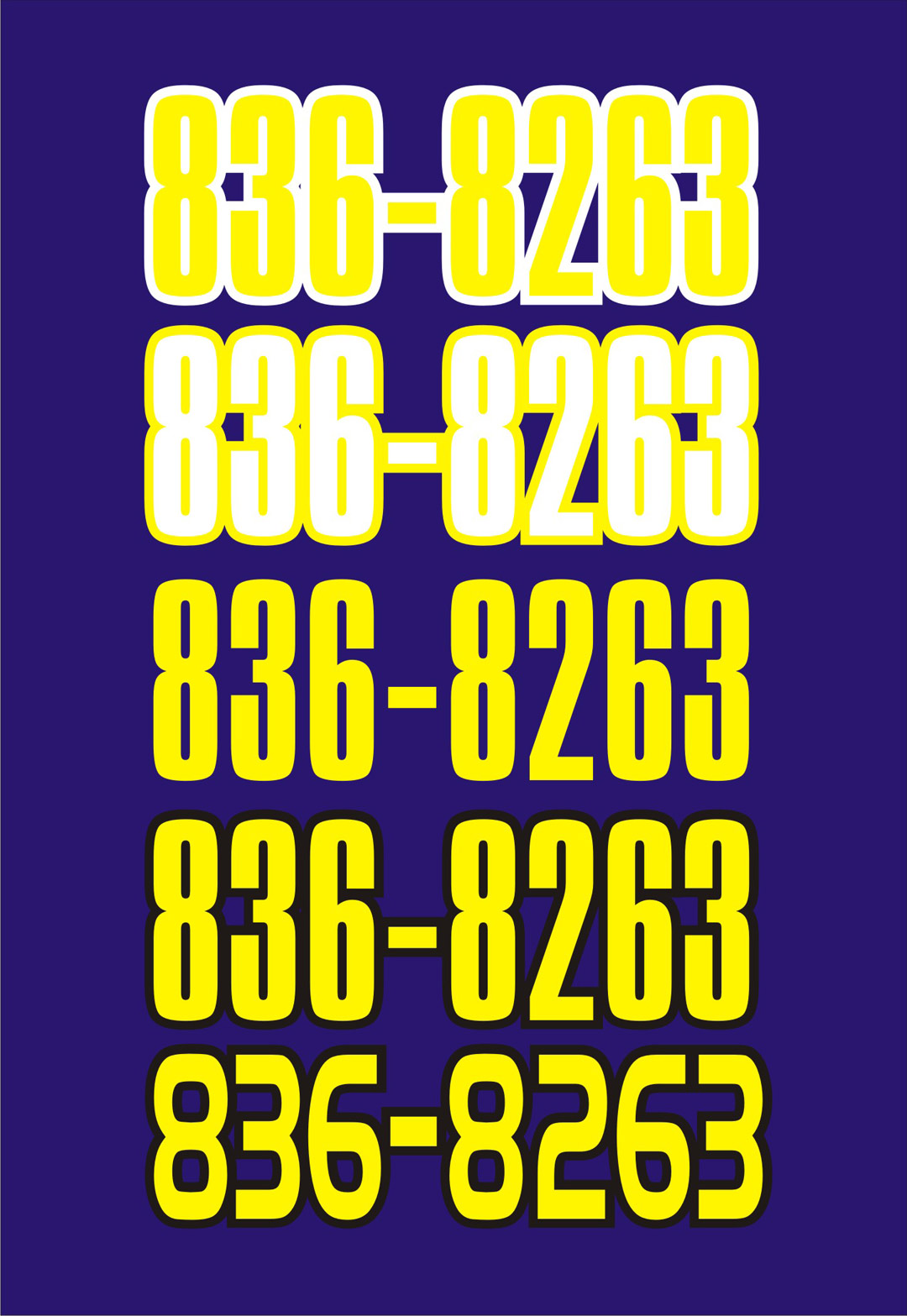
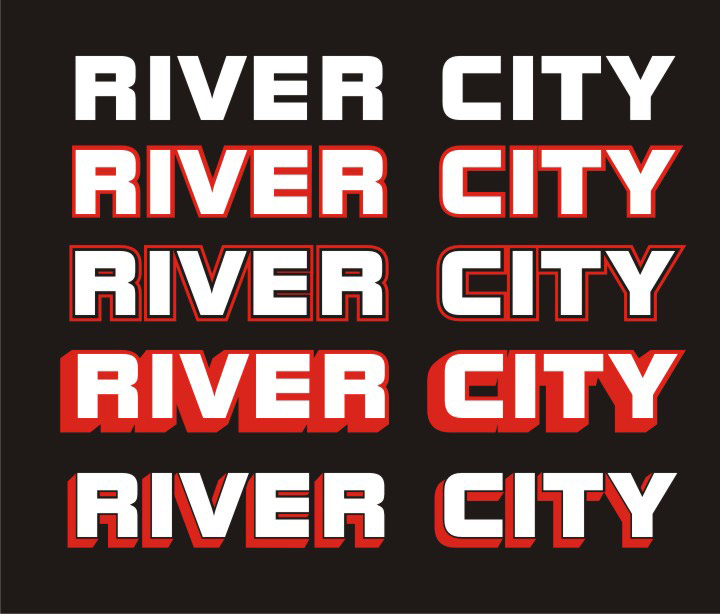
Contrast can work for you or against you. Let’s look at this example and examine why the top two lines are so hard to read. They are pretty extreme, but I see this sort of thing frequently. The top line has a yellow letter—an excellent choice since it provides a great contrast to the dark blue background. The problem is that the white outline, has as much—if not more—contrast to the background as the yellow. The outline and the letters are each fighting for attention and neither one is winning.
The second line shows the colors reversed, with the letter in white and the outline in yellow, but the problem persists. The letter is plain yellow in the third line; notice how easy it is to read compared to the two lines above it. Plenty of contrast! The black outline was added in the fourth line. It increases the contrast around the letter, making it stand out even more, yet the outline almost blends in with the background. It doesn’t compete for attention.
On the last line I switched typestyles to point out the importance of negative space within the numbers. The numbers on the first four lines are very condensed; leaving almost no negative space within the numbers. What happens with letters and numbers with little internal negative space is a phenomenon I call “eye welding.” The eyes will “weld” everything together and at a distance these letters or numbers will not be easily recognizable.
Some of the coolest letter styles have little negative space within the letters. While they look great up close, their readability suffers at a distance. Now step back from this image and back up a few paces from it. As you keep backing up, you will notice the top two lines become unreadable almost immediately. With each step the next two lines get harder to read while the bottom line remains easy to make out. Allow your lettering to breathe and watch out for “eye welding.”
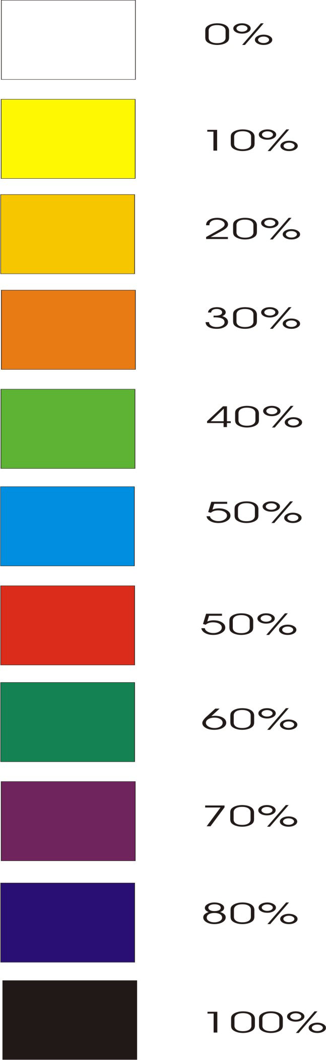
Outlines and shadows can help lettering in the middle color values. This chart has some common colors arranged in order of value. I’ve heard different theories on this, just as I have on the most readable color combinations. Nothing is set in stone here—it’s just a guideline.
For maximum contrast, if we take values from opposite ends of the value scale and use them together, we should get good results. What about the colors in the middle? When the lettering is one of these middle values, it will benefit the most from outlines and shadows, because the outline can be used to increase contrast. It’s important, though, to use the outline to increase the contrast of the letter, not fight with it.
One thing I’ve noticed is that the middle of the color value scale isn’t really the middle. By that I mean orange, which is down at 30% according to this chart, can still be considered dark. You can treat it as either a light or dark color. White lettering will show up on it just about as well as black. Confusing, yes, but that’s the way it seems to work. Colors like blue and green will work the same way—you can treat them as a dark color until they get below that 30% value or thereabouts.
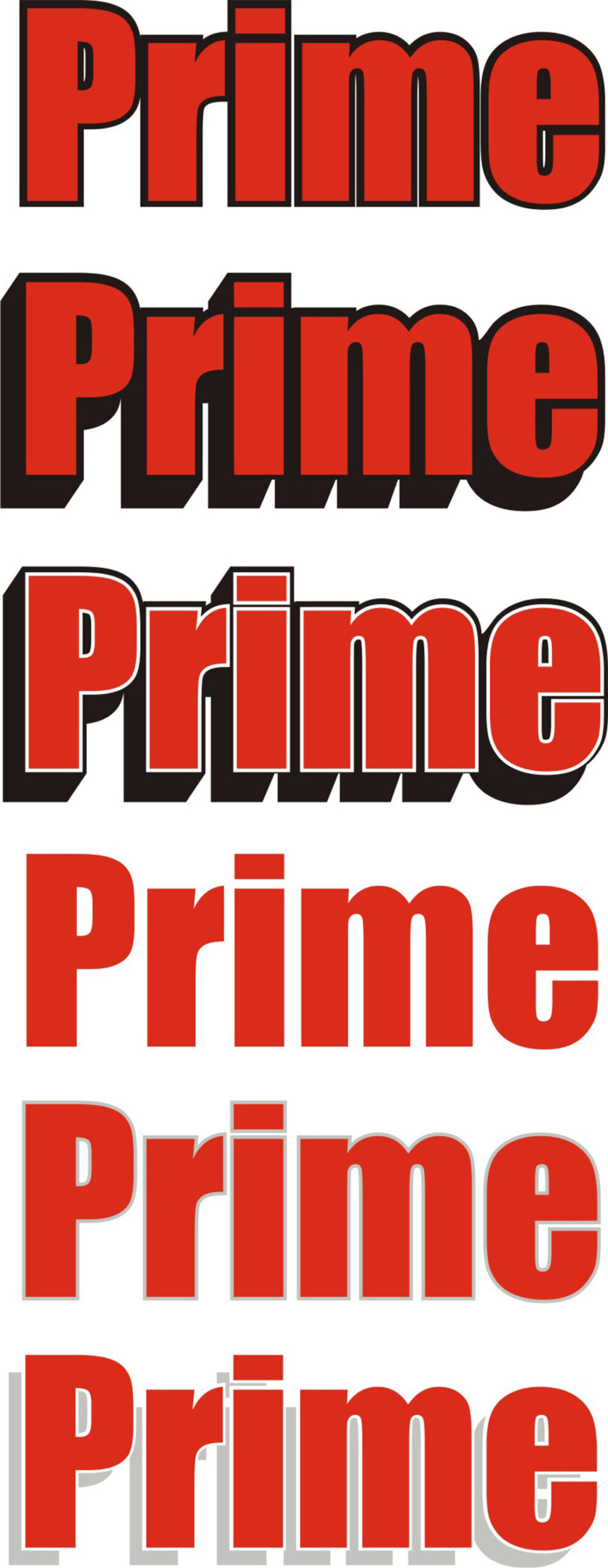
Making red on white work. This example shows one of the most cussed and discussed color combinations: red letters with a black outline or shadow. The top line shows a simple black outline. The outline has more contrast with the background than the letter, which is not good. Even though the outline is thin, there’s still trouble with “eye welding” filling in the centers of the letters at a distance.
The second line has an outline/shadow combination. Now we are getting into even more trouble with “eye welding” because it forms a big shape under the “IME” that isn’t familiar to the eye. That unrecognizable shape is what we will notice at a distance—rather than the letters themselves. When we have to stop to figure out what a shape is because it isn’t instantly recognizable, our sign gets hard to read.
The third line shows an example of a technique that is used frequently—a white pin line has been added to define the contrast between the red and the black. The greatest contrast lies between the black outline/shadow and the background. This little thin pin line and its contrast between the letter and the outline are challenging that contrast. It’s like a bunch of school kids jumping up and down, each one trying to get the teacher’s attention. Is it working?
Try backing away from this example until things get hard to read. The plain red letter on the next line demands way more attention, due to its better contrast. As usual, less is more. White or black backgrounds rest at opposite ends of the value scale. They are the hardest to use outlines and shadows on because nothing can increase the contrast between the background and the letter. When using red on white I like to use a thin silver or gray relief outline or shadow. Relief shadows and outlines allow the contrast between the letter and the background to still exist, while adding other colors—very handy when working on white or black.
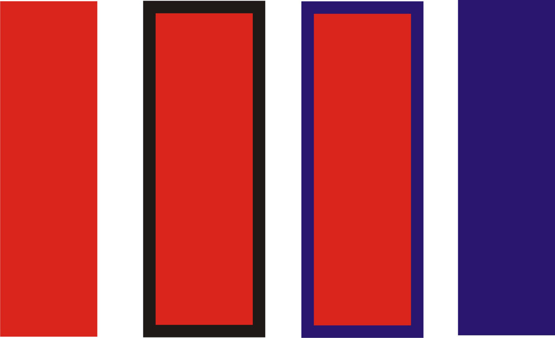
Adjacent colors affect how we see a color. Here we have a group of color bars, some with outlines. Even though the red is the same in all examples, it looks slightly different with the black outline, sort of muddied, with a brown cast to it. With the blue outline there is a purple effect going on. Notice that the blue is affected also. This is a result of “optical mixing.” The eye will actually mix the two colors together in our brain. These are important things to consider when choosing outline colors. Usually, this can be prevented by using a relief or offset—spacing the outline or shadow away from the letter so that the background color shows through.
A relief between the letter and outline or shadow can help legibility. This illustration shows how a relief will help with contrast on a black background when viewed from a distance. Back up from this example and take note of how the examples with a relief read better at a distance than those without. You may have to back up a little ways, but there will be a point where the legibility of the letters with relief will be stronger.

Be careful with those heavy black outlines. Here we start off with a blue-to-white fade on a yellow background with a heavy outline/shadow. While this looks great up close its readability will drop off quickly when distance is brought into the mix. Once again, back away from this example and watch as the top line starts to get hard to read while the other three remain readable. Notice how the lettering starts to recede and the shadow’s shape starts to come forward. Once this happens we are left with the shape of the shadow, which is something foreign to the eye, and therefore slower to recognize and read.
I’ve had numerous discussions with fellow sign makers on the subject of readability and using certain color combinations such as yellow on a white background. Usually, I hear the same comment “Oh, you can make it work by using a heavy black outline.” That may be true to some extent, but how well will it work? It’s like saying you can cut firewood with a hacksaw. You can “make it work” but it’s certainly not as efficient as a chain saw. The idea here is to make signs that are intended to inform from a specific distance. (Will your customer’s truck only be viewed up close and sitting still?)
Again, I go back to my racecar lettering days and remember something that really hit home. Back when airbrushed numbers were coming into vogue, I read an article in a national weekly racing paper. The noted racing journalist asked, “Why do the cars that look so good at the indoor shows become impossible to read on the race track?”
I started to pay attention to what made lettering stand out at a distance. I learned it was all a matter of contrast and the basic rules of thumb. I made it a habit to picture the vehicle out on the track, going down the back chute at over a hundred miles an hour, rather than sitting there in the garage right in front of me. That habit continues to this day—in my mind’s eye, I picture signs and vehicles at a distance rather than up close.
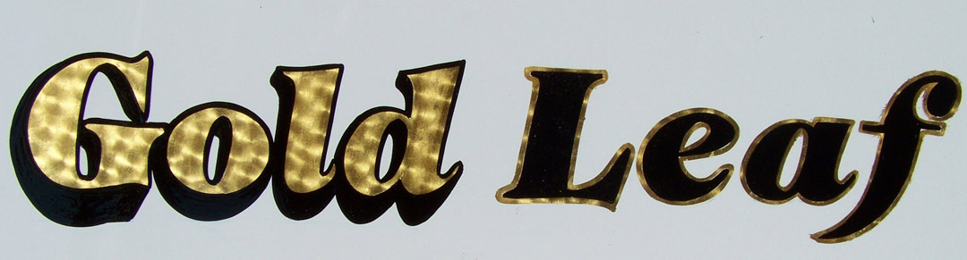
Gold leaf on a white background is a challenge. This panel shows gold leaf on a white background. This combination used to plague me. I always did it the traditional way, as you see it in this example with the word “Gold.” It never worked out on the racetrack, nor was I ever happy with the way it looked on trucks. But that’s the traditional approach.
The solution to this dilemma came from—where else—the racetrack. This time it was at the drag strip. I used to go to the big NHRA National in Memphis every year and I’d take as many pictures as I could. I’d see the work of all my heroes—Glenn, Alton, Brando, Stanford and a host of others.
One year I spotted a stunning Camaro with a beautiful trick paint job on it done by Bruce Deveau. The paint was multi-colored but the lower half of the car was mostly white with gold leaf lettering. What impressed me was that the leaf was done in reverse of the traditional manner—the lettering was black with a gold leaf outline. It was so obvious! It was beautiful, and so much more readable than the traditional way. It followed the basic rule of thumb, yet I never considered it.
When I lettered this little panel, I showed it to my wife, Denise, who was wondering just what this article was about. We work as partners in the business, pinstriping together, but the sign end of things is pretty much my area. I showed her the panel and asked her which word was easier to read. She answered, “Gold.” I was stunned. I moved it further away and her response was the same. I was really confused, because I saw “Leaf” reading much better. It wasn’t till I moved about twenty-five feet away that she saw that “Leaf” read much better. I had forgotten the fact that I still see everything at a distance, even when it’s right in front of me.
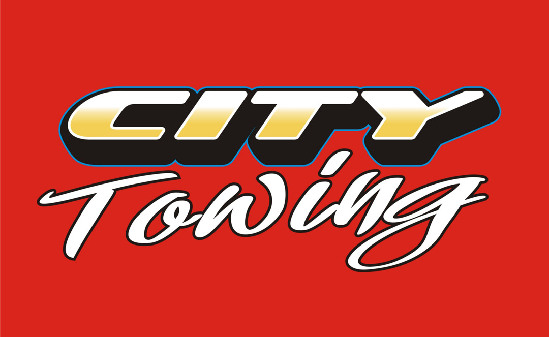
Try putting it to work! Now let’s take a little bit of what we have been discussing and put it to practical use. I’ve done a fade of yellow-to-orange on white. Leaving a little white relief around the edges helps keep the contrast all the way around the letter. The heavy outline/shadow adds more contrast to the letter rather than just sitting on the red background.
As we back away from the lettering, notice how the black recedes into the background and the lettering comes forward. It’s the exact opposite of what happened in the example on the yellow background. I added a pin line of process blue for a little added interest around the outline/shadow. This is only going to show up at close range, so it will not affect readability.
For “Towing,” I used a thin black outline for added contrast. I also tilted “Towing” a little bit to position the dot of the “i” in that awkward bit of negative space created between the “t” and the “y.” This type of treatment will work well on any color background in the 30% to 80% range. For backgrounds lighter or darker, an outline or simple drop shadow with a relief works much better. This is what we should be shooting for whenever possible: a combination that looks good up close and one that can be read across the street or going down the highway.
George Perkins’s shop, Perkins Signs, is in Millington, Tennessee.
This appeared in the July/August 2008 issue of SignCraft.
