By Raymond Chapman
Posted on Friday, October 21st, 2022

All sign craftspeople have access to the same basic equipment and materials. With a signature we can suddenly have our own business, complete with just about everything that the shop down the street uses for sign production. While features may differ, most of the equipment and software does just about the same thing. By adding a few zeroes to the total, we can purchase the ultimate in sign production equipment and software.
In addition, we can acquire a massive amount of clip art, fonts, estimating software and other aids that places at our fingertips a complete package of sign-making technology. Depending on our bank account or credit card limit, we all can have access to the same resources as anyone else in our industry.
If we all use the same type of equipment and can buy the same software, fonts, clip art and wiz-bangs, why do our signs look different? Why are there great-looking signs and mediocre signs in the same town, all produced with basically the same kind of equipment, computers, plotters and printers?
Design is the difference
Visit just about any area and you will find both poorly done and high-class sign work—all produced by “professional” sign makers. But it quickly becomes apparent that there are those who know more about layout and design than others. Their work is pleasing, easy to read, and enhances the product or service that they are representing.
At some point, many have assumed that technology takes the place of the human brain. (Staples Office Supplies will sell you an “Easy Button” but all it does is beep.)
Design is still a visual process of putting together pieces of the layout puzzle—all of which rely on some very simple principles. And they do not come with a CD and a manual. Put the pieces together in an orderly fashion and you have a successful design—try to force together parts that do not fit, and the result is conflict and chaos.
Over the years, it seems that we have gone from learning at the feet of a mentor (or personal study) to calling tech support. We rely more upon salesmen and software reps for design information than acquiring it from those who have traveled a successful path.
While the software available to us today is fantastic and makes the design process so much easier, it is only a tool to be used along with time-tested, proven principles in order to enhance the image of our clients.
Since we all participate on a level playing field, it seems to me that there are only two ways to compete with other sign folks in our area. One is price. We simply do everything cheaper than the next guy. That’s a downward spiral because there will always be someone willing to do the work cheaper than us—even though they won’t be in business very long. The more practical area of competition, though, is design. By making our product more attractive and effective we not only improve the image of our client, but also our own image. The better my customer looks, the better I look. Hopefully, my business is built upon what I can do to enhance the image of my customer—not upon the latest piece of equipment that the bank and I have purchased.
A few before-and-afters
These photos represent upgrades we have made to signage in our area. They are not intended to be the “ultimate” design or the only solution to the problem, but what we chose to do at the time within the budget of the client. Some are very simple, while others are more complex. Each was designed with the idea of improving the image of the customer.
Raymond Chapman’s shop, Chapman Design Studio, is in Temple, Texas.
This appeared in the March/April 2009 issue of SignCraft.
This sign sits along the frontage road of a busy highway. It was difficult to read at high speeds because of the low color contrast. By enlarging the copy and using a heavier weight font, the layout is more effective. The letters are high-density urethane [HDU] board finished with acrylic latex paint. The top section is aluminum with HDU graphics.

While this sign was readable, it didn’t convey a very personal image. We used our ShopBot flat bed router to improve the owner’s entrance. It was routed in an oak panel, and the lettering was finished with 1Shot lettering enamel.
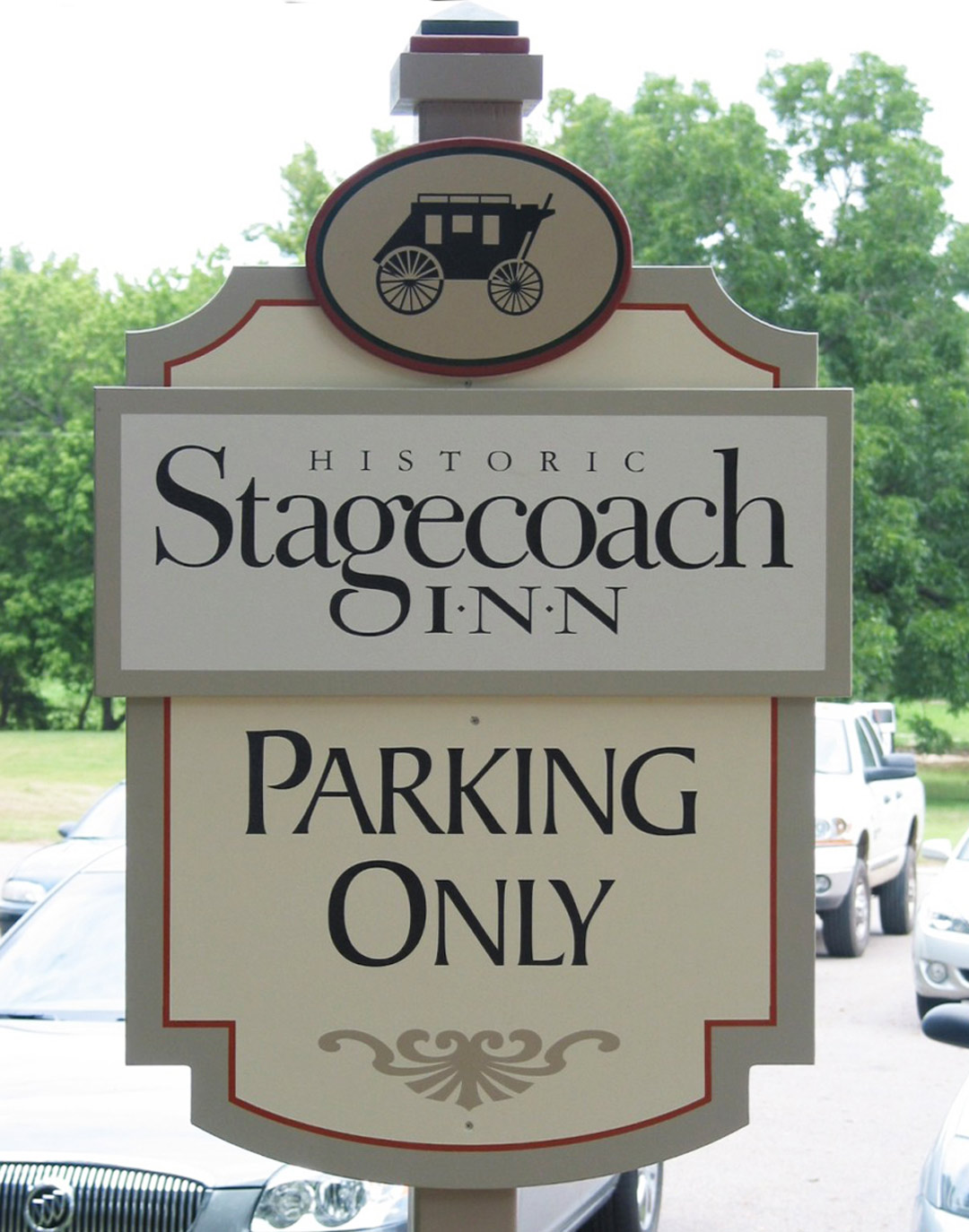
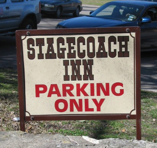
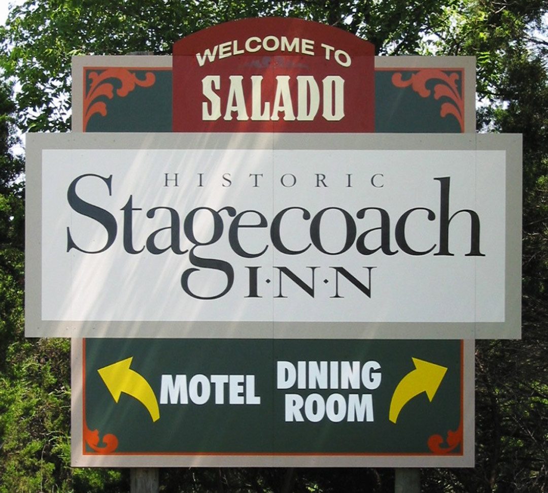
The owners of this historic inn wanted something that would tie all their signage together. The “Stagecoach” logo was developed and used throughout the property. The resulting image is more professional and inviting, without shouting. Notice the panel shapes—a sign needn’t always be a rectangle. It uses acrylic latex paints and high-performance vinyl film on an overlaid plywood panel.
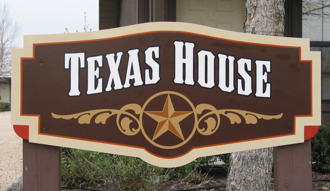
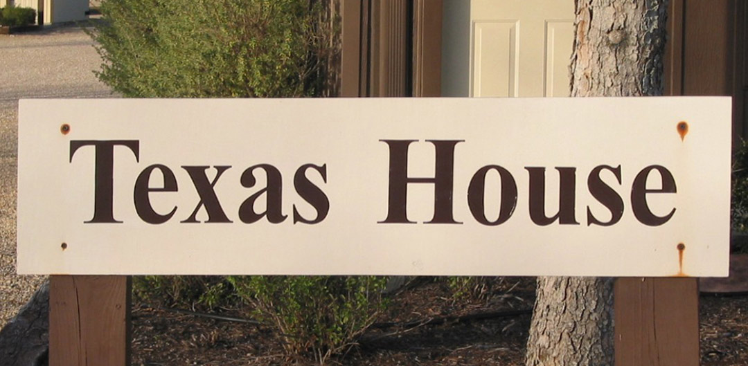
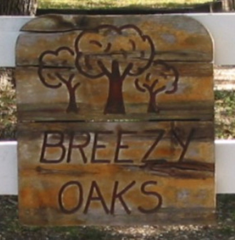
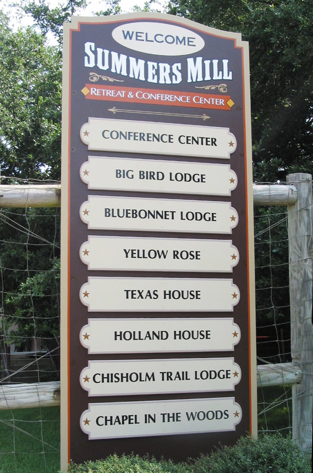
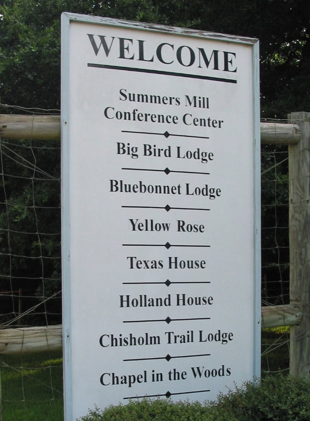
This series of cabin names at a resort and conference center was plain and did not add to the overall beauty of the area. With an attractive shape and color combination, the new version more effectively conveys the “Texas look.” It uses acrylic latex paints and high-performance vinyl film on an overlaid plywood panel.

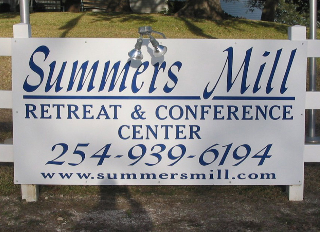
While all the words are spelled correctly, the old sign did little to invite folks into this retreat center. There is no need for the phone number to be so large since this center is in a rural area with little traffic. A pictorial of the actual mill helps to add charm to the sign. The lettering is high-performance vinyl film and on an overlaid plywood panel finished with acrylic latex paints; the illustration is a digital print.
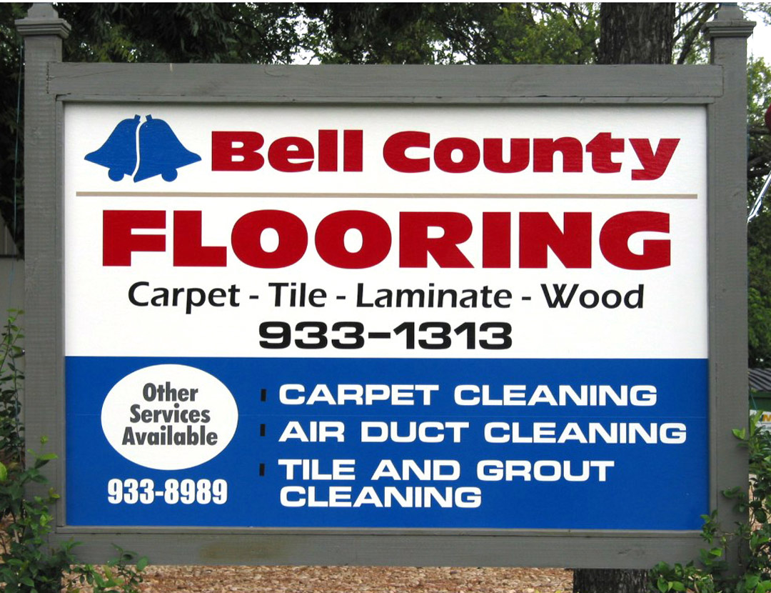
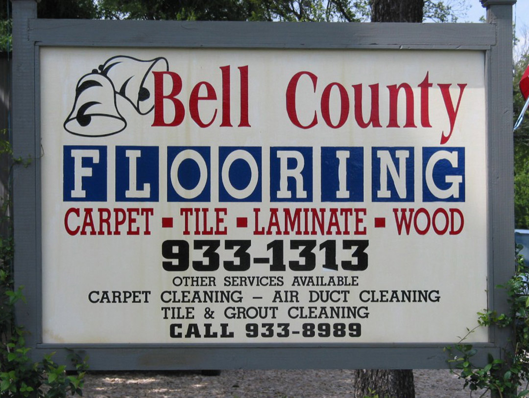
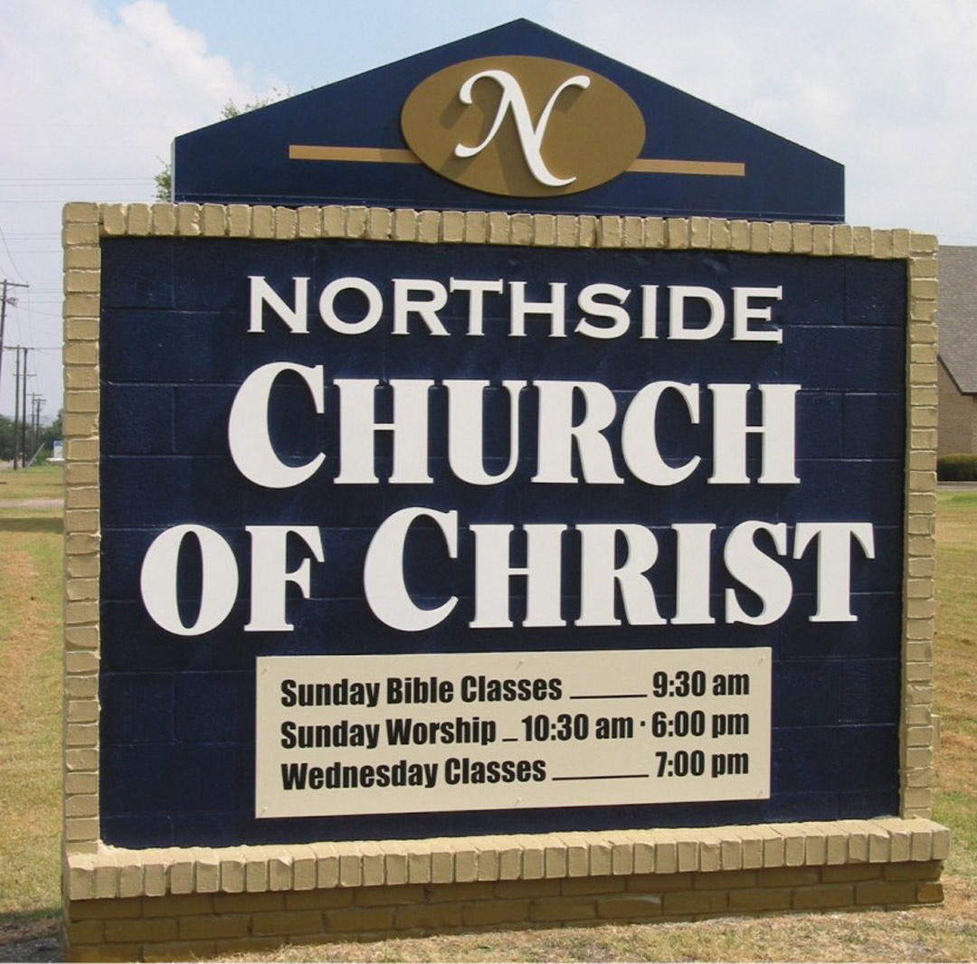
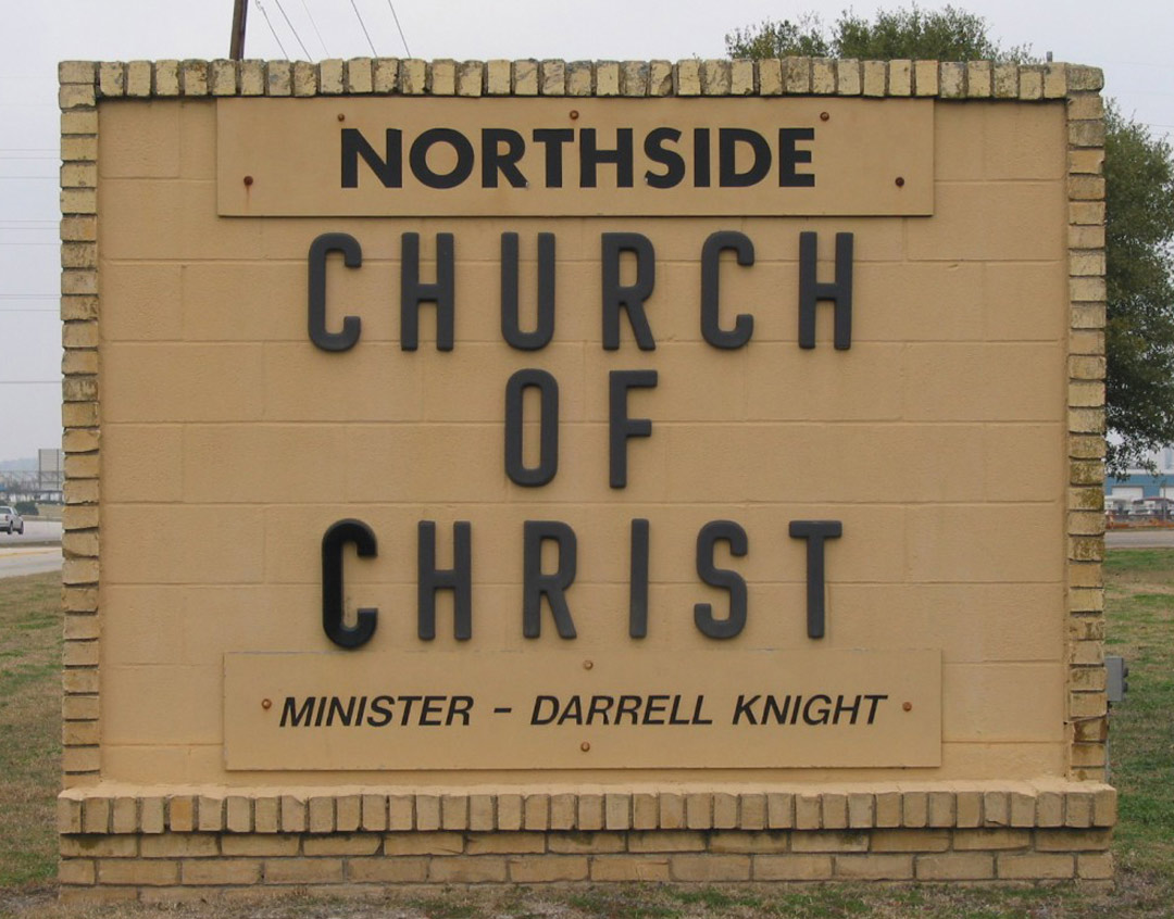
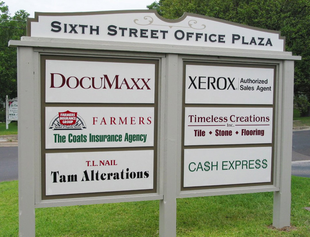
With the large amount of copy on this sign, it was difficult to tell that it actually advertises two businesses. By separating the information into copy blocks in panels of contrasting colors, it became somewhat easier to read.
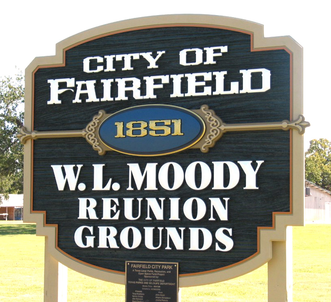
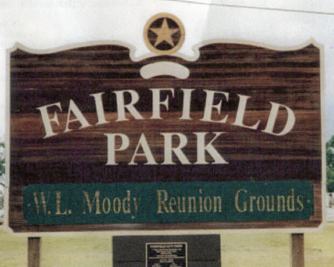
This sandblasted redwood sign had deteriorated badly and the city wanted a different look. Color contrast was improved, along with a more balanced copy arrangement. The old sign was 8-by-12-ft. while the replacement was 7-by-8-ft. A more historic look seemed to be in order since they wanted to stress the founding date. The lettering is cut from HDU board with aluminum composite backing and finished with acrylic latex paints. The woodgrain texture and prismatic letters were cut on our ShopBot flatbed router.
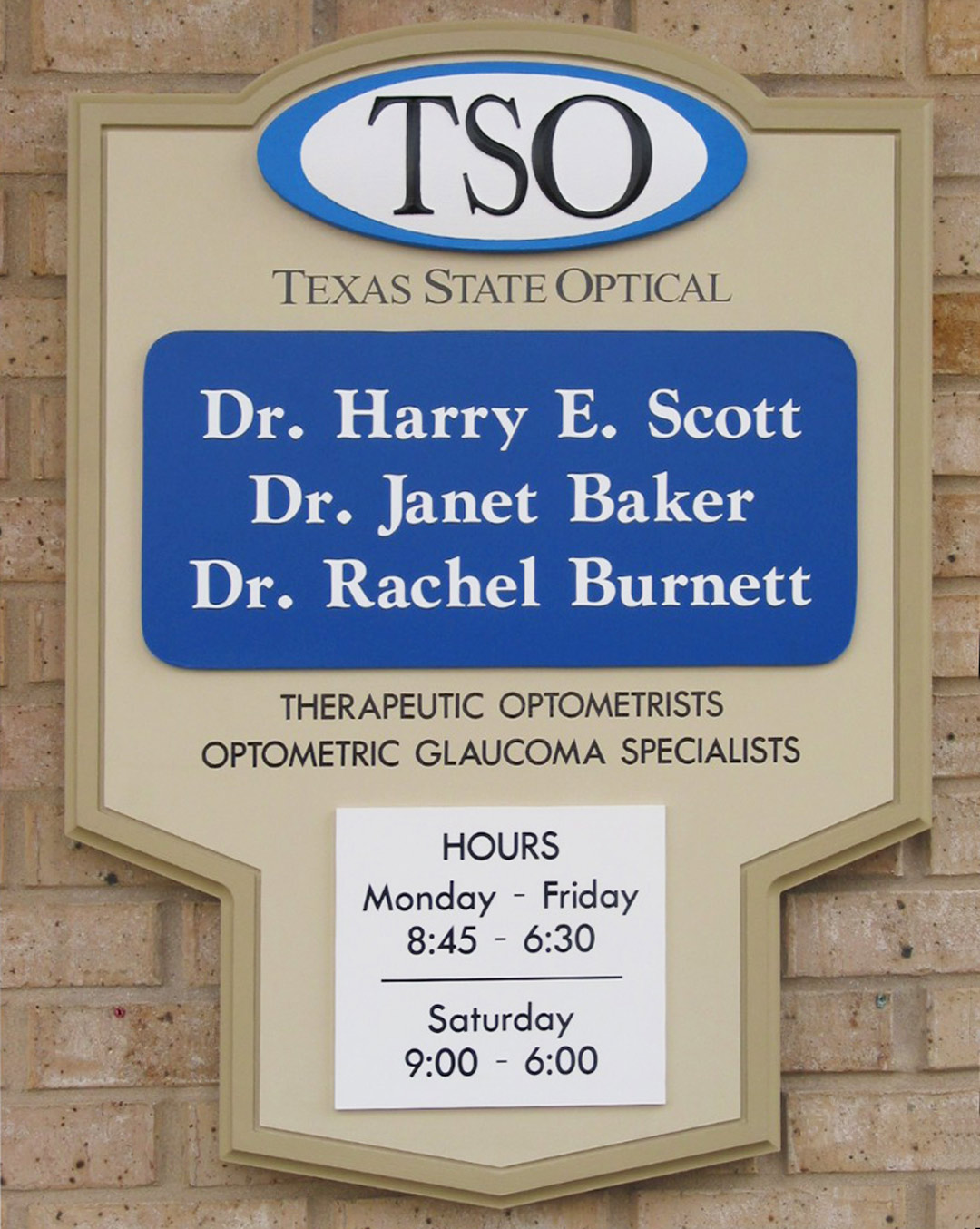
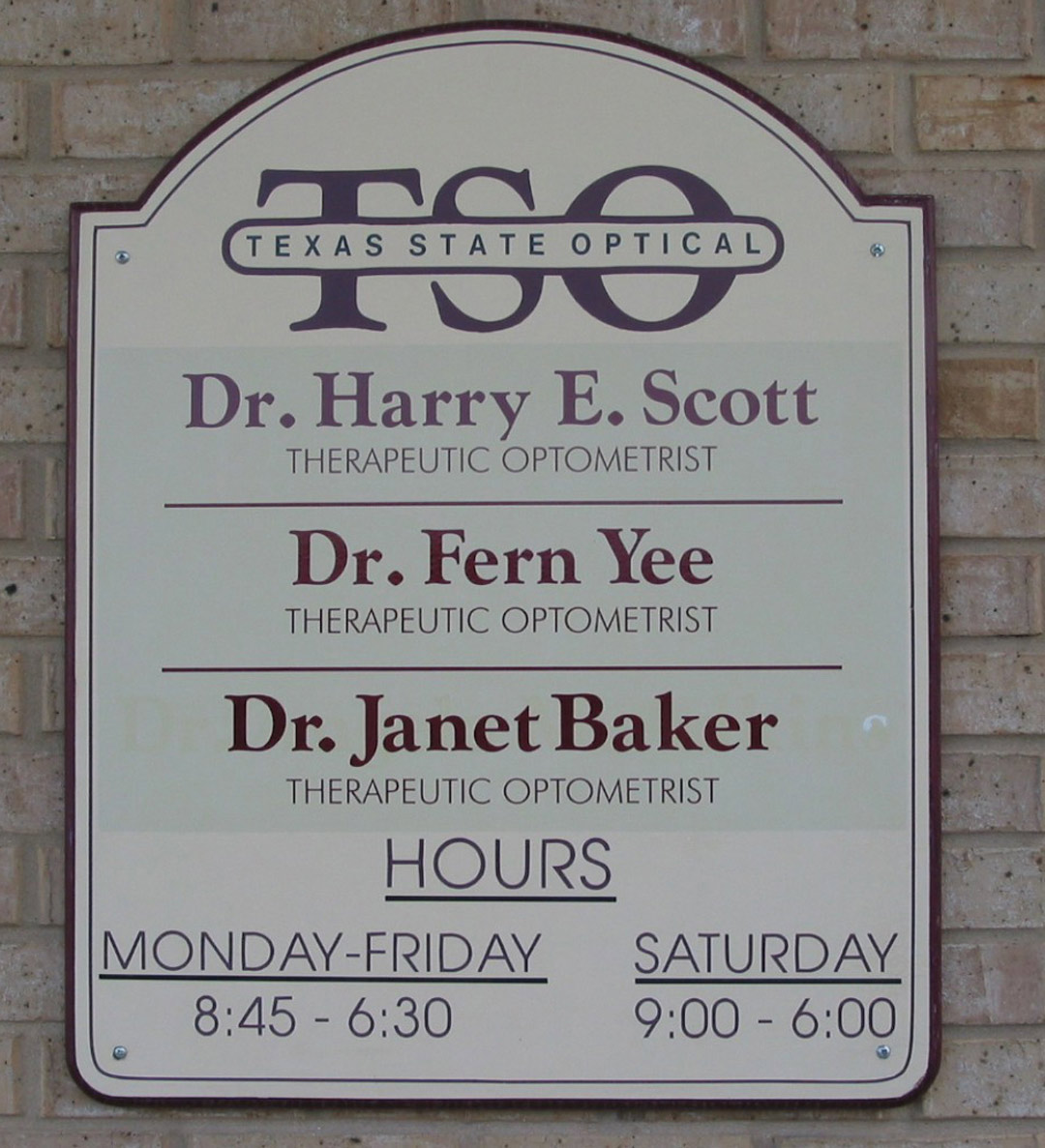
We did the sign original sign at left about 20 years ago. It had undergone several changes and touch-ups by other shops. When the logo changed, it was decided a replacement was needed. We used PVC board panels where changes would be necessary. Unique shapes keep our designs from looking like everyone else’s. The lettering is high-performance vinyl film on PVC board with HDU trim, finished with acrylic latex paint. The TSO oval was prismatic-routed on our ShopBot router.
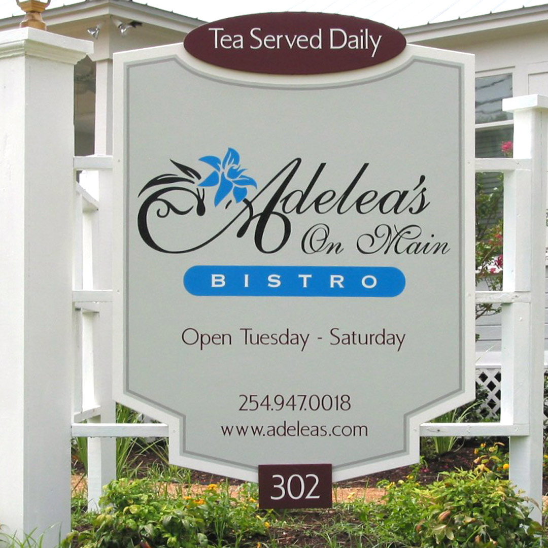
The client wanted this sign repainted for her new business. Before we could do the job, a small tornado came through and removed the two panels from the structure—the perfect excuse for a new shape. The sign is viewed by foot traffic and slow-moving vehicles, so the layout doesn’t need to shout. The lettering is high-performance vinyl film on an overlaid plywood panel finished with acrylic latex paints.

The old sign did little to attract travelers into this small village. The new logo was used on all new signage and added a more dignified image, in my opinion. Notice the division of copy into separate panels with contrasting colors. The lettering is high-performance vinyl film and on an overlaid plywood panel finished with acrylic latex paints.
Monotony is to be avoided whenever possible. Because everything is the same font and color in the old version, there is little to excite the viewer’s eye. Individual panels are removable for easy changes. The new version uses the same logo and color combination that is used throughout the property. The lettering is high-performance vinyl film on an overlaid plywood panel finished with acrylic latex paints.
Changing to a horizontal format gave this building’s tenants more exposure. We were able to create a better overall look as
