By signcraft
Posted on Saturday, November 9th, 2024
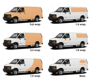
Customers often don’t understand the difference between a full wrap, a partial wrap or basic lettering on their vehicle. Some even refer to all vehicle graphics as “wraps.” Brian Johnson of Signature Graphics uses this illustration to help customers see the difference and lets you determine their budget at the same time. It can really speed the sales process.
 Brian is the senior graphic designer at Signature Graphics, London, ON, Canada, and does a lot of vehicle graphics, like the ones you see here. His work was first featured in the Sep/Oct 2011 issue of SignCraft.
When meeting with a client about vehicle lettering, Brian shows them this illustration, which provides six options for vehicle advertising on a van, from a full wrap down to basic door lettering. It’s far easier than trying to explain the possibilities. A picture is still worth a thousand words.
Click here to download Brian’s Illustration as a PDF.
Click here to download Brian’s illustration as a JPG.
“I printed the illustration,” Brian says, “then mounted it on an 11-by-17-in. piece of corrugated plastic. As they look at it, I give a ballpark price range for each option. You can tell a lot about their budget by their reaction, and it helps make sure both you and the client are on the same page.
“Often they say they want a wrap, but have no idea of the cost involved. Sometimes I give them a price range for a quarter-wrap, then they say, ‘Oh, let’s just put the logo on the doors….’ That doesn’t mean you don’t try to sell them what they need, but if the budget just isn’t there, you’re wasting your time.”
Showing them their options works both ways. Often when a client sees that they could move up a notch and get a lot more advertising, they’ll do it. It’s easier when they can see the difference on the illustration rather than trying to explain it in words. Most clients understand things faster when you can show it to them.