By Dan Antonelli
Posted on Friday, January 24th, 2025

Probably the most critical application of a brand for most service businesses is the vehicle. It’s the most public representation of their company and serves to establish an initial perception of that business in the viewer’s mind. The continued viewing and repetition of the brand on the vehicle serves to build brand awareness in a way that no other medium comes close.
The problem most small businesses run into is that their brand doesn’t work well on a vehicle. Maybe it has poor distance legibility, or maybe its format or structure doesn’t fit the canvas properly. Or perhaps the icon doesn’t work well for the medium.
As designers, it’s our job to let the client know what the limitations are to their current brand and educate them on why they may be hurting themselves by using it. We should be offering rationales on why a different approach might be more effective and deliver a better ROI than their current brand.
It’s best when you get to do both
I’m fortunate at my agency that we generally only design truck wraps for clients who first have us do their branding. When you have that happen, it’s a great opportunity. You start with a clean slate, and you can carefully plan ahead on how the new brand will integrate into the truck wrap. We usually start the process with a series of sketches. As we narrow down and refine some potential concepts, we do some quick rough comps in Photoshop from these sketches.
If we are hired from the start to do both brand and truck wrap design, we may show some of these preliminary sketches with the concept on a truck. Often this is helpful for the client to see how one design might work slightly better than another.
The important thing to try to work into your wrap design is how to best integrate the brand. You have to make sure they work in harmony, and that it is done in such a way as to reinforce the brand, not detract from it. You want it to look as if the whole brand was designed specifically for the truck application, rather than like it was just “placed” on there.
This is no time to blend in
As always, brands and truck wraps should be designed to stand out, not fit in. If your wrap designs look ordinary, or like every other wrap out there, then your client’s brand is blending in. Avoid the typical pitfalls in most wraps, such as reliance on Photoshop fills, glows and halos, and in general, photography.
Photography doesn’t represent a small business brand. A good logo should do that. Every square inch devoted to photography is less that can be devoted to a brand.
Let’s take a look at a few recent brands that showcase this approach—and our philosophy for truck wraps.
This article appeared in the January/February 2013 issue of SignCraft.
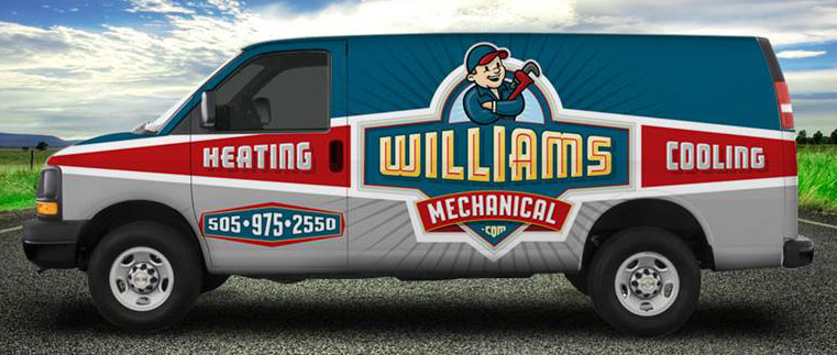
This is a retro-themed wrap design that takes its visual cues from the brand we created. We felt it was important to add “Heating and Cooling” to the design because many of their residential customers do not know what “Mechanical” means. The unique color scheme and use of panel shapes help create a fleet look. The messaging is easy to read, and the character and logo make the brand memorable. This is certainly not typical of most HVAC contractors’ designs, which is why it works so well.
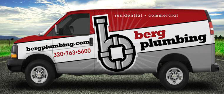
This logo design was never used. We opted to go with a different approach with it. But I really like this design and think it’s one of my best. The messaging is clear, concise and memorable. The color scheme and broad striping make it part of an easily identifiable element of the brand. I don’t think this would have been missed driving around town.
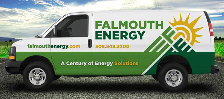
This client does solar, electric, fuel oil, and heating and air services. They have a small fleet of service vehicles and have been around for 100 years. We wanted a modern brand and a way to integrate the brand into the wrap. It was also important to have a design that would translate easily onto other vehicles in the fleet. A simple wrap design like this connotes a larger company.

By splitting the primary colors, we have a unique approach to the truck wrap with a logo that is essentially a perfect circle. We used the white space for the rear to include a dominant headline and carry through the message of the brand.

For this logo and truck wrap, we actually changed the design of the logo once we saw how it worked on the truck. The original logo we proposed had a wrench coming horizontally through the middle and behind the panel, with only the end of the wrench showing.
We knew we still needed to get “Heating and Cooling” in there, and the center area became much too crowded. So the wrench was deleted, and the blue and red triangles were added at top and bottom. This allowed us to have a fairly vertical logo that still worked well in the available space. The ribbons then connected the whole design together, making it all more cohesive.
Dan Antonelli owns KickCharge Creative (formerly Graphic D-Signs, Inc.) in Washington, New Jersey. His latest book, Building a Big Small Business Brand, joins his Logo Design for Small Business I and II. He can be reached at dan@kickcharge. com. Dan also offers consulting and business coaching services to sign companies. For more information, visit danantonelli.com. On Instagram: @danantonelli_kickcharge.
