By signcraft
Posted on Sunday, August 31st, 2025

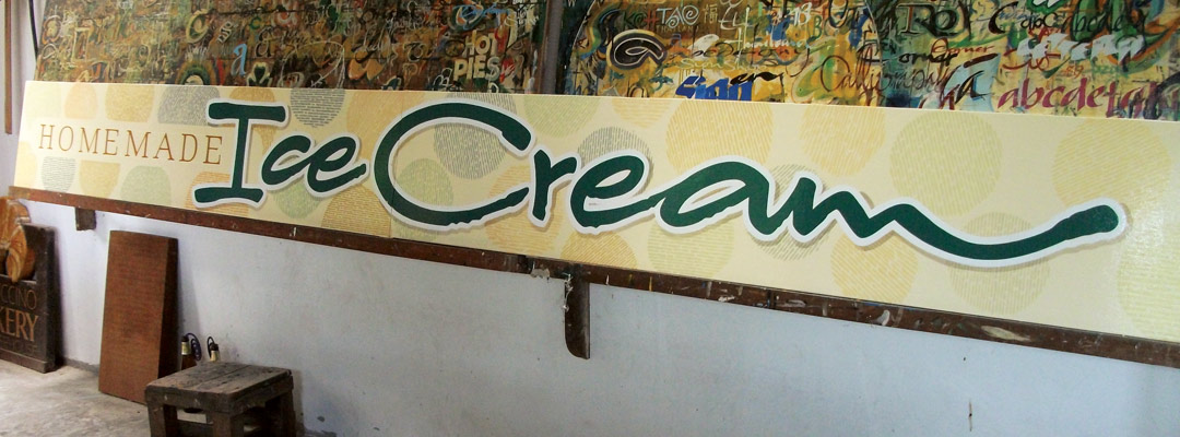
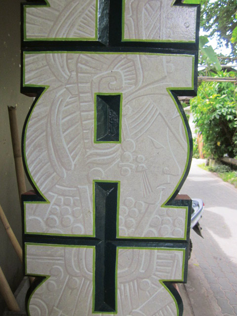
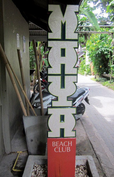
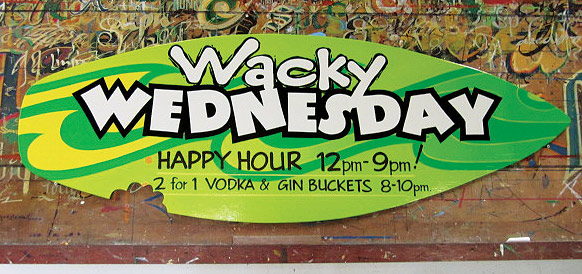
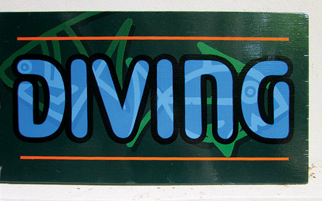
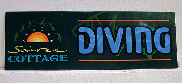
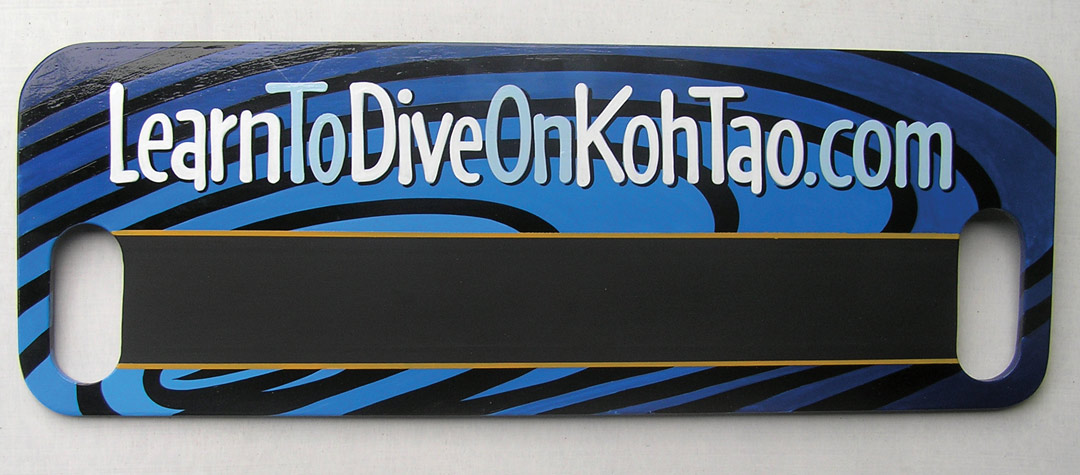
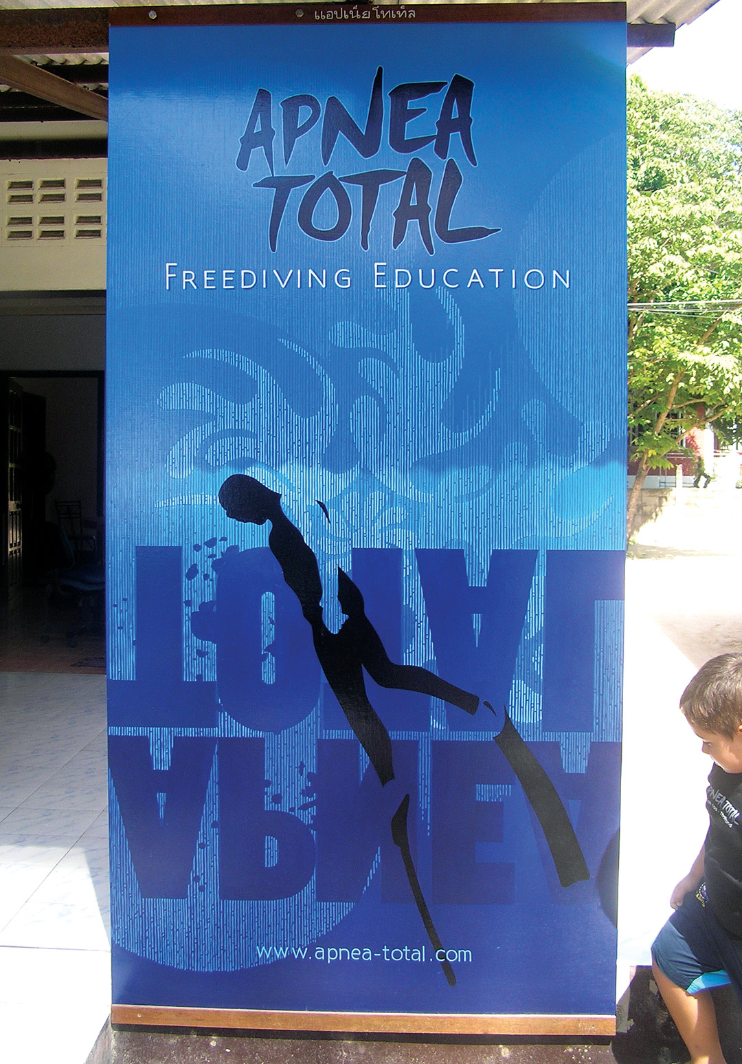
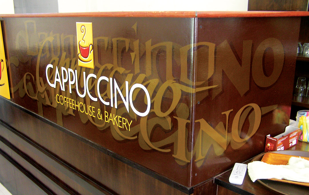
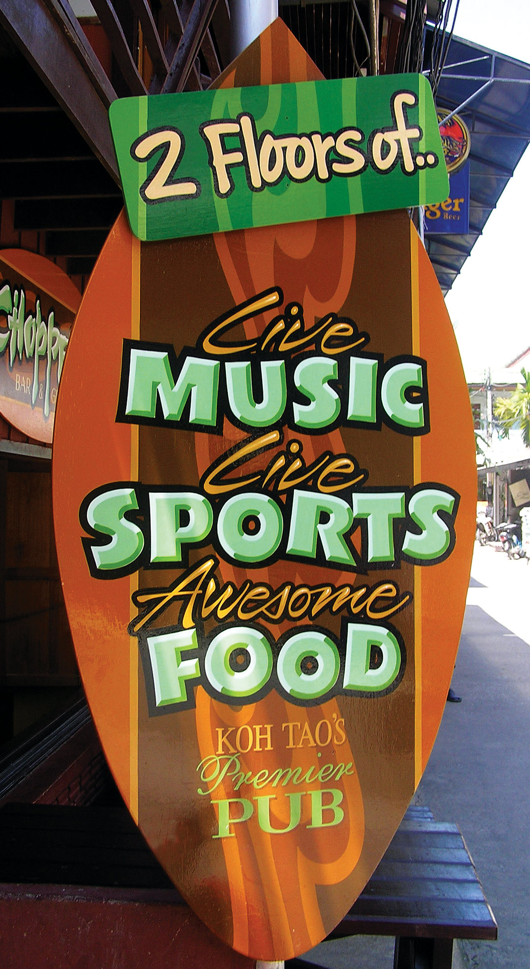
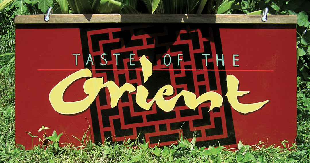
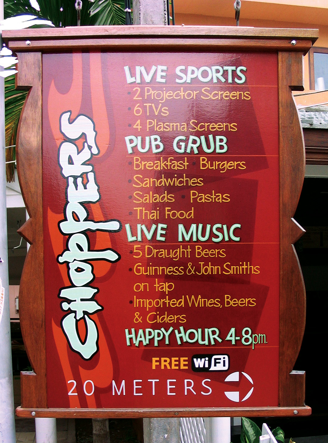
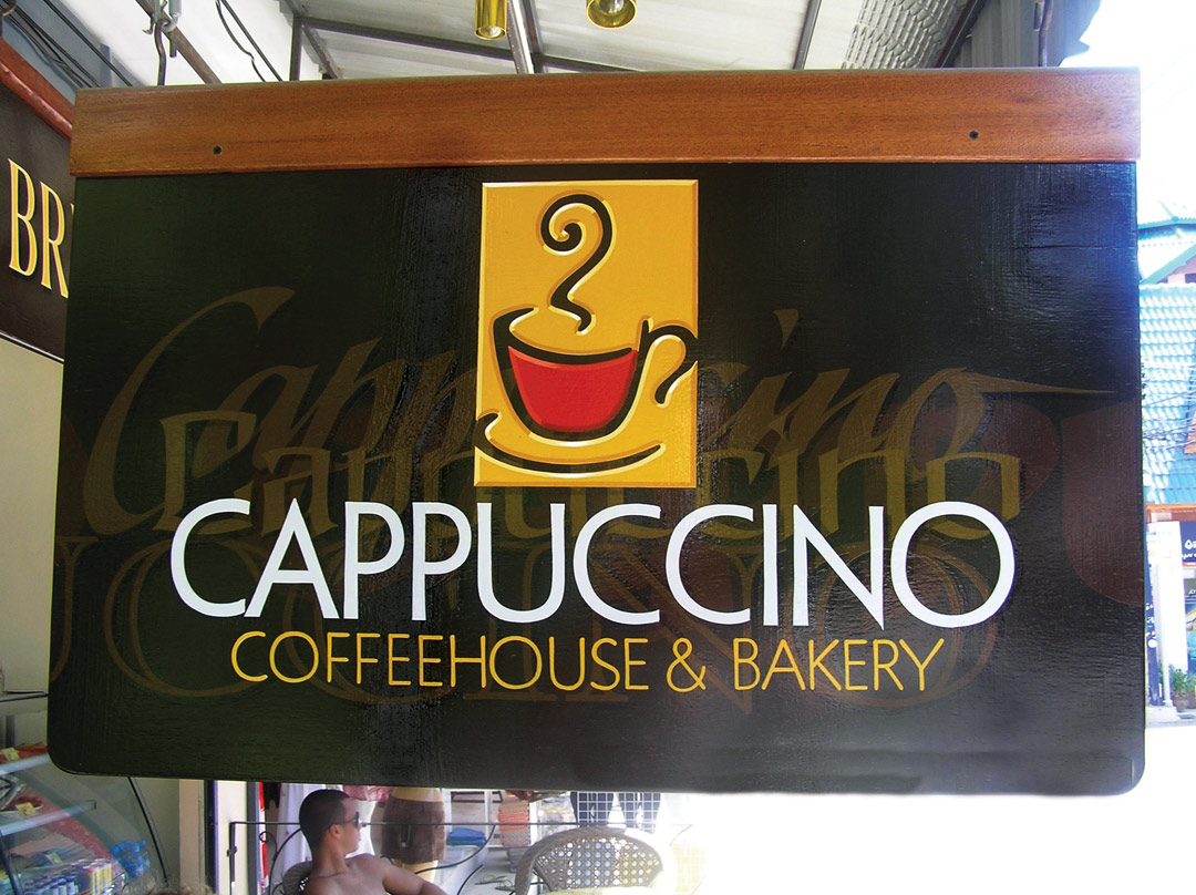
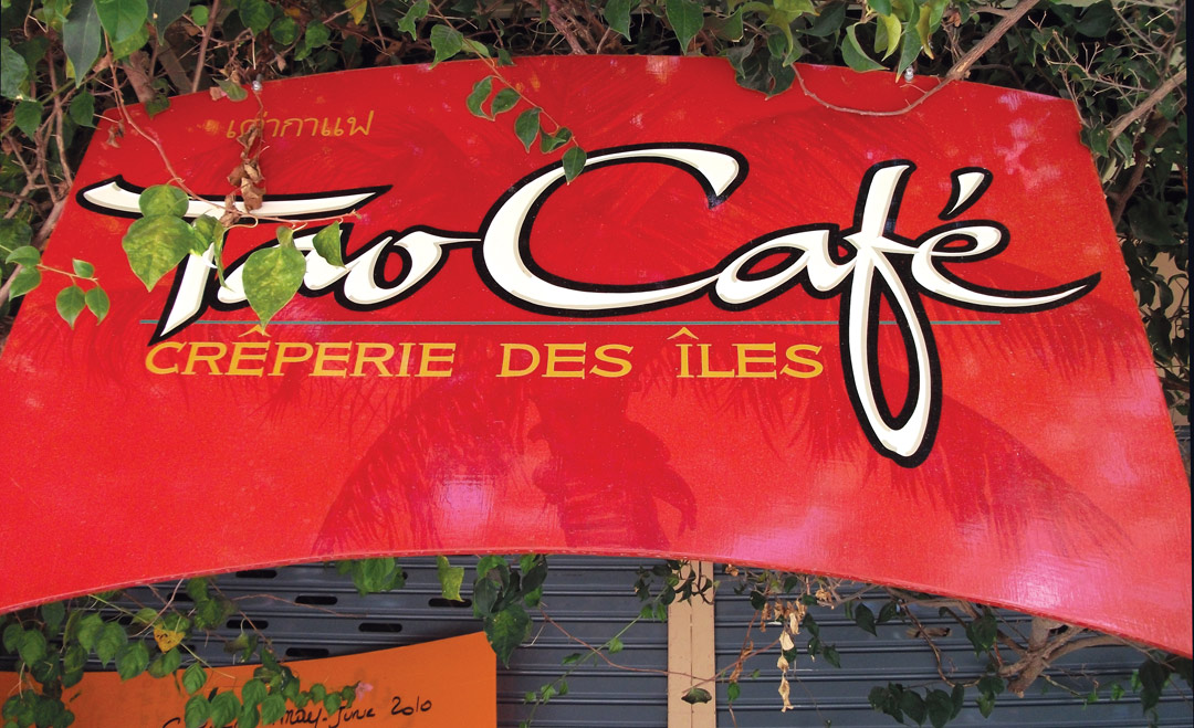
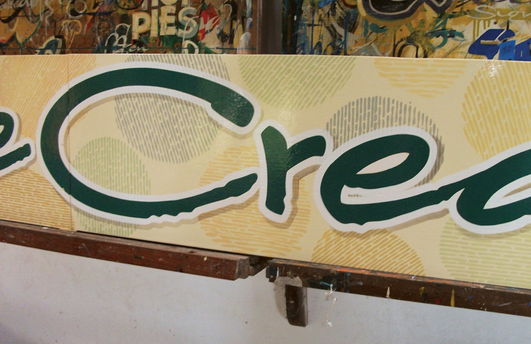
Rob Cooper works in a tourist area where there’s a lot of foot traffic and vehicles don’t fly by at interstate speeds. One of the ways he takes advantage of that is to add appeal to his signs by using cool background effects. Palm fronds, maps and textures often show up to add extra interest to the sign. It may be a detailed pattern, but other times it is a simple color panel.
The key point is “to add interest”—not to overwhelm the message, not to be what you notice first. Take a look and you’ll notice that it’s very subtle—it doesn’t get in the way of the message but rather invites a second look to see what’s going on back there.
If the viewer just gives the sign a glance, they’ll get the essential message. The background effects add to the overall appeal, just like the colors, shape and letter choices. It’s not something he uses on every sign, of course, but it can be very effective.
He does all his work by hand, so the effects that you see here were all done with a combination of paint and creativity. But no matter how it’s executed, an interesting background can bring a lot to a sign.
In Koh Tao, Thailand, the primary industry is tourism. People come to climb, dive, cycle and enjoy the natural beauty of the island. The local businesses, as you can tell, cater to that market, and signs are their essential marketing tools—just as they are for almost every small business worldwide.
This article appeared in the January/February 2014 issue of SignCraft.