By signcraft
Posted on Friday, October 17th, 2025

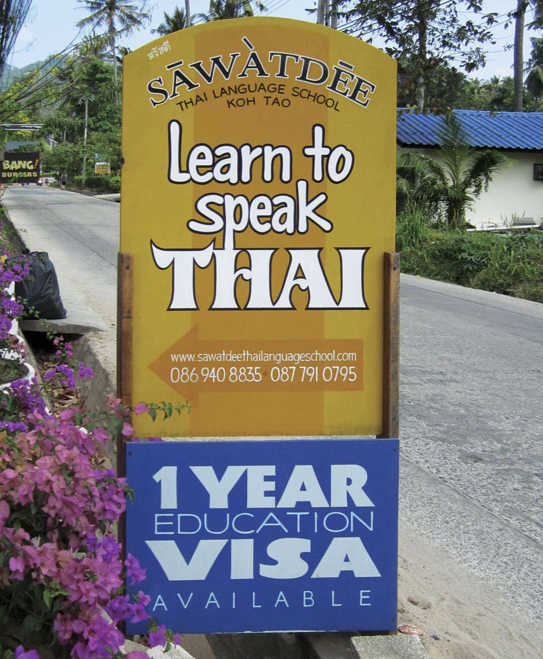
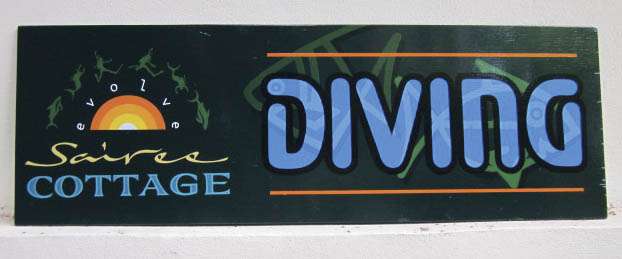
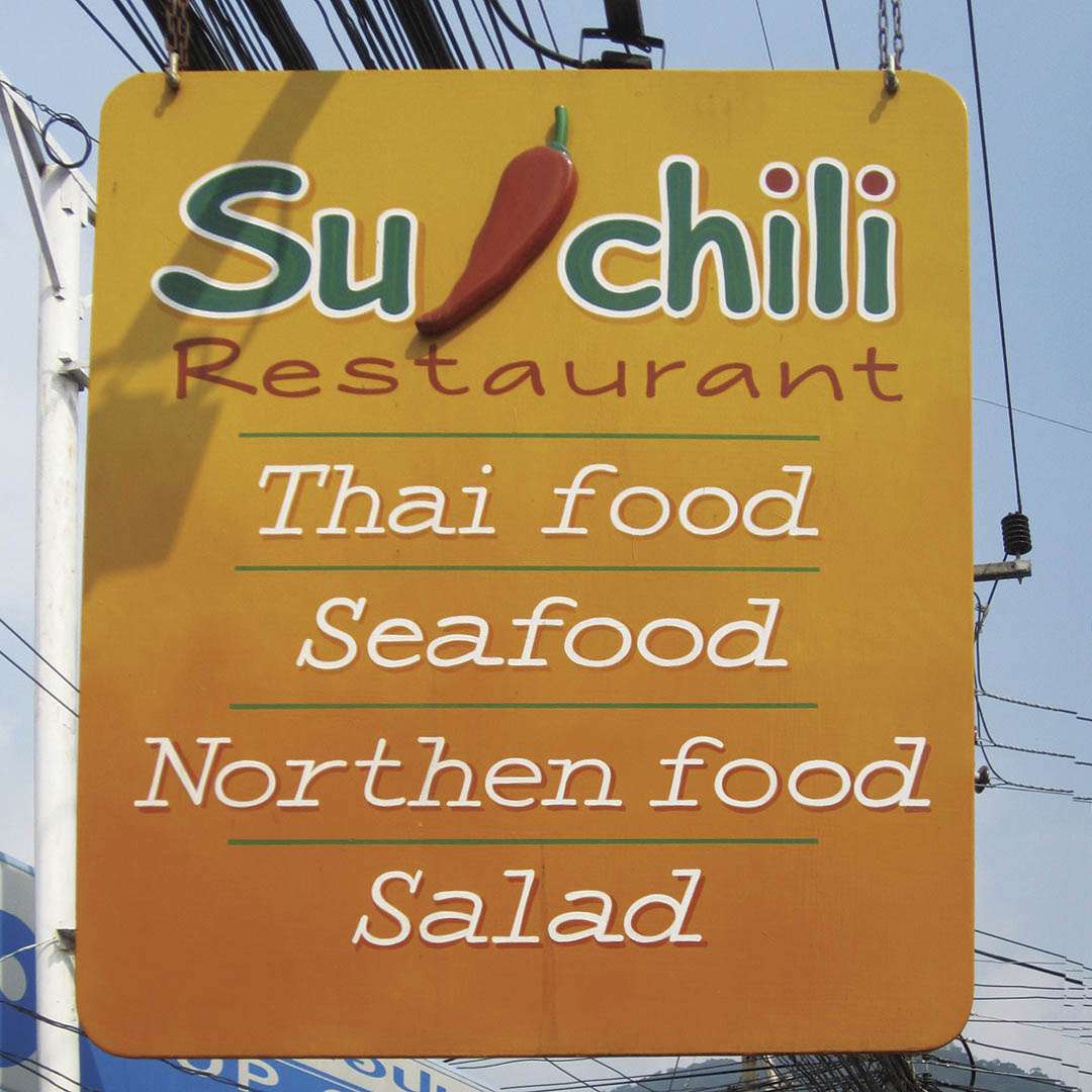
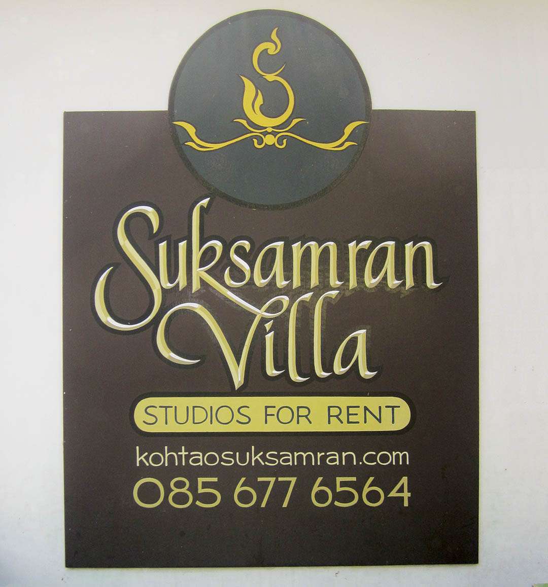
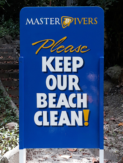
You don’t need to analyze Rob Cooper’s signs for very long to realize that he is a master at the use of contrast. Primary copy may be four or five times larger than the secondary copy. Tight script headings ride on top of letter-spaced block secondary copy. Dark blue letters may sit on a screaming yellow background.
Many sign people seem almost afraid to do that. Instead, they make everything about the same value, and the resulting sign is visually boring.
“For a sign to do what it is intended to do,” says Rob, who lives and works on the island of Koh Tao, Thailand, “it must be readable. If you squint at the sign and cannot easily read the essential message, the sign is not working.”
 In sign layout, contrast tells us what is most important. Little or no contrast, by comparison, tells the reader nothing is important—and therefore that the sign may not even be worth reading.
Contrast is naturally interesting to the eye, too. Bold against lightweight text, stiff against loose, dark against light—we like to see that.
Squinting at a layout distorts your vision, blurring the copy and graphics, which lets you perceive the overall layout. It lets you see what a viewer is likely to see in their limited viewing time. A viewer does not study the layout like the person who created it. He looks at the layout as a whole and decides if he wants to read anything on it, then if so, what to start with. The squint test provides critical information about a layout.
“There are a few easy ways to make a layout more legible,” Rob says, “color, contrast and letter weight—or a combination of all three. In my work, I like to focus on the most important part of the sign—the name, whatever they do or some critical message. I make it really obvious that it is the central point.
“This can be done by making a strong contrast between the background and the lettering, by using a high contrast color or a big, bold letter. All the rest of the copy can be of less contrast or lighter weight lettering.
“If the main copy is strong, the eyes will go straight to it. It’s all about pulling forward what you want to read and pushing back the rest. Any special effects or funky backgrounds should not fight with the main copy.
“Contrast can also be created by varying letter weights. For example: a delicate script next to a bold letter, or a big bold script with a line of lightweight, double-spaced block letters under it. The possibilities are endless!
“For a perfect example of what I’m trying to say, just take a look at anything that Bob Behounek has had in SignCraft magazine over the last 30 years. Bob never fails to get the most out of his layouts, and they are always so totally readable.”
This appeared in the May/June 2014 issue of SignCraft.