By signcraft
Posted on Saturday, January 3rd, 2026

In every issue, SignCraft gave a few sign makers an imaginary project. We asked them to do a sketch of the sign they might have produced, and to quote a price for the job. Most of the details were left to the designer’s imagination. The object was to see how different sign makers approach the same project. Here’s the scenario these sign makers were given:
Board members from a nearby mobile home park stop by to discuss a new sign for their entry. The existing sign has standard formed plastic letters mounted on tongue-and-groove siding, and they want to update their image. They are unsure of their budget at this point and want a concept and pricing to present to the rest of the board. The sign code limits them to 32-sq.-ft. per side, as it is in a residential area. The sign sits along a suburban two-lane road.
This appeared in the November/December 2015 issue of SignCraft. While the prices have been adjusted for inflation as of 2026, they may not accurately reflect current pricing for such signage.


Jim Jackson
Artcraft Sign Company, Raleigh, North Carolina
Typically, folks who approach me for a sign come through one of two channels: They have seen my work in person or on my website, or they have been referred. I have channeled my shop’s reputation deep into “custom sign” territory over the last five years because I have found that you become known for the work you put on the street. I’m assuming that the trailer park folks want a high end-ish custom sign if they took the trouble to find me among my many competitors.
My process for this type of work flows like this: Get out a legal pad and get a friendly conversation going with the customer. Interview the client to understand their objectives, especially “What do they want this sign to DO for them?”
I ask about their business, trying to ascertain in my opinion what their brand should say to the world—no matter whether they already have branding or not. As we chat, I start to sketch whatever signage comes to mind, based on the conversation.
Generally, by the time I finish asking questions, the sketch is also done. Once shared with the client, it frequently becomes the basis of the sign. I try to never address objections, colors or budgets at this initial stage, as I see these factors as potentially compromising the basic design process. Starting with a relatively clean slate, I try to sort out what I think is the very best sign type, size, design and material needed to make the sign do its intended job.
Form follows function quite literally with commercial signage. (I see a lot of vehicle wrap designs that seemingly forget this.) Compromise comes later, if required, but why start ruining something at the beginning? One important question I always ask myself during this phase is: “If I were the owner of this client’s business, what signage would I make for myself?”
I sell that.
For the Tall Pines Village exercise, the client clearly wants an upgrade. They already accept the idea that their sign is important, so I go for the top shelf to start. Some clients never get this far; some never realize the value of their signage. In my opinion, this is akin to sending out wedding invitations written in crayon.
The hand-drawn sketch really seems to work wonders. I am constantly surprised by this, but a two-minute pencil drawing done in front of a client, paired with an existing portfolio of decent work in the local market that they are likely already aware of, seems to be a legitimizer.
Objections to the sign professional’s ideas seem to fall away much more easily when the client perceives that you actually care about their project. Almost all of my complex jobs are sold with the sketch. The only problem is that I then have to figure out how to build whatever grand idea of the moment I just sold!
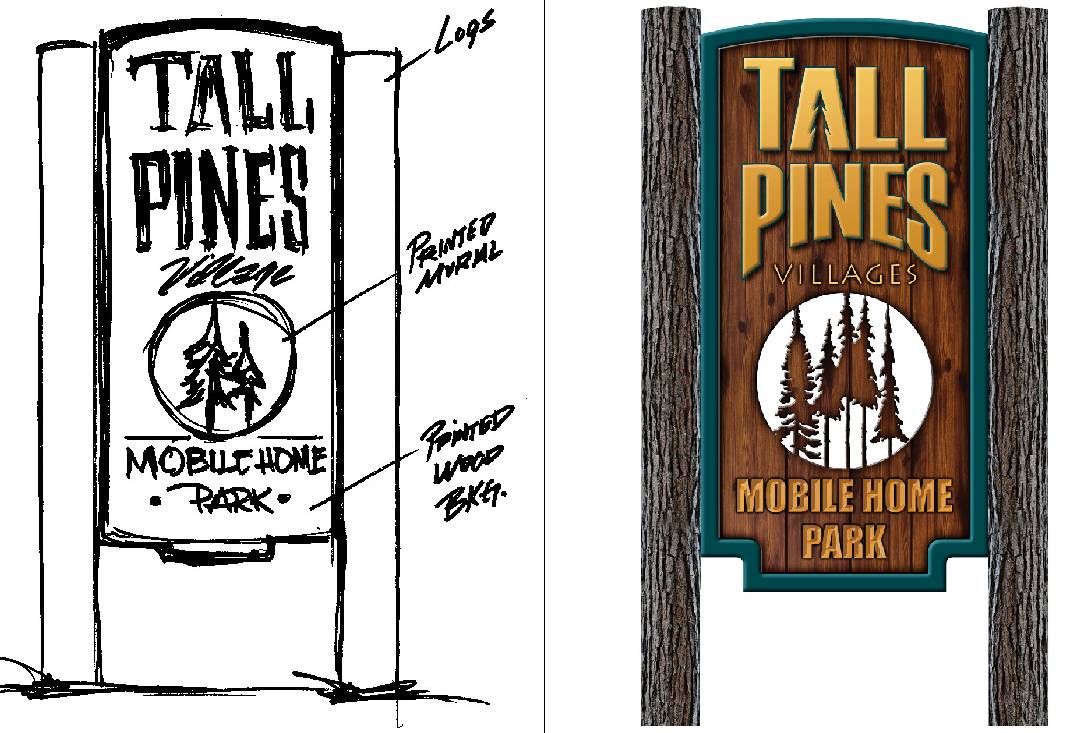
For Tall Pines, my design influences were these: The client specifically wants to upgrade, so make it really stand out. I went with mirror finish metal letters to make a connection with the metal trailers. The color breaks, support structure and “feel” of the design connect to National Park entrance signage design (in my mind, at least). The background colors (and the chrome letters, again) are pure Vintage Shasta Travel Trailer.
It is intended to be very readable and hopefully is subliminally nice enough that it makes a Trailer Park seem like the exact place you wanna be (somehow). Lighting and dimensionality are huge attention getters, so they are in. They also scream “Quality!”
I love reducing copy to its lowest and simplest form. Less (copy) is More (readability). So I try to keep the word count low (unlike when I write stuff), readable, to the point, and I try to accent with relevant imagery. Tall pine tree images on the “Tall Pines” sign seems right.
I love using fonts from LetterheadFonts.com because around here, almost no one else does. That helps give the work a fresh, attention-getting feel. I try hard to stay away from Times Roman, Murray Hill, Helvetica (even though I like it) and Brush Script because they are so widely used.
I also like satin finishes a lot, as gloss can sometimes be distracting with shadowing and light bounce, though shiny components on a satin background have a nice punch, so I used that here.
Sign codes generally suck, and 32 square feet is not huge, which is a typical problem. When I can get away with it (here, for instance), I make the “sign” fit the code, but the bracket or monument design gets utilized as a big, fat arrow that says: “Look at this sign!”
Similarly, I like atypical height–to-width ratios. People are pretty accustomed to seeing a 4-by-8 that equals 32 square feet. Mixing that up a bit is different, and different gets noticed. Having dimensional components exceeding the linear boundary of the sign background is good for the same reason.
If I can get all scholarly and apply some of Mike Stevens’s principles of layout [see Mike Stevens’s book, Mastering Layout], I start to feel like a real sign guy! Other than that, design-wise, I just like to stand out from the crowd in my market if I can get away with it. This makes doing the work fun and gives me a potential portfolio piece that will bring similar work in the future.
Next, I put the math to it and figure the selling price. I don’t negotiate this figure. If they can’t budget it, I can offer less-expensive alternatives. But clients reaching into my wallet on quoted work is a no-go around here. I’ve already gone broke playing that game. It is what it is, something less costly will be… something less!
The client is already emotionally connected to the concept via the sketch conversation, so I figure out the bigger build issues and go ahead and do an invoice. (I can always delete it if it doesn’t sell.) Then I email it to them with apologies for the high-dollar figure (after all, even $100 is a lot of money to me!) and ask for the deposit.
I tend to just close the sale and skip the B.S. Sometimes I get a cardiac patient, but not usually. With the direct approach, I either get started quick, or quit thinking about it altogether and move on to the next item on my list. I don’t seem to mind wasting my time, but I hate it when others do it for me!
If we get through that all right, I do a scaled drawing in FlexiSign and send it over for approval.
The price:
As I sketched Tall Pines, I ballparked it off the cuff at $12,600. (I have done a number of similar jobs, so I had an edge this time!) Then I crosschecked myself with quick roughly estimated materials plus markup plus labor.
I never add the list up until it is complete, so that I know I am not steering the math toward my gut number. This time when I totaled the time and materials version, I was about $8 off of my gut. (Being that close is a bit unusual!) Usually I am happy with a 10% difference and quote the higher number.
For many types of signs, especially the more typical ones, multiplying the cost of materials times five will give you a selling price that covers your labor, overhead and profit. [You can learn more about that in Jim’s article “Try this easy approach to pricing your signs”.] But that doesn’t necessarily work for a complex custom job like this, so I did a more conventional estimate.
My material cost estimate for Tall Pines came out to about $4000, but a big chunk of that was to Gemini for stainless fabricated letters, so I can’t exactly multiply that particular cost by five as the market generally accepts times two as a maximum for materials. Again, I use multiple pricing methods and sometimes they are co-mingled!
In the end, the quality of the sign (read that as: “How well it does its job.”) is more important than the price of the sign. Somehow we seem to attract just enough clients who appreciate this philosophy.
In the business, we all know that signs are in fact “cheap” at almost any price, if they are doing their job well. Since I start with that task—to do its job well—as paramount, hopefully the sign is doing its job! If I’m doing my job right, I know that the sign will pay the client back many times his or her original investment. Plus, I personally dislike the mentality of “cheap” so I guess I have run most of the low-end work out of here by now.
Pricing a sign as a commodity, which I see a lot of vinyl/digital only shops do, removes any incentive on the part of shop folks to do anything more than pound the signs out assembly-line style. That is okay for some signage, but most signage needs a little care, expertise, design and love put into it!
Bob Fiddler
Johnny’s Signs, Bedford, Indiana
YEAH! Another committee sign!
First of all, I want to clarify, unlike Mother Nature, we bear no animosity towards the mobile home lifestyle. With that said, I do feel she is unfamiliar dealing with boards, committees, etc., bypassing their conference rooms and meeting halls where progress regularly grinds to a halt.
After discussing the findings of the “committee”, we decide to send a few photos of completed projects via email similar to their requests—derived from months of debating and the appointment of a new chairperson.
Showing photos of similar projects we have done is somewhat common for us. It lets us show the prospective customer a finished sign and evaluate their feedback without wasting valuable time in meetings. It also allows us to present a design that will at least be in the ballpark—and may not require seven amendments, thus saving cost.
With the info gathered, we decide on a portrait format that will accent a post idea to be a part of the design without much added cost. Most of our projects are somewhat layered, but some appear very dimensional yet have no dimension at all. This is a valuable negotiation tool after a design has been achieved and the budget hand is finally played.
Two 6-by-6-by-14 treated posts: $129.32
Four bags of dry concrete mix: $25.88
Design and router set up: $401.20
Installation, three hours: $465.91
Total: $2,888.42
We do a rough sketch with ideas of proportion and vague design. After confirmation to proceed, we generate a vector version in our Gerber software. We start with a vector for routing and possible added layers for upselling. Then we run it through Photoshop to finalize the design. If this project comes in over budget, we could delete the printed posts (under protest). If we were under budget, we could upgrade it with router-cut dimensional letters.
The PVC panel will be routed to shape on the Gerber Sabre 408 router. Since we’re routing, the trees will be cut through. The panel will be cleaned, scuffed, re-cleaned and direct printed with our HP Scitex, then UV coated with ClearShield gloss liquid laminate.
The treated 6-by-6 posts will be set in dry concrete. The PVC pipes will be wrapped with a pine bark design printed on 3M 480cv3, then coated with a flat finish UV liquid. The pipes slide over the treated posts, then routed caps are installed and sealed inside the pipe tops. I originally thought of using real pine logs but had deterioration concerns. The sign mounts are recessed through the pipes and mounted to the posts, then the PVC panel is attached.
Roger Cox
House of Signs, Frisco, Colorado
Our normal process begins with a client meeting to gather information and educate them with our knowledge of design and materials. At this time we require a $1200 design fee for our professional design services and sign permit procurement. We also discuss budget ranges for the sign, support structure, lighting and installation.
This is followed by a site visit or researching client-provided photos of the building and/or the install site and surrounding areas. We then begin drafting our concept sketches and present the option(s) to our client, followed by a 3-D color version, which really allows the customer to see the concept with all the proposed textures and dimension.
This step usually always sells the sign. Once the sign concepts have been approved we submit the final proposal and begin fabrication upon the 50% deposit payment terms.
Price: Design and permitting: $1200
Main sign with steel supports: $18,000
Secondary sign with steel supports: $4400
Hand-hewn logs with steel interfaces: $1900
Excavation, concrete, installation and trip charges: $3600
Stone base and sandstone caps: $4500
Total project cost: $33,600
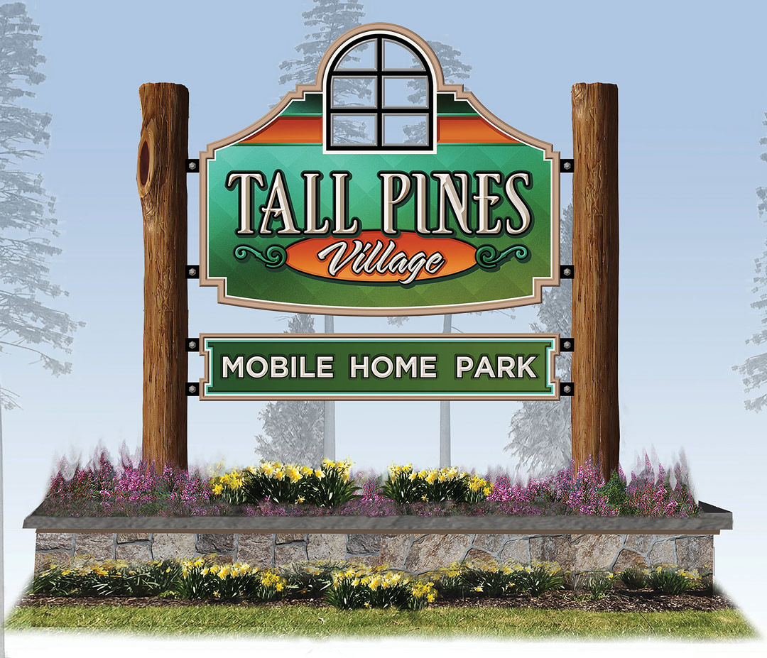
This project was very familiar to us, as we do many freestanding signs in our area. We presented the concepts to the board, along with other samples of our work, and a mention of the many awards we have received over the years. All these factors allowed us to up-sell from their original budget of $19,400.
The main sign is fabricated from multiple layers of HDU and measures 54-by-72-in. per side. Features include a recessed background with a unique modern texture, so the sign doesn’t look too rustic, and finished with a gradient-blend using latex paints. The window is cutout and inlayed with clear acrylic.
The letters are prismatic-carved and mounted to the raised outlines. The secondary sign, also from HDU, measures 12-by-72-in. per side. It features a smooth surface with a gradient-blend painted background and raised letters inlayed into a milled pocket. Both signs feature internal steel frames for structural support and interfacing to the wood posts. We sourced the rustic logs from a local log-home builder.
After our excavator prepped the site, we installed the wood posts in concrete footers. The stone mason then worked on the stone base and cap before we came in with the finished signs. The client budgeted for lighting in the next year and will install LED up-lights concealed in the planter. We ran power during the excavation process and capped for future use. The maintenance crew for Tall Pines handled the landscaping.
