By Jeff Cahill
Posted on Friday, January 9th, 2026

Today we’re talking about a subject that’s had at least two sides to it for those who make signs ever since cave dwellers started putting pictograms on walls:
What gets the primary emphasis—the business name or the product/service they offer?
For me as a sign maker (not a brander), the primary message that a sign provides to the viewing public is critically important. That’s what needs the most emphasis. The viewer usually only has a few seconds to read a sign. Is it my job to give the brand-identity or first tell what goods are being sold?
If only given one choice, I’ve always tried to make sure that the product line gets top billing. Some business names lend themselves to include both, but for others it’s not so easy. If it’s a new business, I tend to give equal billing to both the business name and the product line.
But faced with the choice of the emphasis being on the company name or the service, I put my money on the product or service. I feel that’s what the viewer needs to know.
Historically, in the vintage books on advertising and signs that I’ve collected, most hand-rendered posters and sign boards were done using this approach. And that was in the era when we had stupendous economic growth!
When I see a sign that leaves me wondering what a company does, I think of the great opportunity that is being lost by yet another small business that is struggling to survive and grow. Because sign advertising is their very best marketing value, it hurts to see them losing that opportunity. Small businesses need all the help they can get. Branding is different for small businesses, and there’s a huge emphasis on brand name recognition today.
Branding and signs
To some graphics/ marketing people, branding seems to mean a focus on the name of the company. At a local Chamber of Commerce seminar, the presenter held up Texaco as an example. Their name and big red star got the point across without ever saying that they were an oil company. I asked her if she thought the average small business had a hundred years and millions of dollars to invest in the process so that they could have the luxury of dropping their product or service from their “brand.”
In another comparison, she wouldn’t concede that it would be better to stress Bakery on a storefront window rather than the surname Wilson’s. I guess she believes that Hostess was always a bakery’s name and that you come out of your mother’s womb just knowing that.
Just because it’s working for Starbucks, it doesn’t mean it will work for Joe’s Carpet Cleaning. When you see the Texaco logo today, you know what they do. You don’t need to know that it stood for Texas Co. a hundred years ago. We don’t have to say Gas and Oil anymore. The same for Ford (the Motor Company, not the local electrician).
But if the sign has a big, beautiful JOE’S on it, and I don’t get the Carpet Cleaning message unless I stop and look very closely, then the sign is a failure. It’s money wasted.
For all our technology, we have taken a step backward in effectiveness if we forget that the reader needs to know what a business does, more than—or at least as much as—he or she needs to know the name of the business. Branding fails if you don’t clearly get the message of what this company does or sells when you see the sign.
Branding doesn’t replace marketing, just like signs don’t replace marketing. Most of the time, branding works because there is a lot of supporting electronic and print media working as well. Most small businesses don’t have the extra advertising dollars to help turn the design into a truly memorable brand. It takes years and mucho-dollars to create one of those brands.
Of course, there are always those folks who will insist on seeing their name in lights and let their service or product step down to second place. Often they just don’t realize how they are hurting their chances of reaching their prospective customers. As the professional that they come to for their sign, we can help them see that.
The business owner, Joe, may like the idea of his name being the focus, but in reality, it means nothing if the viewer doesn’t know what the company does or sells. If someone goes online to search for some service in their area, like Carpet Cleaning, they’ll find a directory or several websites. Then that’s a time they could remember they saw Joe’s truck or logo. But what if you don’t do your research like that?
Branding for small business
Maybe the issue is this: What is effective branding for small business? It can’t be the same as it is for Texaco, Target, Pepsi, Sears or any other major national brand. They no longer have to tell us what they do—we all know. But Spring Creek Florists has to tell us that they are a florist, legibly and large enough for us to read it. Otherwise, if all we remember is Spring Creek, we could wind up contacting the rental office of a local apartment complex.
Effective branding addresses this issue. It gets the reader the information they need to want to do business with this company. It’s not about serving up a pretty or striking or clever or bold company name or logo. The reader has to get what the company does or sells along with the name (or brand).
Don’t forget, too, that some people like to support their local communities. If the town or region isn’t indicated, it may mean a lost sale. Personally, if all I get is a generic e-mail address on a printed ad, I don’t buy from that source. I search until I find something that’s available locally, or at least made in America, before I go down the line and buy elsewhere.
Emphasis and vehicle wraps
Misplaced emphasis on type and graphics is a common issue on vehicle wraps. It stems from the same consciousness. When you combine poor branding, poor wrap design and poor legibility, the result is visual confusion. That’s all—and that’s not advertising.
I see wraps like this every day. Recently I saw one that had nice, curvy lime green lines running front to back, sort of like the old Coke logo. Then it had a great big JENN on the side, and then something like “Your greener way to cleanliness” below the name.
What does that mean? It was parked in front of an auto parts store. Are they recycling anti-freeze or putting the deodorizers in a bathroom? Or were they just in there buying a part?
Did that design work? For the thousands of dollars the company probably spent, they could have spent about $450 and had a bunch of generic vinyl stuck to the vehicle telling their whole story. They may have at least gotten some sales from that. As it was, what they had was only a monogram for their business. I doubt they get any sales from it.
Legibility and the 3-second rule
For me, the first question about any sign layout still has to be, “Is it readable?” That’s followed by, “Does it deliver the most important message first?” And then, “Is there supporting information so that the viewer can contact them?”
A client of mine who has been very successful in the advertising world said that he lived by the Three-Second Rule in his work: If you don’t get the message in three seconds, it doesn’t work. This is true of most signs, too.
When someone brings me their artwork, I explain that it doesn’t mean that I’ll automatically do their sign. I can’t sell something in good conscience that I know will be ineffective. If I can see the design will fail and I can’t help them see otherwise, I let them go out the door.
Money is secondary to me on that issue. I want folks to remember me for being ethical and that my sign or advertising program sold more work or products for them—not that I did graphics on their sign or vehicle that didn’t produce any sales.
That’s a choice each of us has to make. Just because a person has a degree in marketing, advertising or graphic design doesn’t mean they know what works on a sign.
Make some constructive alternative drawings from the art you’re given. Put them side-by-side and let your client see the difference. After all, it’s their money. I’ve had more than one person thank me for stopping them from making a poor decision based on just one person’s point of view.
Jeff Cahill’s shop, Quality Signs & Designs, is in Woodland Park, Colorado.
This appeared in the July/August 2014 issue of SignCraft.
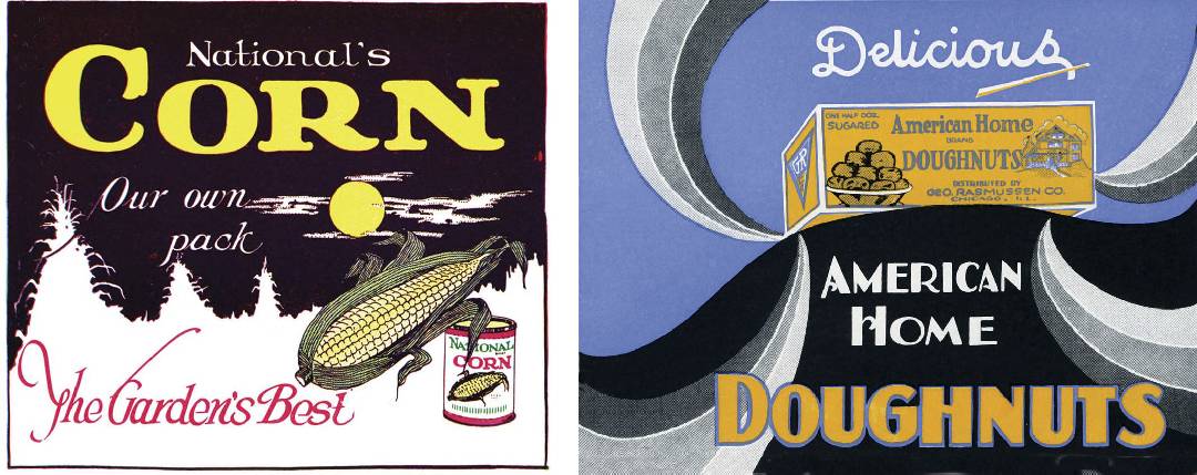
Early packaging design stressed the product first, over the manufacturer. This color illustration is from a 1939 edition of Silk Screen Methods of Reproduction by Frederick Drake & Co. of Chicago.
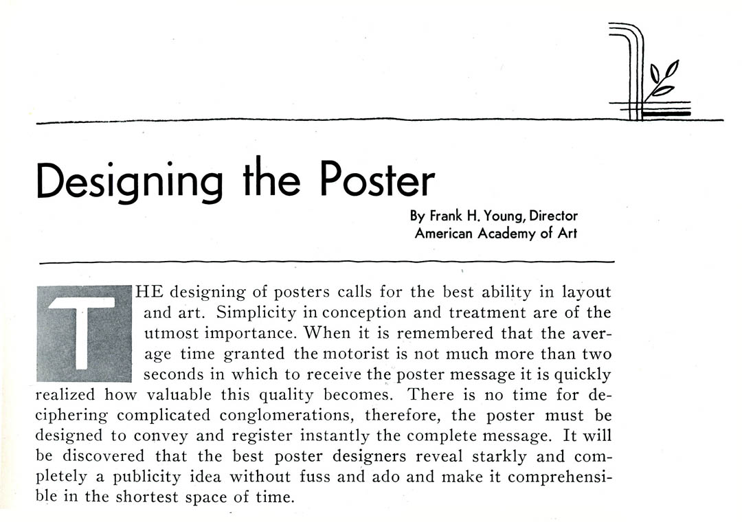
This text on the purpose of design is from a 1930 edition of Advertising Outdoors (Chicago), and I believe it is just as relevant today.
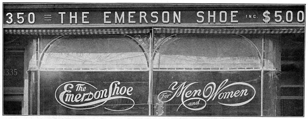
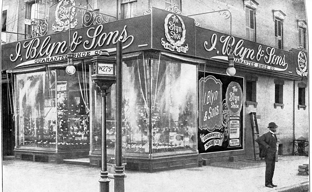
These two images from “Sign and Banner Making,” published by the International Library of Technology in 1906, show the contrast of the approaches. I think the owner of Blynn & Sons shoe store suffered the same ego affliction that buyers of today’s overly-busy vehicle do today. It sure looks like the consciousness of branding that’s prevalent today.
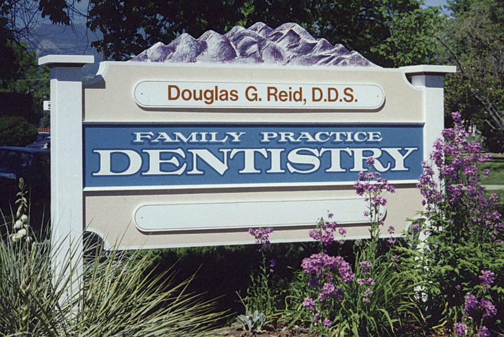
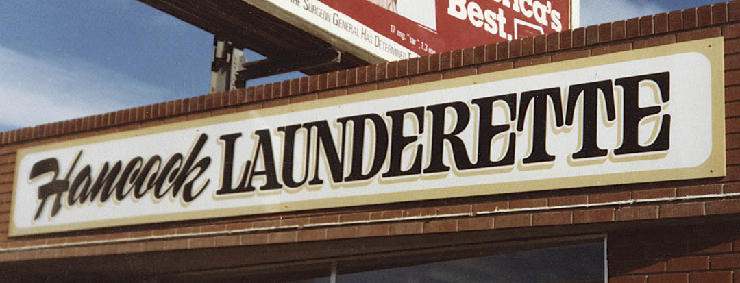
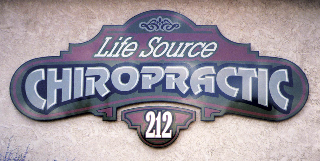
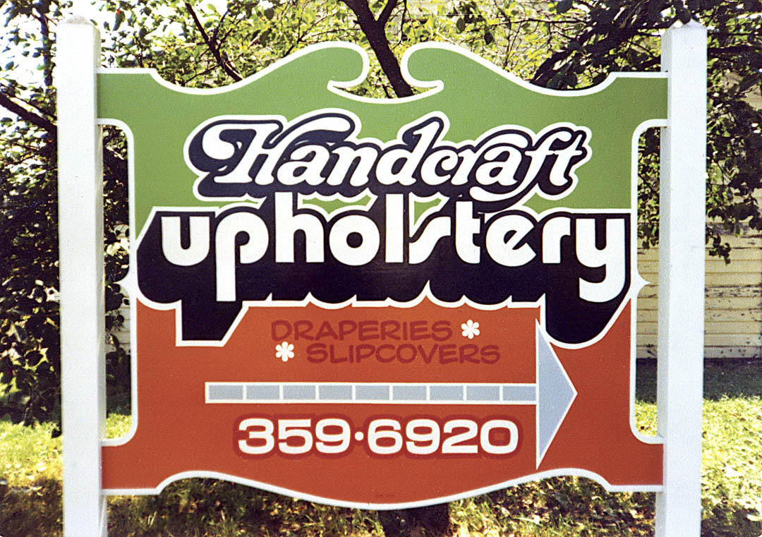
These examples show how I’ve considered the sign’s primary message when doing the layout.
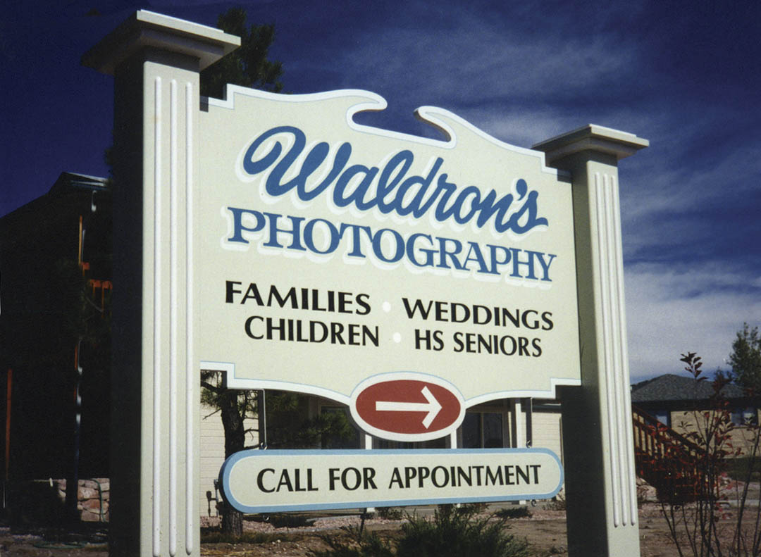
Though the script is larger, the primary message, “Photography,” is still more legible and would likely be read first.
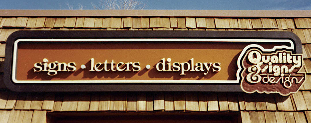
On my own sign, I made sure that viewers would at least get Signs, Letters, Displays first.
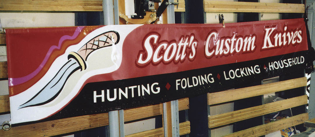
Here’s a case where the name and product could share the primary emphasis.
