By Dan Antonelli
Posted on Friday, March 13th, 2026

Building brands is always a fun, but very challenging exercise. We are blessed with clients who often give us a lot of creative latitude to design their brands, and they share our philosophy of building images which we would consider to be “disruptive.”
And by disruptive, I mean brands that don’t fit in or look like other brands. That’s what the best brands do—they disrupt the space they live in by standing out.
Such was the case with Ken Goodrich, the owner of Goettl Air Conditioning based in Phoenix. It was about four months ago that I met with him while speaking at the ISA Sign Show in Las Vegas about truck wrap design.
Ken talked about a new radio campaign that was launching, which focused on his childhood experience of working with his dad on air conditioning equipment, and holding a flashlight while his dad worked. I thought it was an interesting campaign idea, but I felt like there was a disconnect between the nostalgia being evoked and the more modern brand Goettl had evolved into. For a 75-year-old company, perhaps it makes sense to go back to our roots and see if we could somehow connect the messages.
I started trying to envision how I could tie these elements together. We had this old company with this nostalgic campaign focusing on a boy with a flashlight. I had Ken send me all the old logos from the ’40s and ’50s that Goettl had used. And then I had a crazy idea—but it would require rebranding the whole company, including redoing the truck wraps of more than 40 vehicles.
Why not integrate that 10-year-old Ken, holding a flashlight, into the original branding? We could render it in a Norman Rockwell style and give a visual to go along with his radio campaign. And then integrate it onto the vehicles in a way we hadn’t seen done before.
Getting the client on-board
I figured the best way to get Ken on-board with this was to do a few very rough drafts of what we had in mind. Thankfully, it didn’t take much to convince him of the idea. Now came the hard part: how were we going to actually pull this off?
The biggest challenge was finding source imagery that our illustrator could reference to draw from. We quickly realized finding an old ’40’s or ’50’s ad that had a boy holding a flashlight the way we needed would be impossible.
So we then went to Plan B: stage a photo shoot with a 10-year-old boy, then use that as our reference to illustrate from.
As luck would have it, I have a neighbor with a 10-year-old son. We dressed him in overalls and a newsboy cap, then armed him with a flashlight. We had him hold a blank sign which would represent the logo—which at this point we still hadn’t finalized. We figured we could also use this pose to work for the vehicle wrap, as well. We headed to our “state-of-the-art” studio in my garage.
Tweaking the existing logo
We were able to reference the original art for the logo from back in the ’40s and base an updated version on it. While maintaining the roots of the original brand, we proposed several versions with updated typography. We modified a few of the original elements to put a better, more cohesive mark together. We tried several options before returning to typography and colors closer to the original logo.
Illustrating the boy
Ken suggested that we use photos of his son when he was 10 years old as the basis for our illustration. He sent several pictures, and we were able to get it to work out. Using the original reference photos for lighting and position, and then the photos of Ken’s son, we digitally painted the boy in Corel Painter first, then brought everything into Illustrator for vectoring. This process took approximately 80 hours of time.
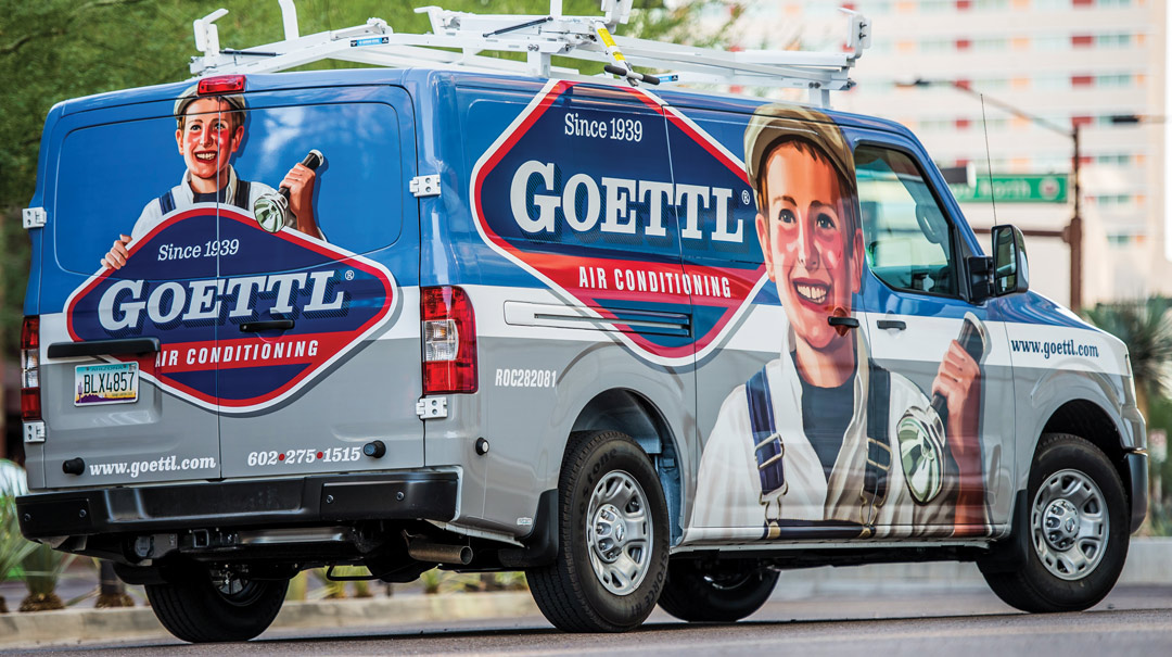
The truck wrap and fleet branding
While our illustrator was working on the final rendering, I was busy working on how we’d incorporate this new branding on the trucks. Initially I thought I would use the logo with the boy above on the truck, but the more I played with it, the more I realized that the proportions wouldn’t allow for the impact I was hoping to achieve.
I decided to have the logo elements split for the sake of the sides of the truck. In doing so, I’d be able to have a large image of the boy and have the logo flank him. Both elements could then be much larger.
We enlisted the help of a local sign company in Phoenix, AZ Pro Group, to execute the installation of the truck wraps. Their team did an amazing job.
The results and the ROI
We asked Ken about the results thus far. He said, “Since hitting the streets, the response has been fantastic. Previously, our trucks seemed to blend in with the rest of the crowd, and now, so many people are really taking notice of the new brand. It creates a warm, personal feeling that is a huge part of our philosophy, of always doing the right thing by our clients. These rolling billboards have by far been our best investment in terms of an ROI.”
This appeared in the September/October 2015 issue of SignCraft.
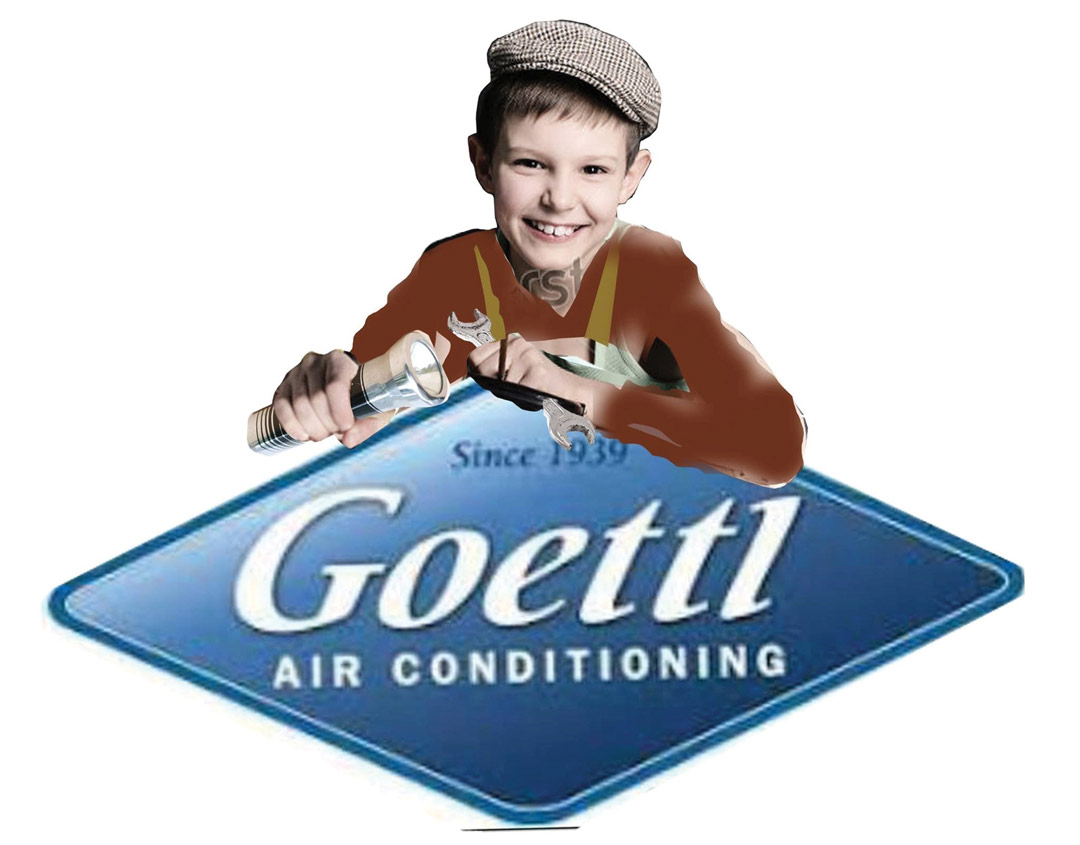
We created this very rough concept sketch in Photoshop, using the old Goettl branding prior to our photo shoot.
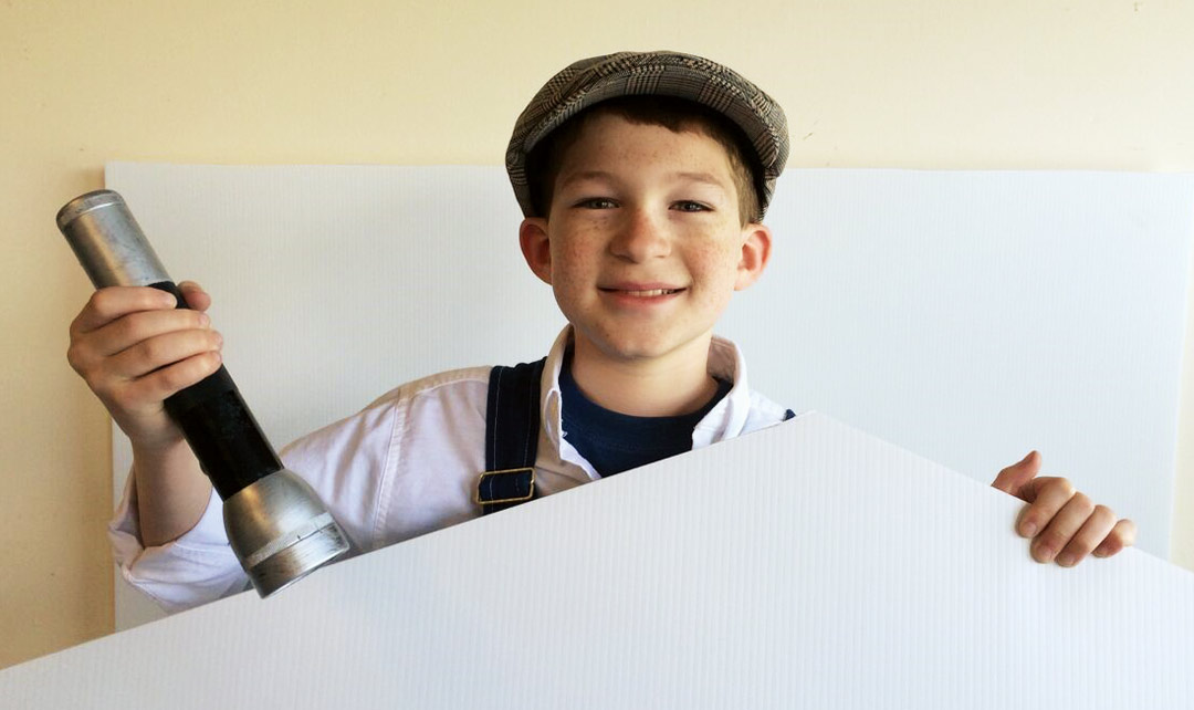
The photo session gave us the rough pose we needed to base our illustration on.
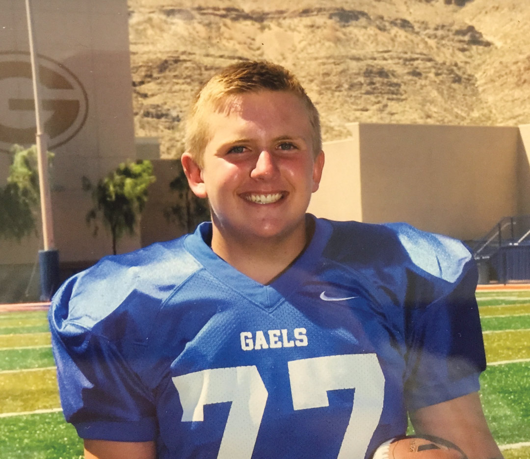
The client gave us a few photos of his son for the illustrator to use for the facial characteristics.
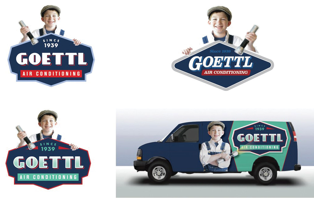
We tried several variations of the logo at first, which had different typography and panel shapes. Ultimately we decided to go with a design that carried over more of the original logo. One rough shows how the design might live on the truck. This continued to evolve as we got the illustration done.

After further refinements, the illustration is coming together.
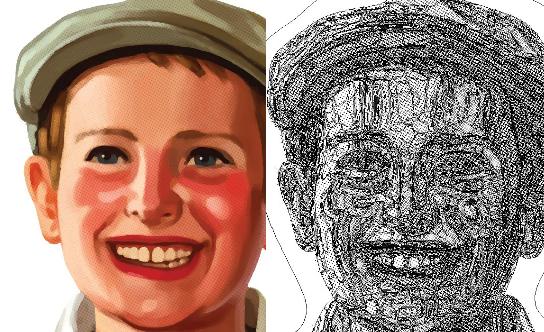
You can see the amount of work and detail that goes into bringing an illustration of this type to life.
![]()
Here’s the finished logo. We also did a version without the boy for other applications.
This is what I mean by disruptive design—creating brands (and wraps!) that stand out because they don’t fit in.
Dan Antonelli owns KickCharge Creative (formerly Graphic D-Signs, Inc.) in Washington, New Jersey. His latest book, Building a Big Small Business Brand, joins his Logo Design for Small Business I and II. He can be reached at dan@kickcharge. com. Dan also offers consulting and business coaching services to sign companies. For more information, visit danantonelli.com. On Instagram: @danantonelli_kickcharge.
