By signcraft
Posted on Saturday, May 9th, 2026

In every issue, SignCraft gives a few sign makers an imaginary project. We ask them to do a sketch of the sign they might have produced, and to quote a price for the job. Most of the details are left to the designer’s imagination. The object is to see how different sign makers approach the same project. Here’s the scenario these sign makers were given:
The new owners of a vintage bookstore contact you about a double-faced 3D hanging sign. The store is located in a busy downtown area where there is a lot of foot traffic, and the ordinance permits a 9-sq.-ft. hanging sign. The well-established collectible and vintage book shop has been in an historic building for over 100 years. Until now, their only identification has been the 1930s-era gold-leaf lettering on their window. The new owners are looking for a classy dimensional design that fits in with their business and building.
Price:
I would estimate a double-sided hanging sign done on the CNC router would be in the $3376 range, including design fees and installation. This assumes the final design is basically cut-out letters on a simple background and the install is a fairly simple frame and attachment.
The price could double if there is gold leaf and multiple layers. I do not have a formula but experience has taught me to add 25% to the final price of a job of this size to account for unseen expenses. I am usually pretty good at knowing how long it takes to do the fabrication and painting, but I have cut myself a little short in the past. Experience is the best teacher!
Jeff Miller
Red Dwarf Graphx | Astoria, Oregon
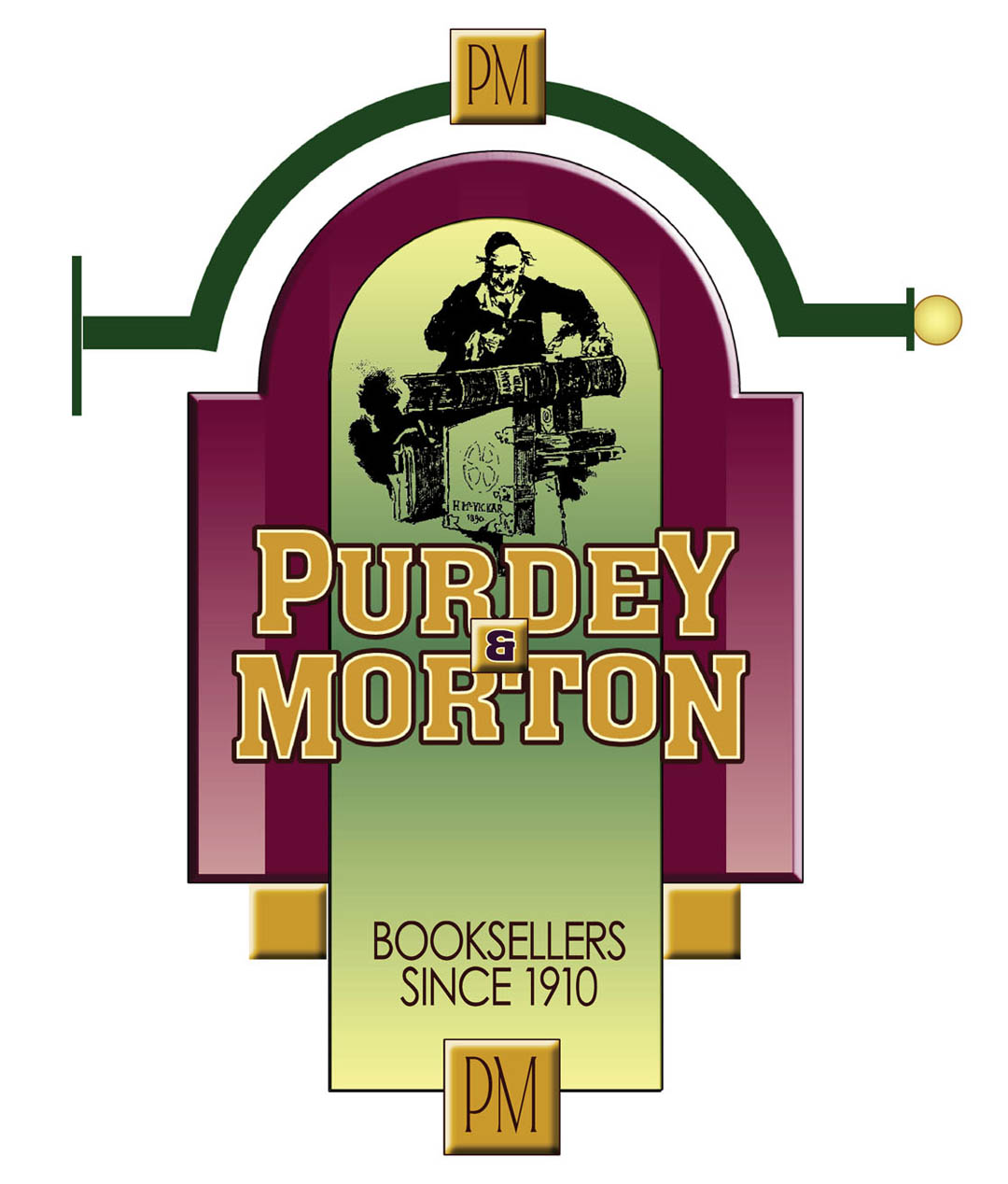
On a project of this scale, there are a lot of details that need to be determined to get to a final price. At the preliminary meeting, we look over my portfolio and online examples and see where the project needs to end up. We look for materials to fit the particular project and move in a direction to get a price for the sign.
Then I will start some initial designs to get the ball rolling. Usually it will be fonts that the client has seen and liked and go from there. Every client is different, so different levels of them getting involved is something to consider. I prefer to have them make the beginning decisions for design direction, then I take the lead from there so I can plan as I work.
I come up with a couple of rough sketches or computer renderings to show where I’m going with it, then have them choose the direction and design elements. After that, the colors and fabrication details are up to me as I consider budgets and client preferences.
I always get a design fee up front as this type of sign is normally pretty involved, and I can spend a considerable amount of time just in the design phase. I let them know that the design phase is critical. Later on, changes can get expensive due to the nature of structural components, so we always get all the details worked out in the final design—before fabrication starts. That way, the only changes will be color tweaking and things of that nature.
The final product is usually pretty close to the design. I take photos of the sign when it is done and compare them to the original sign design layout which I superimposed on the building photos. I usually get it very close. In the age of computer renderings, it is imperative that the client gets a very good representation of the finished product before it is built and installed.
For pricing, the level of detail is the main factor. Will there be gold leaf or will it be all 1Shot enamels? Is there work that needs done by hand or can it all be done on the router? Materials for a sign on a wall versus a hanging sign mean the structure must be accounted for. Engineering also comes into play for hanging signs. That always adds extra costs—doing the drawings for the engineer to make their calcs from is something I need to be compensated for.
Price:
Sign: $3309
Bracket: $540
Prices do not include installation or logo costs.
Gary Anderson
Bloomington Design | Bloomington, Indiana
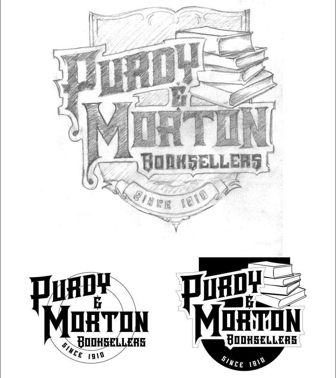
The fact that this is a vintage bookstore that’s been in the same location for 100 years first makes you think of Post-Victorian or Art Nouveau graphics. But it says there’s some 1930s gold leaf lettering on the windows, so I decided to take an alternative approach.
The design is mostly a rectilinear Deco style, but the illustration is somewhat Post-Victorian. I used a whimsical guy looking over these big books for the illustration. The detail is lost in the drawing, but it would show on the sign.
My main goal is to get people’s attention, especially in this day and age when everyone constantly has a screen in front of their face. I tried to give them something unique to look at, something they haven’t seen before.
As for colors, there were no restrictions mentioned so I just chose what I felt worked. Ordinarily, I would ask about their color preferences, or any colors they don’t care for. Again I would go with something unique, like the green and purple. I also like to use a mix of neutral and hot colors, so I used the pale gold in there.
My approach usually involves layers that are built up, and the sign is done that way. I’ve been doing that for a long time and like that look. Each side would use four levels of cut-out PVC board, then hand painted with acrylic finishes.
The pictorial panel is a digital print, then everything is clear-coated with ClearShield for UV protection. An attractive bracket adds a lot of interest, too.
Price:
I often use more than one method to estimate the price of a sign like this. We use SignVox for our pricing and shop management, but I often write down an outline for the pricing before turning to SignVox, which will price out all the material and labor.
Design: $392
Production: 16 hours at $130 per hour: $2080
HDU, smalts, gold leaf, paint: $426
Bracket and hardware: $192
Installation: 2.5 hours at $170 per hour (one person): $425
Total: $3515
Mike Leary
Sundance Sign| Dover, New Hampshire
We start every project with a discussion with the potential client, covering the information needed to put together a design. Our goal is to create a sign that will fit the branding and marketing needs of the business as well as the budget being provided to produce it.
Additional information is needed, including the sign ordinance requirements. A visit to the site to see the building and how the ordinance affects the sign, as well as knowing the client’s desires, allows the creative process to begin.
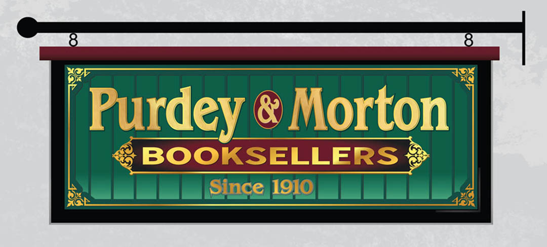
I learned that the owners wanted a 3-D projecting sign to help improve their visibility to foot traffic. They also had a reasonably large budget for the 9-sq.-ft. sign that was allowed by the city. Their current branding has been the 1930s-era gold leaf lettering on their window. With the information gathered it was time to get started on the design.
I decided the best direction would be to incorporate some of the styling from the existing window for the design. Additional elements were added to the design to take advantage of the 3-D effects.
The HDU sign panel will have a cap on the top. The large stripes in the background are relief carved and finished with a gradient fade of clear to green smalts. The “Booksellers” panel is recess carved and painted with black to burgundy blend. All lettering is 23K gold leaf. “Purdy & Morton” will have a soft detail carved in the center of the letters to simulate matte centers. A simple steel bracket was chosen.