By Bob Behounek
Posted on Friday, May 23rd, 2025

Moving vehicles are everywhere. Some are on the street; some are on a race track. When it comes to graphics, I feel there are many similarities between the two. Both require extremely clear, readable information.
As the race car flashes past us, along with a host of other competitors, the graphic competition is at the maximum. Unlike cars on our streets that move so much slower, race vehicles are all in one venue—vying for our attention at a high rate of speed.
Lettering race cars took the art of hand lettering even deeper to another level. When I bought some brushes and paint to tackle my very first lettering job, I never thought there would be a formula and basic theory to adhere to.
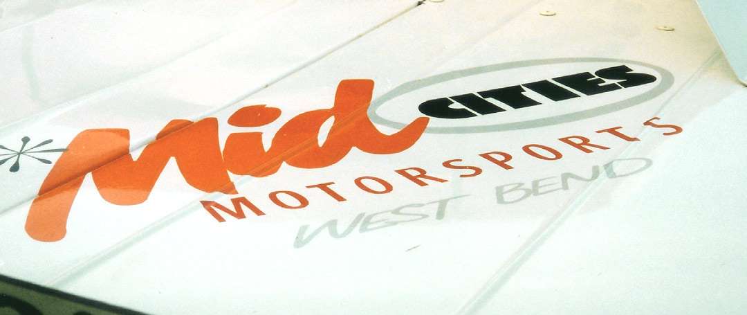
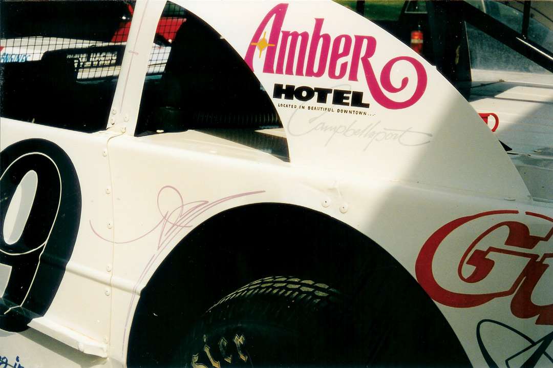
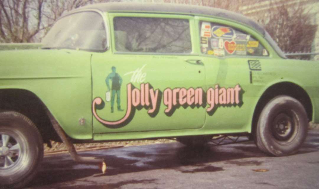
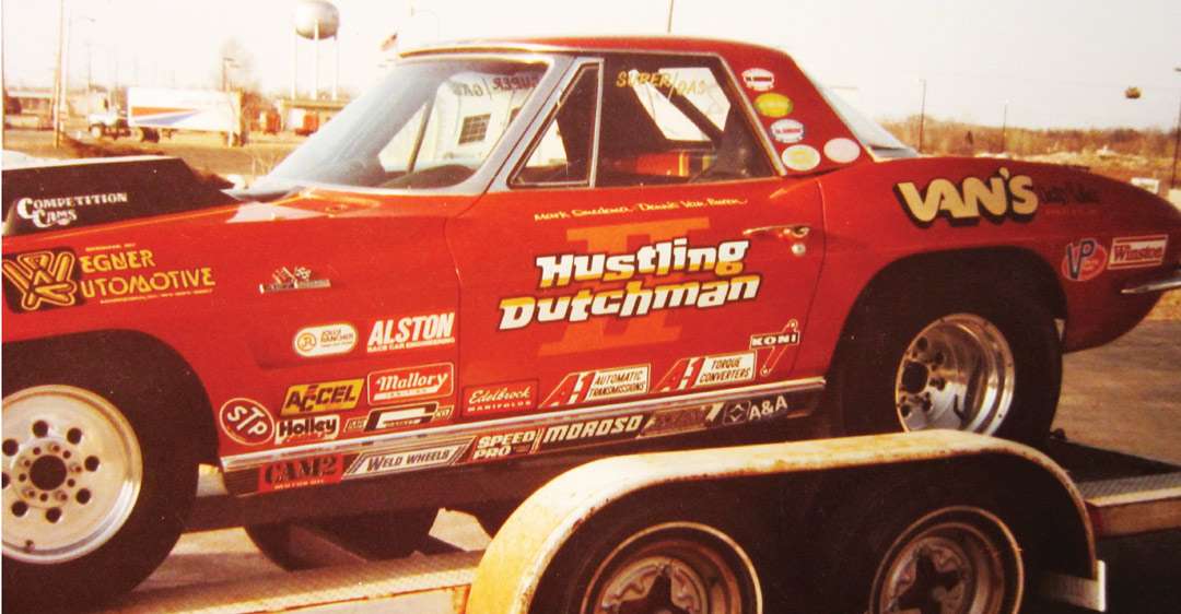
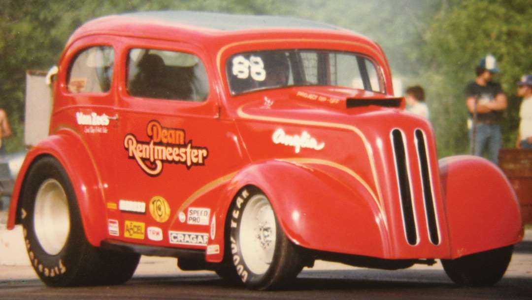
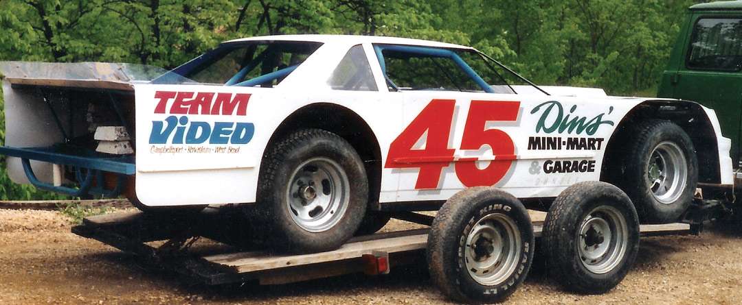
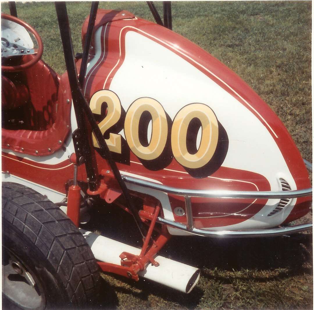
I have always been a fan of anything that rolls, no matter if it was on the street or on the rack track. That keen interest kept me observing the hows and whys of this unique artwork. Race car graphics were special. Simple messages were conveyed through clean letter forms and line drawings.
The power of this hand-painted art helped me understand what looks good and reads well and what does not. Watching all these vehicles pass by gave me a pretty good education about what it took to look good and read well at the same time.
I don’t know if many of you have built any scale models of cars, planes or boats. In my early years, I found this hobby to be of great value for experimenting with lettering forms and color combinations. There were so many great automobiles to build that represented the real-life race vehicles.
No kidding—I tried every color combination possible. It was easy enough to place the finished scale body on the floor to see if I could read the graphics as I was standing there. It was like looking at it from the same distance I would if I were in a real grandstand. Using those inspirations as a benchmark kept the creative juices flowing on every scale project for many years.
That early experimentation provided knowledge I used the rest of my life in the career I would choose years later. Cool graphics for 3-D moving objects became a challenge to master in scale or full-size.
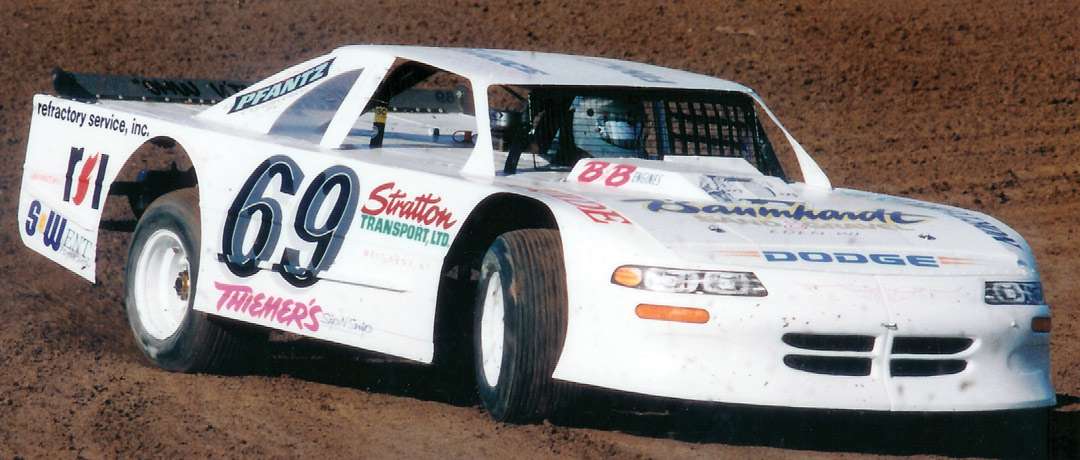
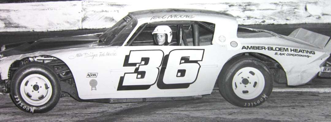
The very first time I was asked to hand letter a “real” race car, it put me in a much larger scale. I tried to paint up a scale version first to get a proportional resemblance. This really helped. But I quickly learned that I could visualize the full-size project without producing a smaller version first. Either way, I wanted to make wiser choices from the get-go, so I wouldn’t waste a lot of time making poor choices in type and color.
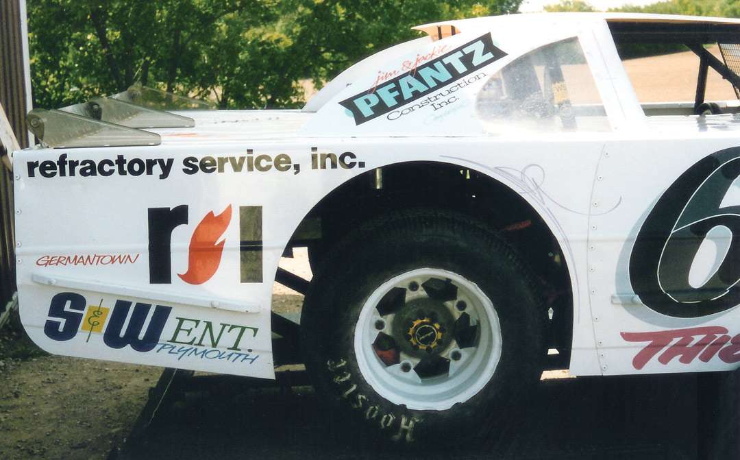
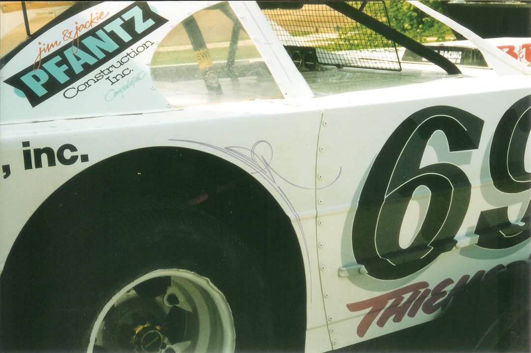
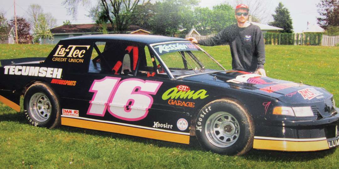
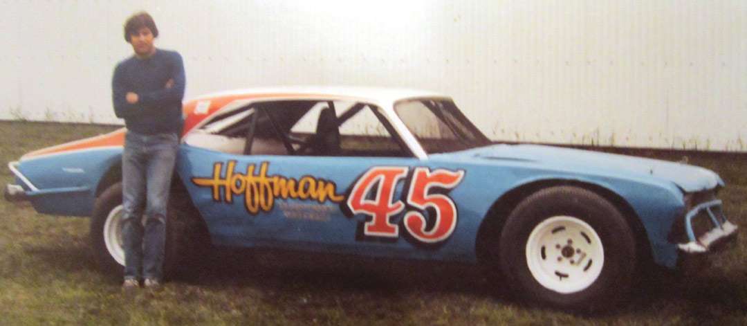
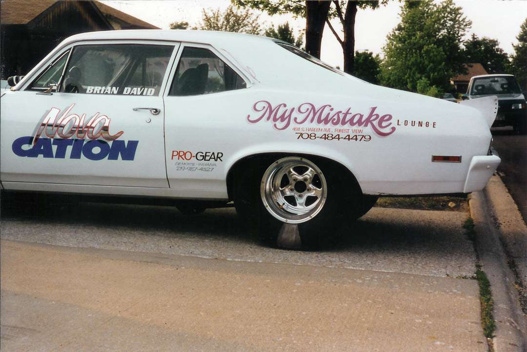
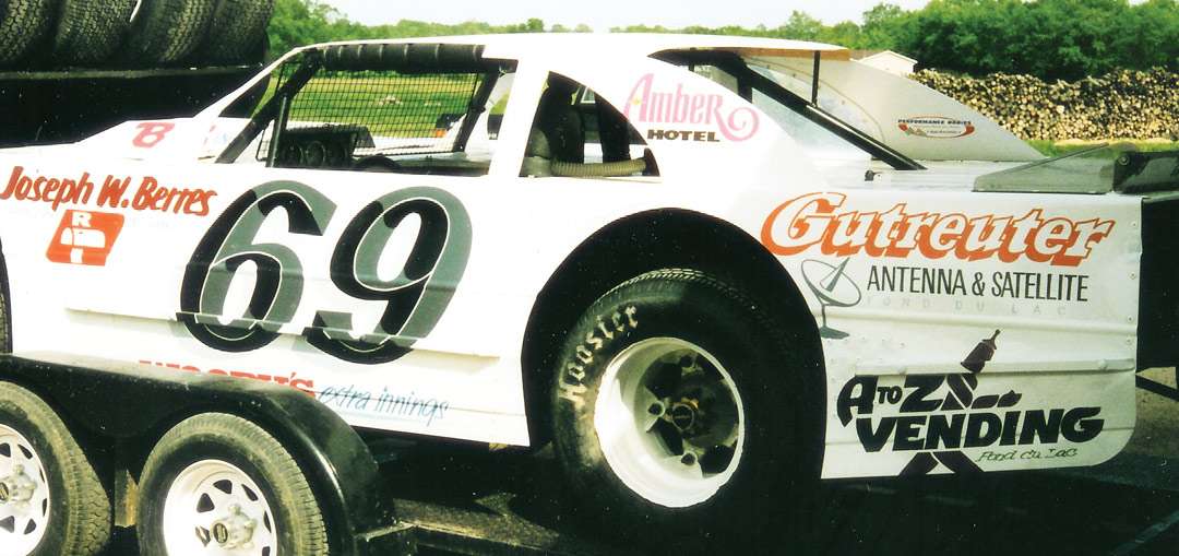
Some years passed, and I was able to land a very creative first job in a real sign shop. This was a major help—working with and learning from some of the best. Techniques, products, materials and a massive heap of inspiration opened up to this kid who had started out painting model cars. Over the years, I had the opportunity to hand paint many real race cars—treating them all as I did when I was much younger and working in a much smaller scale.
See—there are so many similarities between moving vehicles of every type. It almost seems too simple, doesn’t it? The only secret? Clear, readable, high-contrast lettering at any speed.
Bob Behounek has spent over 40 years as a sign artist and pinstriper in the Chicago, Illinois, area. More of his articles can be found by clicking on Archives at www.signcraft.com.
This appeared in the March/April 2013 issue of SignCraft.
Bob Behounek has spent over 40 years as a sign artist and pinstriper in the Chicago, Illinois, area.
