By signcraft
Posted on Sunday, May 25th, 2025

Transparencies can be an easy way to sneak a logo or graphic into a sign without adding too much clutter—fish or coral for a dive shop; nuts, bolts and a brake disk for a mechanic. It’s a unique effect that adds a lot of interest to an otherwise basic layout.
Rob Cooper often uses it to slip in the customer’s logo as a background or to trick the viewer into thinking they are looking through layers on a flat sign. It’s a subtle yet attractive effect that isn’t used often in sign designs.
“The key is making sure the colors are not too strong,” says Rob, “so that the graphic doesn’t interfere with the lettering, but still have it be visible. You want to create interest while still retaining legibility, so subtle is usually the way to do it.”
Hear more about Rob’s approach and get a great dose of transparency at work on his signs in “Transparent graphics can add a lot of appeal to a layout.”
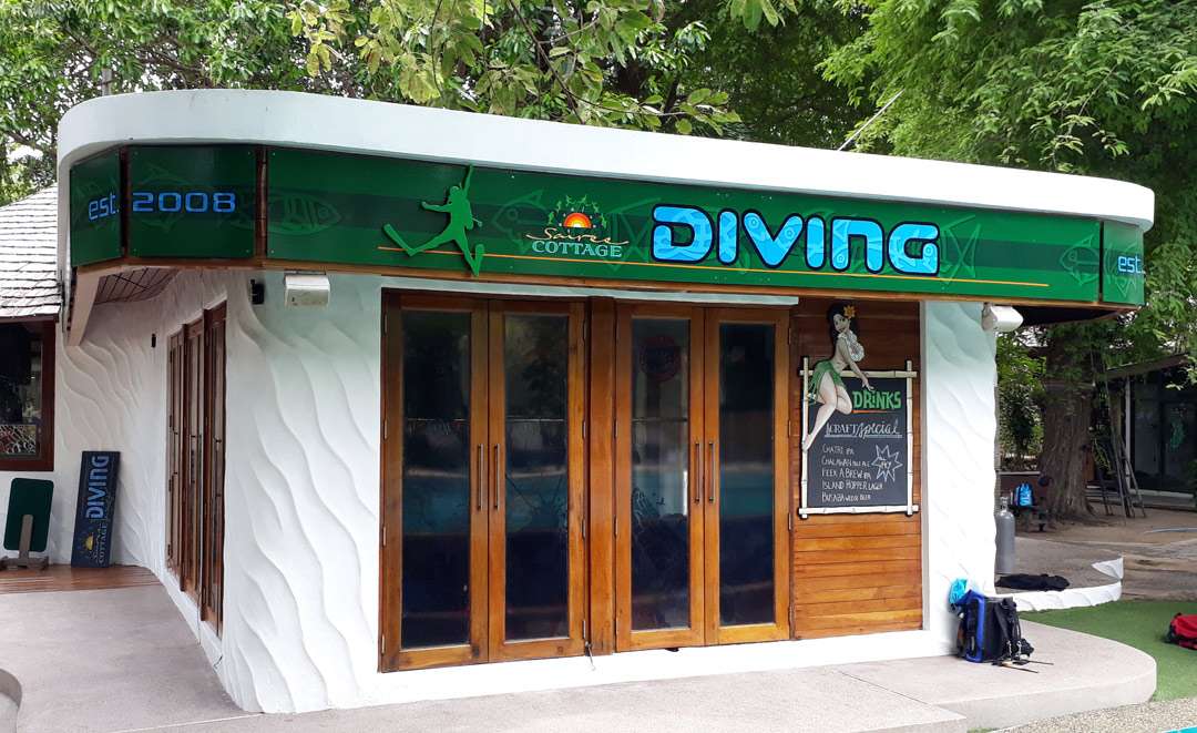
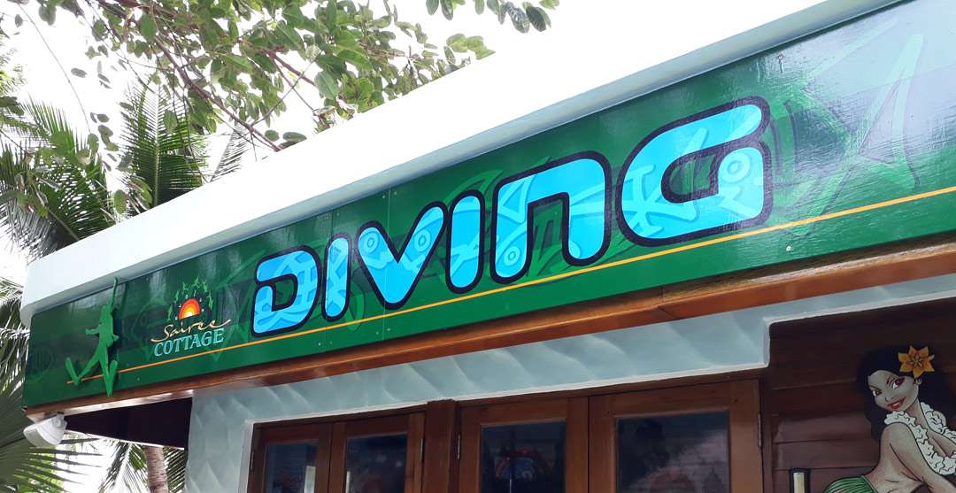
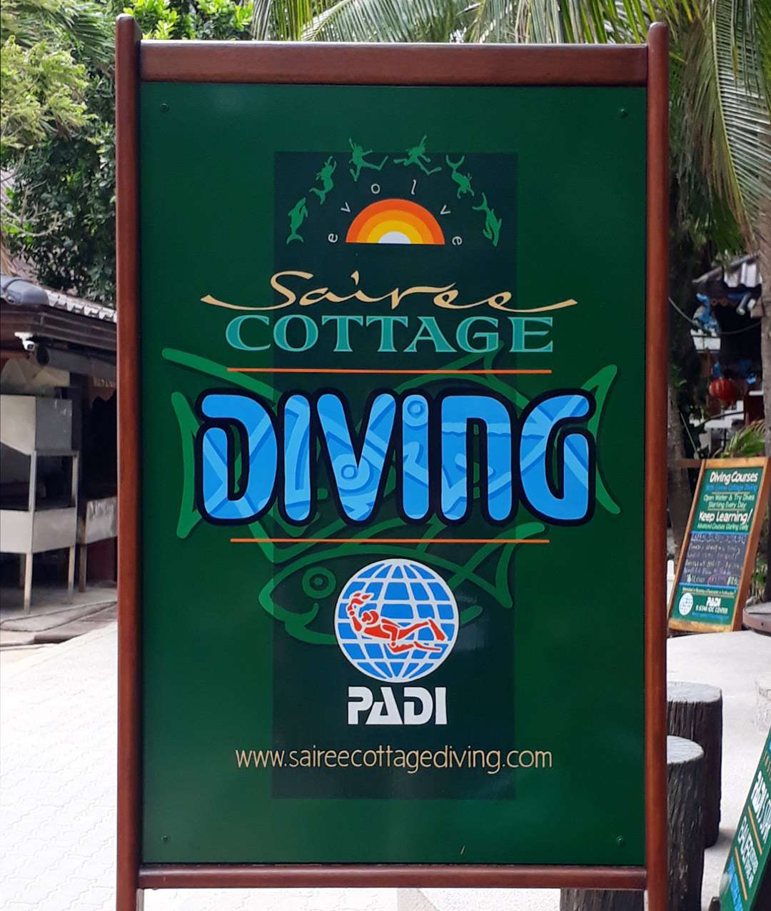
Sairee Cottage Diving
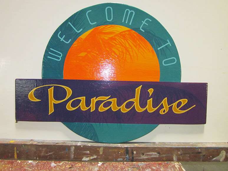
Welcome to Paradise
