By Bob Behounek
Posted on Saturday, April 11th, 2026

Summer has arrived, and as I wheel past the typical strip malls I see plenty of signs similar to this example: A fascia sign on a building where most of the signs are similar in size and color. I’m assuming our mall’s landlord created plenty of restrictions in the sign criteria, too.
It looks like the Magic Scissors sign was produced under a certain budget, as well. That cute little top hat and scissors graphics, along with the text in the Futura typeface, resembles many of the business cards that commercial printers produce.
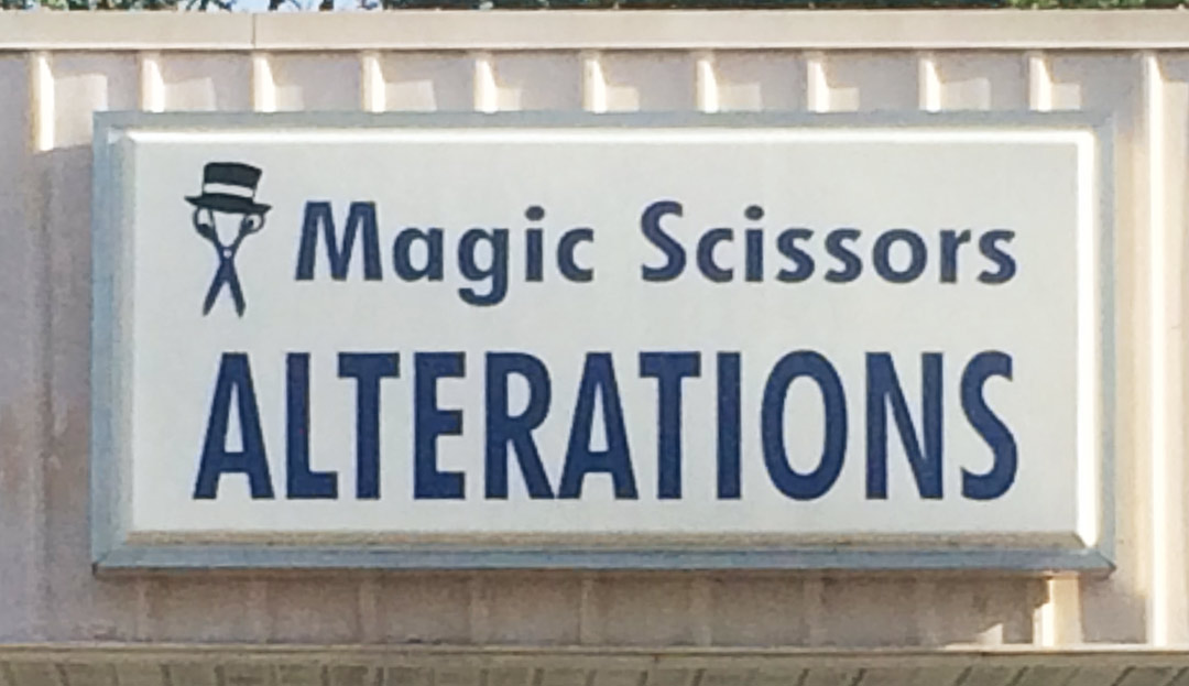
Unlike many of the signs in past Design Clinics, this one has considerable open space and there is no copy flooding the outside borders. I can tell the word “Alterations” has been compromised in height somewhat, though.
Breaking up the message
My vision to help this overall layout begins with separating the two words “Magic” and “Scissors.” Utilizing a large graphic of a pair of scissors within a colored shape will lessen the need to keep the word “Scissors” as big and bold as “Magic.”
I chose to stylize the original Futura type a bit, too. This gives our business a unique look that separates it from plain lettering, making it more custom without hindering the readability.
Our new color shape can now help two things work together for the common cause. It resembles a hunk of textile while also pulling double duty as a subtle area arrow that sends our reader’s vision from left to right. Overlapping our scissors onto the “M” and “Alterations” over the color shape links all these elements together, creating a complete design.
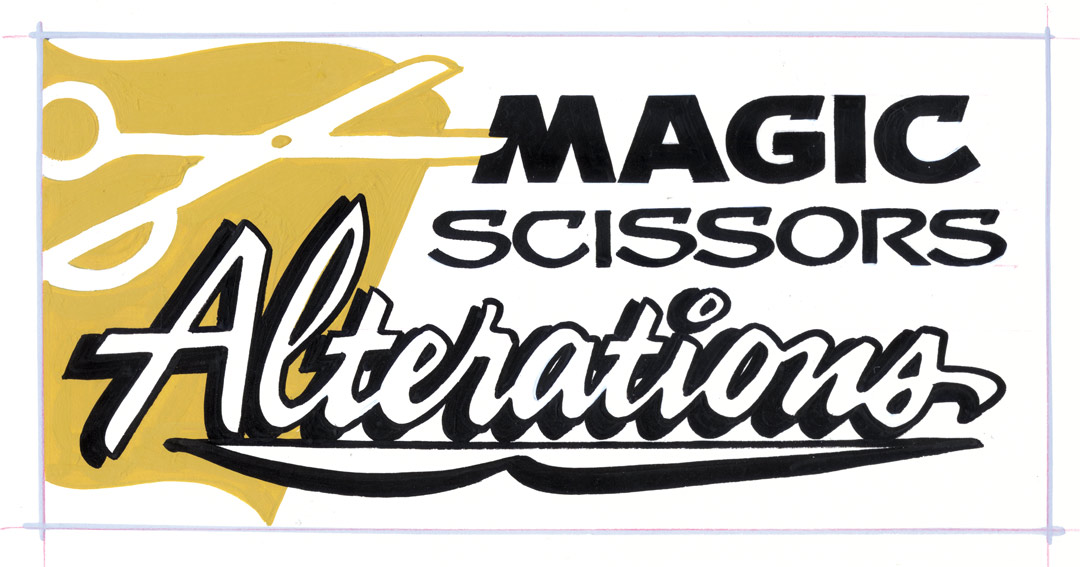 I used black for all the lettering, assuming that was part of the sign criteria established by the landlord. I’m recommending one other color be light gold. Its hue is certainly light enough to allow our higher contrasting black letters to come forward and read clearly. I’m sure you already know, but black (being neutral in color) on white is one of the best color contrasts on our planet.
Simplicity wins
All design work is vulnerable to trying too hard. I wanted to keep this design simple, without too many tricks. Utilizing our black color, I opted to use “Alterations” in reverse, with only a black drop shadow and outline. This works well as an alternate black reverse geometric shape. I like the positive lettering with the negative twist on one word.
To contrast the stylized Futura type at the top of our design, I chose a semi-loose hand-rendered style for “Alterations.” Think about it. Alterations are mostly done by hand, by a human being. So this word needs an emotional feel. Hand-rendered words have so much more power to convey the human-to-human emotional connection.
The top two words tell us who is creating the service, and the bottom word describes what is done and how. I’ve taken the extra time to create stylized type and to compose various contrasts in letter height, width and style. Adding a simple graphic in a subtle shape creates impact and interest, giving our readers a visual before they pause to read this message.
Human emotional connection
Throughout my career I have strived to interject a human-to-human connection in my work. There are many ways to do that. All the information, whether it’s two words or 20, must be felt before it can be read. This lets you create a mood with your design.
The simplicity of elements helps our customers not only understand the message as quickly as possible, but want to look at and read what they see. Don’t get me wrong. The basic printed word works well in certain circumstances. But there is no replacing the human-to-human emotional connection in our designs. It attracts our attention quicker and keeps us connected to an advertisement even though we may not have an overall immediate need for the product or service it advertises.
Bob Behounek has spent over 40 years as a sign artist and pinstriper in the Chicago, Illinois, area.
