By Bob Behounek
Posted on Saturday, June 20th, 2026

Not so long, when we talked about “classic signs” we meant something unique and special. But the project for this Design Clinic is an example of a new type of classic design that we see today: A classic example of information stuffed into a given area. The information is presented as it often is on the printed page that we see in books. (Remember them?) There is minimal contrast. The size and weight of the letters is basically the same, line after line. Yes, the information is all there, but there is little visual appeal to draw and hold the viewer’s eye so that they really get the message.
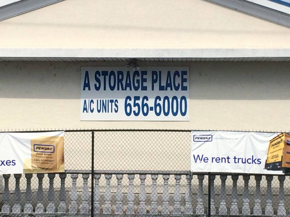
How often do we see this type of signage today? It’s almost everywhere, used in almost every situation. Sad as it is, this is the standard, accepted procedure for much, if not most, of today’s signage.
But let’s see how we can improve the effectiveness of this sign. Not knowing our overall setting or the road configuration near this sign, I’m going to assume it is on a street with a typical 35 mph speed limit.
This layout seems to utilize Helvetica Medium type throughout. Hot diggity! It’s usually a very readable type, right? But just look at how the type was compromised by squeezing it, condensing it from left and right. A true, time-tested, highly legible typestyle is now choked so much that it is hard to read.
The margins surrounding the copy are so minimal that they run off onto the building’s fascia. It’s a good thing both are light in color, because had the building been dark, it would have made the lack of margin even more obvious, creating a cluttered look.
This ad is cramped and difficult to understand at any speed. Though it is quite basic and has very few words on it, it is still a tough read.
The main message gets most of the space
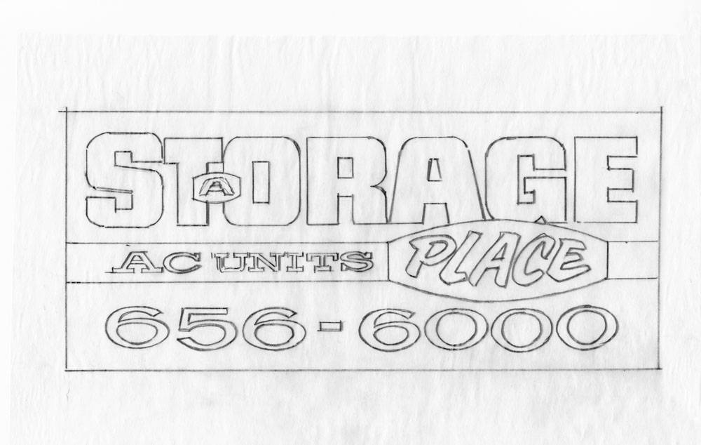
One of the most basic principles of sign design is to accentuate the most important information. This essential principle was overlooked on the original layout.
Our main subject here is that this is a place to store things. Our most important element is Storage. Quite obviously the building is a place, so there’s very little need to advertise that element.
In most cases I try to minimize anything that hinders the essential subject matter. This business is apparently called A Storage Place, so we need to accommodate that as the business name, but not compromise the all-important Storage. If you or I were out looking for a place where we could store things, we would need to see the word Storage first.
My first thought is to utilize approximately 68% of the space on the sign for our main subject or service, which is about two-thirds of the sign. On the sign in the example, about 50% is used for the entire business name and 50% for the phone number and secondary copy.
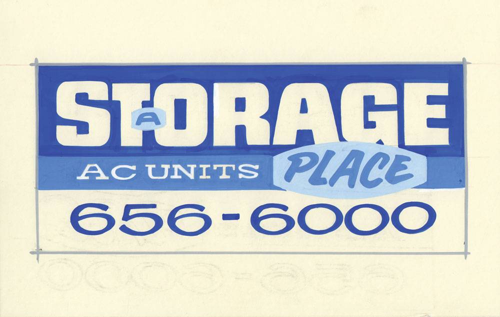
Capitalize on a single color
As for color, the sign in our example uses dark blue on white with very little contrast and type or style. Adding two horizontal stripes or rectangles, reversing the background to blue with bold white letters, creates a positive/negative appearance that is easier to read.
I don’t usually try to design size and monotones, but seeing our sample done all in blue inspired me to give it a try. Next in importance after Storage was the secondary information, AC Units. Using a lighter-weight type with a serif contrasts our heavy text up top. I used a lighter shade of the same top color blue background. White letters will contrast well on this.
Minimize the least important copy
Before I move farther downward, I wanted to address those pesky two words, A and Place. As I said earlier these two elements take up way too much space in the original layout and certainly cramped our readability.
I think that if we minimize these two elements in style and color, they will sort of disappear and not harm our message one bit. Using a different panel shape will encapsulate those words all by themselves. I really have two monochromatic blues working together to create very little color contrasts on the sign.
So the top two-thirds of the sign is dedicated to saying Storage and AC Units. As we have for decades in the sign industry, we now need to deal with those dreaded phone numbers. I chose to go back to the example sign’s original color lettering, using the darker blue on white positive background.
This sign is not meant to win any sign design contest, or grace the cover of industry publications. The sign is meant to do one thing really well: to tell a message as we zip by at any speed. Take a look at the revised layout. In less than three seconds, what do you read?
Bob Behounek has spent over 40 years as a sign artist and pinstriper in the Chicago, Illinois, area. More of his articles can be found by clicking on Archives at www.signcraft.com.
This appeared in the November/December 2015 issue of SignCraft.
Bob Behounek has spent over 40 years as a sign artist and pinstriper in the Chicago, Illinois, area.
