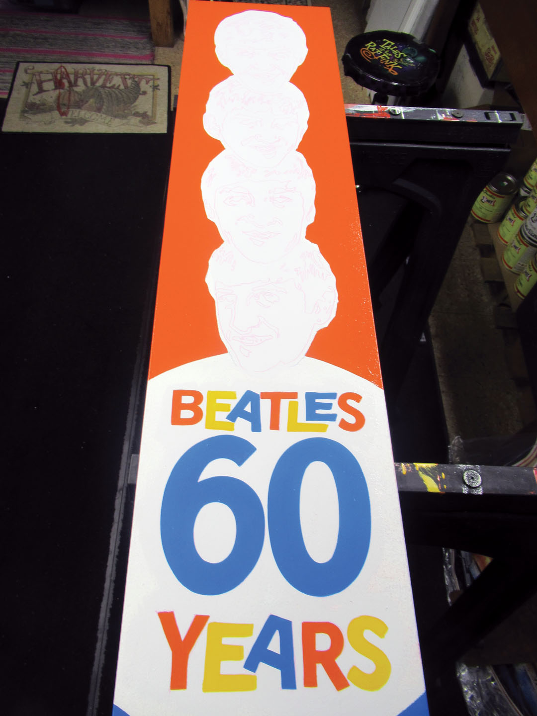

In this sequence of photos, you can see how I “spotted in” the orange, blue and yellow lettering on the white panel, then “cut in” the black. The white background behind the lighter colors gives added brilliance for maximum readability. The dark background easily covers the light colors in one coat.
