By Bob Behounek
Posted on Friday, August 26th, 2022

No matter how many signs we design, paint, vinylize or produce in some form or another, the number of design possibilities before us is unlimited. That is, unless we limit ourselves to what modern technology has presented us with.
As seasoned sign makers working in the highly competitive commercial sign world, we all can relate to the stressful logistics we face every day. I don’t believe for one minute that our present situation is much different than what we had in the eras gone by. Sign people and sign work have always been changing over the years.
I get the opportunity to talk to a group of sign friends from time to time, and whenever the subject of design, color and composition comes up you can see the twinkle in their eyes! These sign folks love what they do and can’t wait to get to the next project.
Just yesterday a good friend of mine said, “I not only take pride in what I’m making because I’m putting my signature on it, but it’s got to look good!” If we’ll admit it, many sign people make signs look good for other sign people to ogle at, too.
Bring back the daily design competition
Here in Chicagoland, the sign community had always treated their work similar to a huge sign contest happening on an everyday basis. It might be color usage, design, speed in production, creative typography modifications or all the above, but people wanted to develop their design skills.
Unfortunately, I don’t see as much of that kind of competition anymore. Correct me if I’m shortsighted, but that approach was quite a creative way to give our clients the best possible signage, too.
Think about it. Imagine a major sign contest that continued for decades with many contestants in every corner of the city trying to out-design one another.
From my contact with clients lately, the focus is now mostly based on a cost standpoint rather than design, color or composition comparison. Are we merely creating a wholesale sign shop atmosphere where every shop sells very similar products? I certainly hope that’s not the case. Wouldn’t it be great to bring back that daily design contest?
Where I like to start
One of the very first things I consider when a sign project is presented to me is, “How can I make this sign special?” Not only from a design standpoint, but from the viewpoint of the client’s business. Let’s create a long-lasting value that everyone can be proud of—a well-composed piece that will look good, function well and be a good representation of their business.
Most of the time a design like this need not be fancy or over-engineered, using every trick we know within one sign, but clean and simple instead. Often it can be simplified even more than we originally thought. Some of the finest designs ever put down on paper were simple and concise. They deliver lasting design value for years to come.
Creating a common ground for all the elements with a special “kick” thrown in can give a sign that unique look. I’m not afraid to go the extra mile to help a sign design become special in its own way. As I go over the following examples, I’ll try to explain how simple the complexity of each design was to achieve.

Let’s start with the Bonfire project. Using a bold typeface to build our design on, I modified the vertical strokes to simulate a rough indented look. I kept the “O” round with a flame bursting from its center. At first glance, one would see the heavy type with the fire above. The indented features will not only contrast the sharp, unmodified lower product panel, but on second glance one sees the crushed bold typeface that gives a woodsy feel.
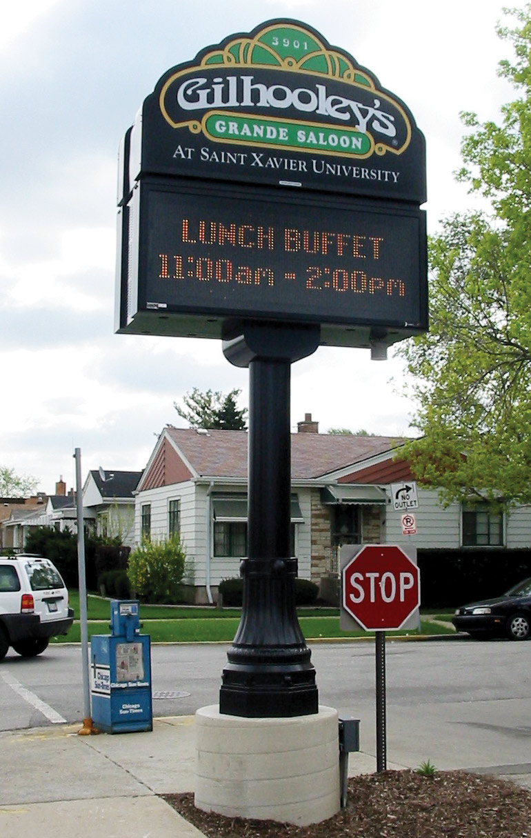
The Gilhooley’s sign was part of a bigger sign program for a local college campus. This restaurant was to be unique without the appearance of being part of the college. Taking on the “days gone by” motif, the outside edge needed to look old—certainly not contemporary like the adjoining sign system was. We used contour shape with type appropriate for the era and a massive “old Chicago” stanchion and post to give students the feel of that era when passing by.

Grand Bear is just what it says. This sign needed a very special 3-D “grand” feature along with other architectural cues from the surrounding buildings. Here’s where it was time to push the “extra mile” button and bring in a specialty artist to carve the bear figure. Making signs is one thing, carving creatures is another indeed. Nancy Beaudette [Sign-It Signs & Design, Cornwall, Ontario, Canada] did one heck of a job on the carving.

Nancy created this dimensional figure to nestle under a roof feature and rest upon a sign panel and message center that was very simple in contrast. Finally, everything needed to be held up by rock similar to that used on their building, simulating an old-fashioned rock foundation. All in all, the total look took everything from existing features and what needed to be grand.

The Eye Care hanging sign was small in contrast, but needed to be extra special, too. Located in an historic district of town, the sign needed to take design cues from the era the architecture represented. We simulated gold leaf carved text and used low color contrasting side bric-a-brac flourishes encompassing the text within a custom shaped background. I can remember seeing signs like this all over Chicago when I was a kid. Again, it’s only fitting to go the extra mile to recreate something special for a project like this.

Jack’s dimensional sign is part of the “Grand Bear” complex. It’s a separate business within a woodsy surrounding. Here was an opportunity to utilize a hand-rendered typeface that can give Jack that “emotional charge” clients see but seldom realize why it draws them in to check the business out. A simple log cabin graphic, some contrasting woodsy colors and the “log cabin” logs behind this sign created the special feel needed within this complex.
I’m sure there are many other approaches that could have been used on each of these projects. There are many ways to go the extra mile and make a sign special, creating something clients can be proud of. These are the things that make clients feel they got something unique and custom.
Push the “extra mile” button from time to time. Just maybe it will start a new daily sign contest within every city and town again. Boy, wouldn’t that be great!
This appeared in the January/February 2008 issue of SignCraft.
Bob Behounek has spent over 40 years as a sign artist and pinstriper in the Chicago, Illinois, area.
