By Bob Behounek
Posted on Friday, January 17th, 2025

Most of us have heard of the cliché “Hindsight is always 20/20”. Most of the time, we certainly have a clearer understanding of things after the fact. Our decision-making ability is governed by quite a few things that surround us at the time, along with plenty of past experiences.
So it is with sign design. There are so many options at our fingertips, and on any given day, some will work and some will not. We cannot use a “set” design for every project, either, as the demands of each job will differ.
One of the great influences throughout my career in the sign industry has been the many graphic inspirations I have witnessed each and every day. It could be on the street, in printed material or down aisle 12 at the local grocery store. Everything we see—good or bad— influences us.
Taking in all the information we see and compacting it in our memory banks is an ongoing process. Some of the well-designed and inspirational graphics I see can overpower me at the time. Pieces of these visuals always seem to fall into place down the road somewhere when the need arises. What I am saying is that the more well-thought-out designs we see, the more we are able to reuse them in our own work in some form or another.
I often try to analyze the signage that I see around town, whether it is effective or not. I know there were many variables for each and every design. I’m sure each sign had a fair amount of customer input, village ordinance criteria and sign designer expertise, which contributed to the final outcome.
Some things override others, too. The psychology of all the elements involved in design has fascinated me for decades. It’s similar to the psychology of design that is behind automobiles, industrial objects and other things we use on an everyday basis. All designs were originally inspired from other things the designer saw.
Just last week I found some old photographs I had taken along the way. I could not help seeing the impact the sign artist had on my interest in letterforms. Back then, analyzing signs like those made me more aware of what was more important and how I could use letters like this in my own work. Thinking through what I just said reminds me how important this was to all of us at one time or another. We all helped each other strive to create better signage.
I still can’t help it—I really enjoy analyzing any type of communication art when I get a chance. It helps my own design ability. The design process for each and every sign tells the many reasons why these signs were completed the way they were. Every sign comes with a story, so I am going to analyze a handful of recent projects.
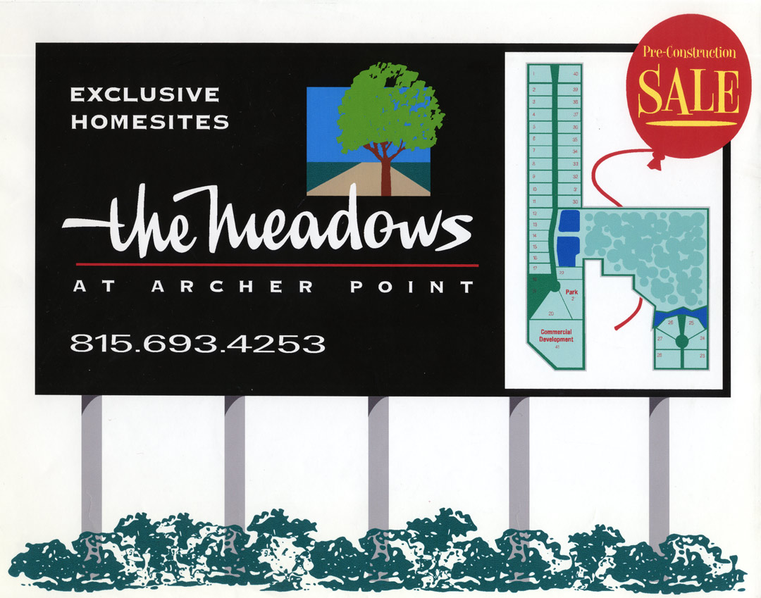
The task of The Meadows billboard was to create interest in the property development. A 50-mph speed limit creates a challenge for passing readers. A hand-rendered script was used on the main copy. It not only contrasted all the block text but also generated a human link to prospective readers.
The background is neutral black with neutral white text. Only the logo and site map utilize any color. The black background with light color copy delivers maximum contrast and readability. Separating the neutral colors from the other colors creates balance and contrast. The warm red balloon with the sales text is small but packs a punch. It can certainly be seen first. Most viewers will never read or understand every inch of this billboard in one passing. There are two things that one can read quickly, and they add up to the sale of The Meadows. Everything else is secondary.
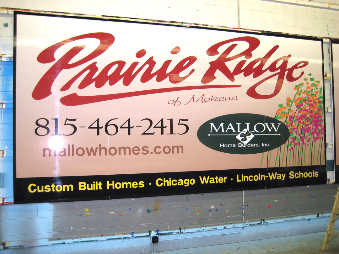
The Prairie Ridge billboard, at a customer’s request, had some hand lettering put to use to generate visual interest. Yes, that’s right, this is a sign set back off a busy road that had plenty of graphic competition. So, composing a hand-lettered script for our dominant message would capture our reader’s eye over the regular text used on other nearby ads. A colorful, simplified graphic of prairie flowers was added to help readers visualize a prairie setting. Adding some hand-lettered copy can create an immediate human bond to outdoor advertising.
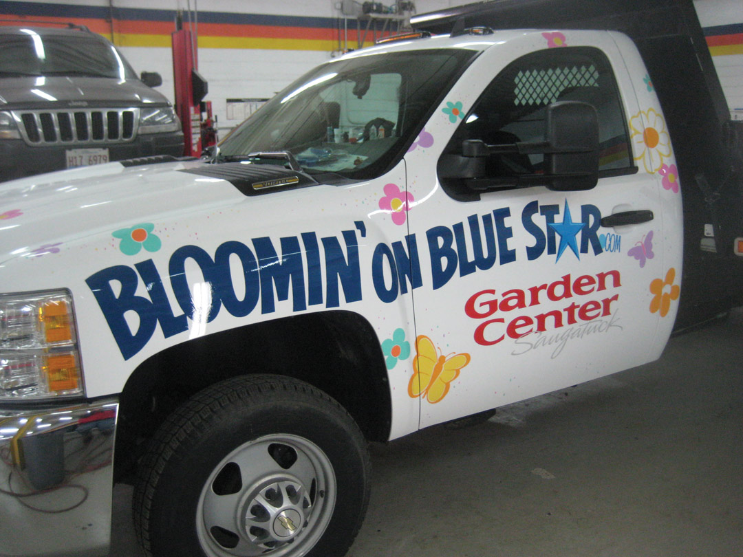
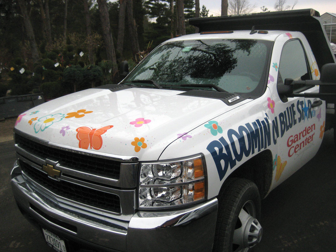
The Bloomin’ on Blue Star truck utilized some existing design cues, which had been used on local billboards to create interest in this new business. Being a vehicle, it was essential to simplify the many elements used on the outdoor advertisements. Utilizing the entire vehicle from front to back allowed our dominant message to have enough space to be not only big enough, but easy to read clearly, too. Scattering many colorful butterflies and other flying shapes added to the Bloomin’ experience and created a fun atmosphere. Using a warm red color on the garden center copy helped that message to move to the forefront and balance with all the larger mid-tone blue copy.

Your business ad has one mission: impact. This vehicle design uses two of the most highly contrasting colors, yellow and black, leaving absolutely no doubt about what you are reading. The large light orange circular shape hovers over the yellow, creating a visual impact. The smaller text at the bottom was placed in a warm red again. It was somewhat balanced with the other colors. Being a hot color, red will push to the forefront.
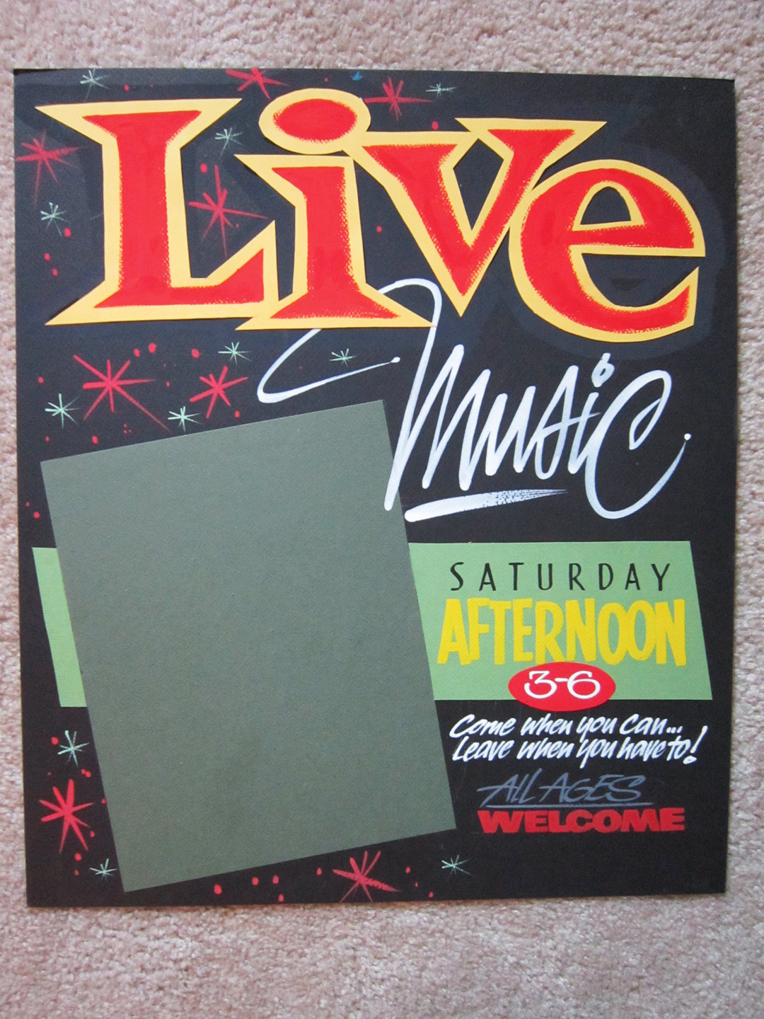
The Live Music showcard was used to announce weekly music at a coffee house. A space was allowed for photos and group information. Using cutout colored paper for the Live text in hot yellow meant I could glue it on and not have to double coat the black card stock. Using a pebble texture also created dimension, and dry brushing the red center added to the boldness of the message. Linking a neutral white Music script to the cutout paper letter not only gave some high contrast, but also allowed the readers to understand what was live.
Thinking through your designs beforehand can save plenty of time in the long run. I know I have a reason for every shape, color and type I have used so far. The planning and design stages are more creative than the actual productions of most signage. Look over what you have created recently and ask yourself why you did it that way. You may be surprised what you learn.
This appeared in the March/April 2012 issue of SignCraft.
Bob Behounek has spent over 40 years as a sign artist and pinstriper in the Chicago, Illinois, area.
