By Bob Behounek
Posted on Friday, August 8th, 2025

For the “Design Clinic” series, SignCraft asked veteran sign designer Bob Behounek to show how he would redesign typical signs we’ve seen along the road. We’ve asked Bob to explain the tools he would use to make them more appealing and more effective.
We’ve chosen projects that are challenging from a design perspective. We know nothing about how the sign originated—what the client insisted upon, how they controlled the layout, or how they limited the sign shop that produced the sign.
Our goal is simply to continue to give SignCraft readers knowledge, skills and ideas that they can use to create signs of higher value. More effective signs not only command a higher price, but they set your work apart and give you something else to sell beyond generic identification. Here’s what Bob said about this project:
When I see signage with one or two colors of lettering on a one-color background, I wonder why it was done that way. Most of the time, we’ll never know what path was taken by the client and the sign person who produced the sign. We’ve all had our own experiences, knowing how the client’s demands limited our options. Often they strong-arm the design, tying our hands and over-ruling our efforts to create a more interesting and effective layout.
We’ve all had the experience of showing a more effective layout and having a client reject it in favor of their own version. It’s a fact of the sign business. But it doesn’t keep us from trying to help them get the best value for their investment in signage. Often a client is truly appreciative of our efforts, and that’s a true success: when we can use our skills and knowledge to help their business succeed.
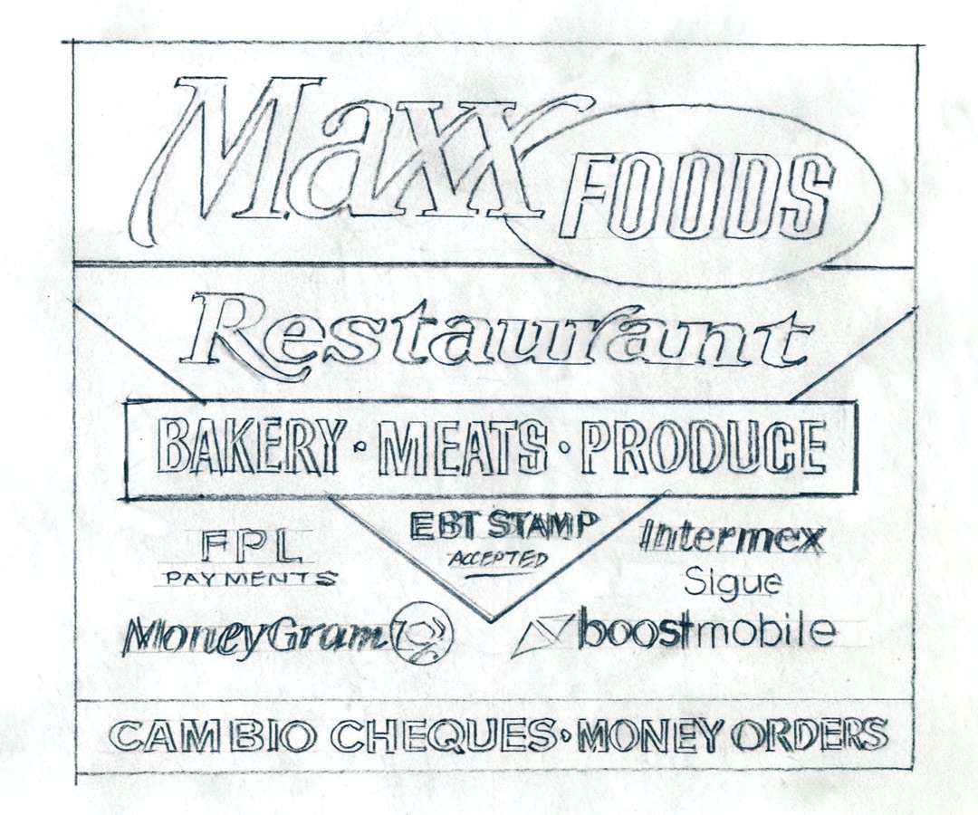
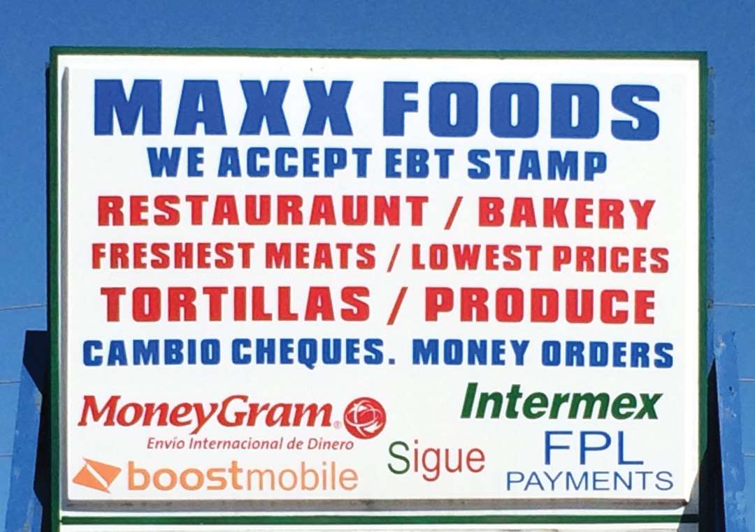
My hunch is that this client set up the text similar to a newspaper ad. We’ve all had customers who requested we paint the Lord’s Prayer on the head of a pin. This sign hovers close to that request. Our food store owner seems to want everything jammed onto his sign. Quantity has compromised quality. That hurts the sign’s overall feel—and usefulness.
Start with the primary message
A sign has to have a single dominant message that helps readers understand what an establishment is, what it specializes in. When a client feels everything they do is important, all the text ends up about the same size. There’s no contrast to help our reader’s eye maneuver through all the information.
The speed limit for readers rolling past this sign is 45 mph. Without a doubt, this is a tremendous amount of copy to comprehend at this speed. I had several readers read the copy, and on average it took 12 seconds for them to read it all. At 45 mph, in those 12 seconds we would be a block or so down the road by the time we got to the third line!
The higher contrasting dark blue (cool) and the lower contrasting fire red (warm) provides some contrast, but because there is so much copy, at 45 mph most of the words will be seen just as color blocks. The typestyle is bold, but difficult to read under these circumstances. The only contrasts are color and letter height.
After turning my truck around at the next intersection and heading back to look at this sign, let’s see what recommendations could make this a more effective ad.
First, this sign is overloaded with text. I’m going to separate the messages and prioritize them, organizing them in order of importance. We know that it will be impossible for anyone except foot traffic to read all the messages on this sign—even if the client refuses to consider this. He’s insisting that all the copy stay, so we’ll do the best we can to control it.
Our dominant feature has to be Maxx Foods, followed by their main items of sale: Restaurant, Bakery, Meats and Produce. Those items must be understood first. I’m going to respect our client’s budget and utilize minimal materials, keeping most of the background color white.
This looks like a good opportunity to create a logo for the main Maxx Foods, too. This will help set up a separation of the information through contrasts in type. Enhancing our client’s business name with a stylized type will contrast with the plain-and-simple sans serif informational text. Now Maxx has its own look.
Organize the secondary copy
Now for the list of services. We have six services plus three money-related features: EBT stamps, money orders and check cashing. Separating these two groups will help our readers get the information in the order we want them to get it. Remember that at 45 mph, we have about two seconds to comprehend a message on this sign. Anything after that will have to be reviewed the next time the viewer passes by.
Reviewing the copy, I see four services as most important: restaurant, bakery, meats and produce. I don’t know the business, so I can’t say which of the four is most important, but I’ll choose Restaurant because it is listed first on the existing sign.
I’m going to place that in a geometric-shaped panel and reverse the copy, creating another contrast of shape and color. A stylized arrow points downward to a second shape that houses our remaining services.
These shapes will help us focus on the key information in those two seconds we have to comprehend the message. Think of it as a sign inside a sign. It reduces the visual clutter, giving the reader’s eye the option of reading this more dominant and more appealing “sign” first and leaving the secondary “sign” for them to read later.
So we’ve given Maxx a stylized look of its own. That same style was then transferred to the dominant product, which we’ve decided is Restaurant. Those two words will read together as Maxx Restaurant. Our plain word, Foods, will qualify the other services for the next time customers pass by. Utilizing the same typestyle as Foods, that message will read together as one also: Foods—Bakery, Produce & Meats.
I’m going to recommend smaller shapes to house the money-related messages in their respective logo colors. This thought, all its own, should be separated from all of the above features and services.
Clutter kills a sign
More than likely, our sample sign was done without much thought about the reader. The client didn’t, or couldn’t, take into consideration the speed, the reading time and the text comprehension.
I’ll bet our client dictated what he wanted on the sign and most likely controlled much of the design process. How many times have you presented a drawing only to have the client say, “In this open space, can we put…”? When that happens, the erosion of the design has started.
For me, it’s sad when ineffective signs get installed. A cluttered, hard-to-read sign is set up for failure. With a more effective layout, a sign can really improve the chances of success for a business.
This article appeared in the March/April 2014 issue of SignCraft.

Bob Behounek has spent over 40 years as a sign artist and pinstriper in the Chicago, Illinois, area.
