By Bob Behounek
Posted on Friday, September 19th, 2025

Before we go any further, I have to make one important observation. A lot of folks—maybe most folks—assume that you can place information on almost any surface and people passing by will automatically read the given message.
This is where a lot of signage begins and ultimately fails. Depending on various circumstances like neighboring signage, road conditions, speed limits, building colors, any number of other distractions can keep people from even looking at a certain sign.
With the exception of sign designers, few people set out to look at and read signs. They see signs, but it’s up to us to make sure they actually read some or all of what the sign says.
Without question, designing simple signage is a true art form. There are so many factors to be considered on every project—the site, the image of the business, the local sign code. We all know our economy can set some very tight constraints when it comes to cost and production. It’s a real challenge to produce an effective, appealing, legible sign.
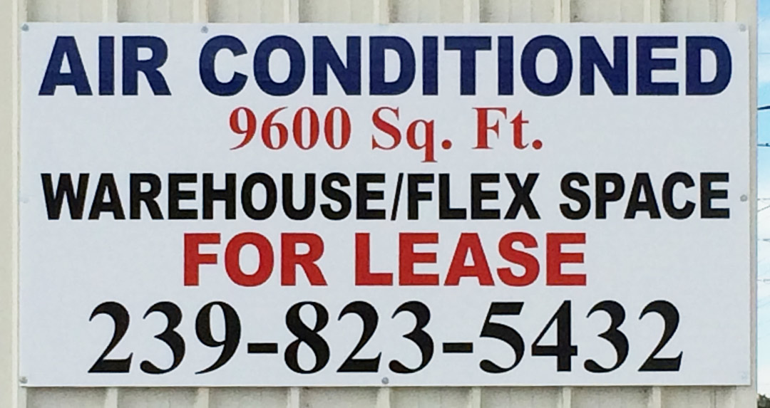
I’m not going to assume this “For Lease” sign was produced with a lot of consideration to its surroundings or the needs of anyone trying to read this as they whiz by. Like so many such signs, the client probably listed everything he or she wanted on there, asked for a price, then asked for an even lower price. At that point, maybe all the sign shop could do was type in the copy as fast as possible and produce the sign.
Managing the message
But let’s take a look at how a little design consideration could improve the effectiveness of this sign—and deliver more value to the client. Because with a sign, the value is determined not by how little you pay for it but how many people actually read the sign and get the message.
It looks like this sign is in a very warm environment. “Air Conditioned” is at top center! Maybe our client thought the feature should be that big and important. Hard to say.
Our text is pretty much big and bold, stuffed on there from side to side and top to bottom. We don’t know how much control our client had over this design, either. Client demands can often make it nearly impossible to produce an effective layout. Nonetheless, this is our opportunity to see what could be done to make this signage as effective as possible.
Panels can help
Here I see a sign that is almost the same color as the building, with very few contrasting colors and type styles. The copy is jam-packed on there in two basic letter styles, making it difficult to separate the information and read it.
Let’s start by using some simple geometric color shapes (panelization if you will) to help us get the sign’s multiple messages under control. Panels are a big help for that.
I feel the most important item to understand is our product: “Lease.” By using a chunk of a circle in yellow on the first third of our design and dropping the large black “Lease” on there, we get the point across. If you drive by at 35 miles per hour, you now know one thing for sure: yes, that space is for lease.
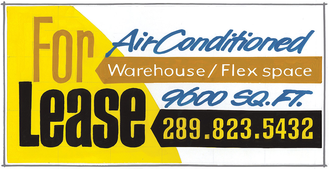
Next, incorporating a reverse black arrow with the phone number in yellow completes the thought in color. “Lease” and the phone number read as one unit. Seeing this from any distance the prospective customer would be hooked by the main message. If time allows, they could also look further and see our phone number, too.
Now we place “For” in a lower-contrasting imitation gold color, along with another reverse arrow that tells our readers what is being offered. This also reads as another “color thought.” It is less contrasting so that it is not competing with what we think is very important to our client: his request to advertise that this unit is “Air Conditioned.”
Using a cool color like blue with an italicized brushstroke type style sets this information apart and connects it to how many square feet is air-conditioned. It’s also a color block that reads together as one thought.
Color guides the eye
So our finished product has three messages with three different color blocks or thoughts. You may notice that our product, Warehouse Flex Space, seems to be of least importance in white on the low-contrast imitation gold panel. But our product should be apparent by the type of building signs affixed to it. (Some things can be obvious.)
Most important here is our information in black and yellow—two of the highest visibility colors on the planet! Even if you drove by at 80 miles per hour, you would know this unit is available to lease.
Up next and of secondary importance in color contrast is our stylized blue text. It’s in total contrast to all the other stiff type with a cool look and feel.
Our readers’ eyes will flow through this design from the top left downward, hitting our blue “Air Conditioned” then on to “Lease” very quickly. Even though there’s plenty of information on the sign, using contrasting type and colors creates a sign that is much easier to read.
My ultimate intention is to have every sign I produce work and help sell products for a client. Not every one works as I wish, but a diligent, thorough survey of each sign placement helps insure that it will. I don’t want to just guess and hope it works. Good design starts on the jobsite!
This appeared in the July/August 2014 issue of SignCraft.
Bob Behounek has spent over 40 years as a sign artist and pinstriper in the Chicago, Illinois, area.
