By Bob Behounek
Posted on Friday, January 23rd, 2026

This design clinic addresses two issues. Not only do we need a redesign, but we also need to modify the verbiage to improve its effectiveness.
The owner of this dark gray service vehicle is somewhat unhappy with how his vehicle advertising is currently perceived. On a quick read as the vehicle flashes by, it looks more like Gott’s Auto Air, rather than the full-service mobile mechanic that he is.
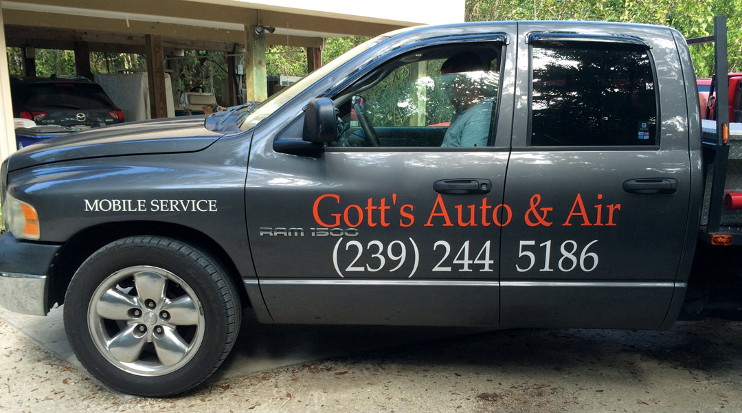
This particular design may have originated on the business card, with all the text in the same typestyle. There is no contrast in letter style and weight. This can work okay on a small business card, but it struggles on the side of a truck.
The wording seems to confuse some readers, as well. The ampersand, done in the same color, almost becomes invisible. The higher contrast of the white phone number, again in the same typeface, overpowers the business name.
Let’s edit the text
Our client needs to convey his services with a clear and concise word grouping. To best get the needed information to our client’s prospective customers, we need to modify our text to deliver a clear message and redesign those words.
Now is a perfect time to make a change in the text to “Complete Auto Repair.” This sums up what Mr. Gott does. I’m not an auto mechanic, but to me, when it says “Complete” that’s exactly what it means.
I’m eliminating the word “Service” because it is quite obvious with all the equipment in the back that this truck is a service vehicle. It’s our responsibility to remove unnecessary text whenever we can.
We can also incorporate one of the smaller words from the front fender into the name: “Mobile.” Now we have a clear statement that reads “Gott’s Complete Auto Repair”.
On to the layout
With this clear message, the design process can now shift into high gear. I’m thinking about using some contrasts in type weight and size to create a dominant focal point.
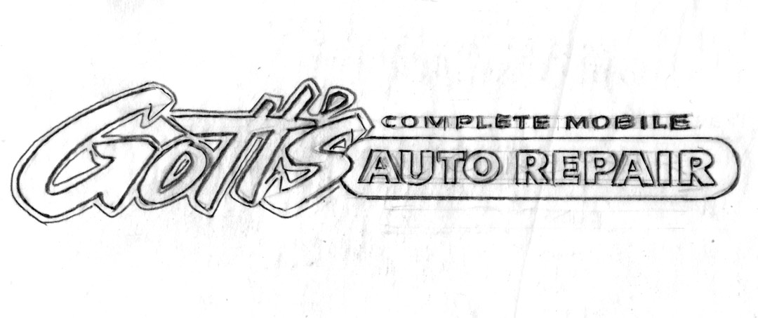
Without doubt, our service is the most important feature of this design. “Auto Repair” must have unrestricted readability. Using a bigger, bolder, squashy typestyle on our client’s name, slanted towards the service inside a long geometric shape, creates contrasts in type and size.
“Gott’s” squashy appearance slightly hinders its clarity and allows our straightforward block text to have the unrestricted clarity it needs. It’s a balance, if you will, with these two design elements linked together.
It creates a logo look that could also be incorporated into other visual needs our client might have—shirts, hats, invoices, etc. In time, the squashy “Gott’s” can become a trademark for the mobile auto repair all by itself, without some viewer needing to read the rest of the ad.
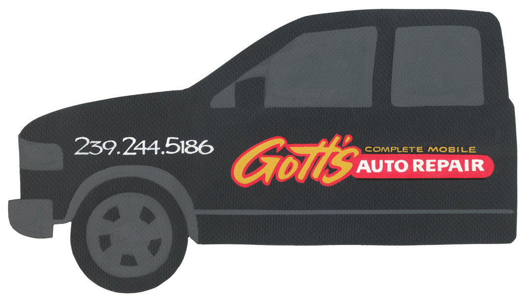
This design flows from left to right. At a quick glance, there is no problem understanding who and what the owner of the service vehicle does. In my redesign, I have associated the colors with the information, too.
Our sign ad will read in gold: “Gott’s Complete Mobile.” The “Auto Repair” will color code in white with how to get in touch via the phone number.
Moving the phone number
Our phone number is best separated from this new logo by placing it on the front fender. Just like a billboard, you cannot comprehend all the information at one glance. Isolating the phone number helps readers write that number down the next time they see this truck go by.
My goal is always to create “quick-read messages,” whether they’re on moving signage or the stationary kind. In our many attempts to create cool signage we must remember what the sign is used for—advertising, of course! That means viewers can read the message quickly in a pleasant format that is professionally designed to be easily understood.
This appeared in the March/April 2015 issue of SignCraft.
Bob Behounek has spent over 40 years as a sign artist and pinstriper in the Chicago, Illinois, area.
