By Bob Behounek
Posted on Friday, February 27th, 2026

Whenever I drive by a directory sign like this, I can’t help but test myself. Can I understand any of the information at my driving speed? Often the answer is no.
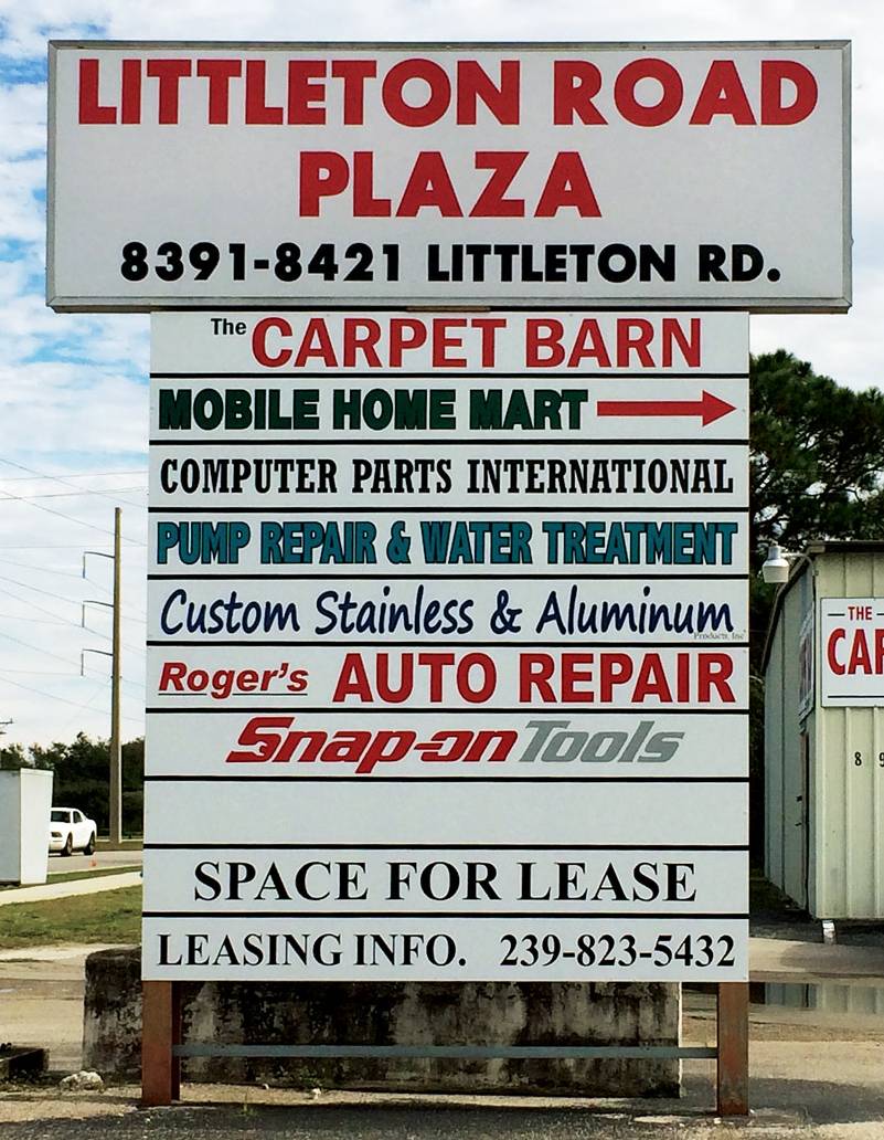 Once a complex like this is built, there are many challenges as to how all the tenants will get the signage they need to reach the public. In cases like this, the solution is a roadside directory, which is beneficial to the builder but not necessarily to the tenants.
In a typical strip mall, the fascia signage is regulated and must be a certain size and color. These signs are usually spaced out between each storefront so that each tenant has the opportunity for their ad to be seen individually.
Here, our directory sign lumps all those businesses together in a stack, one on top of another. Most likely the size is dictated by the square footage requirements set forth by the local sign code. I have always thought this concept was one of the worst sign plans anyone could impose on local businesses.
Getting back to my drive-by, as I approached the sign at the legal speed limit, all I was able to see was a mish-mash of type and clutter. There are many lines of lettering with words in mixed sizes, a logo or two, and an arrow. It has very severe readability issues at best. The people who build these complexes, along with local sign restrictions, certainly do not have the best interests of the tenants or the passersby in mind.
Where do we start? A viable solution to an issue like this is a major challenge. I’m going to work with the basic sign structure given here and see what can be done to get these tenants some more usable advertising.
I see plenty of white background space in the top panel, which does get my attention. “Littleton Road” is stated twice on the top panel, taking up valuable square footage.
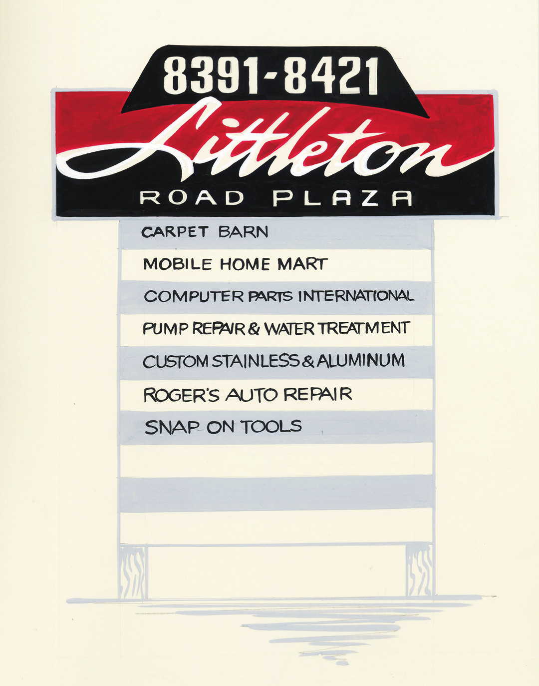
I think the best way to balance lighter and darker colors is to reverse the entire top panel. Our street addresses, “8391–8421,” must be somewhat larger so viewers looking for an address will find it.
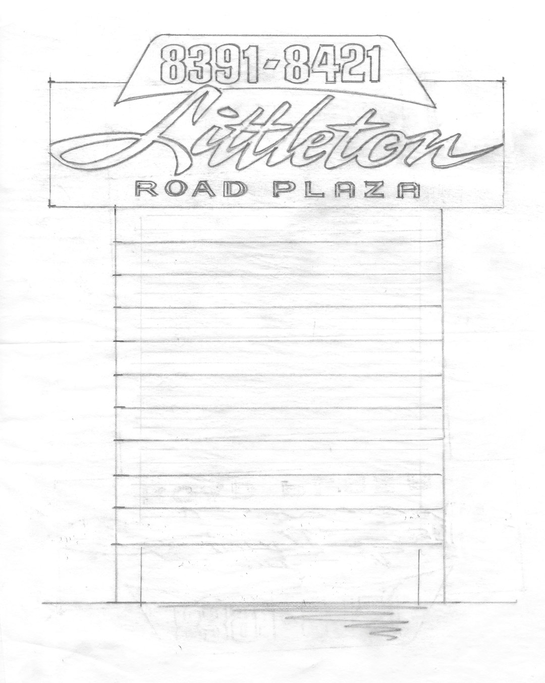
On my sketch, I decided to modify the sign shape a bit to create some interest. Adding the geometric shape at the top with a molded form leads our line of sight downward towards the list of businesses.
There is an excessive amount of type, both serif and sans on the original sign. I opted to reverse the colors on the top panel, using the lighter color for the plaza name then using that same color on the background of the tenant panels below.
Controlling the copy The text on my added shape at the top needs to be clean and readable, boldly telling passersby the addresses. Below that, I inserted Littleton in a loose script on a contrasting split background.
I’m playing games with the readers here, and making Littleton a little bit more difficult to read. The ploy should send our reader’s eyes directly below to the list of businesses.
Just in case you’re wondering, yes—“Littleton” is not as important as the names of the tenants. If you are looking for an address or a business name, you already know you’re driving down “Littleton Road.” If you don’t know you’re on “Littleton,” you’re probably lost, so I guess you don’t plan to do business with anyone in our plaza, right?
Tenant panels The tenant panels could be handled in any number of ways. First off, downsizing the overall height of the letters will greatly improve readability. I know—it can be hard to explain to a client that smaller letters can actually be more legible than large letters that are jammed out to the borders. But it is a fact.
Our eye needs space around a word to speed its recognition of the word. Opening up all that space around the business names helps them breathe and allows your eyes an easier pathway to separate and read them faster. I chose to register the tenant names to the left margin for a quick selection. I used a medium gray background on every other panel to separate them even more.
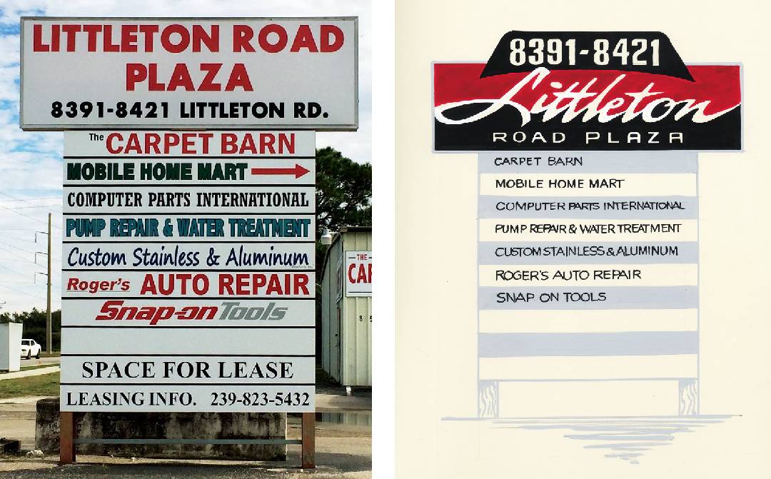
What I have done here is helpful in many ways. But I still feel for all the businesses who decide to rent spaces in retail centers like these. They depend on signage and directories to reach passersby, yet usually it is often extremely difficult for folks like us to find them as we drive by.
Bob Behounek has spent over 40 years as a sign artist and pinstriper in the Chicago, Illinois, area.
