By Bob Behounek
Posted on Friday, May 15th, 2026

As I travel around town, my hope of finding signage that creates interest and intrigue is dwindling. The overall lack of design leaves me somewhat empty. I know circumstances vary and are ultimately partly responsible for what we see these days. But it leaves me wondering: Does much of the sign community not understand the importance of effective design, or are their hands tied behind their back on most sign projects?
Our subject sign this month falls into that same category. On the positive side, we see plenty of open space on this beauty supply sign—almost too much. The design has limited contrast in type weight, color or size. Maybe the sign criteria for the strip mall required that all signs use red graphics on white. Or maybe this job just went to the bottom-line low bid.
Strictly identification
This white fascia with a white sign background creates a very albino feel with no borders created by color or shape. All the type is upper- and lowercase. Looking at the sign quickly as we pass by, nothing really jumps to the forefront. It all sort of floats in midair, not wanting to catch our attention in any way.
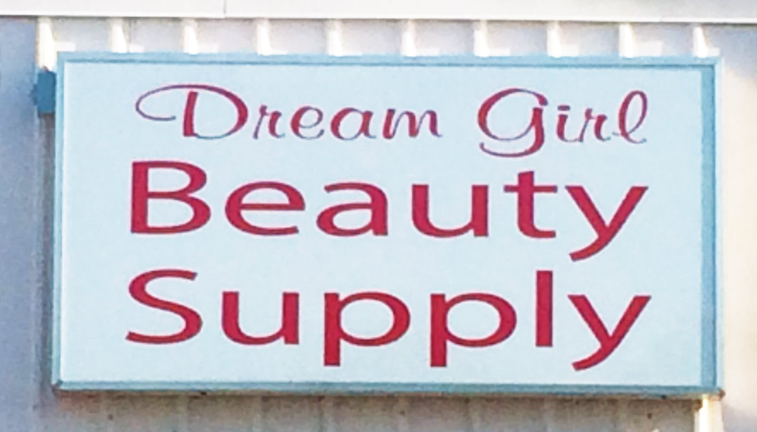
Aesthetically, everything has been centered mechanically, but visually “Dream Girl” appears too far to the right because of the negative space around the swash on the D. The computer may have centered the text, but the viewer’s eye says it’s not centered. That creates a distraction and hurts readability.
In the last Design Clinic, I mentioned how important it is to create a feel for the business with the sign layout. This “feel” is the overall look of an advertisement. It’s something to catch our interest even before we actually start to read anything. Readers need to have a reason to break away from whatever they are doing to look at a sign.
Getting their attention
Some of the best outdoor advertising utilizes simple type with a simple graphic depicting something to grab our attention—maybe a car, airplane, product or a person. These extras do cost a little more to produce but are well worth the effort.
In past Design Clinics I have tried my best to adhere to the colors of the original sign. This time, though, I am proposing a change of color to help create that feel. Breaking away from the original red text, I chose to use a more feminine color, like purple. This color usually represents elegance, sensitivity and passion.
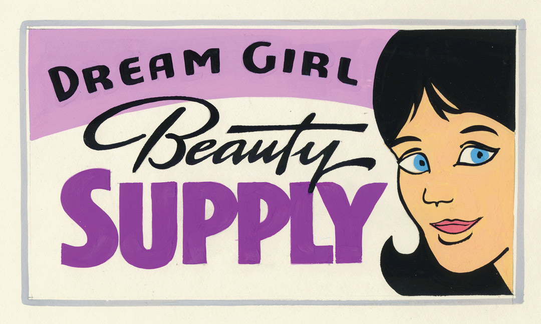
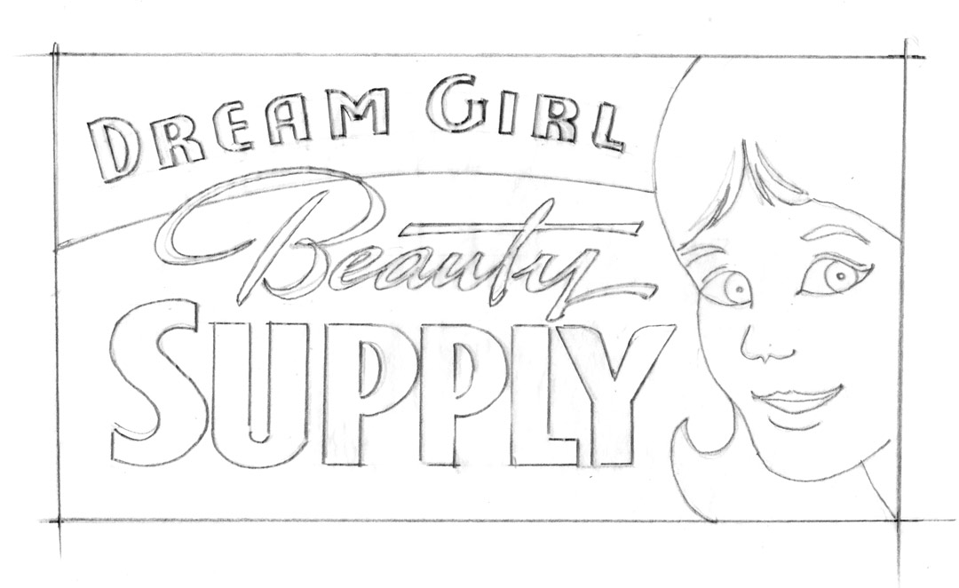
Using some colored geometric shapes again allows our viewer’s eye to travel into our design from top to bottom. It also creates a break between the building color and our sign background.
Two typefaces (fonts) are used to separate our messages. The word “Beauty” is flowing in a semiformal script to soften our block style “Dream Girl Supply.” Contrast in size, color and shape brings what we need to read to the forefront. “Dream Girl” is smaller, but the same type as “Supply”. I added a simple somewhat retro graphic of a girl’s face to augment these words. Could this graphic be a dream girl? Absolutely.
I used this graphic because it was simple, without any blended colors, but everyone will likely have a dream girl of their own in mind. Her black hair links all the black text together, creating our sign’s dream girl feel in one unit or thought.
Guiding viewers through the message
Reading the sign from the upper left to the upper right, we can quickly see the smaller words “Dream Girl Beauty” and our girl’s face as one unit. The word “Supply” is obviously made the most bold as it is our product/service and would be the last word our eyes actually read.
There is always more to creating a clean, readable advertisement than just typing in some words and placing them on a sign. The extra thought and time can deliver much greater value for the customer, too—providing increased sales and profits for them.
I hope this design would pass the landlord’s sign criteria. If not, I guess it’s back to the drawing board.
This appeared in the September/October 2015 issue of SignCraft.
Bob Behounek has spent over 40 years as a sign artist and pinstriper in the Chicago, Illinois, area.
